May 14th, 2023
Posted in PrintBuying, Printing | Comments Off on Custom Printing: What to Do When a Job Goes South, Chapter 2
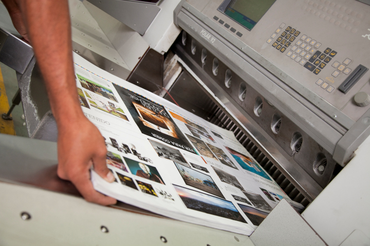
Photo purchased from … www.depositphotos.com
Some commercial printing jobs go south. It’s a fact of life. Here are some lessons you might want to consider based on issues I just had with two of my recent print jobs.
That said, it’s actually helpful to approach things in the following manner. Fixing a problem job for a client who is disgruntled, as well as learning something of value for future jobs, makes you a better print buyer than having all jobs run without a hitch.
The Husband-and-Wife Publishing Team
I recently reprinted a 6” x 9” perfect bound literary print book (i.e., with high production values needed to compete with digital books sold at a lower cost) for a husband-and-wife publishing team. I have worked with this client for over ten years. The two principals of the small publisher love the physical nature of the print book, and they share this love with their literary clientele.
Unfortunately, in this case there were three problems.
The first had to do with folds that were slightly off on the French flaps (3.5” extensions to the front and back cover, folded over the front and back inside covers to give the impression that the book has a dust jacket). These also provide room for additional promotional information. Unfortunately, some of these were not absolutely square (or true).
In addition, the color on some of the book covers was not as saturated or intense as on the original printing of this book.
Finally, in spite of my client’s explicit delivery instructions, all copies of the print book came to her and her husband’s house. They should have received 50 samples. Instead, they received 750 books, 700 of which needed to be at the print book distributor’s warehouse halfway across the country.
Needless to say, I asked my clients to check multiple copies of the books from multiple cartons to determine the extent of the color problem and folding problem, but I addressed the shipping problem immediately because their unsold books needed to be at the book distributor yesterday if not sooner.
Fortunately I had the exact email in which my client had set forth her delivery needs, as well as proof that she had sent this email directly to the printer. With this in hand it was easy to get the book printer to provide appropriate labels for the ten boxes of perfect-bound books to facilitate UPS’s picking them up and re-delivering them immediately.
My client was happy with the speedy service. Having the books picked up and rerouted went a long way.
Furthermore, the printer’s rep for this book offered my client a discount on the problematic books with folding issues and color intensity issues. She hadn’t been asked for this discount. She offered it on her own. My client was especially touched and felt well taken care of in spite of the custom printing issues. At the moment, while her books are being rerouted to the book distributor, my client is tallying up the number of less than perfect books, which already seems to be a smaller number than initially expected.
Moreover, I asked my client to compare the printed book covers to the contract proof she had received from the printer. (The printer had produced two copies: one for their use and one for hers, so my client still had a copy of the cover proof.) Apparently the proof, which my client had initially told me she had liked, did match the final books she had received.
So as the book printer’s speedy attention to making my client and her husband happy moved forward, the scope of the problems gradually decreased.
What We Can Learn
When things go wrong with shipping, which does happen, it always helps to have the email in which you specifically stated what printed copies had to go to which destination point. In fact, it may help to make sure this information is also noted on the printer’s proof sign-off sheet, or to confirm in some other way this information before the cartons ship out. If anything changes, then update the delivery spec sheet and send it to the book printer noting explicitly that it is an update to the original information.
Regarding my client’s color issues and folding issues, I had made an initial assumption that might not have been adequate. I had assumed the art files had been correct for the reprint. What I should have also done is ask my client to send a sample from the initial printing of the book for the printer to match. A physical copy when compared to the ink density and folding issues would have shown exactly what my client wanted. Sometimes the printer’s physical proof and the original art files are not enough (particularly when you’re trying to match a prior press run).
The Fashionista’s Color Chin Cards
I mentioned this job in several past issues of the PIE Blog. My client is producing a set of laminated chin cards. These cards (with a series of full-bleed solid ink hues showing what fabric colors and makeup will be complementary to one’s complexion when held under one’s chin) are 8.5” x 11”, laminated on both sides, and printed on card stock.
I had expressed concern that if produced on a laser printer these cards might have banding problems (uneven lay-down of toner showing streaks through the solid colors). After all, the colors were full bleed, on large cards, with heavy coverage of the colored toner particles. Foreseeing any problems with such banding was my goal in suggesting my client purchase an initial complete set as a proof. Unfortunately, I was right. (I’m usually much happier when I’m wrong.) There was banding. So my client gave the job to another printer.
Rather than lose a client entirely (since she also produces much smaller color swatch books based on the same color system), I thought ahead.
I thought about the HP Indigo color laser printer, which uses much smaller toner particles suspended in fuser oil (rather than the much larger dry color toner particles used in many other digital laser presses). I thought this might minimize banding. I realized this flaw occurs in many cases where the color is built up with multiple layers of cyan, magenta, yellow, and black toner particles, and thought it would be more evident in a large space, like an 8.5” x 11” full-bleed chin card. But I thought the HP Indigo process might be more forgiving.
That said, I also thought back to the three times this job had been printed without incident, without banding. The printer I had used had actually brokered out this digital job himself. I happened to know the kind of press he had used (a Fujifilm J Press, a production inkjet press, rather than the HP Indigo, the color laser digital press I was considering).
I thought a bit further and spoke with a printer who has this digital press. Apparently, since it is an inkjet press, it builds color with minuscule dots (more or less of the cyan, magenta, yellow, or black ink just means more or fewer minuscule dots). This was the technology used for the prior three printings of the chin cards without any visible banding.
At this point, although I know that even inkjet print heads clog from time to time and yield poor quality printing work, I still thought this might be a future option to win back this job. Granted, it will require my client’s seeing samples from this J Press and probably also paying for a full-size, complete proof of all the color chin cards. Since this job is reprinted at least once a year, it doesn’t hurt to have a new printer in the wings who can potentially produce quality work, with consistent color and no banding, for each reprint.
What We Can Learn
Never give up. Actually, that’s the gist of the lecture I received from my fiancee.
My own suggestions have to do with research and being open to multiple technologies. My client’s job was too small (too short a press run, 50 sets of 72 pages, back and front, or 36 leaves) for offset lithography. The only option was digital. That said, there was traditional dry toner (the toner particles don’t always land as precisely as offset ink). There was HP Indigo’s minuscule toner particles suspended in fuser oil. And there was production inkjet, with colors built from process inks using minuscule stochastic spots rather than much larger halftone dots.
At least this is my current assessment, my hypothesis. But I do have to see this hypothesis confirmed with printer’s samples and a physical proof.
I urge you to take the same approach with the commercial printing jobs you buy.
Posted in PrintBuying, Printing | Comments Off on Custom Printing: What to Do When a Job Goes South, Chapter 2
May 6th, 2023
Posted in PrintBuying | Comments Off on Custom Printing: What to Do When a Job Goes South

Photo purchased from … www.depositphotos.com
A good working relationship with a printer is like a marriage. It takes work. It also doesn’t always go the way you want it to. Sometimes a job goes south. This doesn’t mean it’s time to get up and leave. It just means you need to find a solution that works for both you and the printer. I think most people would not necessarily acknowledge this, since it’s human nature to be angry and get into blame when something goes wrong.
Examples
I used to be a lot harsher, back in the ‘90s when I was an art director and production manager at a government education nonprofit foundation. I remember sending back a delivery of stationery in which the two colors of the logo were out of register. I told the first printer I didn’t want to see a bill, and I sent the job to another printer. Maybe this was, in fact, the right approach. After all, this stationery was for the CEO of the company.
Another time, I sent back a job in which a photo had been flopped (printed backwards). This didn’t show up in the blueline proof (we didn’t yet scan our own photos). The image had been “right reading,” but in the final print job it was “wrong reading.” The photo included the company’s logo pictured prominently (and backwards). I asked for this job, a newsletter, to be reprinted. Now that I think of it, maybe this was the right approach.
Unfortunately, we started to get a reputation among the printers we used (I and the three designers who worked for me). Some printers were hesitant to work with us.
I was slightly more than half my current age. I’ve mellowed a bit since then. Now I prefer a mutually agreeable solution.
How Bad Is Bad?
About 15 years ago I brokered a book printing job for (as I recall) the Embassy of Chile in Washington, DC. The problem was that all the pages in all of the print books were wavy (as opposed to completely flat). My client at the embassy had followed my suggestion and had checked random samples within all of the cartons of books. So there was a reasonable expectation that the problem was pervasive.
This time, instead of sending everything back, I called the printer and asked for suggestions. He said I should turn the cartons of books over (to change how the books lay in the cartons in order to adjust their weight distribution) and then wait. Within a week’s time they had flattened out. The pages were no longer rippled or wavy. My client was very happy and more than a little impressed (as was I by the book printer’s ability to solve the problem).
(My guess at this point was that the covers had been printed via sheetfed offset lithography and the text blocks of the books had been printed via heatset web offset lithography. The books were probably bound and trimmed without letting the text blocks absorb ambient moisture after traveling through the heating units of the web press and then being cooled abruptly by the chill rollers.)
The reason for the problem was actually less relevant than the fact that the book printer solved my client’s problem. Moreover, the print books (while not great when they had wavy pages) were still usable for initial distribution (of a few copies), and as soon as the waviness had relaxed, everything was good to go.
But what if the waviness had never gone away?
How bad is bad? This was fixable. Another project was not. The covers of the print book I brokered for another client were “painted” (heavy coverage of a solid color) with full-bleed black ink from which the cover photo was knocked out. It was rather dramatic.
Unfortunately, the book-cover lamination was added before the ink was completely dry. The slightly wet cover ink gassed out (gave off a gas), which produced bubbles that lifted the lay-flat laminate off the press stock. Again, it was bad in different ways, but for the most part it affected all copies.
So I had the book printer take off the covers and reprint them, wait longer this time for the ink to dry, and then rebind and retrim the print book. Unfortunately the trim size was then slightly smaller than originally intended. In itself, this could have caused horrible design problems. Design elements could have been too close to the trim and been chopped off (or, on an intuitive level, they could have felt like they were too close to the trim). I myself had actually designed the book and had left adequate margins, so everything was good.
The printer was not happy, but he wanted my future business (this is why it’s good to nurture mutually-advantageous commercial printing relationships with your vendors). He also had to trim every book by hand one at a time (not really by hand, since he did use mechanical trimming equipment, but it was a slow and arduous process).
In this case the printer’s cost in lost revenue was less than the cost to reprint the entire book. My client would have accepted nothing less (and certainly not just a discount). Why? Because she was selling the print book and it was ugly (i.e., unusable and unsalable) until the problem had been remedied.
Another client regularly reprints her (approximately) 2” x 3” color swatch books, which people use to choose colors for makeup and clothing that complement their complexions. I forgot to adequately explain to the printer how the job was to be laminated. In haste I made a mistake. So I paid out of my pocket to have the job reprinted.
In this case it was not the printer’s problem. It was mine, as my client’s broker. Unlaminated cards would not have been salable (would not have suited my client’s needs). The problem was pervasive (it affected all color swatch books). There was no other answer but to reprint.
What to Do
Boom. The job arrives. Look at it immediately. With a critical eye. Don’t put this off. You haven’t accepted delivery of the job until you have checked it and responded to the printer. That’s how I’ve always looked at this process.
If there are problems, alert the printer immediately and start to check random samples in a number of the cartons to get a good sense of the extent of the problem. You don’t have to check every item. You will start to see patterns. For instance, maybe the problem is only in samples taken from one carton. Maybe the color shifted in a handful of press sheets, and the pressman didn’t catch the error.
Then document everything with photos and a written description of the problem and its extent.
For instance, recently the client with the color swatch books had color shifts in her finished books. She did what I just suggested and told me the problem was evident in 10 books out of 200. Five percent. They were usable. One client complained.
We settled on free shipping for the next reprint plus an agreement to use a different digital press and a more robust sample-press-sheet checking process. My client was happy (above all else, this is the goal). How did we arrive at the amount? Ten books at I believe about $15 each (total cost of the job divided by 200 books). A fair trade: the shipping cost for free.
I had another issue once with a printer in Canada. He was producing a magazine regularly for one of my clients. As I recall, he had to reprint a press signature of the magazine for some reason. We agreed to “split the difference,” to share the cost of the extra press run. Without my remembering the details (it was 23 years ago), I do remember that in this case the reprint was necessary and not clearly the printer’s fault, so the resolution was fair. Both parties (the printer and my client) were not happy but also didn’t feel taken advantage of. My client printed the magazine at this vendor’s shop for many issues going forward.
(In your own work, another approach might be to ask the vendor about reprinting the job at his actual cost rather than at your normal cost including the printer’s mark-up.)
Overall, this is a judgment call. Do the research into the problem, its cause, and its extent. Then decide what will make you whole. Can you accept the job at a discount? Or do you need a reprint?
Overall, the goal is to get a satisfactory printed product and also to be able to continue one’s long-standing, mutually beneficial working relationship with the commercial printing vendor. This depends in large part on the lines of communication and mutual trust you have nurtured over a number of custom printing jobs.
A printer friend of mine calls a job printed for a client who has never printed with the company before, who probably chose the printer based solely on price, and who is not likely to work with the printer again a “drive by.” This is what you don’t want to be and understandably so. It actually benefits you as well as the printer–over your time working together on multiple print jobs–if both you and the printer “win” rather than if one of you loses.
That’s why I say it’s like a marriage.
Posted in PrintBuying | Comments Off on Custom Printing: What to Do When a Job Goes South
April 30th, 2023
Posted in Envelope Printing | Comments Off on Custom Printing: The Power of the Outgoing Envelope

Photo purchased from … www.depositphotos.com
Over the past few years, I’ve noticed that with urgent emails, promotional emails, and spam, I get between 150 and 300 emails a day. Even checking and discarding most of them takes time. In contrast, I get only a handful of physical mail (mostly bills and a few direct-mail pieces). Overall, the direct mail marketers have a lot more of my undivided attention than the email marketers.
In my opinion, direct mail has become a far more personal “conversation” between marketers and prospective clients. And I don’t think I’m alone in believing this. I also don’t think this reflects any great changes in physical mail design.
In this light, I want to discuss a few thoughts on how to ensure that your target audience reads your direct mail materials if your job involves writing, designing, or custom printing such mail.
Clean the Address List
First of all, send your marketing materials to those who will appreciate them. Granted, you won’t always know, but it doesn’t hurt to envision the prospective customer’s “persona,” comprising all of her or his likes and dislikes, hobbies, political preferences, etc., to ensure that the list of addresses to which you send your direct mail reflects this demographic information.
This also means that you should make sure the addresses are complete, accurate, spelled correctly, and current. Your Post Office can help you do this.
Mail list hygiene isn’t really a design decision, but it will at least get your direct mail package or self-mailer in front of those people more likely to be interested. That benefits both them and you.
The Outgoing Envelope
In marketing and publications, this is called the OGE (outgoing envelope). Unless your mail piece is a self-mailer (folded, sealed, and addressed, along with a mail indicia for postage payment), your first job is to get the prospective client to open the envelope. Personally, I usually throw out mail addressed to “Occupant” or “Homeowner.”
But the outgoing envelope is far more than its addressing. When you’re designing direct mail envelopes, consider their size, paper, color, material, texture, and weight.
Here are some thoughts:
Envelope Size and Shape
Custom envelopes that are of an unusual size will attract reader attention. For instance, I’ve received large envelopes, tiny envelopes, square envelopes, and even custom envelopes in the shape of something else (like a truck or a key). Keep in mind that the Post Office will charge more to deliver large envelopes (ask the business mail advisor at your Post Office about the difference in size between letter mail and flat mail, or research this online). Also research surcharges for square custom envelopes. I believe most of the surcharges reflect such things as the difficulty (vs. ease) of automation in processing your mail. If you comply with the rules, you get the discounted rate.
Odd sizes will cost more, but if they increase reader interest (in a material way–and a measurable way), this may be worth the cost. Think of it as an investment.
Color, Texture, and Weight of the Custom Envelope
I recently received a very dark envelope with very serious looking and minimal print in black ink. Needless to say I opened it immediately thinking it was something official and bad. It turned out to be for a funeral parlor. Granted I did throw it out, but the outgoing envelope certainly succeeded. It got me to open the letter.
Other textures or colors (maybe a felt finish, maybe a bright color) can be relevant to what you’re selling and also both a tactile and a visually satisfying experience.
In this light, by increasing the weight of the envelope paper, you can make the entire mail piece seem more official. (People associate heavier paper with a sense of gravitas.) You might want to talk with your printer about 24# vs. 28# envelopes. The former is the regular weight of 60# text paper, while the latter is comparable to 70# text paper. Using 28# paper is also smart for larger envelopes that may contain more marketing materials, since the paper is both thicker and more durable than 24# stock.
Alternatives to the Paper Envelope
An alternative totally different from a colored and textured paper outgoing envelope is a transparent plastic envelope. I’ve received envelopes that have big windows showing what’s inside the envelope, but I have also received totally clear envelopes.
One that comes to mind was for a grand-format inkjet printer. It was made entirely of transparent plastic sheets heat welded into envelopes. I was intrigued. The marketer had done her/his homework and knew I was interested in offset and digital commercial printing. So I not only opened and read the marketing materials, but I also kept the package and wrote a PIE Blog article about it.
You may even choose to forego the envelope entirely and send a self-mailer. Make sure your Post Office approves the paper, design, placement of barcodes and addresses, size and format, etc., before you print, since there are a lot of regulations (which as noted earlier actually allow your mail to proceed smoothly through automation, thus reducing the postage you pay). It’s better to get Post Office approval than to print the job and be sorry when it can’t be mailed or when it incurs a surcharge.
If you send a self-mailer, you can incorporate unique folds (check out Trish Witkowski’s Foldfactory videos online) and seal the proper panels with fugitive glue.
Unique print products pique the reader’s interest. And this sells.
Envelope Personalization
Generic mail gets tossed. Personal mail gets read.
I’ve received direct mail stamped with indicias and meter stamps, but I’ve also received mail with precanceled stamps that are for direct mail use but that look a bit like the “Forever” stamps you buy at the Post Office. These make the envelope look like a friend sent it to you (unless you know what you’re looking at).
Some marketers even choose a typeface for addressing the letter that looks like handwriting, also making the direct mail package look more personal (certainly more personal than a Crack ’N Peel custom label affixed to an outgoing envelope).
When you combine this with clear, accurate, well-chosen addresses vetted for their appropriateness for your message, you’re on the right track to a sale.
These little tricks can get your direct mail package opened, and that’s the first step in interesting your reader in your message and potentially making a sale.
The Power of Cross Media Marketing
All the better if you can key this direct-mail product into a website (home page or personalized landing page). Everything I’ve seen and read suggests that combining physical direct mail and online marketing can drive sales exponentially, because this marriage of technologies allows for a two-way conversation between the marketer and the prospective client. You can receive a direct mail piece, become interested in the content, and then contact the company and request more printed and virtual information through an online portal.
A Reflection on the Quality Product or Service You Offer
Ultimately, your direct mail package is not only a description of the product or service you offer but also a physical product in and of itself, reflecting the quality you promise and your attention to detail. You can convey all of this through your design, paper choices, and every other element of your direct mail piece.
The Takeaway
Each day we go to our mailbox and make an often instant decision as to what to throw away and what to open, read, and even keep. This is based on such visual cues as the custom envelope’s color, shape, texture, paper weight, level of transparency—or, if it’s a self-mailer, based on the intricacy of folds, the typeface, whether there is an indicia or a precanceled stamp that looks like a real stamp. Details matter.
Plus, a direct mail piece (comprising the overall design of all elements) is a physical sample of someone’s (sometimes even a commercial printing vendor’s) design and printing work as well as proof of their attention to detail. So the piece “sells” on many levels.
If it directs the reader to a website or a personal landing page, it even takes advantage of the synergy of cross-media marketing, giving you more sales oomph than either a website by itself or a direct mail piece by itself.
Posted in Envelope Printing | Comments Off on Custom Printing: The Power of the Outgoing Envelope
April 23rd, 2023
Posted in Digital Printing, Photos | Comments Off on Custom Printing: Problems with Digital Halftones
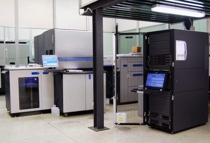
Photo purchased from … www.depositphotos.com
A reader of the PIE Blog posted a comment recently describing problems that have occurred in his transition of some titles from offset printing to digital printing, mostly insofar as his digitally printed halftones (and presumably any area screens) printed lighter than expected.
For my response to this reader, I assumed (from the wording of his question) that he was referring to print books produced on uncoated paper using laser printing technology (also referred to as xerography or electrophotography).
Here’s the reader’s question as well as my answer:
Question:
We have run into problems when moving titles from offset to digital. All grayscale images. Contrary to my expectations, digital print images look washed out, losing in my estimation 10% or more (so a 20% screen looks like 10%). Is this your experience? What is the best strategy for converting existing pdf file to digital print (do we have to go back into InDesign and reprocess all the images?).
Answer:
Thank you for your comment. I can usually tell the difference between digitally printed text, screens, and halftones, and offset printed text, screens, and halftones. To me digital screens and halftones just don’t seem as crisp. Also, the transitions in digital screens and halftones don’t seem as consistent (or even) as those printed via offset lithography.
That said, I have seen a lot of really good inkjet work on coated stock (usually posters). So it is probable that the uncoated vs. coated substrate (print books vs. posters) makes a difference, as does the specific digital technology (laser printing vs. inkjet).
In your case it sounds like you are digitally producing print books (which as I note may be of a lesser quality than offset printed books). With this in mind I would suggest that you request samples from your printer (to help you evaluate the technology), check into the HP Indigo electrophotographic press (a laser-based printer of very high quality that uses toner particles suspended in fuser oil), and ask the printer to gang up a number of photos you have darkened a bit in Photoshop to mitigate the problem.
Ask for suggestions as to whether to darken highlights, midtones, and shadows or just the shadows (there may be a less than even transition, and you don’t want to go from overly light to overly dark images). Making some test sheets (and even trying this test with different commercial printing shops) may help you.
I wish I could say this was simple. For print books you are already producing, your printer may be able to make simple changes to the PDF files directly in PitStop (a preflight program) without your needing to go all the way back to the Photoshop files and then reimport them into InDesign before creating the press-ready PDF files.
So the short answer is to set up a test with the print provider to measure just how much lighter the halftones and screens are than expected (i.e., as created) and then to adjust halftones globally (going forward) using Photoshop. Plus, it may be possible to adjust current halftones slightly at the printer using preflight software.
More Thoughts / More Research
After I sent my reply to the reader and posted it online, I did some more research, which I’d like to share with him and with you.
First of all, a lot of the problems reflect the difference between laser printing and inkjet, and between uncoated paper and gloss coated paper.
But first I’ll start with the reader’s probable motivation for choosing digital printing over offset printing, and his resulting need to control the density of halftones, area screens, and gradations. Most probably it was a print book with a limited press run. Such a book is more economical to print digitally because of the absence of extensive make-ready work needed for offset printing.
As another example, I have a client who needs 50 copies of a 184-page book at present. This is ideal for digital laser printing. While the unit cost of the copies will be high, the overall cost of the entire 50-copy print run will be far less than a comparable print job produced via offset lithography.
(Of course the other reason to choose digital technology is for variable-data printing, which is ideal if there must be a level of personalization from copy to copy.)
The Technology
The technology makes a difference as well. Laser printing, particularly dry laser printing (in which flecks of dry toner are attracted to the printer drum with an electrostatic charge, and then transferred to paper, and then bonded to the paper with heat and pressure) can (in my experience) become problematic because the toner flecks may not be as precisely placed with this digital technology as are halftone dots of printing ink in offset lithography. This can cause a fuzzy or ragged look to laser-printed type and images.
Plus, occasionally there are artifacts in digital printing. These are unintended specs or marks that mar an otherwise pristine halftone, area screen, or gradation. Some digital presses seem to be more prone to this than others. And some values (darker or lighter) in black and white images, or some colors in color images, seem more prone to this.
On the positive side, many high-end digital toner presses are available now. I personally like the HP Indigo, which uses toner particles suspended in fuser oil rather than dry toner particles. I have seen excellent results from this digital press, and I believe a number of other vendors have manufactured similar presses as well.
In addition, there’s always inkjet digital printing. When you look at laser printed samples, you’ll see halftone dots on a regular grid (very similar to the halftone dots of offset lithography). In both offset and laser digital halftones, the halftone dots are larger or smaller depending on the amount of a particular color needed (cyan, magenta, yellow, and black).
In contrast, inkjet-printed halftones are dithered. The halftone dots are not larger or smaller. They are all the same size (minuscule). There are just more of them in areas of denser color. So the overall gradations between colors and between values look almost like a continuous tone image (i.e., they are smoother than laser-printed images).
In short, the choice between digital laser technology and digital inkjet technology could help mitigate this PIE Blog reader’s problem with his print books.
The Paper
Paper makes a difference, too. I’ve seen inkjet printing on gloss coated stock that looks as good as offset commercial printing (just as I have seen toner-based digital printing on uncoated offset paper that is lighter than desired, with uneven gradations and occasional artifacts). The PIE Blog reader might want to experiment with paper substrates (depending on his client’s needs).
Photoshop Controls
I had encouraged the reader to select test images and print them digitally after discussing his concerns with his printer. While a simple solution may involve just darkening the images a certain amount on a consistent basis, this may not be enough. The reader may need a more nuanced solution.
For instance, it is possible to selectively increase or decrease the tones of an image in Photoshop using the “Curves” tool. This tool displays a grid with a diagonal line running from the bottom left to the top right (showing initial tones and the new tones to which you will lighten or darken them). This pertains to both black and white images and color images.
By adding control points (or points) to this diagonal line (you can find out how to do this online) and then pulling them up or down (to change the diagonal line on the grid into an “S” curve), you can selectively lighten or darken the quarter tones, halftones, and three-quarter tones of a photo. That is, you can individually tweak the various levels in a halftone image from the lightest lights through the middle tones up to the darkest darks.
The key here is to run tests (physical printouts) with your commercial printing supplier and then apply what you have learned to all subsequent halftone (or area screen and gradation) work.
One of the articles I found also showed a gray scale that transitioned in equal steps from white through grey to black in 10 percent increments. The PIE Blog reader could create a scale like this and then have his custom printing vendor print the scale on both uncoated paper and coated paper, using both laser digital technology and inkjet digital technology. Then the PIE Blog reader could make decisions for future work based on an analysis of the resulting test sheets.
The Takeaway
Here are my suggestions for those of you with a similar problem to that of the PIE Blog reader:
- Involve your commercial printing vendor early. You may even want to find an ally in the printer’s prepress department. No one will be more knowledgeable (both in general and in terms of that printer’s specific equipment).
- Create tests (inkjet and/or digital laser on various paper substrates). Based on these tests, develop a standard operating procedure to lighten or darken images in Photoshop.
- Don’t assume that such problems (with lightness or darkness of images) will be evident across all values of a halftone. You may want to selectively change highlights, midtones, and shadows using such Photoshop tools as Curves.
Posted in Digital Printing, Photos | Comments Off on Custom Printing: Problems with Digital Halftones
April 16th, 2023
Posted in Marketing | Comments Off on Custom Printing Case Study: Making a Business Recognizable

Photo purchased from … www.depositphotos.com
This is a blog post about making sure your customers can find your business. More specifically, it involves branding, logos, large format print signage, and customer awareness in general.
In this light, I want to tell you about a local thrift shop that my fiancee and I adore–and frequent almost daily. It comprises two storage units and (on clear days) the pavement of the parking lot in front of the storage units. And nothing else.
There are no signs except for the large format print logos on the trucks, which the proprietor uses to collect donations.
The only promotion I know of is by word of mouth and on Instagram, in contrast to most print catalogs I have either seen or designed myself, which usually include the name of the company, the phone number, and the website address on every catalog page.
Furthermore, the name of the establishment, which includes the word “donation,” does not reflect the unique nature of the furniture, paintings, statues, and glassware available on an ever-changing basis. Therefore the prices, which are higher than those of a thrift store, can be off-putting. This is really more akin to a consignment store or an antiques store. If it were positioned that way in the promotion (overall branding) of the shop, I think that people would be more amenable to the prices but would still value the quality of the furniture and curios.
Breaking This Down: The Business Model
This particular establishment has high-level expenses. They pay their employees well. They need to pay for two huge storage units, and they need to pay all associated costs for at least two large moving trucks. After all, they use the trucks for one of their main sources of revenue, which is clearing out all—or any part—of a client’s personal or business goods and then selling them at this establishment.
Think of this part of the business as a cross between a moving company and a charity donation venue. If, for instance, you have a business and have just upgraded all of your furniture or computers, you would give this business a call to donate all the old items you’re replacing. Or if someone in your family had just died, you might have this business clear out and then sell all of the relative’s worldly possessions.
(Granted, in all cases the business keeps the revenue from the sales, but the clearing out portion of the job is still especially valuable.)
Because of its expenses, this business need to make money when selling the furniture, statuary, paintings, etc., many of which are significantly more intriguing than yard sale or thrift store goods. My fiancee and I, for instance, have already purchased a number of original paintings, complete with stories about the artists who painted them. And the prices, while not cheap, were still very reasonable—particularly on 75-percent-off sale days.
The Business Environment
So the overall environment consists of two storage rooms at the back of a parking lot in a warehouse district. The goods spill out onto the parking lot, especially the best items of furniture. At night everything goes back into the storage locker. The second storage unit contains everything from small paintings to clothes to statuary to cooking implements to hardware items and tools. Some of these goods are of marginal value (and cost). Other items include primitive wood masks from around the world as well as items carved from stone. Compared to the other shop a few storage units away on the asphalt of the parking lot, these are smaller items.
Then there is a “free” area with bins of print books and an array of lesser quality furniture. All of this changes—sometimes hourly—as the trucks come in and unload practically every item imaginable from every corner of the world.
Unfortunately, if you don’t know where to find this unique store, chances are that you will not stumble upon it. You have to be going there. It has to be a destination, and you need directions.
A Few Words on Traditional Branding
If you Google “How many exposures does it take to ensure brand recognition,” the first few snippets of information listed will say “five to seven.” I realize this is arbitrary and possibly based on nothing, but it does illustrate the point that brand awareness is “grown” gradually and intentionally. It is not accidental or random.
Almost always this involves a recognizable logo, something that may have an image related to the company (even if it is abstract and only suggestive of the tone, purpose, or values of the company). Computer companies, for instance, may have logo marks that look futuristic and that suggest speed, communication, and control.
These logo marks, or pictorial renderings, are accompanied by the name of the company, in a typeface and in colors that reflect the tone of the company, whether it be futuristic or classic (like an antique dealer’s logo). Sometimes the logo includes only the title of the company, and in these cases the typeface, the shape of the various letterforms, and the placement of color must do all the work in conveying the overall image (and the emotions, thoughts, and values the company wants the viewer to associate with the company).
Fortunately, this particular donation company’s trucks all have large exterior panels, which act as large format print signage to do exactly what I have described.
That said, what if the trucks are out collecting all of someone’s worldly possessions? The two storage units don’t really have any signs or other connection to this logo. If they weren’t wide open with their goods spilling out onto the parking lot, they would be indistinguishable from the other storage units in this business park.
Think about three letters, “BMW,” and the immediately identifiable blue, white, and black of the logo. Think about Home Depot’s orange. If you saw only the colors and no logo, you would probably be able to pair the colors with their associated names and logo marks. This is not an accident. It has come about through the association of words, simple images, and colors, again and again, over time. Even in a grocery store, with all of the competing labels, I’ll bet you could find the Starbucks kiosk for a cup of branded coffee. You would immediately recognize the two-tailed siren, classic green, etc. I do, and I don’t even drink coffee.
Back to the donation company (with all other words in the title omitted to protect the innocent). The trucks move from day to day, depending on the available parking spaces. And moving the only visible large format print signage (the sides of the trucks) might therefore be counterproductive in the owner’s establishing consumer brand recognition.
Positioning
Then there’s the positioning. How might the owner of the company describe the target customer? In marketing language, this might be called “the persona” of the target client, what she or he likes, dislikes, what motivates them, and so forth.
That is, what kind of person would the company like to attract to the two storage units? What kinds of items do they want to buy? I think the company has for the most part articulated this vision (since my fiancee and I know the proprietor and have spoken to many of the other customers).
However, because there is no signage, none of the visual cues that might help position the business in the minds of potential customers have found visual expression. Or even expression in the business name chosen to represent the company.
More specifically, the word “donation” suggests thrift store values, lower prices than those charged at this location. Then again, “donation” also suggests lower value than perhaps the words “choice goods” or “unique items” or “works of art.” Perhaps the revenue of the company, or even the perception of some customers that the prices are high, might change if these words found visual expression in the large format print signage.
After all, in many cases people consider higher priced items to be of a higher value if they cost more (as counterintuitive as this might seem).
Of course this would require a coordinated marketing effort. The name of the company, its logo, the color used for the trucks, and all printed collateral would have to be consistent in promoting the company and in positioning it as an upscale place to find furniture and works of art that might not be available elsewhere.
The Takeaway
This is the beauty of coordinated branding. A skilled marketer can consciously grow potential customers’ awareness of a company as a unique source of value. And this visual positioning can pay off in spades.
If the proprietor of this donations business wants to collect items people no longer use and offer them to those who will love and cherish them (an admirable goal benefitting both the people and the planet), perhaps some enhanced, coordinated branding might be in order.
Posted in Marketing | Comments Off on Custom Printing Case Study: Making a Business Recognizable
April 9th, 2023
Posted in 3D Printing | 2 Comments »
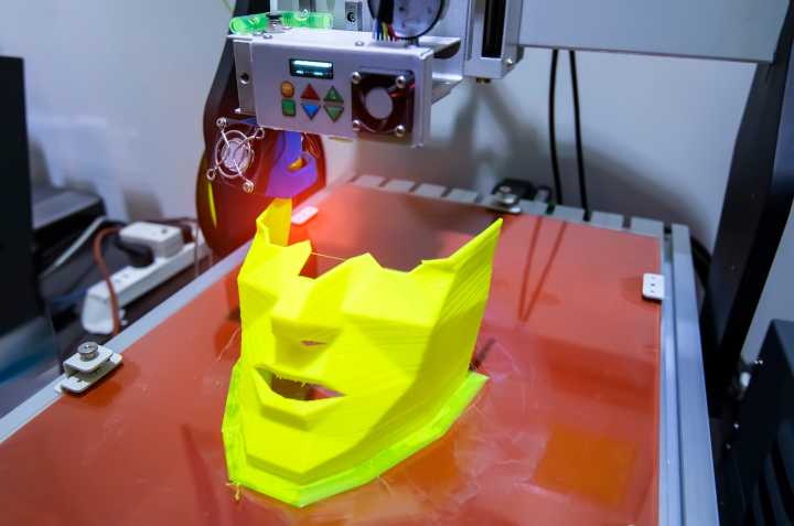
Photo purchased from … www.depositphotos.com
Every day in my Google aggregator email feed, I get a list of digital printing articles and a list of offset printing articles. I find it incredibly useful. In addition to updating me on the technologies and techniques of various aspects of commercial printing, the Google aggregator shows me what’s trending. And recently 3D custom printing has been trending, showing up in a large percentage of the links to commercial printing articles.
In this light, about six months ago I wrote a PIE Blog post about 3D printing. Being a student of offset and digital printing, which in many ways symbolize in two-dimensional form our surrounding 3D world, I’m still finding it challenging to wrap my brain around the concept of making physical “things” with a process analogous to inkjet printing.
You may want to check out Wikipedia when doing your own research, as well as an article I found entitled “What Is 3D Printing?–Simply Explained,” by Lucas Carolo, 02/11/2023, WWW.all3dp.com. Much of what I have written here has been in response to items discussed in these articles.
The 3D Manufacturing Process
Since I don’t have a twelve-year old handy, here’s my 65-year old take, from my cursory research, on what 3D printing is (in non-technical terms) and what implications it has for such issues as copyright protection, reasonable control over firearms, and printing such things as food and medical products (including internal organs).
Plus I will touch briefly on the benefits of 3D printing for the environment, the realignment of manufacturing processes in a world where we can “print our own,” plus challenges for the labor market brought about by the projected growth of 3D printing (or additive manufacturing).
Based on my cursory research, it seems that there are only a handful of steps in 3D printing. First there has to be a computer model, a diagram, if you will, to drive the fabrication of a 3D product. These models can be created with CAD (computer aided design) software packages, or they can even be found online in “repositories.” So you could conceivably just go online, find a computer model for a product, download it, and print it.
The next step is preparing the model for production on your 3D printer. I have seen these in computer stores. They are now very affordable. The ones you or I could buy work with spools of (basically) plastic filament, which are melted and extruded (squeezed out in a stream through a nozzle or print head). This is not unlike an inkjet printer, which does the same thing with liquid ink.
The plastic filament (which looks like a thick plastic wire) builds the physical model layer by layer as the print head travels back and forth over the bed of the 3D printer, which rises or falls as necessary to allow for the growth of the product layer by layer.
Then, the heated plastic solidifies. Or, in some approaches to 3D printing, UV light or even a laser cures the plastic (causes it to harden). For this to work, the computer model must first be “sliced.” Slicing breaks down the 3D computer image into flat layers, which can then be printed one upon the other and thus built up into the final form. This is a mathematical process, as I understand it.
The next step is to print the product. In the case of a desktop 3D printer this process works with different kinds of plastic, but in other additive manufacturing processes 3D products can be made in a similar way with other materials, including metal, ceramic, food, and even biological matter.
To help you visualize this, here’s an analogy. In a nutshell, additive manufacturing is akin to collecting clay and modeling it into a sculpture, while subtractive manufacturing (its opposite) is analogous to chipping away at a block of marble with a chisel to create a sculpture. In the manufacturing arena, subtractive manufacturing would include such processes as “machining” or grinding away metal from an item.
The third option is molding (such as injection molding), which involves pouring a molten material, like plastic or even metal, into a hollow form (the inverse of the final 3D component part) and then removing the mold. This actually can be tied in to 3D printing, because it is possible to either print a mold or print a (plastic) part around which you can then make a mold (for pouring more durable materials than molten plastic).
Most of these processes take time and cost a lot. Among other things, for instance, you would have to create the molds from which you’re making injection molded products (such as plastic toy soldiers).
But with 3D modeling, you just create the computer model yourself, scan a physical object and turn it into a computer model, or acquire the computer model from a repository and then print it.
One benefit of this process is that plastic products made layer by layer from a computer file can be infinitely more detailed than machined component parts. That said, once printed they are usually a bit ragged in areas (or they have supplemental plastic support pieces that hold up the 3D model but that must be removed before use).
So the next step is post processing. (It’s a little like the clean up or finishing work you need to do if you’ve just poured a bronze sculpture into a mold and then opened the mold to find portions that need to be ground away. In 3D printing, you may need to clean up, cure, or paint the pieces, or even assemble them into a larger, more complex final product.
Again, as a reminder, we’re talking about 3D custom printing on desktop machinery using plastic filament, but the concept still holds true for industry-level additive manufacturing.
What’s Is 3D Printing Good For?
The first thing I learned in my research was that companies or individuals could make prototypes easily, quickly, and cheaply.
This is a bit like the prototype a package designer can make before committing to a long run of a particular carton design. If you’re producing a 3D item using subtractive manufacturing or injection molding, you have to build manufacturing equipment specific to producing that particular item.
In contrast, if you’re 3D printing a plastic model head (see the photo at the opening of this article), you can print one copy or ten copies for a small amount of money, quickly. If you’re producing a printed model head as a toy to be sold to children, you can print one, make design changes, and then print a revised version.
This is not true with more mechanical, laborious manufacturing processes (such as injection molding or machining). So your time from idea to prototype to market can be faster with 3D printing, and you have the ability to improve, simplify, or even personalize the 3D plastic head toy each time you print it.
Granted, you can’t print a huge run of these plastic heads quickly or cheaply. This is a more time consuming process for the actual production run (at this point in the development of 3D printing) than the final stage of traditional manufacturing.
Here are some other items that are in vogue for 3D commercial printing at the moment:
- Home décor items such as furniture
- Fashion items such as shoes and jewelry (these can be very intricate, as noted before)
- Firearms
- Food (such as crackers, hamburgers, and even such products as food for astronauts)
- Actual body parts and especially prosthetic limbs. (This doesn’t surprise me, since the medical field has been growing human ears on mice for a long time–on their backs, not their heads.)
- Spare parts that allow people to make their own product repairs at home
3D Printing Is Similar to Inkjet Commercial Printing
As you’re reading this, you may be seeing (as I do) a similarity between inkjet printing in the commercial printing arena and 3D printing with plastic filament in the manufacturing world. You can prototype quickly, personalize your items, print a limited number of copies for a reasonable investment, and easily modify the printout by changing the computer file.
All of this has profound implications, and many of these implications bring to mind the workflow of digital commercial printing.
For instance, since the 3D desktop printers are already affordable, and since they will presumably improve in the near future and use other raw materials such as metals, then 3D printing will presumably democratize manufacturing (make it available to most people, or at least give them more options).
For example, just as you can now write, design, and digitally print publications with equipment that will fit in your home, in the near future you may not need to go to a store to buy something (like a replacement part for a product you own). Instead, you may just download a computer-designed template and print your own replacement part.
Or, manufacturing may move closer to the final destination (think of people who send art files to another state, print their books there, and have a lower freight bill since the printed products are already close to their destination).
Like digital printing, 3D manufacturing will also allow for reduced inventory. Companies won’t need to store inventory since they can 3D print items at the time they are ordered (just like web-to-print for publications). This will save warehousing space and the costs associated with inventorying products, reduce energy for heating and cooling storage facilities, and reduce carbon emissions by minimizing product delivery by truck.
Plus, there will be less material to dump in landfills, since products can be made only when needed (you won’t need to make a huge number of products just because that’s the only way to make the unit costs reasonable). Sounds like digital commercial printing again, doesn’t it?
Social and Ethical Concerns to Address
These are a few of the issues I’ve read about recently:
- Gun control issues. When you can download a template and 3D print your own gun, this can be challenging for the control and licensing of firearms.
- Copyright issues will need to be addressed.
- Ethics issues and religious concerns related to the 3D printing of biological items may need to be addressed.
- Labor issues. The new 3D print workflow will have an impact on labor. Presumably there will be more machines and fewer people getting paid to manufacture items. How will these displaced workers be reintroduced into the labor force?
Welcome to our brand new world.
Posted in 3D Printing | 2 Comments »
April 2nd, 2023
Posted in Photos | Comments Off on Commercial Printing: Thoughts on Photo and Art Reproduction Licenses

Photo purchased from … www.depositphotos.com
In life, nothing is free. In commercial printing, if you reproduce an image (a photograph or an illustration) that someone else created, you have to pay for the limited rights to do so.
In this light one of my print brokering clients came to me this week noting that she had purchased a subscription to a service that allows her to create pretty much whatever image she wants using an online artificial intelligence application.
My print brokering client regularly prints multiple copies of a small (approximately 2” x 3”) color swatch print book (there are 28 individual master versions) that help fashionistas choose make-up and clothing colors based on their hair and complexion. She also prints copies of a 72-page set of cards (much larger, 8.5” x 11”) with a die cut for the user’s chin, to be held under the user’s face and used in conjunction with the color swatch books. The goal is to help clients look good.
My client also produces print books and ebooks to support this proprietary color scheme (keyed to the seasons), and, for the decade I’ve been working with her, she has been incorporating her own illustrations (of women of various complexions) into these commercial printing products to illustrate her color selection process.
Rights for Reproduction
So, back to the artificial intelligence images. My client called me asking the legal ramifications of reprinting these illustrations in her printed products, for which she will charge money.
I’m not a lawyer, nor do I play one on TV, but I do have 46 years of experience in publications and custom printing. So I had some suggestions.
First of all, when I was a print book designer back in the 1980s, the government education non-profit for which I worked would publish a yearly edition of a print book addressing 10 domestic and 10 foreign policy issues. The cover of the book included four large images, reflecting the edition’s highlighted issues. In addition, an overrun of the book cover became a marketing postcard distributed across the United States to sell copies of the textbook.
This was before photo CDs and before image downloads from the internet. At the time, we made an annual trek to a “picture agency” (a physical location) and provided a list of the kinds of photos (subject matter and format) we wanted to include in these two print products.
The proprietor of the picture agency would bring us sleeves of transparencies (slides), which we would review on light boxes. These were highly intriguing, unique images. We would choose maybe 20 and return to our office, promising to send back the unused, original slides (not even copies of original slides) immediately once we had made our final four selections. The original slides they gave us were so valuable as original art that one year when I sent back multiple sleeves of original slides, I had to insure the package for an exorbitant amount, something over $200,000 as I recall, since our organization could otherwise have been liable for potential loss of the package in the UPS delivery process. Needless to say, buying images now (or the rights to reprint such images) over the internet sidesteps this problem.
Rights-Managed Imagery
Each year we had a specific license called a “rights-managed” license telling us what we could and could not do with these images (the artwork, or in this case photos: the intellectual property rather than its rendering on acetate slides).
For the photo reproduction license, we paid a different amount based on the size, placement, number of reproductions (the press runs of the print products), and physical distribution of the reprinted photos (in print books distributed throughout the United States, for instance).
Some years we bought rights to additional photos we would use within the text. (These cost less.) Cover shots (we eventually decided on four each year) cost more. The number of copies of the book (and the fact that they were for educational rather than promotional use, distributed for free with our government education experience in Washington, DC) also made a difference. I’m sure the cost would have risen had we made a profit on the print books (if they had not been supplemental to the government education seminars we provided).
Our promotional use (in addition to the educational use in the print books) also made a difference. The 60,000 copies of the cover overrun printed on a marketing postcard along with sales language cost more as well.
What we got for all this money was the following. We had explicit rights to reproduce photos from around the world that were truly unique and amazing, reportage shots from war-torn countries as well as more commonplace images for our domestic issues chapters in this print book. All of the images were of the highest quality, and they were one of a kind. That is, few if any other organizations’ print books would include images like these (and certainly not the same ones).
Royalty-Free Images
I’m sure this option was around as well, but I didn’t know about it because we already had a process. Royalty-free images, which I started to see available online in the ‘90s or on CDs including huge assortments of digital art and photos, were a lot cheaper than our rights-managed images. Unfortunately, they were also were more generic.
That said, the lower cost for the reproduction license (in some cases a subscription price to use a large number of images each month with far more latitude than with rights-managed contracts) made this ideal for certain kinds of publications. In fact, when I started my own business in 1998, I used a lot of royalty-free images in the freelance design work I was doing at the time. Everything was affordable, and, as I recall, as long as I credited the company (on the printed product) from which I had bought the rights, I could alter the image if I chose to (posterize or colorize it, for instance, but presumably alter it in other ways as well).
Back to My Client
So when my client contacted me last week about using an online AI illustration generator in her work, I went through the preceding discussion with her. I also described the concept of “derivative work,” which involves altering a photo or illustration she was buying rather than reproducing it exactly as it was originally presented.
(To put this in context, back in the 1980s and early 1990s, when we were buying rights-managed reproduction rights, we never would have thought of altering the images or using them to make a political statement or to sell anything but our specific government education print book.)
Interestingly enough, my client had spoken to her lawyer (which I thought was smart), and he had said that artificial-intelligence-created imagery (which is what she now has) cannot be copyrighted because it is not produced by humans.
I told my print brokering client that getting feedback from a lawyer was a smart move. I also said that the final arbiter would be the specific image reproduction license she had purchased, which would set forth her rights and obligations, along with the duration of the contract, how she could alter the images, etc. I presumed that anything not explicitly stated in the license would be fair game, but I also suggested that she consult her lawyer about image alteration. I also made sure she would remember to credit the agency (as noted in the license) from which she was buying online artificial-intelligence services.
The Takeaway
How does this relate to you as a designer or art director selecting photos or illustrations, presumably through some kind of online service?
- Read the license carefully and abide by it. Some people, for instance, without knowing they have to pay for it, link their web pages to media owned by other people and (even if it’s an accident) wind up paying hefty settlements. Avoid this.
- Understand the concept of “derivative work.” Only alter your images if your license (usually a royalty-free license) says you can do this.
- Understand the differences between a rights-managed and royalty-free license, and know when you will want to use one or the other.
- Understand that an image may be under copyright in one country but not another.
- Consider “public domain” imagery. This is imagery that has fallen out of copyright protection or has never been under copyright protection. Shakespeare’s works (granted they are not images) were created before copyright protection existed. In layman’s terms, public domain means you can use it for free and not hear from a lawyer.
- Ideas cannot be copyrighted, only their expression.
- If you’re designing for the internet, be especially conscious of your actions. I’ve heard that some copyright owners don’t accept your apologizing and then deleting their image from your website (because someone else might possibly have downloaded the image while it was on your website).
- When in doubt, ask a lawyer.
- Finally, remember that copyright is a way that other artists can ensure that their intellectual property is not stolen or used in ways they would disapprove of. So it’s not a bad thing, just one for you to understand and be mindful of.
Posted in Photos | Comments Off on Commercial Printing: Thoughts on Photo and Art Reproduction Licenses
March 26th, 2023
Posted in Post-Press Finishing | Comments Off on Custom Printing: Three Sculpted Finishing Operations
Photo purchased from … www.depositphotos.com
It’s easy to forget that commercial printing is more than just a process of putting ink or toner on paper, and miss out on all the other operations that contribute to the overall success of a custom printing job.
A lot of these processes follow the printing step and are therefore referred to as post-press operations or finishing operations. Strictly speaking, even folding and trimming the stack of press sheets after the ink has dried would fit into this category, but today we will focus on three post-printing techniques that give dimension to a printed product: die cutting, embossing/debossing, and foil stamping.
Above all else, commercial printing is a tactile medium. You become especially aware of this when you compare a 256-page perfect-bound print book with French flaps to the same book presented as a file on an e-reader. The print book has heft. The text and cover papers have a rough or smooth feel. And there’s usually a scent associated with a printed paper product.
The three post-press operations I have mentioned add to this tactile nature and accentuate the dimensionality of the printed piece (which is, above all else, a three-dimensional object).
Die Cutting
Die cutting is done on a letterpress. That is, it is a physical stamping process, unlike offset printing, which depends on a chemical property: the immiscibility of oil and water. (Oily ink and water do not mix.)
A letterpress performs a physical, relief-printing process (the image areas are raised above the non-image areas). In the case of die cutting, flexible metal rules are bent into the shape required (let’s say a square to be cut out of the front cover of a presentation folder). These rules are set into a wood base with the edge of the cutting rules raised above everything else. When the letterpress is operated with the presentation cover paper in place, the die rules will chop through the paper. Then the scrap (the portion to be removed) can be discarded by the press operator.
(A similar process can be done for scoring, which is the creasing of thick custom printing paper to allow for smooth, even folding. It can also be done for perforating, which uses a metal rule to punch a row of tiny holes in commercial printing paper so it can be torn smoothly by the end user. While these are also done on a letterpress, they can in some cases be done on an offset press, with the metal scoring or perforating rules attached to the impression cylinder of the offset press. Unfortunately, this eventually destroys the rubber blanket on that particular unit of the offset press.)
Die cutting is used extensively in product packaging. If, for example, you take apart a carton of tea bags from the grocery store (to the point at which all glued portions have been separated and laid flat), you will see that it is composed of an irregular form with a number of flaps. (The same is true if you take apart a presentation pocket folder.) The metal die cutting rules punch out this intricate shape, which when folded and glued yields a rectangular product box.
Dies are always an extra cost. In my experience they often cost between $250 and $500. That said, every time you reprint a job using the same die, you already have it on hand and don’t need to pay for a new die. You just have to pay for the die-cutting process. In addition, for standard dies that many customers might use, your printer may already have these on hand, so you may not need to pay for and wait for a new one.
Embossing/Debossing
Also using a metal die (in this case a two-part die), you can use a letterpress to raise or lower an image above or below the rest of the printing sheet (up to about 1/8”). You would do this after the custom printing component of the job. Otherwise, the pressure of the offset printing press would crush the sculpted image.
In embossing and debossing, one part of the two-part die pushes the design into the paper fibers, while the other part of the die receives this impression, allowing the paper to move forward or backward in accord with the image. This is done with heat as well as pressure to allow the paper to be sculpted more easily, and this adds a smooth surface to the embossed or debossed area as well.
Embossing and debossing dies (embossing raises the image above the rest of the paper, while debossing lowers the image) can be quite intricate, and the edges of various parts of the die can even be at different levels of depth. However, if the lines are too fine, they may cut through the paper (that is, the goal is to form the paper without cutting it).
In addition, if the dies are especially deep, they may need to be beveled (staggered in multiple layers) to avoid cutting into the paper, and this can make the image area of the embossing/debossing look smaller than it actually is.
So involve your printer early in the design process to ensure that your design will work on a physical as well as aesthetic level.
In some cases, you may choose registered embossing, in which the raising or lowering of the paper surface is in register with a previously inked image. This may also be the case if you’re foil stamping a job. For instance, you may want to register a foil seal and an embossing stamp for an award symbol on a certificate or book jacket cover, or even the words in the title of a print book on the book’s dust jacket.
If you just want to emboss or deboss a design on paper without registering it to previously printed ink or previously foil-stamped images, this is called blind embossing. In this case the three-dimensional raised or lowered effect is the complete design, without any printing.
Such soft “text papers” (i.e., high-end textured papers) as felt stock are good for embossing/debossing because they are thick, durable, and soft. This helps them take the impression of the metal dies better than a harder press sheet.
As with die cutting, embossing/debossing will require extra time (dies are subcontracted out by your printer) and will add to the cost of the custom printing process.
Foil Stamping
Another strike-on process used to embellish your print book dust jacket or even the cloth of the case binding itself is foil stamping. This is also good for the starburst seals on certificates of appreciation. In either case a metal die is created with the image area of the artwork slightly raised.
This die is then heated and pressed against a roll of thin foil, and the heat and pressure attach the foil to the substrate. The fabric of book covers actually accepts this process quite readily. In the case of certificates with raised foil seals, the foil-stamped certificates can then be embossed as described above.
Interestingly enough, this process can also be used for physical products such as pencils, pens, frames, and such.
In addition, you have a much wider range of choices of foil than you might think, including metallics, pastels, patterns, and even clear foils and foils that match the background (such as gloss or dull black to be attached to black paper). So in this way you can create contrast between the text and background.
Foil stamping is great for rendering text on dark paper, for instance an invitation with white lettering on a black background. Since offset inks are transparent, it would take two or three passes with ink to create a completely opaque image, whereas the foil is already opaque, so all you need is one pass through the press.
The best paper to foil stamp is either a textured stock (a premium “text” sheet) or even a high quality bond paper.
Granted, as with die cutting and embossing/debossing, foil stamping requires the cost and time involved in cutting (chemically or by hand) a metal die.
Getting It Printed, a text on commercial printing technology by Mark Beach and Eric Kenly, notes that foil can blister if applied over inks containing silicone or wax, or even over coated paper. In addition, applying foil over too large an area (more than eight square inches) may also cause blistering.
On the plus side, Getting It Printed mentions that these plastic foils can stretch, which makes for a successful pairing of embossing and foil stamping.
Posted in Post-Press Finishing | Comments Off on Custom Printing: Three Sculpted Finishing Operations
March 19th, 2023
Posted in PrintBuying | Comments Off on A Case Study on Replacing a Commercial Printing Supplier
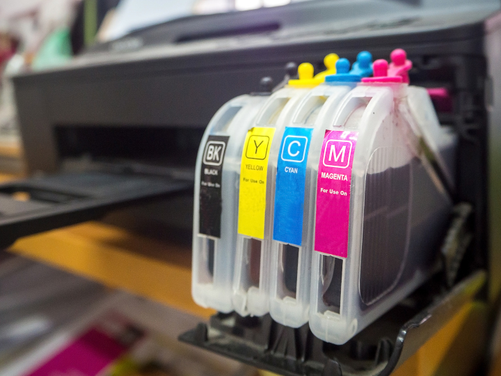
Photo purchased from … www.depositphotos.com
A long-term, mutually beneficial business relationship with a printer sometimes ends. Perhaps the printer goes out of business or starts to not be as responsive as in prior years. Maybe their prices even rise dramatically, making the company no longer an option. What can you do?
In this light I have a case study to share. One of my commercial printing clients produces a color swatch book on a regular basis. These tiny, screw-and-post books are like PMS swatch books for those looking for make-up and clothing colors that will complement their complexion and hair color.
Along with this set of color swatch books, my client prints larger chin cards with a die cut for the person’s neck. These 8.5” x 11” chin cards allow the user to hold a large color swatch under her chin to see how a particular hue will look with her skin tone and hair color.
The cards are 8.5” x 11”, 14 pt. in thickness, with a semi-circle die cut for the chin, and with lamination on both sides. One side of each card is a big swatch of color bleeding on all four sides. The other side is text in black ink only. The total set comprises 72 pages (35 colors with information on the back of each, plus one single-page (front and back) set of instructions.
Losing a Printer
My color-swatch-book and chin-card client recently lost her printer based on issues with management. This particular printer had produced 50 sets of her chin cards every other year or so. The colors had been faithful to her expectations, and there had been no banding or artifacts in the solid, digitally printed colors, so it had become an easy reprint on a periodic basis. A boon to the printer (it was regular, straightforward work) and to my client (the end result was predictable).
So losing the commercial printing vendor was unfortunate. I had actually gone through a similar loss of a printer for my client’s color swatch books for a different reason several years prior. This vendor had upgraded the software on their HP Indigo digital laser press, and for whatever reason a number of the colors of the (smaller than 2” x 3”) swatch books were no longer accurate. This was a harder problem to solve, and it also came down to finding a new printer.
Digital vs. Offset
One of the challenges with replacing the custom printing supplier for the color swatch books (and this will also be true for the color chin cards) was to ensure color accuracy and smooth, even color laydown (compared to offset printed solids). All colors are percentage builds made from the four process colors. There are no PMS colors (since there may be a total of over 100 distinct hues that show up in some of, or in each of, the 28 master copies of the color swatch books).
This would be prohibitively expensive to produce via offset lithography, since it would require multiple passes on an offset press for what would in many cases be only a few copies at a time of the individual swatch books (so many copies of each of the 28 master versions).
For the color chin cards, the same would be true since my client only prints about 50 copies of the 72-page set at a time.
In both cases the limited press run for the individual sets, plus the use of so many colors, requires an accurate and consistent digital press. In my mind that includes the HP Indigo plus perhaps a Konica Minolta plus a Kodak NexPress, although I’m sure in the last several years other vendors have stepped in with equally accurate color digital printers.
With the loss of the color swatch book vendor, and in the most recent case the loss of the color chin card vendor, selecting a replacement has been and will be dependent on a physical proof of all pages.
So I have requested pricing for (in the case of the chin cards, since it’s the current job needing custom printing vendor replacement) a full hard-copy proof from the digital press in question, whether it is a digital laser press or a digital inkjet press (depending on the new vendor).
The color proof will ensure that the color builds (percentages of cyan, magenta, yellow, and black) that my client had specified in her art file (she had kept a digital copy of her chin cards from the prior print run) match her expectations.
This is not always the case for all colors for all commercial printing vendors using a variety of digital presses. And soft proofs (PDFs on screen) of the color swatches (2” x 3” color swatches or 8.5” x 11” color chin cards) would not necessarily present the colors as they will eventually look when actually printed. After all, in the case of a computer monitor proof, the colors are created with red, green, and blue phosphors, whereas on a proof made on the actual press, the colors will have been created from the actual cyan, magenta, yellow, and black toners or inkjet inks.
In my client’s case the die cut and the lamination will be irrelevant, and not including these elements on the printer’s proof will keep the price down ($75.00, approximately, from two of the vendors I’ve approached). I think the cost of such a proof (rolled into the total manufacturing cost by some printers) is an investment, not an expense.
Banding and Artifacts
In my experience, some digital presses also produce solids (in this case up to 8.5” x 11” for the chin cards) that may not be as even a laydown of pigment as with oil-based, thick, offset-printed ink.
Sometimes there are artifacts (stray marks or lines) or banding (usually but not always in gradations from a light tint to a darker shade of a color). I’m not sure whether the banding is a reflection on the number of steps in the gradation (not an issue in the case of my client’s chin cards) or the PostScript (page description language) code of my client’s art file, or even in the nature of the process (spraying ink through nozzles—which sometimes clog) for the inkjet option or using toner particles suspended in fuser oil for the digital laser option.
Regardless, heavy ink coverage can cause problems. And nothing will be as effective in allaying my client’s concerns (and mine) as a hard-copy proof. It will ensure color fidelity (some colors seem to be more problematic than others) and the absence of banding. And once the new printer has proved it can provide an acceptable printed product, my client will have a home for this repeat job for many years going forward.
The Die Issue
Unfortunately, my client will need to have the die for the semi-circular cut out (for the user’s chin) remade. Granted, she paid for it once (approximately $275.00) and it was then used for successive runs of her job. And strictly speaking it is hers (according to commercial printing trade customs). But you could argue that it is only a component of the overall manufacturing process and therefore it belongs to the original printer. Struggling over this for $275.00 may not be worth it.
Availability of Materials
One of the things I’m finding is that not every printer can get the same lamination film for some reason. The job was originally produced on 14 pt. cover stock with 3 mil laminate on both sides of the chin cards. In the cases in which printers have only been able to get 1.2 mil laminate, I have asked for thicker cover stock for the chin card boards.
There is usually a work-around. This is mine.
Other printers may have different approaches. In my case, I think my client will be happy with the printed product as long as the total thickness of the base stock and the laminate on both sides of the cards feels about the same as samples from the prior press runs.
The Takeaway
So there are ways to get around losing a commercial printing supplier, even for a printed product that is a repeat job with colors that may not be easy to match (several of the printers “no-bid” this job outright, concerned that my client would not accept potential color banding or less than perfect colors).
If you have a job like this, it’s worth collecting bids from a number of prospective vendors. The PIE website (I have found) is always a good way to get new printers. Referrals from other clients or other printers that can’t for whatever reason do the job for you would be another option.
But in all cases I feel very strongly that checking an actual, physical proof will put your mind at ease, proving whether the vendor can or cannot provide your required level of quality. Granted, in some cases like these (multiple color builds produced on a digital press), you may need to have some flexibility. Not everything will be 100 percent perfect. Fortunately, my client understands this as long as the hues are reasonably close to the intended color.
But again, all of this will be visible in a good hard-copy proof, and this can help you develop a new long-standing, mutually supportive business relationship with a new printer. It’s a little bit like a marriage. It takes work, but the benefits make it worth it.
Posted in PrintBuying | Comments Off on A Case Study on Replacing a Commercial Printing Supplier
March 12th, 2023
Posted in Printing | Comments Off on Custom Printing: Choosing Engraving or Thermography

Photo purchased from … www.depositphotos.com
I’m a great believer in marriage. Weddings give you an opportunity to use one of the most artistic printing techniques (as well as one of the oldest) in existence: engraving. In fact, since my fiancee and I teach art to autistic students, I could very well share this same information with our students, because there is a long history of engraving in the fine arts as well as the graphic arts.
Engraving is an art form that lends itself to special occasions, such as weddings. However, it is also quite appropriate for corporate materials such as invitations to special gala events, letterhead, and business cards.
The Engraving Technique
Engraving is the opposite of letterpress. In letterpress, raised image areas and text print content onto commercial printing paper. In engraving, lines of images and text are incised into either steel or copper printing plates. Thick ink is wiped onto the plate and then wiped off, leaving ink only in the incised image areas.
Keep in mind that the dimensions of the engraving work tend to be very small (such as the size of a business card or invitation). When the intense pressure of the engraving press is applied, it forces the custom printing paper into the incised type and image areas of the inked plate, and the paper absorbs the ink. At the same time, the image areas are raised slightly by the intense pressure. So when the final piece comes off the press, the back of the sheet is slightly indented behind the typescript letters, and on the front of the sheet these very same printed elements are raised.
To compare this to the most common current form of commercial printing other than digital printing (i.e., offset lithography), offset printing plates are flat (neither raised like letterpress nor lowered, or incised, like engraving). In offset printing, what keeps the ink confined to the image areas is a chemical property of oil and water (or oily ink and water). That is, oil and water do not mix, so it is possible to separate them on a flat commercial printing plate.
To compare all three custom printing techniques in this light, engraving is an “intaglio” (recessed-image) printing process, offset lithography is a “planographic” (flat-image) printing process, and letterpress is a “relief” (raised-image) printing process.
Beyond the aesthetics of a special business card or invitation, engraving provides the sharpest printed impressions of any custom printing technique. Therefore, it is used to print currency and stock certificates as well.
Engraving plates are either steel or copper. According to my go-to book on printing, Mark Beach and Eric Kenly’s Getting It Printed, steel plates will allow for much longer press runs than copper plates. (Copper plates are usually good for press runs up to 5,000 copies, and then they deteriorate.) However, engravers usually only offer a few typefaces on steel plates.
Engraving plates can be imaged in the following ways:
- The lines can be incised by hand using tools. (This is used for steel plates.)
- The type and imagery (very simple line drawings, for instance) can be chemically burned into the metal if you’re starting with a “mechanical” (hard copy, actual type and imagery pasted up on paper), which is pretty much an extinct option now. (This is used for copper plates.)
- The type and imagery can be burned into the commercial printing plate with a laser from digital art files (more common). (This is used for copper plates.)
When you’re designing for engraving, keep in mind that the inks are thick and opaque, which can make them a great choice for a darker paper stock. (They are more striking than transparent offset inks printed on darker commercial printing paper.) Also they come in gloss and dull formulations, which will give you options. For instance, the gloss inks may even appear a bit metallic.
One of the most important things to remember if you are buying engraving services is to choose an appropriate, high-quality paper that will showcase the aesthetics of engraving. Let your printer help you choose the paper stock.
Another thing to remember is to ask the printer to confirm the heat tolerance of your final printed product if you intend to print names and addresses on a laser printer. In some cases the high heat of a laser printer could damage the engraved product.
Engraving requires intense pressure, as noted earlier, so it lends itself to small presses printing small images. Getting It Printed notes that anything larger than a 4” x 8” area would require an additional pass through the press. (For instance, your printer may do one pass for the top of your letterhead and another pass for the bottom of your letterhead.)
An Option to Engraving
But what if you can’t afford the expense of engraving? Or maybe you want something for larger-format printed pieces. What are your options?
Thermography is a hybrid printing technique that actually starts with offset lithography. You may in fact have seen thermographically printed business cards and thought they were engraved, because the type and imagery are raised as in engraving. (One key give-away, however, is that the underside of the printing paper is not indented behind the type letterforms.)
Thermography starts with slow-drying offset printing inks that are dusted with thermographic resin powder after the offset printing step. This powder sticks to the offset ink and “takes on the color of the underlying ink, but may not match perfectly” (Getting It Printed, p. 138). Excess thermography powder (powder not covering type or other image areas) is then vacuumed away, and the printed piece is heated. Heat melts the thermography powder into the offset ink, but it also causes the powder to bubble up (hence the raised effect that simulates engraving).
In my experience, two things are important to remember with thermography. The first is to keep things simple. You can create an attractive, raised effect, but if you try to reproduce anything but the coarsest halftone screens, the screens may plug up and look uneven. (I personally did this once about thirty years ago, so I encourage you to learn from my mistake.)
Also, there is a chance of your receiving a printed piece in which the ink looks stippled (a pattern of tiny indentations, like the skin of an orange peel). So ask your printer for samples, and make sure he is skilled in thermography and can avoid this stippled effect. You want the powder to rise as it is heated, and you want a uniformly glossy appearance, so your printer must be able to control the offset ink application, heat, and thermography powder application.
That said, you don’t have to use thermography only for business cards or letterhead. Getting It Printed suggests applying thermographic printing to perfect-bound print book covers, for instance, perhaps highlighting the title of the book by making it colorful, raised, and textured.
If you choose thermography for a printed item, you have a choice of fine, medium, or coarse thermography powders, so you can use fine resign powder for fine lines and thicker granules for larger areas of type or color solids. However, too large an area of color thermography might result in a blistered appearance. Also, printing across a fold will result in cracking of the dried thermographic powder.
And finally, thermography does not have the highest rub resistance and can therefore be scratched. Also, thermographically printed ink does not tolerate the heat of a laser printer and can lose its “rise and luster” (Getting It Printed, p. 139) if heated.
Posted in Printing | Comments Off on Custom Printing: Choosing Engraving or Thermography