Printing Industry Exchange (printindustry.com) is pleased to have Steven Waxman writing and managing the Printing Industry Blog. As a printing consultant, Steven teaches corporations how to save money buying printing, brokers printing services, and teaches prepress techniques. Steven has been in the printing industry for thirty-three years working as a writer, editor, print buyer, photographer, graphic designer, art director, and production manager.
|
Need a Printing Quote from multiple printers? click here.
Are you a Printing Company interested in joining our service? click here. |
The Printing Industry Exchange (PIE) staff are experienced individuals within the printing industry that are dedicated to helping and maintaining a high standard of ethics in this business. We are a privately owned company with principals in the business having a combined total of 103 years experience in the printing industry.
PIE's staff is here to help the print buyer find competitive pricing and the right printer to do their job, and also to help the printing companies increase their revenues by providing numerous leads they can quote on and potentially get new business.
This is a free service to the print buyer. All you do is find the appropriate bid request form, fill it out, and it is emailed out to the printing companies who do that type of printing work. The printers best qualified to do your job, will email you pricing and if you decide to print your job through one of these print vendors, you contact them directly.
We have kept the PIE system simple -- we get a monthly fee from the commercial printers who belong to our service. Once the bid request is submitted, all interactions are between the print buyers and the printers.
We are here to help, you can contact us by email at info@printindustry.com.
|
|
Archive for September, 2023
Monday, September 25th, 2023
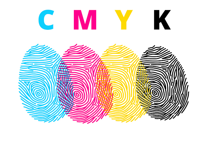
Photo purchased from … www.depositphotos.com
The Printing Industry Exchange Blog is #12 of the best 40 digital printing blogs, as selected by FEEDSPOT.
For a number of years I’ve been seeing online (web-to-print) offers in which you can print your photograph or artwork onto metal. This is based on inkjet printing. It also takes advantage of the reflective nature of metal to enhance the appearance of your photo or art, to brighten it, and to give it an otherworldly sheen.
I find this interesting because it calls to mind a number of other approaches I have seen over the years to enlarge the number of distinct, printable colors available with a particular commercial printing technology.
The Hexachrome Process
About thirty years ago one of the commercial printing vendors I worked with (I was an art director/production manager for a non-profit government education foundation at the time) had installed two technologies relevant to this discussion: Hexachrome custom printing and the substitution of CMYK inks with anywhere from one to four fluorescent inks.
All of this was based on the limits of offset lithography. CMYK inks (cyan, magenta, yellow, and black) combine to create only a limited portion of the visible light spectrum. This is called the “color gamut.” Visible light (what you see outside in the sun) provides the widest color gamut of distinct colors. RGB (red, green, blue) phosphors that create color on a computer monitor or television screen produce a smaller color gamut. And the smallest color gamut is created with ink, paint, or toners (i.e., CMYK pigment on a substrate).
These colors (in the case of offset lithography) are transparent inks (usually printed in halftone dot patterns laid over one another and then slightly angled to keep dots of the four process colors from producing visible moire patterns). The percentages of these colors (as reflected in the size of the halftone dots) when seen together create the impression of color in the eye and brain of the beholder.
Because the offset lithographic color gamut is smaller than that of a monitor (or the visible light spectrum outdoors), it has been a goal over the years to find ways to expand the color range. Back when I was working with the aforementioned printer delving into Hexachrome color and replacement of certain process colors with fluorescent inks, this was how they attempted to extend the color gamut.
Hexachrome added orange and green to the normal cyan, magenta, yellow, and black inks. More specifically, when separating a photograph (for instance) into the usual four printing plates needed for process color printing, this commercial printing supplier would actually separate the photos into six halftone images. Doing so would add two of the secondary colors (orange and green) into the mix and therefore enhance anything containing these two non-CMYK hues, producing (for instance) vibrant blues and purples when combined with the CMYK inks.
You may want to compare this offset lithographic custom printing technique to today’s large-format digital inkjet printing technology, in which multiple inks (such as the usual cyan, magenta, yellow, and black, along with light cyan, light magenta, and sometimes red, green, blue, orange, and violet—or any combination thereof–for up to about ten or twelve inks) expand the inkjet color gamut beyond that of traditional offset lithography.
Touch Plates, Bump Plates, and Kiss Plates
Two things to remember when using commercial printing techniques with an expanded inkset are that you need more than four inking units on your offset press (so the price-per-hour to run a larger press, like an eight-color press, will rise beyond that of a four- or six-color press) and you can’t accurately proof such a job using traditional four-color proofing devices.
That said, and in spite of the fact that Hexachrome has not been a familiar name (to me at least) since I saw it in the 1990s, printers will add colors to your process ink work if you ask them to do so. These colors (with one plate for each additional color) have been referred to as “touch plates,” “kiss plates,” and “bump plates” because they bump up an otherwise subdued or non-reproducible hue. They also increase color saturation and contrast, so the effect can be quite attractive, and can in fact make a particular part of an image (like a child’s red wagon) really jump off the page.
To do this kind of work requires a skilled prepress operator, because you don’t want the transition between the additional color and the surrounding colors to stand out in too stark a manner. You don’t want obvious edges.
White and Silver Ink
The same approach needs to be taken to the underprinting of white or silver ink.
If you are printing on an uncoated, tinted sheet (let’s say a cream stock, for instance), the normal process colors will do two things. They will seep into the paper fibers, which will dull down the color, and (since they are transparent) the process color hues will be changed to a certain extent by the color of the paper substrate.
Printing a white background (graduated intelligently to avoid a “cut-out” appearance) will improve the color fidelity of the overprinted inks (they won’t shift due to the color of the underlying paper), or if you are printing a photo of jewelry, for instance, you can give a metallic sheen to the printed image by using silver ink rather than white ink for the underprinting.
Again, keep in mind that the background needs to be sensitively created with a wide range of tones (light to dark) to make it look like part of the overall color image.
Fluorescent Inks
A similar approach to adding silver or white ink to an offset printed job is to replace one or more of the four process colors with fluorescent inks.
The same printer I referenced earlier that was experimenting with the Hexachrome process (a Pantone, Inc., invention, by the way) made its own set of process colors with the same goal in mind: to augment the printable color spectrum. In this case, this printer would add fluorescent inks (anywhere from one to four fluorescent replacements for the CMYK colors, depending on the result the printer wanted to achieve).
That said, it is possible to replace a process color with just a more intense version of the same process ink rather than an actual fluorescent ink. But in either case, it is important to note that changing the color of one process ink will affect everything in the job—all photos, colored type, and solids and tints—and this may adversely affect such things as skin tones, creating an otherworldly effect. This can be made even more problematic given the difficulty in accurately proofing such ink substitutions.
The Takeaway
That said, you may have more options than you had thought for your commercial printing jobs if you’re willing to experiment with the inks. When I was an art director there were sample books you could get from printers and paper merchants showing the specific kinds of effects possible with metallic inks or fluorescent inks. These included color images printed on different kinds of paper (uncoated vs. coated, for instance, or different colored hues of paper).
Assuming you can still get these sample print books, I’d encourage you to do so in order to show your print provider the exact effect you want to achieve. And don’t assume all printers will be equally skilled in custom printing fluorescent and metallic inks. Ask your printer for samples of work he has actually produced as well as paper and ink sample books.
Posted in Printing | Comments Off on Commercial Printing: Expanding the Color Gamut
Monday, September 18th, 2023
Photo purchased from … www.depositphotos.com
The Printing Industry Exchange Blog is #12 of the best 40 digital printing blogs, as selected by FEEDSPOT.
About thirty years ago when I was an art director and production manager of a government education nonprofit, all of us went through a “logo refresh” or logo redesign. Our superiors felt, rightly or wrongly, that the task would be better done by an outside design firm than by our in-house designers.(We would then implement the new logo in all of our publications.)
What I learned in the process is that there are a number of aspects to consider, but for the most part they fit into these categories:
- How did the old logo design–and how will the new logo design–position the company among other, similar organizations? That is, what is the context of the logo redesign?
- How does the new logo capture and reflect the service or product the organization offers, as well as its unique personality and values?
- How can the new logo be used, creatively and effectively, to give the potential customer an overall understanding of the company–instantly–just by seeing the logo? This might be expressed as “what to do with the logo” or “how to use the logo.”
(While expecting the customer to grasp the entirety of the company through her or his initial exposure to the logo is unrealistic, seeing the logo should bring to mind certain thoughts and feelings congruent with the company’s ethos. This should then be reinforced through subsequent exposure to the logo.)
For example, after seeing the Starbucks logo ten times and drinking ten cups of Starbucks coffee (if that’s your thing), then just seeing the logo should bring to mind positive thoughts and feelings about the company.
Brand recognition is the goal of a good logo.
In this light I was recently asked to help a client redesign her logo. To save her money, I said I would do this as a consultant, and she would be the designer. This is the client of mine who produces color swatch print books to help clients select clothes and makeup hues that will complement their complexion and hair. She is the fashionista I have spoken of in many prior PIE Blog articles.
Design of the Logo (Logo Mark and Text)
My client had already produced draft versions of two logo concepts: a word-only version (just text, no logo-mark) and a version with a gemstone background in multiple colors.
To start with the latter (and I did encourage her to develop three distinct versions from which she could choose after careful thought and discussion with colleagues in her field), the outer diamond shape contained the name of her company in caps and small caps across the center of the gemstone.
My client sells a color scheme and an approach to the use of color, but in reality she sells “magic” and “glamour,” as well as the associated feelings of confidence, empowerment, and joy. The approach to color is really just the scientific vehicle for selling the magic.
Therefore, the gemstone visual motif is appropriate, but in my client’s first rendering, the colors and size of the gemstone dwarfed the name of her company. In addition, the two-word name of her company was set in capital and small capital letters, so it was less legible than an upper and lowercase version of the business name.
So I made these suggestions:
- Make the reader’s eye go to the name of the company first by enlarging the name of the company relative to the gemstone image.
- Use more color in the name of the company and less color in the background gemstone, since the former is more important than the latter.
Design of the Logo (Text-Only Version)
My client chose two typefaces for the text-only version of the logo. For the “color analysis” aspect of the logo she chose an all-caps version in a Modern typeface, with dramatic contrast between the thick and thin strokes of the letters. For the “magic” aspect of the logo (a different word, for the sake of her anonymity, but essentially the “glamour” part of her company), my client chose a script typeface in an upper and lowercase treatment. She also included a starburst on one of the letters to give the viewer a sense of seeing a bright light reflected off glass or metal.
I liked the way the two text treatments of the two essential concepts (color analysis and magic) were presented in contrast to one another. That said, I suggested that my client place the logo (in white on black) on a black, solid rectangle. I said this would simplify the overall look of the logo. Instead of a varied contour (around the two words and the starburst), the logo would have as its recognizable contour or outline only the black rectangle.
The black rectangle would contain and connect all of the disparate elements of the logo. In addition, the black (perhaps with cyan as a highlight color) would look like neon light at night, and this would reinforce the “magic” and “mystery” elements of my client’s business.
I also suggested that my client choose an Old Style typeface (such as Garamond, Palatino, or Times) for the all-caps “color analysis” portion of her business name because of the less dramatic contrast between the thick and thin elements of the letters. I said this would be more readable—particularly by older people. (One’s eyes become less flexible and less able to change focus quickly as one ages.)
Legibility (Vision and Readability Issues)
So in all cases I was asking my client to consider not just the aesthetic elements of the logo, and the relevance of the presentation to the goals and values of the company, but also the legibility of the logo. How does the reader’s eye perceive the logo, giving attention to things like relative size of logo elements, readability of various typefaces and type presentations, and the legibility of upper and lowercase type treatments?
I told my client that this approach is also beneficial when you consider the use of the logo. For instance, how will the logo look when it is on a business card (tiny) or a banner (large)–both from a feeling point of view (associated ideas and values) and a technical or legibility point of view?
Custom Printing Technologies
My client then voiced her concern about the commercial printing cost associated with adding color to the logo. She wanted the process to be efficient and hence less expensive rather than more expensive, going forward over multiple logo uses on multiple print jobs.
My response was to tell her that most printers already have their presses set up for four-color process work. So this would be the most economical approach. In fact, my guess would be that washing up a press and using it to print several PMS match colors would cost more than building color with cyan, magenta, yellow, and black 4-color process inks.
In addition, I noted that laser printers and inkjet printers also work on a CMYK model, so my client would be better able to match the output from all commercial printing technologies (offset, laser, and inkjet).
I also noted that if my client were concerned about color matches between print samples (CMYK inks and toners) and online logo use (Red/Green/Blue phosphors), she could specifically choose hues with the closest visual match across the various technologies.
The one thing I did stress was that when reversing type out of a color (such as reversing the logo out of the black box), the fewer colors that had to be in precise register the better. This is true especially for toner-based laser printing (since the particles of toner often do not wind up as precisely positioned on the substrate as do particles of inkjet ink or offset ink).
If my client were to choose the type treatment reversed out of the black rectangle (for instance) and then use 100 percent cyan as a highlight color for contrast, she would not need to keep four process colors in register. This approach would be more forgiving than a logo using large percentages of cyan, magenta, yellow, and black. And this is especially true for laser printing and for reversing type out of a black background. This is a point where a skilled printer’s advice can be helpful.
The Takeaway
Taking a multi-disciplinary approach to logo design can be prudent or even essential. In your own design work, think about the logo mark and type treatment as an expression of the ethos of your business, but go further. Think about the science of vision, and how various type or color treatments can improve or impede readability. Then consider a commercial printing vendor’s perspective about how the logo will be created with laser, inkjet, or offset equipment, and how this will be reflected not only in the overall cost but also in the ability to match the color output across multiple technologies.
Posted in Design | Comments Off on Custom Printing: Ways to Approach a Logo Redesign
Monday, September 11th, 2023

Photo purchased from … www.depositphotos.com
The Printing Industry Exchange Blog is #12 of the best 40 digital printing blogs, as selected by FEEDSPOT.
I just learned a new word: “advertising creep.” I guess it’s like mission creep, in which your boss’ plans for you grow exponentially, and sometimes the original goal is lost.
Advertising creep is not a bad thing, though. After all, advertisers compete heavily for your attention. Just think about all the images and ads that bombard you when you go to the grocery store. Even the shelves now have “shelf talkers,” little signs as you go through the aisle, identifying and describing the merchandise, lest you not see it and walk on by. On Google, I just found that a grocery store has up to 60,000 individual SKUs (or distinct items).
A Grocery Cashier’s Branded Conveyor Belt
So in this light I was actually rather amused when my fiancee and I entered a specialty food store recently and found advertising creative on a formerly black conveyor belt at a checkout cashier’s station. Moreover, it had a huge QR code along with the bright advertising imagery and text.
So when we got home I Googled this new phenomenon (which I’m sure will spring up elsewhere as well) and landed on “messagewrap.com,” where I did some research.
First I learned about the logistics. I found a video of a seven-year-old installing what looked like a long, flat strip of custom printing material over the black conveyor belt, then attaching the two ends with pre-positioned double-sided tape, and then using a roller to firmly adhere the adhesive-backed, printed strip to the conveyor belt. I hope they paid the seven-year-old. She did a great job.
Accompanying data on the website noted that most people would actually prefer to see advertising instead of a solid black conveyor belt. And from the point of view of the advertisers, this is a great opportunity. After all, for a good chunk of time they have the undivided attention of the target consumer. Even if he or she doesn’t buy the advertised product at that specific time, the message has been transmitted and stored in the customer’s subconscious. Maybe next time.
And in the case of my fiancee’s and my trip to the grocer, the huge QR code we saw will send anyone with a cell phone and the right app (or computer application) directly to the grocer’s website. From this point on, she or he can learn about food items, prices, and more. And everything I have read for years touts the synergistic effect of cross-media marketing. If you use more than one advertising medium together–seamlessly–moving the customer from the conveyor belt (metaphorically, of course) to the grocer’s website, your chance of increasing sales rises exponentially.
What makes this exciting to me is not that it exists now, but that it hadn’t existed before. Someone actually identified the few square feet in a grocery store not covered in flexible packaging art, folding carton design, shelf talkers, and other promotional signage. More power to them.
To go back to the company that makes these wraps (messagewrap.com), here are some specifics from the website:
- There are 6,000 trained installers across North America (plus the seven-year-old in the video).
- The message wrap is supposed to last for six months (i.e., regarding its “durability”). This doesn’t deter me, since other billboards (which is essentially what this is, a moving billboard) are often installed for only a short amount of time.
- The commercial printing product is coated for durability (scratch resistance), but it’s also coated to be antimicrobial. You really can’t say this about the original, unprinted black conveyor belt it covers.
- According to messagewrap.com research, customers seem to love the new look since it is colorful and engaging.
- It’s new. Apparently no one has done this before.
- The specific physical design (having one end of the printed advertisement attached to the other end in an endless loop and then also having it bonded to the underlying black conveyor belt) makes it stay put and not come loose.
I did not look closely with a 12-power printer’s loupe when my fiancee and I saw the printed conveyor belt at the specialty grocer, but given the look of the product in the messagewrap.com website video, I would venture to say that it was inkjet printed on a roll-fed inkjet printer and then coated for scratch resistance and cleanliness. Apparently, it also comes with cleaning liquid to make it both pristine again (after regular use) and sanitary again.
A Medical Office’s Digital Signage
Another captive audience includes patients at a doctor’s office or dentist’s office. In addition to posters on doctors’ examination room walls selling pharmaceuticals, there is a trend now toward digital signage and/or videos. In my dentist’s office waiting room, for instance, there is a short video in which chimpanzees discuss dental self-care. What makes this effective is twofold. When you’re waiting to see the dentist, you have relatively few sources of visual stimulation, so the large-monitor digital-signage/video along with its soundtrack will catch your attention. This visual/audio center of the waiting room can be very persuasive. And this is the goal of advertising.
The second reason it’s effective is that it repeats in an endless loop. Ask any hypnotist just how effective repetition can be.
From the point of view of a marketer, the doctor’s or dentist’s office provides multiple opportunities for advertising creative. The posters in the examination room provide distraction for the patient awaiting a medical examination. In many cases these posters focus on pharmaceuticals the patient may request or the doctor may offer. But when these are paired with brochures scattered among the waiting room magazines and the visual and auditory stimulation of the digital signage, a coherent marketing message can be presented. In fact, I’m surprised my dentist has not yet included QR codes in his promotional literature, although he does text me both before and then after my appointment (for feedback), and his office assistant does call to remind me of the appointment. So you can add my cellphone to the digital signage and printed posters and literature, for a comprehensive, targeted media blitz.
A Near-Field Communication Poster
Finally, the same technology that allows you to tap a chip-enabled credit card against a cash register reader and transfer your payment information, NFC (near-field communication) technology can also enable you to touch a poster with a hand-held device, like a cellphone, and have a NFC chip in the large format print poster link you to further information about a product or service.
What makes this useful is its short range. Unlike Bluetooth-enabled devices, NFC technology only works within about four inches. This makes it convenient for a marketer to link a large format print poster or other marketing tool (in a fixed location) with your (or another prospective customer’s) cellphone. And it also ensures more secure communications.
The Takeaway
In many if not most of these cases, the effectiveness of the advertising is based on cross-media promotion, in which multiple technologies are used together to enhance the effectiveness of both (or all of them) in communicating a single marketing message.
It’s called synergy. Everything works together—if your marketing guru has thought this through and has ensured a seamless transition from one technology (and device) to another. And together everything works better than the sum of the individual, component parts.
Posted in Advertising | Comments Off on Commercial Printing: A Select Few Advertising Venues
Sunday, September 3rd, 2023

Photo purchased from … www.depositphotos.com
The Printing Industry Exchange Blog is #12 of the best 40 digital printing blogs, as selected by FEEDSPOT.
During our numerous visits to thrift stores over the years, my fiancee has bought a plethora of objects with words printed on them. She is a sculptor (that’s one of the skills she brings to our art therapy work), so printed, 3-dimensional objects of interest to her include everything from furniture to vases to giant clocks, even words printed on bottles. (She loves advertising art and found objects.) The list goes on.
Now to me, as a student of commercial printing, this is of interest because I can see how printers print on substrates other than paper. In fact, the first thing I often do when we get home with a new thrift-store purchase is to take out my 12-power printer’s loupe and analyze the print job closely, considering both the aesthetic effects and the technical elements of the print job.
The other thing that interests me is the different cognitive experience of seeing a printed cabinet, for instance, with type rather than a picture or other image printed on it. What little I know about the brain from studying both graphic art (as well as commercial printing) and the fine arts (painting, drawing) has made me conscious of the different parts of the brain involved in seeing and responding to words vs. pictures.
The Furniture
Most of our furniture with words as opposed to pictures printed on it is in the realm of cabinetry. Both pieces that come to mind as good examples seem to have been printed using stencils. If you think back to World War II and the ammunition boxes (which my fiancee also has) stenciled with various letters and numbers, stenciling starts with images, patterns, or letters cut out of a background.
When you place these stencils on the furniture and then paint over the open areas with paint and a brush, you can then lift the stencil off the furniture to reveal a completed image. Then you can do this again and again on other portions of the same furniture, or on other pieces of furniture. This significantly reduces your time and effort when compared to freehand lettering.
Stenciling is also done within the custom screen printing process. In this case a stencil is attached to a fabric or metal screen. Using ink and a squeegee to spread the ink and force it through the screen and open areas of the stencil, you can produce any number of duplicate images. Screen printing is usually done with a base attached to the screen frame, but this doesn’t always have to be the case. In the late 1970s, when I was working at an art gallery, I saw museum personnel custom screen print paragraphs of type right on the wall as descriptions and explanations of an exhibit they were preparing.
In my fiancee’s case, it looks like either method may have been used. If you decide to look closely at your own printed furniture, use a printer’s loupe and look for especially thick ink. That’s one of the clear and obvious characteristics of custom screen printing ink.
The Bottles and Ceramic Vases
I’m thinking specifically of a set of beer mugs my fiancee found that had been created from brown glass beer bottles. Interestingly enough, although all of them have lettering on the surfaces (quite a bit of type), only one writing sample is upside down. In this case the writing notes that if you can read this glass, you’ve spilled your drink.
Given the thickness of the ink, I would say that all of the glasses had been printed with screen printing ink. If you can create a jig that will stabilize the glasses and then spin them around their central axis, you can use a flat custom screen printing frame to print on the curved surface of the glass.
Another option, which may have been used for a much larger vase my fiancee found at a thrift store, involves glazes. The word glaze is derived from a Middle English word meaning glass. In the case of the larger vase, my educated guess would be that the words were painted on with liquid glaze of a particular color, and then the vase was fired in a kiln at an especially high temperature. A glaze seals the surface of earthenware pottery making it impervious to liquids. It can also be used to add a color (or paint an image or add type letterforms, as in this case).
As an alternative, it is possible to print the imagery and/or type (backward, or wrong-reading) on decals and then transfer the images from the backing sheet onto the ceramic piece (printed right-reading) prior to kiln firing. As with the example of furniture decorated either with screen printing (serigraphy) or by hand painting over stencils, it is much easier to make multiple copies quickly by using decals than by hand-lettering the words.
The Printed Clock Face
One of the items my fiancee collects is clocks–of all sizes, from tiny ones to clocks used as round table tops to a wall clock maybe three feet in diameter. I used to run around the house replacing batteries as they ran out, but after a certain time I stopped worrying and just kept live batteries in a few centrally located clocks.
The large face of the three-foot clock appears to be an offset lithographic print on paper. Why? Because of the halftone dots I see with my 12-power printer’s loupe and because it has been produced on paper. Thicker items usually (but not always) need printing techniques other than offset lithography due to the intense pressure of the custom printing rollers against the substrate, which could crush a wood (rather than paper) printed clock face.
So most probably the face of this particular clock was printed on paper, which was diecut and then attached to the wood backing with an adhesive prior to being mounted within the round clock structure.
How the Brain Processes Visual Information
The brain is a fascinating organ. Although it is not as cut and dried a process as I’m about to describe, different parts of the brain process different kinds of information. For instance, for the photo at the top of this article (a photo of colorful, printed mugs decorated with both text and imagery), the right side of the brain usually processes spatial, artistic information, while the left side of the brain usually processes more linear, logical information (like words). It has been found, since I first read about this process multiple decades ago, that certain things you might think would be processed in one hemisphere of the brain (perhaps the left hemisphere for logical information) might also have an aesthetic component that is processed by the other side of the brain.
So in the case of my fiancee’s furniture, clock faces, and ceramics incorporating words and numbers more than images, it is quite possible that they intrigue her because they stimulate both the logical side and the artistic side of her brain. (Granted, I know very little about science, but this is nevertheless an interesting thought.)
The Takeaway
I see at least three things you might want to consider if you are a product designer or even just a lover of fine art and graphic art:
- Printing on actual 3D products may be considered either “functional printing” (such as letters on a computer keyboard or other images used to help you operate a device) or aesthetic printing (such as printing to highlight the beauty of the letterforms themselves on the furniture and ceramics my fiancee bought at the thrift stores).
- In producing effective design work, it helps to be aware of these distinctions and to understand how the brain processes different kinds of information in different ways and in different parts of the brain. This awareness can help you communicate more effectively with those who see and respond to your commercial art.
- It helps to approach any physical, 3D-printed item with the following question in mind. “What kind of printing technology would be the most effective and efficient for printing on the object?” Some will lend themselves to offset lithography, some to flexography, some to stenciling, and some to custom screen printing. In many cases both the material on which you are printing and the number of copies you are making will determine your choice of a particular commercial printing technology. Therefore, the more you know about the various options, the better able you will be to choose the most appropriate method.
Posted in Printing | Comments Off on Custom Printing Type Forms on Vases, Furniture, and Bottles
|
|