Printing Industry Exchange (printindustry.com) is pleased to have Steven Waxman writing and managing the Printing Industry Blog. As a printing consultant, Steven teaches corporations how to save money buying printing, brokers printing services, and teaches prepress techniques. Steven has been in the printing industry for thirty-three years working as a writer, editor, print buyer, photographer, graphic designer, art director, and production manager.
|
Need a Printing Quote from multiple printers? click here.
Are you a Printing Company interested in joining our service? click here. |
The Printing Industry Exchange (PIE) staff are experienced individuals within the printing industry that are dedicated to helping and maintaining a high standard of ethics in this business. We are a privately owned company with principals in the business having a combined total of 103 years experience in the printing industry.
PIE's staff is here to help the print buyer find competitive pricing and the right printer to do their job, and also to help the printing companies increase their revenues by providing numerous leads they can quote on and potentially get new business.
This is a free service to the print buyer. All you do is find the appropriate bid request form, fill it out, and it is emailed out to the printing companies who do that type of printing work. The printers best qualified to do your job, will email you pricing and if you decide to print your job through one of these print vendors, you contact them directly.
We have kept the PIE system simple -- we get a monthly fee from the commercial printers who belong to our service. Once the bid request is submitted, all interactions are between the print buyers and the printers.
We are here to help, you can contact us by email at info@printindustry.com.
|
|
Archive for the ‘Book Printing’ Category
Sunday, June 4th, 2023

Photo purchased from … www.depositphotos.com
The Printing Industry Exchange Blog is #12 of the best 40 digital printing blogs, as selected by FEEDSPOT.
As noted before, I am a printing broker, writer, and printing consultant in the DC metropolitan area. Along with my fiancee, I also do art therapy with autistic students. So my fiancee and I are always looking for art books, particularly at our favorite haunts, thrift stores.
My fiancee and I recently found a copy of the Whitney Museum of American Art Biennial 2022 print book, Quiet As It’s Kept.
My fiancee pointed out the die-cut work, leather (or faux-leather) cover, and cross between tape binding and case binding (which produced a lay-flat book that opens with the entire cover totally flat on the table (on the left) and a pristine stack of tape-bound text pages on the right.
When my fiancee checked online, she learned that the book could be bought with any of four different colors for the leather (or faux-leather) binding on which artist names and the book title had been both debossed (recessed into the cover) and foil stamped with an added color (red on a textured leather or faux-leather background).
The deeply incised, die-cut thumb tabs running down the pages give the entire text block of the print book a sculpted look in addition to their being functional, making it easy to jump around in the book.
Needless to say, I assumed that the unit cost for the book was quite high (depending of course on the overall press run). Regardless, I knew that outsourcing the die cutting (presumably, since many printers would not have the equipment to do this in-house) would also make for an expensive book. So I was surprised to learn from my fiancee’s research online that the print book cost only $50.00 for nonmembers or $40.00 for members of the Whitney Museum of American Art.
Since the book production values intrigued my fiancee, I looked at it closely with a loupe and became intrigued as well.
Technical Analysis: My Initial Thoughts and Assumptions
When I looked closely, I saw that colors outside the CMYK range had been included to extend the color gamut, and I noticed that these had been printed in both solid coverage and gradations within the halftones. So my first assumption was that the printer had used touch plates or kiss plates to broaden the perceived color range.
Then I looked for the tell-tale rosette patterns within the images and didn’t see any. So I was confused. Prior to this, whenever I had looked closely at a printed product and had found no trace of rosettes (but had still found halftone dots at particular angles to one another), the printed product had turned out to be digitally produced via laser printing. So I checked out the printer’s equipment list online and noticed they have an HP Indigo laser printing press.
The Whitney Museum book noted in the copyright page which printer had produced the book, which was very fortunate and not a usual occurrence. Plus, since many printers do not list their equipment online, it was another fortunate occurrence to find this particular printer had listed all of their capabilities and equipment.
Their website also listed key personnel and their email addresses, so on a lark I wrote to the production manager of the custom printing plant and asked what equipment had been used to print this book. I also noted my assumptions about the lack of rosette patterns in the halftones as well as the additional colors.
In addition, I mentioned that I had seen how crisp the text was, which is unusual for electrophotography (laser printing). More specifically, laser printing is usually done with dry toner particles that don’t always conform to the curves and lines of intricate type letterforms. Toner can easily be deposited outside the letters, making the text look a little ragged overall. This is not the case in offset lithography, which maintains a significantly crisper appearance of the type.
In contrast to dry-toner laser printing, toner particles used in an HP Indigo are very small. They are also suspended in fuser oil. Hence, I had assumed the printing had been done on an HP Indigo because of the crisp letterforms, absence of rosettes in the halftones, and the additional colors.
I knew the additional colors could have been printed on an offset press, but this would have involved using a multi-unit press (maybe eight colors) or running the press sheets through the press a number of times. This costs a lot of money. On an HP Indigo laser printing press, more than the usual process colors (cyan, magenta, yellow, and black) can be used at the same time, making a reasonably short run of a low-page-count print book potentially less expensive than an offset printed product.
Finding Out How the Book Was Really Produced
To my surprise, the plant manager wrote back to me almost immediately, on a Sunday no less. He said the following:
“The text pages for this book definitely [were] printed [via] conventional offset, not digitally. Probably [a] 200-line screen, possibly with a 20 micron stochastic plate for the black halftones to prevent a moire on any rescanned images.”
So, I was wrong. Under the circumstances, it seems that the high frequency of the halftone screens (200 lpi) had minimized the rosette patterns. Or, the stochastic plate had made a difference. By the way, stochastic halftone screening (also referred to as FM–or frequency modulated–screening) works differently from traditional (or AM, or amplitude modulated) screening.
AM screening uses larger or smaller halftone dots distributed over a regular pattern (the same number of halftone dots in a liner square inch, just smaller or larger dots depending on the required amount of ink). In contrast, FM screening uses the same-sized halftone dots (in this case 20 micron, or very small, dots). Under a loupe you will see minuscule dots, with more dots in dark areas or areas with an abundance of a particular color, and fewer dots in areas with less of a particular color.
This is also what you see when you look at inkjet printed halftones. Stochastic screening provides the illusion of continuous tone photos (which is what you get with color or black and white prints made from photographic negatives).
The Takeaway, or What You Can Learn from My Approach
I made some incorrect assumptions, but that’s less important than the fact that I looked at the print book as both an artistic expression and a physical product that required certain technologies to create.
I would encourage you to take a similar approach if you design books or buy commercial printing. The more you understand both the traditional, analog methods and the more modern digital ones, the better able you will be to choose the technology that best fits your job.
For instance, if you were producing a short run of this print book, you might have chosen an HP Indigo press (i.e., you may have found a printer with this equipment) because the text of the book would be more crisply printed than text from perhaps a dry-toner laser printer. Or, if you were printing a longer run, you might have opted for offset lithography.
Keep in mind that a museum-produced book like this is itself a work of art. Readers will be looking at the print book expecting gorgeous, faithful color. If you were designing this book, you might use extra colors on an HP Indigo, or you might use additional plates (called “touch plates,” “bump plates,”or “kiss plates”) to expand the color gamut. After all, there are some colors you can’t achieve with only cyan, magenta, yellow, and black.
If you were designing this print book, you could take into account both the budget and the schedule when deciding whether to include such specialized work as the tape binding/case binding mix or the die-cut thumb tabs. But beyond the cost and schedule, you might want to put the aesthetics of the book ahead of the time and cost, since your clientele at an art museum would presumably be sophisticated, artistically trained readers.
If you approach a print book (or any printed product for that matter) in this way, your knowledge of commercial printing will grow exponentially, and you will be a more knowledgeable and more effective (and fiscally prudent) print buyer. In fact, approaching a print job in this manner will make you more aware of what the designer was trying to do, what technology it required, how much it cost, how long it took, and most importantly whether the artistic goals and the processes chosen to bring them to fruition were successful. Did everything work together to create the “wow” factor that both my fiancee and I experienced when we saw this print book? After all, book design and book production are fine arts as well as crafts.
That said, it does help to also have gurus (as I have) who know more than you do and can help you understand how the book was really produced: that is, which of your assumptions were correct and which were off base. There’s no better way to learn. I’ve been in the field for 49 years, and I’m still learning, every day.
Posted in Book Printing | 1 Comment »
Sunday, May 21st, 2023

Photo purchased from … www.depositphotos.com
The Printing Industry Exchange Blog is #12 of the best 40 digital printing blogs, as selected by FEEDSPOT.
In the 1990’s I was an art director/production manager for a non-profit government education foundation. We produced just under 150 projects each year ranging from textbooks to brochures to forms. Sometimes the jobs would stack up, since many of them came due at specific times during the year (such as the beginning of the school year).
I spent a lot of time planning. I made Gantt charts religiously (horizontal bar charts, representing periods of time, with concurrent projects stacked one above the another). Ideally, not too many projects would be in production at once, since we only had three graphic designers (plus me) to do all the work.
The horizontal lines on the Gantt charts were further broken down (by color) to distinguish between the production phase of each job (which we did) and the custom printing phase (which a selection of maybe 15 printers did).
This chart was something I composed each year prior to budget time. At this point in the year, I also worked out target estimates for each project with detailed specifications. To get to this point I had to envision everything, talk with printers, and crunch numbers. What I was given initially was just a list of projects, press runs, and due dates.
It’s a truism—but it’s also very true and worth repeating–that you can only achieve what you can first picture in your mind’s eye. I have carried this approach to scheduling (which I did as part of my job for about seven years in the ‘90s) into the 24 years since that time during which I’ve been brokering commercial printing.
My Current Print Brokering Client’s Print Books
With this approach to scheduling in mind, I want to share a case study with you. A print brokering client of mine produces books of fiction and poetry. These have to be in the print book distributor’s warehouse by the agreed-upon date (whenever that might be), or they will not be accepted. So keeping to the schedule is always vital with this client.
Moreover, since the onset of Covid several years ago and the shortages of various kinds of commercial printing paper since about that time, scheduling larger jobs like print books has been dicey. In terms of price stability, one printer will only hold pricing on an estimate for 24 hours. In terms of scheduling, another printer will need eight to twelve weeks from proof approval to shipping (when six weeks had been the norm in the 1990s).
It’s a different world. But the main point is that I need to get serious—and realistic—when this particular client comes to me to produce one of their (a husband and wife team of publishers) print books.
This happened to me just this past week. My client came to me with specs for both a “galley version” (or reader’s version) of a particular title and a final version. Both were to be 5.5” x 8.5” perfect-bound books with a length of 256 pages. The galley copy would have only a 10pt cover. The final version would have a 12pt cover, French flaps, a hinge score, and better text paper. My client charges a premium for print books with outstanding tactile qualities you just can’t get on an e-reader. So the books have to be good.
Moreover, the reason for the two versions is to allow for reader comments from select reviewers. These comments will find their way into the final (produced shortly after the galley) version. So it’s really one super-long schedule with 50 copies of the reader galley printed and distributed, then corrections made and a new text file uploaded to the book printer, then the final version proofed and corrected and printed, then boxed, then shipped. And no delays of any kind (including a traffic jam on the final day of shipping) can be allowed to push the final delivery to the book distributor past the agreed-upon date.
The Schedule
In this particular case–again with the post-Covid, paper-shortage rules in play–I approached both printers (one for the galley proof and one for the final version) and asked for their current schedules, from art file upload to proof, and from proof approval to shipping. The digital printing of 50 galley copies would take three weeks from proof approval to ship date, and the final version with French flaps would take five weeks for offset printing.
To these estimates I added an extra two weeks at the onset, so my client could make changes to the proofs and then review corrected PDFs for final approval.
Then I added one full week for shipping, based on prior years’ experience that the books usually were delivered within two or three days.
When I added up the required times for all of these print book manufacturing components on a calendar, starting with the date my client said the galley-version files would be ready to upload to the book printer, and ending with the drop-dead delivery date at the book distributor’s shop, I noticed that I could only fit about two weeks in between the two books (between the “galley” book delivery and the upload of the final-version art files). This would be the entire available time for readers to review the books and the book designer to make all text corrections and prepare final files.
It would be a bit like trying to fit Cinderella’s wicked stepsisters’ feet into the prince’s proverbial tiny glass slipper.
The Options
There are always options. My client has, in the past, renegotiated the drop-dead delivery date, usually by a number of weeks or months. However, it means that sales would be lost, but it is possible.
Not requesting hard-copy proofs (and not requiring the extra days for their delivery and return) would be possible, but confirming accurate color for an important book cover on a computer monitor without physical proofs really is a crap shoot.
The third option, which my client actually suggested, would be to send the selected readers an online, PDF version of the galley. This would decouple the two versions (galley and final copy), save the cost of printing 50 copies of the galley books, and sidestep the possible shipping delays inherent in physical proofing.
After all, the reader galleys have only one purpose. They are for reading and commenting on. They are physical proofs in one of the very few aspects of print book publishing that doesn’t need to be physical.
Hence, we have a plan. Either the galley books go to press earlier (still an option), or the galley proofs get decoupled from the final version with French flaps and become a completely virtual proofing tool.
The Takeaway
There are a number of things I’d like you to consider when you apply this case study to your own design and print buying work:
- Printers’ schedules are often longer than they used to be, or the printers can’t commit to schedules until the art files and upfront cash are in their hands. So start by requesting a conservative, prospective schedule (the longest the printers think they might need). Make your schedule based on this estimate, and then tighten it up as the print book gets closer to the art file upload date.
- Consider all aspects of the schedule: editorial, proofing, printing, binding, packing, and shipping—and anything else I’ve missed that pertains to your specific needs.
- Assume that something will be a problem. It’s like leaving for an important meeting fifteen minutes early to account for the broken traffic light and two emergency vehicles that just might be between you and your office.
- Understand that printers have busy seasons and slow seasons. Ask about your printers’ schedules.
- Ask about sourcing paper. Will your specific paper needs be a problem? If so, ask about options. Be open to substitutions.
- If all of this means your book printing project gets delivered two weeks early instead of on the exact date you need it, consider that to be very good fortune, not an error.
- Apply the preceding list to all commercial printing jobs, not just print books.
We can’t control everything, but we can have a good idea of what might go wrong and plan for contingencies.
Posted in Book Printing | Comments Off on Book Printing: Book-Schedule Case Study
Monday, January 9th, 2023
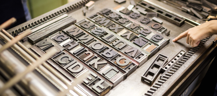
Photo purchased from … www.depositphotos.com
I’ve mentioned before that my fiancee and I consider our second home to be the thrift store. I love the books and CDs. She loves the clothes and furniture. We recently found a new venue that actually has a “free” section that includes two plastic bins of print books.
One of my recent finds is a book of Henry Wadsworth Longfellow’s poetry dated 1899. It’s not in the best shape I’ve seen. (Granted, it’s 123 years old.) But even a cursory observation of the book yields information on typesetting, printing paper, book binding, and foil stamping, to name only a few arenas of print book design.
Here’s what I have seen and learned, and why I find this particular print book worthy of note.
The Text Paper
When I dig through my home library I find books I read in the ‘70s, ‘80s, ‘90s. In many of these, the text pages have yellowed and become brittle. This is because the paper has a number of impurities that make it acidic (rather than basic). This means the pH (which ranges from 0 to 14, with neutral being 7) is below 7. Acidic paper turns yellow and becomes brittle. This can be a problem if you want the books you’re manufacturing, or reading, to last a long time.
In contrast, most of the paper in the older print books I have collected over the years is basic (i.e., the paper has a pH above 7). That is, impurities have been removed in the paper-making process, and in many cases buffering agents such as calcium carbonate have been added. Over time these buffering agents neutralize acidic elements that are either absorbed from the atmosphere or created as the paper ages.
But why would publishers print books on paper that will turn yellow and become brittle? Well, at the present time most paper is acid-free, but back in the 1970s, when I acquired some of these books, presumably the acid-free paper was more expensive. After all, many of my books were novels, intended to be read and then discarded within a few years, so they really didn’t need to be pristine for that long.
As a side note, newsprint is also highly acidic. My fiancee has a number of old newspapers from the 1960s. In all cases these have to be handled carefully, since they are also yellowing and becoming brittle.
But to get back to my 123-year-old book of Longfellow’s poetry, the text paper (it is a case-bound print book without a paper cover) is in exceptionally good condition. Apparently acid-free paper, which is similar to archival paper (which, in addition to not being acidic, also contains no artificial paper brighteners) has a life span of over 200 years. It is especially good for valuable books of poetry and also for ledger books you might buy at Office Depot (since these, too, need to last for a long, long time).
Binding Qualities
The book of Longfellow’s poetry is case bound to increase its durability and longevity. Given how old it is, I wouldn’t be surprised if perfect binding had not yet been invented (actually, I just Googled it, and perfect binding was invented in 1895 but not used in book binding until 1931, according to Advantage Bookbinding (https://www.advantagebookbinding.com/blog/book-binding/things-didnt-know-history-book-binding/).
The spine of the print book has been rounded, which is a process that involves pushing the central pages of the text outward from the spine during binding, such that the pages as seen at the face margin (the front of the book opposite the spine, when you look at it from the side) are concave (curved inward), just as the spine is convex (curved outward).
The book binder also foil stamped the fabric-based cover-casing material using heat and pressure in a “strike-on” process (probably using a letterpress) to transfer the foil material from a roll to the fabric cover of the print book.
There are also fabric headbands and footbands at the binding edge of the book to obscure the glue and folds of the book press signatures where they are attached to the paper “crash,” or “super,” which is hung on the front and back endsheets and binder boards. That is, the interior spine does not touch the outer spine of the book case itself except when the book is closed. This is not a “tight-backed” print book. That is, when the book is opened, the text block (the group of folded and gathered press signatures) moves forward, away from the exterior fabric and paper spine. When the book is closed, the text block moves back into place.
The Printing Process
In the present time, if you want to typeset a print book, you use a computer application like InDesign and burn commercial printing plates directly from these electronic files. Then you hang the plates on an offset press and print the book forms (the flat press signatures prior to folding).
In contrast, the book of Longfellow’s poems (considering the date of publication was 1899) was printed in one of two ways: either via the newly invented offset lithographic process (invented in 1875) or via letterpress.
Offset lithography uses the incompatibility of ink and water to keep the image area full of ink and the non-image area free of ink, using flat printing plates. In contrast, letterpress uses plates with raised image areas (called relief plates).
Even now, letterpress is used occasionally, and a similar technology called flexography–which uses rubber rather than metal relief plates–is used extensively for custom printing sheet plastic (bread bags, for instance) and wrapping paper.
Since the technology was so new when this print book was manufactured, I would not be surprised if letterpress was the technology used.
The Typesetting Process
So what about the typesetting?
Mergenthaler invented the Linotype typesetting machine in 1886 (again, very close to the publication date of my Longfellow poetry book). The Linotype machine allowed type compositors to set an entire line of type at one time. (The machine produced a slug of lead with raised typographic letters for use in the letterpress printing process.)
Prior to this, the type compositor had to select upper and lowercase letters from a wooden case (a box or drawer), one at a time, and compose each line backwards (so it would print forwards) in a composing stick. The lines of type were then laid into a “chase” (along with any incised images, instead of halftones, which hadn’t yet been invented), and then everything was locked up so the various elements wouldn’t move when inked and printed.
Once the print job was done, all of the letters had to be re-sorted into their various job cases (“upper case” letters in the upper case of the type storage unit and “lower case” letters in the lower drawers or cases of the type storage unit). Misfiling these individual metal letters would lead to typographical errors (typos) in the final printed product.
So depending on the reliability of the new technology (and the type compositor’s level of comfort with the new technology), these would have been the two options for typesetting this book of Longfellow’s poetry.
The Process of Printing Images
This book of Longfellow’s poetry has a number of black and white “plates” or images. Had the book been printed today, they would be halftones. But back when this book was published the halftone process for printing had just been invented (in 1869), which may be why the images in this book are engravings instead. You can tell because there are no halftone dots but only hatched and cross hatched lines to simulate shades of gray, depending on how close together or how far apart they are.
And in the front of the print book, between the frontispiece (an engraving on the left-hand page) and title page (on the right-hand page) there is a transparent sheet of tissue paper (glued to the right-hand page close to the binding and slightly smaller than the trim size of the book) for protection of the title page (to keep the ink on the frontispiece plate from offsetting to the title page).
The Takeaway
I personally think that one can appreciate the artistry of an old print book (especially a very old print book) when one understands both the technologies used and the date these technologies were invented. Beyond everything else, book printing and binding are art forms and crafts done by skilled tradesmen who put love and attention into the details of their work.
And it becomes even more intriguing when one realizes that in some cases the materials and techniques employed have allowed people in future years (in this case 123 years after the book was printed) to appreciate the quality workmanship.
Posted in Book Printing | Comments Off on Book Printing: The Beauty of Old—and I Mean Very Old–Books
Sunday, September 11th, 2022

Photo purchased from … www.depositphotos.com
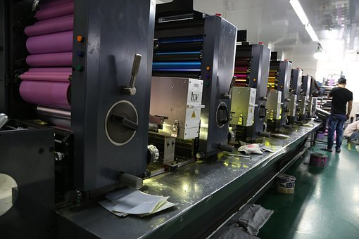
A commercial printing client of mine produces approximately one to three book titles each year. She and her husband value the production qualities of their print books (as do their clients), so the final copies are produced via offset lithography on 12 pt. cover stock with a 60# text sheet for the interior book block as well as French flaps and a hinge score parallel to the spine.
Along with these copies (1,000 or 1,500 for the initial commercial printing), my client produces about 50 galley copies digitally (on HP Indigo equipment or comparable, depending on the print supplier). These copies have 10 pt. covers without French flaps, and the text blocks are printed on 70# text stock.
That said, at the moment two different printers produce these books. One is more cost effective for digital (with a superb turn-around time). The other is a little pricey for offset lithography but can manufacture the books in five weeks (as opposed to the 16 weeks many other vendors are offering due to paper shortages).
The task, then, is to coordinate a digital and an offset press run at different printers and make sure the two books go together.
Issues That Have Arisen: Matching Digital and Offset Output
Matching digital and offset printing for the text and cover, in general, is a huge if not impossible task. In my client’s case, though, there will be no problem, since the text of the books is black only without halftones printed on a rough textured sheet. And even though the covers will be printed digitally (for the galley copies) and via offset lithography (for the final version), the galleys are only review copies and therefore don’t need to be of the same high quality as the final print books.
In your own work, however, you may have problems matching the look of digital printing and offset printing (both the color and the overall surface feel and look of the ink or toner). The key problem is that digital printing uses toner on paper (for laser printing) or a thinner ink mixture than offset inks (for inkjet printing). So even if the paper is the same, the look may be different.
So what can you do? You can standardize the paper (text and cover) used in the two versions. Then, before the final deadline you can get digital proofs on the papers of choice (so you’ll see the texture). Short of running a press proof (an expensive proposition for only a few copies of an offset printed cover), you can look closely at similar covers produced via offset lithography to get a general idea of how your digital and offset books will look together. You will probably need to make allowances for some difference (as my clients have learned), but depending on why you’re printing both a digital (laser or inkjet) version and offset version of your book, this may not be a problem (as it is not for my clients). Just choose offset for the higher level and digital for the lower and don’t expect an exact match.
Another option would be to offset print all the covers (in my client’s case both the galleys without French flaps and the final books with French flaps). Then the interior of the books can be either offset printed or digitally printed. The high-value text blocks will contain a little denser type than the digitally printed version, but the covers will be the same (except some may have French flaps, like my clients’ book).
In either case, in my experience it’s better to review both laser and inkjet samples before you decide. Inkjet seems to have superior color. Then again, the HP Indigo press, for instance, provides stellar color and coverage with laser technology (minuscule toner particles in a fuser oil).
For me, the takeaway is to look closely at laser, inkjet, and offset printed samples to see what you can expect.
Issues That Have Arisen: Preparing Covers
I sent both the cover designer and the text designer a list of specifications for the two jobs. The text in both cases was to be 256 pages. In one case (the final books), the text paper was 60#; in the other case (50 galley copies) the text paper was 70#. Therefore, the thickness of the spine needed to be different for each version (256 text pages of 70# stock are thicker than 256 pages of 60# stock).
The cover designer didn’t think about this. He assumed both text blocks would be the same because they had the same page count. Therefore, to fix the problem one cover art file had to be adjusted and resubmitted. To make this clear to the cover designer, I had received a complete cover template from one book printer and just the spine width (without a complete cover template) from the other.
In your own work, ask the printer for a complete book cover template with the back cover on the left, attached to the spine in the center, attached to the front cover on the right. These templates will also show where to position type on the spine (and how much room to use for text on the spine to avoid having anything wrap onto the front or back cover). Plus cover templates show required bleeds. Personally I find these invaluable. The book printer computes and automatically draws them based on the size of your book (5.5” x 8.5” in my client’s case), the page count, and the thickness (in pages per inch) of your text paper.
Check your proofs, but first, to avoid error, follow the cover template religiously.
Issues That Have Arisen: Bleeds
My client’s cover designer prepared two covers: one with and the other without French flaps. For the galley version (digital), he omitted the flaps but neglected to add bleeds. When I explained to him that live matter art either ends before the page trim or extends 1/8” past the trim for bleeds, he understood and revised the artwork for the galley-version cover.
Issues That Have Arisen: Photo Format
The text designer wanted to add one black and white photo (provided originally as a color image). She asked me if an RGB JPEG would be acceptable. This is what I told her. In making the PDF from the InDesign file, the software can convert images from RGB to CMYK automatically (not a problem in her case, since the photo would be black ink only).
However, in your own work, if you’re converting automatically from RGB (used for computer screen images) to CMYK (used for commercial printing), there can be unexpected color shifts in the translation. If you make the conversion to CMYK yourself, at least you will see the color shifts before the proof.
Regarding TIFF vs. JPEG, JPEG is a “lossy” file format (i.e., the compression algorithm). It provides a smaller file than a TIFF, but over multiple changes to, and savings of, the photo file, the JPEG will lose picture information. This doesn’t happen with TIFFs (which are “lossless”).
In your own design work, you can use either workflow. An RGB JPEG (which used to trigger the printer’s sending the file back to you for correction) can in my understanding now be automatically converted in the transition from InDesign format to PDF format. Ask your printer to be sure. And consider what you may lose when not making this change yourself.
That said, since RGB has a larger color gamut than CMYK, it’s smart to make all color changes in RGB first, and then convert the images to CMYK. Personally I like TIFF more than JPEG, since there’s less risk of lost (visible) picture information. I also like to distill files into PDFs rather than submit them as native InDesign files. Therefore, I prefer to place CMYK TIFF images in InDesign and then distill press-ready PDFs to hand off to the printer.
Issues That Have Arisen: Workflow
The printer with the digital workflow (for the galley copies of my client’s print book) works with InSite. InSite allows for file uploading, proofing, file approval, and probably other actions as well. I don’t believe it has preflight capabilities. (Based on my research, preflight actions seem to be applied in Prinergy, and then the results are brought into InSite.) But at least it provides an online portal for all reviewers to check and approve the accuracy of the files.
(A commercial printing vendor I’m working with on another job at the moment just sent me PDF proofs with bleeds and trim–a red rule around the pages—for a series of flyers. This is another workflow option some printers use–i.e., much simpler than InSite. I’m not sure what the book printer producing the final version of my client’s book—the one with French flaps–will send yet.)
That said, uploading files to InSite seems to be a little bit more complex (until you learn the process) than just using a printer’s FTP file upload site. In my client’s case, however, one reason the price and schedule are so good is that everything is automated. The other book printer (for the final version) charges more, and is producing the final version of the book via offset lithography. The third printer I mentioned (for a separate client’s flyers), who just sent PDF proofs, illustrates a PDF (virtual proof) workflow distinct from InSite.
So, in your own work, decide whether you need hard-copy proofs or digital (virtual) proofs. With my client’s printer’s InSite option (for the discounted price), everything has to be digital/virtual. (There are no hard-copy proofs in this workflow.) For the printer producing the final version, I have requested a hard-copy cover proof (and a virtual text proof). This way (for the more crucial of the two print book versions), my client will see a high-quality proof of the cover. In this case a hard-copy proof is important. And my client is paying more to get it.
In your own design and print buying work, decide first whether you need a virtual proof or a hard-copy proof, and then ask the book printer how he can accommodate you.
Posted in Book Printing | 2 Comments »
Thursday, June 2nd, 2022

It is not simple to print or publish a book. Getting one of the best book printing services is critical whether you are a writer who has just finished writing your first novel or are in charge of ensuring the business profile book of the company where you work. Of course, there are many technical concerns to consider, but there are also some factors to consider in order to complete printing tasks like this successfully. Here are a few suggestions to assist you in selecting the best book printing for your needs. (more…)
Posted in Book Printing | Comments Off on Tips For Selecting the Best Book Printing Services
Friday, April 1st, 2022

Despite the ease and comfort of e-book readers, book lovers still prefer reading physical books. A survey by Voxburner found that 62% of people between the ages of 16 to 24 years preferred print books over e-books. The statistics show the power of print books as even the current generation that is swimming in selfies and mobile screens still indulge in printed copies instead of e-books. There is an emotional connection between readers and the spine of the book. Authors cannot afford to pass up that emotional connection, and therefore utilizing print medium, even in small quantities, can increase your readership. (more…)
Posted in Book Printing | Comments Off on Factors to Consider While Choosing Book Printing Services
Monday, March 28th, 2022

Photo purchased from … www.depositphotos.com
If a print book is a pathway to an adventure, then the cover of the book is the doorway to that experience. I think the photo above captures this sense of possibility. (more…)
Posted in Book Printing | Comments Off on Book Printing: Tips for Designing a Truly Memorable Print Book
Wednesday, March 2nd, 2022

Middle aged or elderly persons of today can share how much they enjoy reading new books that emanate distinctive paperback smells. Custom books can be printed using best book printing services that are accessible online. With the aid of digital print technology, reputable printing firms can offer printed books in lesser time than before. Such printing services are dependable and are available at reasonable prices. (more…)
Posted in Book Printing | Comments Off on Why Use the Best Book Printing Services
Thursday, February 3rd, 2022
We are sure there must be more than a dozen flyer printing services in and around your surrounding area. How can one select the best company with so many choices just around the corner? Well, if you are too confused to make an informed decision, here we are with a detailed guide on how to pick the best flyer printing company in your town! (more…)
Posted in Book Printing | Comments Off on How to Look for the Best Flyer Printing Services?
Friday, August 13th, 2021

Photo purchased from … www.depositphotos.com
As I’ve mentioned before, among other things my fiancee and I do art therapy work with the autistic. Often our projects bridge the gap between fine art and graphic design. Sometimes we do simple custom printing work that I also write about in the PIE Blog (for instance, cutting designs into styrofoam plates used in meat packaging and then inking and printing them). Other times we will discuss elements of commercial design when we’re creating collages that incorporate graphic type as well as images. (more…)
Posted in Book Printing | Comments Off on The Magic of Altered Print Books
|
|