July 24th, 2023
Posted in Packaging | Comments Off on Custom Printing: The Unboxing Experience and Cross-Media Promotions

Photo purchased from … www.depositphotos.com
The Printing Industry Exchange Blog is #12 of the best 40 digital printing blogs, as selected by FEEDSPOT.
In the recent weeks I have received in the mail or acquired in other ways three marketing initiatives that share a few things in common. They all involve packaging that is out of the ordinary. Most involve some form of cross-media promotion, involving the internet and commercial printing media. And one (which I bought at my fiancee’s and my favorite thrift store) involves actual branding, as in red-hot iron used to burn the company logo onto the wood box.
I would say that the three share in common the marketer’s desire to wow the customer and convert her or him to a lifetime, mutually advantageous relationship, and they use multiple media and/or multiple textures and substrates not only to convey information but also to take care of the customer like a king or queen.
Smalls Cat Food
My fiancee and I recently brought a new cat into our home, a Ragamuffin. He’s big (15.9 pounds), and we want to keep him healthy. So after some extended research, we chose Smalls.
The corrugated cardboard packaging that arrived at our door was clearly printed via flexography (two-color, a yellow and black), but the drawings of the cats were adorable. Clearly, someone at Smalls had a particular appreciation for the playfulness and joy of cats, having worked several drawings into the large Smalls logotype that wrapped around the carton.
All of the language printed on the interior of the box panels was personal, describing (in a friendly typeface with words such as “you” and “us”) just how to care for the food and what to do with the package insulation. (Put it in the sink and watch the water make the cornstarch insulation product disappear.)
A print book accompanied the package. “Hi, human” was the salutation on one page. Other pages included hand-drawn cartoons, and there was a smattering of sweet cat photos. Needless to say, there was also information as to why Smalls is so good for cats and how to transition a cat from their prior food to this food. There was also a discount card (in the same yellow with the same cat drawings), plus another handout letting you know how to treat, defrost, and store cat food of this caliber.
So it was a mix of information and sales literature, but it showed a believably sincere desire to make your experience (and your cat’s experience) with Smalls (the company) and Smalls (the food) a happy, and hopefully lifelong, one.
The piece de resistance was the bagged dry ice that the insulation surrounded, within flexo-printed plastic bags that explained how to safely handle (or rather avoid handling) the dry ice. Again, clearly, the goal was to be 200 percent thorough as well as personable. The company clearly wants your cat to appreciate Smalls food for years to come.
And finally, after we had received the boxed cat food, my fiancee and I started seeing regular TV commercials about the Smalls company. You could say that was a little spooky, given the perfect timing of seeing multiple Smalls commercials just after receiving the product, but as a student of commercial printing and marketing, I was just struck by how many coordinated avenues Smalls has addressed with its cross-media promotion. I was also not surprised to see, under the circumstances, QR codes on the promotional literature. These codes send the recipient to the Smalls website for further information, brand exposure, and communication in general.
And none of this felt like a sales pitch. In fact, all of it felt like a genuine attempt to be helpful. I personally hope Smalls makes a lot of money on this highly coordinated packaging, informational, and promotional work. They deserve it.
The Branded-Wood Fish Box
Ducktrap River Fish Farm, Inc., clearly takes branding seriously. Literally. I found their fish (food, not pets) transport box at my fiancee’s and my favorite thrift store, so I snapped it up, presumably for use in an art project. But then I started to notice its promotional approach, and my interest was piqued.
The words and logo image (a trout, I believe, although I could be wrong) are burned into the wood in the top left corner. The brand has texture (debossed letters) and a charred tone that extends past the letterforms and the fish. So it really looks a bit like the backside of a branded cow (as grisly—and intriguing—as that may sound).
Inside the box is a sheet of printed wax paper with a one-color rendering in green ink of the logotype and fish in a repeated pattern across the wax-paper substrate.
When I looked closely and saw all of this I felt like I was in the Wild West, where securing one’s food involved more than a trip to the grocery store. I liked the feel, the connotations, and the imaginative trip to the rivers beyond the city. Presumably, the packaged product is purchased at a grocery store rather than sent to clients (as is the Smalls cat food noted above), but it projects a similar tone of freshness.
I think anyone at any grocery or specialty store selling this product will be honored to buy this fish and keep the box. And that actually benefits Ducktrap River Fish Farm, Inc., since the customer’s retaining the box all but ensures repeat buying. Who wouldn’t go back for more after spotting the box and Ducktrap River Fish Farm, Inc., logo in one’s house repeatedly?
Since I bought the box at a thrift store, I can only imagine what kind of commercial printing promotions accompanied this box in its first use. I would not have been surprised to find out that the marketers had coordinated the fish packaging with promotional literature and an internet presence. After all, when all three of these are operating in lockstep, a marketing initiative can be unstoppable.
Home Security Superstore Mace
Life is scarier than it used to be, with all the rampant crime. So I decided it was prudent to buy mace or pepper spray. Being totally ignorant of all things in this vein, I did some research online and bought one spray can for my fiancee and one for myself.
The initial contact was through Amazon, but as soon as I had made the connection, I started getting information from the Home Security Superstore. I liked the name, since I wanted to be secure, safe, and protected. I was therefore not only relieved but also impressed that the marketing team had reached out immediately to let me know what I had purchased and when to expect its arrival. Over the next day or so, I received other online promotional and informational materials describing the mace product, its use and care, and what other items might increase my sense of security.
Of course this is what any promotional literature should do. But not all of it does. The Home Security Superstore succeeded. It did this splendidly. Since I needed the product and some explanation of what to expect and how to use it, I was especially pleased and made more confident by the online promotional contact.
When the mace arrived, I even wrote a review of the process (and the sense—through the online information–that the company was right there with me, providing any support I needed). And they sent me a gift, another can of mace. So between us, my fiancee and I now have three spray cans: two big ones and a baby one.
Sales (and promotional literature) are often perceived as intrusive and heavy handed. But when you want to buy something and you need help in making your choice, it doesn’t hurt to have the experience that the company is right there—not selling to you but helping you to buy what you need.
When this can be done in a personal way, that reflects consummate skill: a useful skill, a skill that makes my life better.
The Takeaway
When I want to buy something I need, I actually want a skilled salesperson with me. Sales is not a bad word when it involves assessing my needs and then helping me to buy the appropriate item. In all three of these cases I had that experience. It was reinforced by the custom printing collateral, the packaging, the overall branding, and the link to an online presence.
Posted in Packaging | Comments Off on Custom Printing: The Unboxing Experience and Cross-Media Promotions
July 16th, 2023
Posted in Envelope Printing | Comments Off on Commercial Printing: An Envelope-Printing Case Study
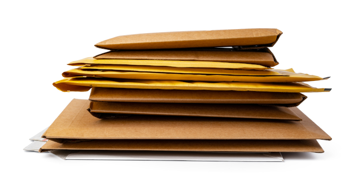
Photo purchased from … www.depositphotos.com
The Printing Industry Exchange Blog is #12 of the best 40 digital printing blogs, as selected by FEEDSPOT.
I realize that things go wrong. I understand that as simple a job (presumably) as an envelope printing run can be fraught with complexities.
In that light, a print brokering client of mine recently brought me a job that included an annual report, a letter to constituents, and a large envelope to contain them. Ironically, as the bidding process proceeded and the specifics of the design came clear, the only element of the package that didn’t change was the annual report, a 12-page, 4-color print product on 80# gloss text with an 80# gloss cover and with all pages gloss aqueous coated.
The Issues
First off, my client specified 9” x 12” vs 10” x 13” envelopes. I conferred with the commercial printing vendor and learned that the ideal size for so few items (two) would be 9” x 12”. My client didn’t need anything larger.
In addition, there was a question about paper weight for the pre-made envelopes. I suggested 28# (comparable to 70# text stock) rather than 24# (comparable to 60# text stock) not only because it would be stronger but also because at that size (9” x 12”) a thicker paper would be more substantial. Less flimsy. Plus with a press run of 1,100 copies, the difference in cost would be (according to the printer) negligible.
So far, so good.
The next issue to resolve was whether my client wanted booklet or catalog envelopes. For the uninitiated, this just refers to the position of the flap. If the envelope opens on the long side, it’s called a “booklet” envelope. If it opens on the short side, it’s called a “catalog” envelope.
In my personal view, the booklet envelope is a little more stately than a catalog envelope. Others may disagree. To me it just looks more like a traditional #10 envelope due to the position of the flap on the long side.
That said (which is really a personal choice), a more pressing issue was that according to the printer, who would be doing the mailing work for the job as well as printing all elements of the project, a booklet envelope would be machinable, while a catalog envelope would not.
This means that the printer’s mailing equipment could automatically insert the letter and the annual report into the envelope if it opened on the long side, but if it opened on the short side, then inserting the client letter and annual report would be hand work. That is, this portion of the job would cost more.
This is where I’d suggest making a mental note. At least that’s what I did. I’m not sure whether other printers (perhaps ones that focus more on promotional mailing initiatives) might have other equipment that could insert items into an open-end envelope (or whether most printers would need to charge for hand-inserting). However, I’d encourage you to ask to avoid being surprised.
Bleeds, Screens, Digital Printing, and Heavy-coverage Solids
After the initial bid, which was based on adjusted specs from the prior year’s mailing, I acquired digital art files for the annual report, accompanying letter, and envelope.
First of all, the artwork did not include heavy coverage solids. This was good. If it had included these, the envelopes might have needed to be printed as flat press sheets that would then be cut, folded, and glued into final envelopes. This (called “converting”) would have been expensive. Given the simplicity of my client’s design, pre-made 9” x 12” envelopes could be used.
However, since the envelope artwork had bleeds on three sides, producing the envelope would need to be done as subcontracted work by a dedicated envelope printer (i.e., not by the printer who had otherwise won the bid). The outside vendor would presumably have produced the envelopes on a special “jet press” that would offset print the envelopes (with bleeds). This outsourced work would cost significantly more than initially planned.
So What Is a JetPress?
A jet press is a specific kind of offset press that accepts envelopes up to 12×15 ½ in size and can print up to 30,000 envelopes per hour. These can even print quality images with fine lines, tight register, or halftones (or area screens). They are appropriate for press runs from 500 copies to 100,000 copies. For fewer than 500 copies, a digital press would be more economical. Unfortunately, even jet presses have limitations. For heavy ink coverage on either the front or back (or both sides) of an envelope, you would still need to print the envelopes as a flat-sheet offset-lithographic project and then convert them into envelopes (adding to the overall cost of the job).
Therefore, I encouraged my client to redesign the envelopes without bleeds. The annual report was perfect as it was. The client letter could be done in-house (by the printer) with or without bleeds. And since it was such a short run (1,100 copies), producing these digitally would be much cheaper than firing up a 40” offset commercial printing press. If my client had concerns about the quality of the screens, she could remove the small screen on the envelope.
And as for the envelope, once my client had redesigned the envelope to omit the bleeds, the printer could then produce all elements of the annual report job in house on a digital press (except, of course, for the offset-printed annual report). This would lower the price back to the initial estimate, saving about $1,400. Again, if my client were concerned about the quality of the screens, she could omit the one screen on the envelope.
From this I learned (and if you are a print buyer or designer, you might want to remember) that bleeds often do not add to the cost of a project, but in some cases (as with these envelopes) they jack the price way up. Not all printers have all press equipment. And subcontracting work costs money and takes time.
Mailing
Fortunately, in my client’s case, the annual report and letter would be sent to constituents with actual postage affixed to the envelopes. That is, this envelope would not need to conform to standards for Business Reply Mail, as paid for by the company that originally sends out the reply mail envelope to potential clients. But since in your case this may or may not be true, I would encourage you to:
- Study (online) the US Postal Service’s Business Reply Mail requirements. Or ask for a print book containing this information. Preparing your envelopes (design, placement of type, blank areas on the envelopes) correctly will save you a lot of money by allowing the US Post Office to automate the process (make the job machinable).
- Ask your printer about these Business Reply Mail requirements if you prefer. His (or her) print shop may have enough in-house mailing capabilities to have made him or her cognizant of all of these requirements. Some printers I’ve worked with actually do everything (or almost everything) the Post Office does right in their own print shops.
- Consider options for business reply mail vs. standard postage (indicia, meter stamp, precanceled stamp, or other stamp), and be mindful of other business reply mail requirements.
- Remember that weight affects postage. Ask your printer whether a 9” x 12” vs. 10” x 13” envelope will increase postage requirements depending on what it must contain. Both are large format, so they will cost more to mail than letters.
The Takeaway
- Discuss your custom printing and mailing components in depth with your printer. It’s even smart to make a physical, paper mock-up showing the size of the envelope, placement of copy and art on the envelope, and all printed items the envelope will contain. Any problems (potential US Postal Service issues as well as printing and mailing costs) will be evident. Nothing communicates your needs better than a physical sample.
- Ask about bleeds, screens, and heavy coverage and how these will affect the cost and schedule for your mailing initiative (as well as whether you will need to subcontract a portion of the overall job).
- Be mindful that the run length of your job will determine whether your printer will produce it (envelopes, in this case) on digital or offset equipment.
- Look for dedicated envelope and promotional custom printing companies if you do this kind of work regularly. This might save you money, and the printer will most likely be very well versed in all postal regulations.
Posted in Envelope Printing | Comments Off on Commercial Printing: An Envelope-Printing Case Study
July 10th, 2023
Posted in Paper and finishing | Comments Off on Custom Printing: Textured Paper Options, and a Nod to the PIE Blog
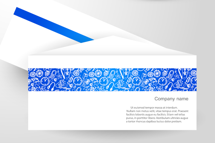
Photo purchased from … www.depositphotos.com
This week we are sharing two short blog articles, one about textured paper options and the other about the induction of the Printing Industry Exchange weekly blog into Feedspot’s Top 40 Digital Printing Blogs.
Paper Choices
When I’m designing something new, my knee-jerk impulse is to print it on gloss or dull coated paper. So I pause for a moment and really think about the purpose of the item. For instance:
- Is the job a print book? Does it include black and white or color photos?
- Is the job an annual report, and do I want to project a corporate image or a softer, more approachable image?
- Am I designing a stationery package, including a business card, letterhead, envelope, and such?
All of these will lead to specific, and different, paper choices.
For instance:
- For print books with lots of photos, black and white or color, the images “pop” when they’re printed on gloss stock. That said, if the book is text-heavy, gloss stock can be tiring on the eyes. It’s easier to read text on uncoated paper or dull- (or matte-) coated stock.
- In the case of an annual report or other print collateral for an organization, uncoated paper feels softer, and the ink colors printed on the stock (solids and photos) are more muted. This, combined with the softer feel of the paper, can give a more intimate and personal feel to the publication. This might be appropriate for an environmental organization that wants less of a “corporate” look and more of an approachable, environmental-steward tone.
- For business stationery, letterhead, business cards, and various kinds of envelopes, you will probably want an uncoated stock. Moreover, to provide a unified look and feel, you might want to select paper from a coordinated stationery-package paper swatch book with different weights of complementary custom printing stock. Or, for the business cards, you might opt for a coated paper (if you’re designing business cards for a tech-oriented company or a financial company, for instance).
- You may also want an uncoated sheet for a special invitation, say to a black-tie dinner. In this case, in addition to uncoated paper, you may want a textured sheet and/or a colored paper stock, perhaps even a dark tone like a deep green or black with white text.
In short, the paper should reflect the purpose of the printed item and the tone or ethos of the company brand. Therefore, it is important to choose a stock carefully, and the best way to do this is with samples.
Your commercial printing supplier or paper merchant can send you swatch books (unprinted, but with a variety of selected papers) and printed samples (produced for the printer’s other clients), and these will make your decisions easier. The swatch books will give you a sense of the colors and textures from which to choose, and the printed samples will show you how solid ink colors, type, and photos will look on the selected paper stock.
Options for Paper Texture
Printing is a tactile experience. Your fingers can help you select paper for special projects. If the choice is an uncoated stock, here are some options:
- Laid: There are both horizontal and vertical lines in the paper, which are added with metal rollers during the papermaking process. This is a good choice for stately letterhead and printed presentations because it simulates classic, hand-made paper.
- Linen and felt: Both of these options simulate the texture and pattern of the cloth after which they are named. As with laid paper, linen and felt patterns are pressed into the paper during the papermaking process. Linen has more of a cross-hatched look with similar-width horizontal and vertical lines (like woven fabric), and felt-finish paper has more of the look and feel of felt cloth.
- Column: This pattern comprises, as the name implies, a series of vertical, ribbed columns on the surface of the press sheet.
- Vellum: Unlike laid, linen, and felt, vellum is very smooth. It has a slightly puckered texture like the surface of an eggshell.
- Wove: Wove is the smoothest uncoated option of all, although its surface is also described as being similar to an eggshell, albeit a bit smoother than vellum.
In all cases, there is no better way to grasp the differences in paper surface (both visually and in terms of the feel of the paper) than to request samples from your printer or paper merchant. Some of the textures are more prominent, while others are less prominent. In all of these cases, the texture lends a sense of understated elegance to letterhead and other elements of a stationery package or to an invitation or program for a special event.
Things to Consider
In my view, color is one of the major considerations, in two senses:
- If you choose a dark colored, textured sheet, it will be striking, but since commercial printing ink is usually somewhat transparent, you may need to add a second pass of a color to make the ink/typescript dark enough, evenly applied, and readable. Granted, for an invitation, you can foil stamp the text on the sheet, but this will require the additional cost of a metal foil-stamping die (which also takes time to make) as well as the cost of the foil-stamping procedure.
- If you choose a white uncoated press sheet, it will absorb the ink. (In contrast, ink sits up on the surface of a coated sheet, whether dull or gloss.) Therefore, the ink printed on an uncoated commercial printing sheet (type, solid colors, or halftones) will look softer, darker, and less intense than the same ink will look on a coated press sheet. While the printer can compensate somewhat for this fact, large areas of solid ink may appear blotchy (when compared to the same ink treatment on a coated sheet). It’s smart to discuss this with your printer and request samples first.
That said, in my opinion, printing color on uncoated paper can provide subtle, nuanced images that are soft and elegant. It just takes a skilled custom printing vendor to do this.
Printing Industry Exchange Blog Included in Feedspot Top 40 List
The CEO of The Printing Industry Exchange just received notification that the PIE Blog has been featured (as #12) in the Feedspot Top 40 Digital Printing Blogs. If you want to learn more, check out this link:
https://blog.feedspot.com/digital_printing_blogs/?feedid=5425058
This is a description of Feedspot’ s vetting process, in their own words:
“The best Digital Printing blogs from thousands of blogs on the web and ranked by traffic, social media followers, and freshness.
“Feedspot discovers, categorizes, and ranks blogs, podcasts, and influencers in several niche categories. We have curated over 250,000 popular blogs and categorized them in more than 5,000 niche categories and industries. With millions of blogs on the web, finding influential, authoritative, and trustworthy bloggers in a niche industry is a hard problem to address. Our experience leads us to believe that a thoughtful combination of both algorithmic and human editing offers the best means of curation.
“There are several ways we discover new feeds.
- Publishers submit their blogs, podcasts, or YouTube channels on Feedspot using the “Submit” form at the top of this page.
- We have a research team who does extensive research on Google and social media platforms to discover new influencers.
- Feedspot has in-house media monitoring tools for discovering bloggers in several niche categories.
“Our expert editorial team reviews each blog before adding [it] to a relevant category list.
Ranking is based on:
- Relevancy
- Industry blogs (those not favoring a specific brand) are given higher rank than blogs by individual brands (who often tend to promote their own products).
- Blog post frequency (freshness)
- Social media follower counts and engagements
- Domain authority
- Age of a blog
- Alexa Web Traffic Rank and many other parameters.”
Posted in Paper and finishing | Comments Off on Custom Printing: Textured Paper Options, and a Nod to the PIE Blog
July 2nd, 2023
Posted in Fine Art Printing | Comments Off on Commercial Printing: A Gorgeous–and Free–Degas Print
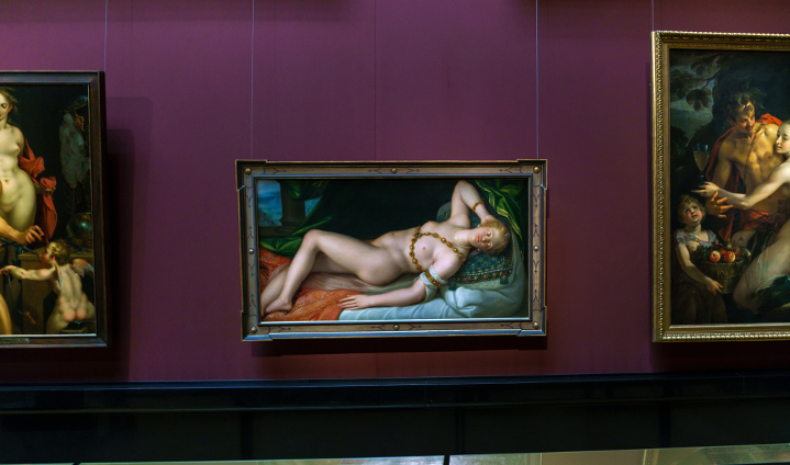
Photo purchased from … www.depositphotos.com
My fiancee and I keep a printer’s loupe (a 12-power magnifier) in the car glove box so that wherever we go (mainly thrift stores) we can check out the artwork. Are the prints authentic, traditional lithographs, or are they offset lithography prints? That is always the question. (Granted, it is highly unlikely that an art print–rather than a reproduction–will show up at a thrift store or estate sale, but it has happened to us a number of times, so it pays to be prepared.)
In this light my fiancee and I recently found an Edgar Degas print online for free. Someone just didn’t want it any more. Since we loved the rendering we saw online, we drove about twelve miles and brought the framed print home. Of course, I immediately found my 12-power printer’s loupe and checked out the art. As we expected, it was (essentially) a very beautiful large format print poster. It was framed by a skilled framer. And it was free. So it was still a good acquisition, most importantly because we like the image (subject matter, rendering) a lot.
The Degas Reclining Nude Print
The print is of a reclining nude. It is quite large, and the print is “floated.” That is, it seems to float above the background mat rather than being covered by it. The drawing by Degas is sensitive and beautiful, and the tones are rich, deep, and velvety. So it actually looks like either a charcoal drawing or a real lithograph. There is nothing cheap about it (except for its being free).
Moreover, the edge of the floated paper on which the poster is printed is deckled. That is, the edge is feathered rather than flush cut in order to mimic hand-made paper. And the paper is a cream-white, laid commercial printing stock with the traditional texture of horizontal and vertical ribbed lines.
All of this plus the signature looks entirely authentic. But it’s not.
Upon close examination with a loupe, I see the halftone dots (black only and somewhat ragged, which lends to the authentic look). And the deckled edge of the paper is actually an illusion as well. The printer has created a slight shadow on the paper, which also comprises numerous halftone dots, as does the signature. Only the red museum stamp has the traditional commercial printing rosette pattern of magenta, yellow, and black halftone dots set at slight angles to one another.
So if you like the image (and don’t have multiple thousands, tens of thousands, or hundreds of thousands of dollars or more), this is still a nice acquisition. It also shows that a skilled offset lithographer is an artist as well as a craftsman to be able to create a large format print like this.
The Lithography Process
Traditional fine art lithography and commercial printing (i.e., offset lithography) both work on the same principle, that water and oil do not mix. This chemical property allows both the image area and the non-image area of both a traditional litho plate and an offset printing plate to be on the same flat or planar surface (hence the custom printing term “planographic”). And since both image and non-image areas are on the same plane or level, it is possible to print very long runs of an art print when compared to other commercial printing techniques (intaglio, for instance, in which the image is recessed–or sunken–into the custom printing plate, or relief, in which the image area on the printing plate rises above the non-image area).
A fine artist preparing the plate for printing (historically, the plate was limestone, because of its absorbency, but it is now often metal) draws on the limestone plate surface with a greasy crayon (oil, fat, or wax), sometimes tinted to be more visible. These image areas, which can be very detailed, and either very rich and velvety or very subtle, will attract the oily lithography inks.
The rest of the limestone (or metal) printing plate is treated with a solution of gum arabic and weak nitric acid. This will attract water and repel ink.
The artist wipes down the image with lithographic turpentine, removing excess oil or wax from the image but at the same time sealing the image areas so they will better accept the lithographic ink. During the custom printing process, the artist also keeps the limestone plate wet. Due to the porosity of the limestone, the printing plate absorbs water and helps maintain the separation of ink (on image areas) and water (on non-image areas).
When everything is ready, the artist inks up the plate, positions the printing paper on the plate, and rolls it through the hand-operated printing press. Then he repeats the process (with more hands-on attention than in offset lithography and with a much shorter press run to increase the value—due to scarcity—of each individual print). Then he signs and numbers the individual prints in the limited press run.
If the artist wants to introduce color into the printed images, she or he has to use a different limestone plate for each color and then print them in alignment (called “in register,” the same custom printing term as used in offset lithography).
How Does This Differ from Offset Lithography?
First of all, both traditional lithography and offset lithography, as noted above, are planographic printing processes based on the “immiscibility” of oil and water. (Oil and water don’t mix.)
That said, offset lithography plates print first to a rubber and fabric blanket, and then this printed image is transferred from the blanket to the paper substrate. In contrast, in traditional lithography the image is transferred directly from the printing plate to the paper.
In addition, with offset lithography photos and gradated tones (tones that are intermediate rather than fully black or white) have to be rendered using halftone technology, which breaks an image or photo down into a grid of dots, larger or smaller depending on the amount of ink to be printed. Dark areas contain larger dots. Lighter areas contain smaller dots. (This is called AM or amplitude-modulated halftone screening and is different from FM or frequency-modulated screening, which comprises the dithered, random pattern of minuscule dots produced on an inkjet printer.)
In traditional lithography, there are no halftone dots. According to Silvie Turner in Print Collecting: Selecting, Evaluating, and Caring for Fine Prints, “One of the qualities most valued in lithography is its ability to record the finest nuances of shade, tone, and wash with the greatest fidelity, allowing a wide and subtle range of tone—from a very deep black to the tenderest of greys.” (Turner, page 18).
How Can You Tell the Difference?
As noted above, I always start with the loupe. If I see halftone dots, I know the print is an offset lithograph.
Art dealers suggest that you buy traditional lithographs from a reputable fine art dealer. (These will, of course, hold more financial value than prints from a much longer, and presumably less personally curated, offset lithographic print run.)
Look for a signature (and make sure it’s not made up of halftone dots). I also just learned that there may be a signature on the back of the press sheet. Look for this, too. Also look for the print number and the total print run, expressed as a fraction (5/300 means the fifth print pulled in an edition of 300). Both of these should be hand-noted under the image, usually in pencil.
Ink on a traditional lithograph is also usually thicker than on an offset lithographic large format print.(Wear cloth gloves when you check the ink so the oils on your hands do not damage the print.)
The Takeaway
Sometimes you can find real lithographic prints at estate sales and thrift stores. It has happened. It’s worth knowing what you’re looking for, and it’s worth keeping a printer’s loupe with you.
That said, there’s still a huge amount of artistry (as well as craftsmanship) in offset lithography. If you like a large format print, even if it’s not an original litho, I think it’s best to not be a purist, especially when you get it for free or at a discount at a thrift store.
Posted in Fine Art Printing | Comments Off on Commercial Printing: A Gorgeous–and Free–Degas Print
June 24th, 2023
Posted in Proofing | Comments Off on Custom Printing: Proofing Options, Old and New
Photo purchased from … www.depositphotos.com
Over the 49 years I have been in the commercial printing industry (going all the way back to two high school yearbooks and two college yearbooks in the 1970s), proofing technology has changed, and improved, dramatically.
What Proofing Was Like Back Then
Back in the day (circa 1974-1990), I used to check the following proofs for an important job:
Client’s Page Proofs
I would start with the page proofs, which were xerox copies of grid sheet pages I had pasted up with paper typeset copy that came to me in a single column (i.e., not as fully composed pages). The photos were 8” x 10” continuous-tone silver halide prints from negatives, which I would cover with tracing paper on which I would indicate photo cropping in pencil.
Printer’s Blueline
Once the page proofs had been approved and corrected (I had to typeset new sections and then paste them onto the grid sheets), the job would go to the printer and I would get a blueline proof to review. The blueline was made photographically from negatives of the completed (pasted-up) pages. Back in the day, we weren’t going directly from electronic files to metal commercial printing plates. We had an interim step, the negatives and the blueline proofs of the negatives.
The goal in reviewing bluelines was to make sure all copy was in place (that nothing had been inadvertently omitted) and that the printer had accurately cropped, photographed, and stripped in the photos. Nothing else. No editing (it was too expensive to make changes, produce new film, and make new bluelines). Placement of color (solids and screens) was either indicated in writing on the single-color bluelines or made visible on the blueline proofs in a slightly different shade of blue.
Color Proofs
Occasionally, for color placement, I would check overlay color proofs. The colors were for position only. They were in the general color family but not at all color faithful. For photographic-quality color I would review a Matchprint or Cromalin, two brand names of color proofs made from the separated color negatives. The former was made with colored films, and the latter was made with mixtures of colored powders. Overall, both options were quite good for the time period (‘80s and ‘90s). At the end of this period we were also starting to read about what was called an “Iris proof,” a high-end inkjet proof well ahead of its time.
Paper Dummy
Occasionally, if the printed product was to be more intricate than a brochure, perfect-bound print book, or saddle-stitched print book, I would request a paper dummy from the printer or paper merchant. This was a mock-up of the final job. For instance, the paper dummy for an annual report might show how the overall printed product would look and feel on the actual printing stock, but there would be no actual commercial printing ink on the pages. They would be completely blank. That said, it was still often important to see what the white dull or gloss, or perhaps cream dull or gloss, stock would look like and what the bound book at that specific page count would feel like in the reader’s hands.
Here’s another example. For a project like a pocket folder with a ¼” build on one pocket and no build on the facing pocket, it would be helpful to review a physical paper dummy with these exact physical dimensions (again without any printing) just to see if the pockets (or the expansion builds on the pockets) would be accurate and would comfortably contain whatever we needed them to hold. This was our last chance to make any changes.
Ink Drawdown
On very rare occasions, we could request an ink drawdown. This was the specific PMS commercial printing ink mixture smeared on the actual printing stock. This might be useful to help us visualize two PMS colors together on a particular shade of cream paper.
Press Proof
I never had to do this, but for a price it was possible to print one or a few copies of the final job on a small press for client approval. This was not as expensive as the final press run (since it was short and on a small press), but it did involve all steps in the custom printing process. Therefore, it was only useful for the most prestigious jobs that required “critical” as opposed to “pleasing” color.
On-Site Press Inspection
The final option (which I regularly requested up through my years as an art director and production manager in the late ‘90s) was the press inspection. I would go to the printer’s shop and check printed sheets as they came off the press. For critical color work, this actually was essential to avoid errors while they still could be corrected (that is, before the client had seen the job).
When I did a press inspection, it was within the printer’s time frame (around the clock), so I might check one press signature at 3:00 p.m. and then another at 9:00 p.m., then another at 3:00 a.m. If anything was wrong, new negatives and plates would be created and hung on the press, and the process would start over.
The Takeaway
Thirty plus years ago, in the arena of proofing options for commercial printing, a lot was left to the imagination. You couldn’t look at everything on-screen in a PDF. You couldn’t check your own inkjet proof produced on your own desktop printer. Putting together an overall mental image of how the final piece would look based on all the aforementioned (and disparate) elements, you had to make educated guesses. The more proofing steps you included, the more likely you would be (and your client would be) to like the final printed job.
What It’s Like Now
Here’s a rundown of the current options for commercial printing, some of which are similar to, and many of which are quite different from, back when I started in the field:
Client’s Page Proofs
In the late ‘80s (1987 to be exact), my employer, a non-profit government education foundation, stopped doing physical paste up of paper typeset “galleys” (or single columns of imaged photographic typesetting paper, cut, waxed as an adhesive, and aligned and burnished down on grid paper). At that point we made the change to computer page design and typesetting in house using Aldus PageMaker (an early page composition product similar to InDesign but far more rudimentary).
So in terms of proofing, we could see the laid-out pages on our computer monitors along with cropped and positioned photographs we had scanned into the computer system. Once the computer monitors were able to show grayscale (not just black and white) images and then rudimentary color images, we could visualize what the final print job would look like. This was a bit like the current PDF on-screen or virtual proof. The color was not yet completely faithful, but, in terms of position, everything could be seen as it would appear in the final commercial printing job.
We could then print out laser copies of complete pages for client review.
Bluelines Replaced by Laser Proofs and Inkjet Proofs
For a short while we still reviewed bluelines (made from the negatives, as noted above). However, when the commercial printing vendors ceased making interim negatives and instead produced metal plates directly from the digital art files, the bluelines were irrelevant (and actually misleading).
So we used some version of a laser copy for position-only work and some version of inkjet printing for color work. You could see everything you needed to see (all elements in position, including type, halftone images, graduated color screens, etc., with a good amount of color fidelity).
The good news was that we knew what the final product would look like. The bad news was that although the inkjet printers were keyed to the actual offset lithographic presses, we were in reality using two different technologies, and if we needed to print PMS (or match) colors (instead of 4-color process inks) on the final press run, these would only be close simulations on the inkjet proof.
Color Page Proofs Still Needed
There were no more analog Matchprints and Cromalins (made from negatives). Everything was digital. Interestingly enough, the people who created the Iris proofs back in the ‘80s would have been pleased to see the current version of color inkjet proofs produced on much cheaper desktop equipment.
Paper Dummy
The paper dummy is still useful. I still like to see and feel a simulation of the final job on actual paper if the job is of high importance. And for complex work, like a flooring-sample display binder I had printed for a client a few years ago, it was essential that she see the turned-edge leather panels at least on a similar, sample product, so she and her client could visualize their final product.
Ink Drawdowns
I haven’t needed to request an ink drawdown since the late ‘90s, but for a PMS-color-based job on tinted paper or textured paper stock, I wouldn’t rule it out.
Press Proofs
Same as before. If it’s critical, like an invitation for the queen, perhaps it’s worth a press proof on a small proofing press. But expect it to cost over $1,000. And for the most part an inkjet proof will do.
Onsite Press Inspection
I haven’t needed to do one of these since the late ‘90s either. But for food, fashion, or automotive advertising of the highest quality, I wouldn’t rule it out. But one thing to keep in mind is that there are now electric-eye-based, closed-loop, color-control applications on offset presses that continuously monitor the color and make color adjustments during the press run to keep everything color faithful and consistent. So press checks are now pretty much unnecessary.
The Final Takeaway
Things have come together. You can see paper, color, halftone imagery, solid colors, bleeds, gradations, pretty much everything, in one place on an inkjet proof. This kind of proof is usually adequate.
That said, you may be tempted to accept only an on-screen proof (a PDF). In fact, for quick-turn-around digital printing jobs, I have a few vendors who will only do virtual proofing.
But for color-critical offset lithography work, I think it is always worth paying for a physical proof. Colors on computer monitors are made with light. Colors in commercial printing work (laser, inkjet, and offset, along with screen printing, letterpress, gravure, flexography, or any other physical process) are made with physical inks or toners. The color gamut is not the same in the two arenas. So don’t skimp. Look it as an investment, not an expense, and proof early and often.
Posted in Proofing | Comments Off on Custom Printing: Proofing Options, Old and New
June 19th, 2023
Posted in Plastic Cups | Comments Off on Commercial Printing: Musings on a Printed Plastic Cup

Photo purchased from … www.depositphotos.com
I am definitely a design and custom printing nerd. Last week my fiancee came home from a lunch with her son. They had dined at CAVA, a local Mediterranean restaurant. She had brought me a mid-size clear plastic cup with the logo emblazoned in white type, the letters “C,” “A,” “V,” “A,” and nothing else. I was ok with not having received a bit of leftover food in a doggie bag because I was so intrigued by the design of the plastic cup.
The Design
What makes this cup so special? First of all, the lines of the logo exactly match the lines of the cup. That is, the word “CAVA” is set in all capital letters in a heavy sans serif typeface (granted, that is the restaurant’s logotype). The particular slanted letterforms of the “AVA” not only nestle into one another (i.e., the kerning or space between letters has been consciously and appropriately reduced), but the letterforms also match the slanted edge of the cup from the top rim to the base. In fact, the “A”s in CAVA are actually like inverted versions of this cup.
The white ink, which appears to have been applied via custom screen printing, is completely opaque and slightly softened in its gloss (comparable to the surface of a white silk press sheet). The writing therefore contrasts beautifully with the heightened gloss of the plastic cup.
What sets this cup apart, however, is the combination of the boldness of a four-letter logo and the expansive feel of the logo on the clear plastic. The logo is large, and it wraps almost halfway around the circumference of the plastic glass, and although it is raised about an inch from the bottom of the cup, the logo extends upwards about two-thirds of the way up the side of the cup. So it feels big but not gigantic. Bold, as I said.
Moreover, if you look closely, there are a number of rings around the cup where it gets progressively smaller as you move down from the top to the bottom. And the logo is balanced nicely between the three rings at the top of the glass and the single ring at the bottom.
Back to the transparency. The logo on the clear plastic provides a sense of opulence, as though the logo were floating on the transparent plastic, and as though it could have been any size (larger or smaller) because there is no boundary between the logo and the glass.
This last point I will address further as we move into the technology and the other options for custom printing such a cup.
The Technology
In this case I would guess that the printer had used custom screen printing to add the logo to the glass. Screen printing inks are thick, bright, and opaque. The thickness and the opacity allow for a dramatic contrast, even between a white logo and a clear glass.
But, you may ask, how can you print with a silkscreen (or metal mesh screen) on a curved cup? Based on my research, I know it is possible to rotate a cylinder (like a glass or a can) while keeping the screen-printing frame flat on the top of the rotating item. Of course in this case the glass is more triangular than a tumbler glass, an aerosol can, or a similar shape, but I’m sure there are ways to adapt the process to the substrate.
One other benefit of custom screen printing such a cup or glass would be the durability of the thick screen printing ink. Even on a plastic glass, rub resistance would be important in order to keep the white CAVA logotype from cracking or flaking (and tarnishing the restaurant’s crisp, brand image).
Other Printing Options
With the advent of digital commercial printing, inkjet technology has provided an alternative to screen printing for a printed cup like the CAVA glass. In this case the print heads, which would never actually touch the plastic wall of the glass, could spray the white ink onto the side of the cup as it was rotated in some sort of jig (an apparatus to hold and spin the cup).
Since plastic is not a porous substrate, the commercial printing supplier might use UV inks, which cure instantly when exposed to ultraviolet light. These inks can be used on nonporous materials like plastic, and depending on their formulation and the substrate, they will have good rub resistance.
You might ask which of these would be more appropriate for custom printing a plastic cup or glass for a restaurant chain. In my opinion it would depend on the length of the press run. Both custom screen printing inks and UV inkjet inks can be formulated to be opaque (especially a white ink), but it costs a lot more up front to prepare a screen printing run than an inkjet printing run. There is a lot more makeready, so for economical screen printing it helps for the run to be multiple thousands of items or more. In contrast, there is very little makeready for a digital printing run, like inkjet, so there are only minimal preparation costs to amortize over the entire press run.
In addition, if you were a marketing manager at CAVA and you wanted to personalize each plastic glass or provide a series of cups that changed every so often (i.e., short, versioned press runs within one overall marketing initiative), you might choose inkjet technology.
(Granted, the printer would be the best advisor as to the point where one technology—perhaps inkjet–becomes less cost effective and the other—perhaps custom screen printing–becomes more cost effective.)
One final option that is trending these days is “direct-to-object” inkjet printing in which the inkjet print heads are not fixed in a single plane but can move to spray ink on an uneven shape, such as a CAVA glass (the more conical shape, as mentioned before) or even a football. This is possible because the printheads never touch the object.
Other Marketing Options
A good part of the attractiveness of all of these technologies rests on the absence of a label. The subconscious marketing message transmitted by custom screen printing or inkjet printing ink onto a clear plastic substrate is the expansive feeling it evokes. There is no bounding rectangle of a label (even a clear label), so the logo can ostensibly go on and on forever. It floats on the glass, cup, or whatever else you’re printing.
But this may not be an issue, depending on your design goals. If so, there are a number of options that may be less expensive.
For instance, you can print on an opaque label, which can be affixed to the plastic glass. If your design is more contained, perhaps in a rectangular border, this would be perfect. And many labels are made to be impervious to moisture and cold/hot temperatures (like wine bottle labels).
Another option would be a clear label on which you could print any number of colors with an assortment of technologies (such as offset lithography, flexography, inkjet printing, and laser printing).
Finally, you might even look into shrink sleeves. You may have seen these marketing novelties wrapped around bottles in the grocery store. Once printed, these can be fitted over a bottle like a jacket, and then with a source of heat you can shrink the wraps to a tight fit around the glass or plastic items.
What might make these good for marketing would be the extra space you would get onto which you could print logos, text, or other imagery. If you look at shrink sleeves in the grocery store, the consumer branding can feel much more dramatic when compared to the finite boundary of either a white opaque label or even a transparent label.
The Takeaway
For this one, the takeaway is simple. If you’re designing a glass or cup, as CAVA marketers did, research custom screen printing, digital inkjet, and even direct-to-shape printing. Your printer may have connections, vendors they trust. This is not a job everyone can do well. It requires special equipment and skill. So, as is always the case, get referrals but also request samples. The technology options are out there. You just need to look.
Posted in Plastic Cups | Comments Off on Commercial Printing: Musings on a Printed Plastic Cup
June 12th, 2023
Posted in WaterlessPrinting | Comments Off on Custom Printing: Waterless Printing (Driography)
Photo purchased from … www.depositphotos.com
When a printing supplier I work with mentioned that she had a Heidelberg direct imaging press for one of my client’s jobs, a collection of “chin cards” based on her color model for selecting complementary hues for make-up and clothing based on a person’s complexion, I was thrilled. Unfortunately, I was also mistaken. The press turned out to be a Heidelberg, but it was a production-quality color laser printer, not a waterless press.
That said, when my associate mentioned the press, I remembered seeing the Heidelberg Quickmaster DI in the late 1990s and early 2000s. I had been amazed by its dense ink coverage, halftones upward of 300 lpi (with no visible rosette patterns), super-hard halftone dots, and incredible color fidelity.
The Heidelberg Quickmaster DI and Waterless Offset Printing
First of all, Heidelberg is known for exceptionally high-quality manufacturing in the commercial printing press world. Color fidelity, durability–Heidelberg is the BMW of presses.
That said, I supplemented my own exposure to waterless printing on the Heidelberg Quickmaster DI press with online research (including Wikipedia), and then I reviewed online literature by Heidelberg and came up with the following.
The Quickmaster DI is a waterless press. This process has also been branded as “Driography” (by 3M in the late ‘60s). It differs from offset lithography in the following way.
Offset lithography is based on the fact that oil and water do not mix. By coating the printing plate (during commercial printing) with a water- and alcohol-based dampening solution that is attracted to the non-image areas of a metal printing plate, and by attracting the oily offset inks to the image areas of the printing plate, it is possible to have both ink and water on the same flat surface of the plate (called a “planographic” surface) while only printing the ink from the image areas (type letterforms, halftone dots, and solids).
In contrast, a waterless press starts with a metal plate that is coated with silicone rubber. A digitally-controlled laser burns the plate, activating a photo-polymer that allows the silicone (during the processing of the plate) to slough off from the image areas only (type and images), leaving the remaining silicone coating intact. Silicone then repels the ink (of a specific viscosity), but the exposed metal of the underlying commercial printing plate attracts the ink (of a specific viscosity).
Because of the surrounding silicone, the image areas of the custom printing plate are actually recessed (also known in both fine art printing and commercial printing as “intaglio,” with the third option, after “planographic” and “intaglio,” being “relief” or raised printing—like letterpress).
Because the image area is recessed, when compared to offset lithographic plates, a waterless press can carry more ink to deposit on the printing substrate. So ink density can be much higher than in traditional offset lithography.
More Benefits of Waterless Offset Printing
First of all, it’s not really offset lithography because it’s not based on the mutual repelling of oily ink and water (which is more of a chemical process). Because of this, waterless offset (which is more of a physical process) is actually more precise than offset commercial printing, in part because pressmen don’t have to struggle to get the correct balance between the oily ink and the alcohol and water dampening solution.
Here are some more benefits:
- Waterless inks are more viscous than offset inks. That means they are thicker and tackier (they stick to each other better than offset inks, which improves ink trapping—or the slight overlapping of inks where they abut to one another). Waterless inks provide a wider color gamut and greater color fidelity than traditional offset lithography inks.
- The higher halftone screen rulings–from 300 lpi (lines per inch) to 800 lpi or higher, in contrast to the 175- to 200-line screens used for traditional offset lithography–allow for more detailed images and increased ink contrast.
- Since waterless plates can carry more ink, and since the ink is thicker than offset inks, there is better ink holdout with waterless printing than with offset lithography. (An ink’s holdout is its ability to stay on the surface of the paper rather than seep into the paper fibers.) In addition, the lack of water absorption by the commercial printing paper also contributes to this enhanced ink holdout. (That is, wet paper reduces ink holdout. Drier paper increases ink holdout.)
- The thicker ink and absence of a water and alcohol dampening solution also maximize the dimensional stability of the paper. Drier paper doesn’t stretch as much as wet paper. This makes for better registration and less waste.
- On a traditional offset lithographic press, you can print from (approximately) a 5 percent halftone dot to a 95 percent halftone dot. Anything lighter than 5 percent would be white (unprinted paper). Anything darker than 95 percent would be black. (Granted, these numbers will vary depending on the press, the ink, and the paper). That said, for waterless offset, the printable halftone dots range from .5 percent (in highlights) to 99.5 percent (in shadows). In short, waterless offset allows for a much larger printable tonal range than traditional offset lithography.
- Color is more consistent (i.e., more easily maintained) throughout the press run.
- Waterless halftone dots print with a harder edge and little or no fringing, elongation, or dot gain when compared to offset lithography. This allows for crisper images and more detail in highlights and shadows.
- The waterless offset process speeds up printing, reduces waste, and eliminates environmentally hazardous chemicals. More specifically, since the overall process is more precise, it can proceed more quickly with less waste (paper waste, ink waste, etc.). And since the dampening solution is no longer necessary, no alcohol or waste water is released into the environment.
- Since the process is simpler and more consistent than offset lithography, waterless offset cuts makeready time in half when compared to offset lithography.
- Plates for a waterless offset sheetfed press can last for 100,000 to 200,000 impressions. And on a web-offset press, the printing plates can last for 300,00 to 600,000 impressions, although rougher papers (below a #1 or #2 coated press sheet) will reduce the run length of the plates.
- For repeat press runs, you can save the digital ink-key preset information, allowing for the press’ “coming up to color” and yielding usable press sheets much faster than with offset lithography.
- Finally, if the waterless press is a Heidelberg Quickmaster DI (direct imaging) press, then the plates themselves can be imaged right on the press. I’m sure by now there are other direct imaging presses as well. My experience with this particular technology (as reflected in the Heidelberg press) came quite a while ago in the late 1990s and early 2000s.
The Caveat: Temperature Control
For better or worse, there’s one caveat. The process is based on the temperature of the inks. For the inks to stick to the exposed part of the plates, they can’t be too hot (which would reduce their viscosity). Therefore, waterless presses need to have a coolant (water) pumped through tubes in vibrating rollers in contact with the inks to reduce their temperature (as it rises during the printing process) and keep it within a usable range.
Without such cooling devices, the lack of water in waterless offset would allow for increased friction between plates, rollers, and ink (as would the milling of the ink itself through the rollers), raising the temperature of the ink. And this increased temperature would change the viscosity of the ink and therefore cause printing problems (i.e., it would reduce the clear separation between ink avoidance and ink affinity–away from the silicone coating and toward the exposed metal plate). With the cooling systems, this is not an issue.
Why Now? Why Not in the 1960s or 1970s?
With all of these benefits, I personally wondered why the technology didn’t catch on earlier, say in the ‘70s or ‘80s. Based on my research, it seems that there were some issues with paper, plates, press, and inks. Apparently these have been resolved, and with more aggressive advertising this technology has started to come into its own.
The Takeaway
So waterless offset is really more of a mechanical process than a chemical process. It yields incredible color as well as superb halftone detail and contrast. Therefore, if you have a press run from 500 to 25,000 units or considerably more (up to 600,000 units), you may want to do some research into which commercial printing suppliers have this kind of press (or which printers have configured some of their presses to do both waterless and conventional offset lithography).
Posted in WaterlessPrinting | Comments Off on Custom Printing: Waterless Printing (Driography)
June 4th, 2023
Posted in Book Printing | 1 Comment »

Photo purchased from … www.depositphotos.com
The Printing Industry Exchange Blog is #12 of the best 40 digital printing blogs, as selected by FEEDSPOT.
As noted before, I am a printing broker, writer, and printing consultant in the DC metropolitan area. Along with my fiancee, I also do art therapy with autistic students. So my fiancee and I are always looking for art books, particularly at our favorite haunts, thrift stores.
My fiancee and I recently found a copy of the Whitney Museum of American Art Biennial 2022 print book, Quiet As It’s Kept.
My fiancee pointed out the die-cut work, leather (or faux-leather) cover, and cross between tape binding and case binding (which produced a lay-flat book that opens with the entire cover totally flat on the table (on the left) and a pristine stack of tape-bound text pages on the right.
When my fiancee checked online, she learned that the book could be bought with any of four different colors for the leather (or faux-leather) binding on which artist names and the book title had been both debossed (recessed into the cover) and foil stamped with an added color (red on a textured leather or faux-leather background).
The deeply incised, die-cut thumb tabs running down the pages give the entire text block of the print book a sculpted look in addition to their being functional, making it easy to jump around in the book.
Needless to say, I assumed that the unit cost for the book was quite high (depending of course on the overall press run). Regardless, I knew that outsourcing the die cutting (presumably, since many printers would not have the equipment to do this in-house) would also make for an expensive book. So I was surprised to learn from my fiancee’s research online that the print book cost only $50.00 for nonmembers or $40.00 for members of the Whitney Museum of American Art.
Since the book production values intrigued my fiancee, I looked at it closely with a loupe and became intrigued as well.
Technical Analysis: My Initial Thoughts and Assumptions
When I looked closely, I saw that colors outside the CMYK range had been included to extend the color gamut, and I noticed that these had been printed in both solid coverage and gradations within the halftones. So my first assumption was that the printer had used touch plates or kiss plates to broaden the perceived color range.
Then I looked for the tell-tale rosette patterns within the images and didn’t see any. So I was confused. Prior to this, whenever I had looked closely at a printed product and had found no trace of rosettes (but had still found halftone dots at particular angles to one another), the printed product had turned out to be digitally produced via laser printing. So I checked out the printer’s equipment list online and noticed they have an HP Indigo laser printing press.
The Whitney Museum book noted in the copyright page which printer had produced the book, which was very fortunate and not a usual occurrence. Plus, since many printers do not list their equipment online, it was another fortunate occurrence to find this particular printer had listed all of their capabilities and equipment.
Their website also listed key personnel and their email addresses, so on a lark I wrote to the production manager of the custom printing plant and asked what equipment had been used to print this book. I also noted my assumptions about the lack of rosette patterns in the halftones as well as the additional colors.
In addition, I mentioned that I had seen how crisp the text was, which is unusual for electrophotography (laser printing). More specifically, laser printing is usually done with dry toner particles that don’t always conform to the curves and lines of intricate type letterforms. Toner can easily be deposited outside the letters, making the text look a little ragged overall. This is not the case in offset lithography, which maintains a significantly crisper appearance of the type.
In contrast to dry-toner laser printing, toner particles used in an HP Indigo are very small. They are also suspended in fuser oil. Hence, I had assumed the printing had been done on an HP Indigo because of the crisp letterforms, absence of rosettes in the halftones, and the additional colors.
I knew the additional colors could have been printed on an offset press, but this would have involved using a multi-unit press (maybe eight colors) or running the press sheets through the press a number of times. This costs a lot of money. On an HP Indigo laser printing press, more than the usual process colors (cyan, magenta, yellow, and black) can be used at the same time, making a reasonably short run of a low-page-count print book potentially less expensive than an offset printed product.
Finding Out How the Book Was Really Produced
To my surprise, the plant manager wrote back to me almost immediately, on a Sunday no less. He said the following:
“The text pages for this book definitely [were] printed [via] conventional offset, not digitally. Probably [a] 200-line screen, possibly with a 20 micron stochastic plate for the black halftones to prevent a moire on any rescanned images.”
So, I was wrong. Under the circumstances, it seems that the high frequency of the halftone screens (200 lpi) had minimized the rosette patterns. Or, the stochastic plate had made a difference. By the way, stochastic halftone screening (also referred to as FM–or frequency modulated–screening) works differently from traditional (or AM, or amplitude modulated) screening.
AM screening uses larger or smaller halftone dots distributed over a regular pattern (the same number of halftone dots in a liner square inch, just smaller or larger dots depending on the required amount of ink). In contrast, FM screening uses the same-sized halftone dots (in this case 20 micron, or very small, dots). Under a loupe you will see minuscule dots, with more dots in dark areas or areas with an abundance of a particular color, and fewer dots in areas with less of a particular color.
This is also what you see when you look at inkjet printed halftones. Stochastic screening provides the illusion of continuous tone photos (which is what you get with color or black and white prints made from photographic negatives).
The Takeaway, or What You Can Learn from My Approach
I made some incorrect assumptions, but that’s less important than the fact that I looked at the print book as both an artistic expression and a physical product that required certain technologies to create.
I would encourage you to take a similar approach if you design books or buy commercial printing. The more you understand both the traditional, analog methods and the more modern digital ones, the better able you will be to choose the technology that best fits your job.
For instance, if you were producing a short run of this print book, you might have chosen an HP Indigo press (i.e., you may have found a printer with this equipment) because the text of the book would be more crisply printed than text from perhaps a dry-toner laser printer. Or, if you were printing a longer run, you might have opted for offset lithography.
Keep in mind that a museum-produced book like this is itself a work of art. Readers will be looking at the print book expecting gorgeous, faithful color. If you were designing this book, you might use extra colors on an HP Indigo, or you might use additional plates (called “touch plates,” “bump plates,”or “kiss plates”) to expand the color gamut. After all, there are some colors you can’t achieve with only cyan, magenta, yellow, and black.
If you were designing this print book, you could take into account both the budget and the schedule when deciding whether to include such specialized work as the tape binding/case binding mix or the die-cut thumb tabs. But beyond the cost and schedule, you might want to put the aesthetics of the book ahead of the time and cost, since your clientele at an art museum would presumably be sophisticated, artistically trained readers.
If you approach a print book (or any printed product for that matter) in this way, your knowledge of commercial printing will grow exponentially, and you will be a more knowledgeable and more effective (and fiscally prudent) print buyer. In fact, approaching a print job in this manner will make you more aware of what the designer was trying to do, what technology it required, how much it cost, how long it took, and most importantly whether the artistic goals and the processes chosen to bring them to fruition were successful. Did everything work together to create the “wow” factor that both my fiancee and I experienced when we saw this print book? After all, book design and book production are fine arts as well as crafts.
That said, it does help to also have gurus (as I have) who know more than you do and can help you understand how the book was really produced: that is, which of your assumptions were correct and which were off base. There’s no better way to learn. I’ve been in the field for 49 years, and I’m still learning, every day.
Posted in Book Printing | 1 Comment »
May 28th, 2023
Posted in Advertising | Comments Off on Custom Printing: Advertising Options at the Beach

Photo purchased from … www.depositphotos.com
Here it is spring already. At this rate it will soon be time for the beach. I can already feel it in the air.
When I think back to visits my fiancee and I have made to Ocean City, DE, one of the things I remember most clearly are the advertisements. I know that makes me a commercial printing nerd, but so be it. Ocean City would not be a thriving center of commerce if not for all the advertisements, from the signage to the banners, that seem to focus on only two things: food and beauty.
Here are some thoughts on the various vehicles for beach advertising and why they are effective.
The Kites
In this case, we are similar to our house cats. We love color and movement. We also want “that,” “the pretty, shiny thing they have,” whatever that might be.
On the boardwalk in Ocean City there is a kite store that has been in business as long as I can remember. They always have kites in the air, presumably tethered to something on the ground. These kites are colorful and diverse, and it looks like it would be fun to own one and fly it on the beach.
Presumably, it is no accident that I feel this way. I’m sure the marketing team at the kite store knows that the vivid color and movement of the kites will attract my attention far more effectively than any signage. At best, signs tell a story, while actual products show you what you’re missing.
Skywriting
At the beach there are a lot of things you can do with a small airplane that go far beyond flying from one location to another.
In my recollection of more than 45 years’ worth of trips to Ocean City, the skywriting has been one of the more intriguing. Maybe it’s because skywriting requires supreme control over the plane. (I’ve never seen one lose control, although I’m sure that happens.) Maybe it’s because of the movement (as noted above with the kites). And perhaps it’s because of our innate desire to know the whole story. Skywriting starts as meaningless lines of airplane exhaust. Then the lines evolve into words. Then a sentence. Once you start watching, you just have to see the whole thing.
Large Format Print Signage Tethered to Boats and Airplanes
I’m sure you could go through piles of photographs of Ocean City and see airplanes and boats trailing banners of some kind, even going back to the ‘50s or ‘60s, or probably even earlier. Back then we didn’t have digital signage. But the idea is related. If your potential clients for a meal with drinks or the newest beachwear are in beach chairs on the sand, nothing works as well as advertising that doesn’t require them to change their positions or even turn their heads.
Just sit, stare straight ahead, and absorb the advertiser’s message. It’s just like watching television.
Digital Signage
The first place I saw digital signage was in Ocean City, maybe 20 years ago. I remember how fascinated I was, and how I tried to wrap my brain around exactly how and why I knew it would be a winner. Then my fiancee and I saw it in the movie theaters during the decade we worked as standee installers. Then it was in the malls. Then it was everywhere.
In the case of Ocean City digital signage, I initially saw what looked like a matrix of individual pixels on which the colors changed in ways that allowed simple text and images to travel across the signs. The large size of the pixels made the signage look computer-generated or artificial in contrast to the digital signs we now see in strip malls near our house (which seem to be of much higher resolution). These images look more like movies projected in endless loops.
In either case, even with the more primitive equipment we initially saw at the beach, what made digital signage stand apart from other large format print signage was not just the movement (like the kites noted above, which would have intrigued a cat as well as a person) but also the ability of digital signage to present a narrative.
In my opinion, digital signage compared to static large format print signage is like a movie compared to a photo. This is due to two characteristics of the medium. Digital signage may include both sound and visuals (print signage only speaks to one sense: the sense of sight). And digital signage can both tell about, and show, multiple events over time. It can transmit more information and, like the kites, tease the viewer with more color and movement.
And, as with any type of advertising, the longer the ad holds your attention, the more chance it has of getting you to buy something.
Vehicle Wraps
These used to be rare. In fact, I think that before vehicle wraps, the kind of similar advertising that caught my attention was the mini-billboard situated in the rear of a small flatbed truck. I saw these in Ocean City, too. The vehicles were small versions of regular delivery trucks, but instead of a covered bed (like the structure built around an 18-wheeler load), there was a double-sided display board running the length of the truck. An advertiser could pay for advertising (like a miniature billboard) that would travel through Ocean City telling the advertiser’s story.
But once inkjet large format printing came into its own, and once advertisers could print imagery on vinyl flexible enough to glue to all exterior plastic panels of a car (or a bus or a truck), there was far more room to advertise.
Having seen wrapped vehicles traveling through Washington, DC, before I saw them in Ocean City, I was still struck by how they stood out from all the other cars. I think this is one of the reasons they are effective. First of all, back in the day they were rare. I would see maybe one car a month completely covered with large format print imagery. Like the panel trucks carrying a two-sided billboard, they stood out because they were unique.
Plus, as noted before, there was a lot more room to advertise, especially with perforated vinyl mesh. (I’ve heard it called 60/40 mesh because 60 percent is the printed image and 40 percent is the matrix of tiny holes.)
You might have seen printed vinyl mesh on a bus. From the outside, the vinyl-printed imagery can cover not only the sides of the bus but but also the windows. This provides an unbroken surface (almost the entirety of the vehicle) on which to advertise. But from the inside, you can still see through the windows because of all the tiny holes in the perforated vinyl.
The Takeaway
So if you’re a designer or marketing person, consider the options you have. Moreover, consider using the same type and imagery across a number of these options distributed across the geographic location in which you are advertising. Brand consistency sells.
Keep in mind that variety, movement, and color will attract attention and allow you to present a memorable sales message.
Novelty is important, too. The digital signage and even the vehicle wraps stood out, for me at least, because I hadn’t seen them before.
And nothing sells like the product itself (when I was growing up, department stores used to have people demonstrating cooking tools right in the middle of the store). The kites in Ocean City, for instance, are a good sales tool because they appeal to the inner child within all of us and evoke our happy childhood memories.
They do a good job of this in Ocean City. Moreover, it’s a seamless, coordinated presentation across multiple media.
Posted in Advertising | Comments Off on Custom Printing: Advertising Options at the Beach
May 21st, 2023
Posted in Book Printing | Comments Off on Book Printing: Book-Schedule Case Study

Photo purchased from … www.depositphotos.com
The Printing Industry Exchange Blog is #12 of the best 40 digital printing blogs, as selected by FEEDSPOT.
In the 1990’s I was an art director/production manager for a non-profit government education foundation. We produced just under 150 projects each year ranging from textbooks to brochures to forms. Sometimes the jobs would stack up, since many of them came due at specific times during the year (such as the beginning of the school year).
I spent a lot of time planning. I made Gantt charts religiously (horizontal bar charts, representing periods of time, with concurrent projects stacked one above the another). Ideally, not too many projects would be in production at once, since we only had three graphic designers (plus me) to do all the work.
The horizontal lines on the Gantt charts were further broken down (by color) to distinguish between the production phase of each job (which we did) and the custom printing phase (which a selection of maybe 15 printers did).
This chart was something I composed each year prior to budget time. At this point in the year, I also worked out target estimates for each project with detailed specifications. To get to this point I had to envision everything, talk with printers, and crunch numbers. What I was given initially was just a list of projects, press runs, and due dates.
It’s a truism—but it’s also very true and worth repeating–that you can only achieve what you can first picture in your mind’s eye. I have carried this approach to scheduling (which I did as part of my job for about seven years in the ‘90s) into the 24 years since that time during which I’ve been brokering commercial printing.
My Current Print Brokering Client’s Print Books
With this approach to scheduling in mind, I want to share a case study with you. A print brokering client of mine produces books of fiction and poetry. These have to be in the print book distributor’s warehouse by the agreed-upon date (whenever that might be), or they will not be accepted. So keeping to the schedule is always vital with this client.
Moreover, since the onset of Covid several years ago and the shortages of various kinds of commercial printing paper since about that time, scheduling larger jobs like print books has been dicey. In terms of price stability, one printer will only hold pricing on an estimate for 24 hours. In terms of scheduling, another printer will need eight to twelve weeks from proof approval to shipping (when six weeks had been the norm in the 1990s).
It’s a different world. But the main point is that I need to get serious—and realistic—when this particular client comes to me to produce one of their (a husband and wife team of publishers) print books.
This happened to me just this past week. My client came to me with specs for both a “galley version” (or reader’s version) of a particular title and a final version. Both were to be 5.5” x 8.5” perfect-bound books with a length of 256 pages. The galley copy would have only a 10pt cover. The final version would have a 12pt cover, French flaps, a hinge score, and better text paper. My client charges a premium for print books with outstanding tactile qualities you just can’t get on an e-reader. So the books have to be good.
Moreover, the reason for the two versions is to allow for reader comments from select reviewers. These comments will find their way into the final (produced shortly after the galley) version. So it’s really one super-long schedule with 50 copies of the reader galley printed and distributed, then corrections made and a new text file uploaded to the book printer, then the final version proofed and corrected and printed, then boxed, then shipped. And no delays of any kind (including a traffic jam on the final day of shipping) can be allowed to push the final delivery to the book distributor past the agreed-upon date.
The Schedule
In this particular case–again with the post-Covid, paper-shortage rules in play–I approached both printers (one for the galley proof and one for the final version) and asked for their current schedules, from art file upload to proof, and from proof approval to shipping. The digital printing of 50 galley copies would take three weeks from proof approval to ship date, and the final version with French flaps would take five weeks for offset printing.
To these estimates I added an extra two weeks at the onset, so my client could make changes to the proofs and then review corrected PDFs for final approval.
Then I added one full week for shipping, based on prior years’ experience that the books usually were delivered within two or three days.
When I added up the required times for all of these print book manufacturing components on a calendar, starting with the date my client said the galley-version files would be ready to upload to the book printer, and ending with the drop-dead delivery date at the book distributor’s shop, I noticed that I could only fit about two weeks in between the two books (between the “galley” book delivery and the upload of the final-version art files). This would be the entire available time for readers to review the books and the book designer to make all text corrections and prepare final files.
It would be a bit like trying to fit Cinderella’s wicked stepsisters’ feet into the prince’s proverbial tiny glass slipper.
The Options
There are always options. My client has, in the past, renegotiated the drop-dead delivery date, usually by a number of weeks or months. However, it means that sales would be lost, but it is possible.
Not requesting hard-copy proofs (and not requiring the extra days for their delivery and return) would be possible, but confirming accurate color for an important book cover on a computer monitor without physical proofs really is a crap shoot.
The third option, which my client actually suggested, would be to send the selected readers an online, PDF version of the galley. This would decouple the two versions (galley and final copy), save the cost of printing 50 copies of the galley books, and sidestep the possible shipping delays inherent in physical proofing.
After all, the reader galleys have only one purpose. They are for reading and commenting on. They are physical proofs in one of the very few aspects of print book publishing that doesn’t need to be physical.
Hence, we have a plan. Either the galley books go to press earlier (still an option), or the galley proofs get decoupled from the final version with French flaps and become a completely virtual proofing tool.
The Takeaway
There are a number of things I’d like you to consider when you apply this case study to your own design and print buying work:
- Printers’ schedules are often longer than they used to be, or the printers can’t commit to schedules until the art files and upfront cash are in their hands. So start by requesting a conservative, prospective schedule (the longest the printers think they might need). Make your schedule based on this estimate, and then tighten it up as the print book gets closer to the art file upload date.
- Consider all aspects of the schedule: editorial, proofing, printing, binding, packing, and shipping—and anything else I’ve missed that pertains to your specific needs.
- Assume that something will be a problem. It’s like leaving for an important meeting fifteen minutes early to account for the broken traffic light and two emergency vehicles that just might be between you and your office.
- Understand that printers have busy seasons and slow seasons. Ask about your printers’ schedules.
- Ask about sourcing paper. Will your specific paper needs be a problem? If so, ask about options. Be open to substitutions.
- If all of this means your book printing project gets delivered two weeks early instead of on the exact date you need it, consider that to be very good fortune, not an error.
- Apply the preceding list to all commercial printing jobs, not just print books.
We can’t control everything, but we can have a good idea of what might go wrong and plan for contingencies.
Posted in Book Printing | Comments Off on Book Printing: Book-Schedule Case Study