Printing Industry Exchange (printindustry.com) is pleased to have Steven Waxman writing and managing the Printing Industry Blog. As a printing consultant, Steven teaches corporations how to save money buying printing, brokers printing services, and teaches prepress techniques. Steven has been in the printing industry for thirty-three years working as a writer, editor, print buyer, photographer, graphic designer, art director, and production manager.
|
Need a Printing Quote from multiple printers? click here.
Are you a Printing Company interested in joining our service? click here. |
The Printing Industry Exchange (PIE) staff are experienced individuals within the printing industry that are dedicated to helping and maintaining a high standard of ethics in this business. We are a privately owned company with principals in the business having a combined total of 103 years experience in the printing industry.
PIE's staff is here to help the print buyer find competitive pricing and the right printer to do their job, and also to help the printing companies increase their revenues by providing numerous leads they can quote on and potentially get new business.
This is a free service to the print buyer. All you do is find the appropriate bid request form, fill it out, and it is emailed out to the printing companies who do that type of printing work. The printers best qualified to do your job, will email you pricing and if you decide to print your job through one of these print vendors, you contact them directly.
We have kept the PIE system simple -- we get a monthly fee from the commercial printers who belong to our service. Once the bid request is submitted, all interactions are between the print buyers and the printers.
We are here to help, you can contact us by email at info@printindustry.com.
|
|
Archive for the ‘Photos’ Category
Monday, December 18th, 2023

Photo purchased from … www.depositphotos.com
The Printing Industry Exchange Blog is #12 of the best 40 digital printing blogs, as selected by FEEDSPOT.
One of my print brokering clients is a “fashionista.” I have written numerous PIE Blog articles about her work. Her main printed product is a 3.54” x 1.42” color swatch book on a screw-and-post assembly that looks like a small PMS swatch book. It allows her clients to select complementary clothing and makeup colors based on their complexion. Over the years my client has expanded her product line into print books, an online presence, and (soon) clothing based on her proprietary color scheme.
All of my client’s products include illustrations of women with various hair colors and skin tones. These include cover art for 28 separate “master” copies of her color swatch print books. Among other things, my client is an illustrator, but drawing all of these cover models takes time.
AI-Generated Photography in My Client’s Work
With this in mind my client recently sent me about ten or so photos generated by Artificial-Intelligence (AI)-based photo generators she had found online. She had typed in various prompts, and the software had generated breathtakingly beautiful images that looked a lot more like photos than illustrations.
My client had asked my opinion. I gave it to her, and I also did some online research into the whole process (and legality, regarding copyright infringement) of AI image generators.
First of all I will say more about why this is relevant to my client. It’s not about attractive photos. It’s about what my client is really selling.
I told my client she was really selling beauty, magic, dreams, fantasy, and glamour. Feminist literature I perused also spoke of the “male gaze” (in less than glowing terms). My client’s vehicle for selling these intangibles is her proprietary color scheme. In much the same way, as she ventures into clothing lines, her products will be less about the fabric and style and more about how the colors themselves enhance the beauty of the person wearing the clothing.
With this in mind, let’s return to the photos. I will describe some of them. All of the women are stunning. They range in age from their twenties to sixties (my guess), blondes, brunettes, redheads, women with stunning gray hair. Latinas, African Americans, Caucasians. Beauty and diversity.
What they all have in common is that they look directly at the viewer.
This has been important since the dawn of painted portraits. When the subject of a painting or photo looks directly at you, this forms a bond between the subject of the image and the observer, much more of a bond than an image of a subject looking elsewhere. If the subject looks elsewhere in the painting or photo, the person looking at the image becomes an observer rather than a participant. The relationship at that point changes from a link between the subject and the observer to the subject’s relationship to her or his environment (possessions and/or people).
So it is understandable that my client chose only images gazing at the observer, photos that will be reproduced on her print book covers, web pages, and marketing collateral.
Actually, chose is not as precise a word in this context as created. She created (or the AI algorithm created) all ten of the images my client shared with me specifically based on text prompts. In fact, when I did some research on the subject, I learned that some of the AI image generators will accept figurative language as well as literal wording. That is, you can type in an allusion, metaphor, simile, famous quotation (presumably). My client typed in specific ages for the women, and then noted that all of them should be beautiful (a subjective concept), and that all should be looking at the observer. But the AI image generators apparently can go well beyond this.
In fact, I noticed one other thing about the ten images my client shared with me. The subjects’ eyes were not only focused on the observer, as noted, but they were “in focus” (which implies the subjects of the photos are/were “present” with the observer rather than lost in thought—or bored). That said, their gaze is slightly (just barely) softer in focus to imply romantic interest in the observer.
All of these characteristics work on the viewer. Subconsciously, but powerfully. Just ask any glamour photographer who takes pictures of models for clothing ads or cosmetics ads.
Fantasy
I also mentioned fantasy as one of the things my client sells with her proprietary color scheme. One image she requested had the subject in “period” costume in front of an iron gate and with Gothic architecture in the background (akin to the Gothic novel Jane Eyre).
In our current world, where everyday life is serious and now often dangerous, images of models (which my client will have selected or created very consciously to appeal to her clients) tied to people’s fantasies will go a long way. These will be images with characteristics to which my client’s clients will aspire.
As a rule, most, if not all, advertising is about either possessing something or becoming something. And since my client’s clients are all women, the photos my client creates with AI image generation technology will be aimed at encouraging her clients to become whatever they aspire to in their dreams and fantasies. They will do this by using my client’s color system to enhance their own beauty, their sense of glamour.
In short, I think my client is going in the right direction not only by focusing the “gaze” of the models on the observer but also by including some elements of fantasy. After all, romance novels are actually increasing dramatically in their popularity for a reason.
(From BookRiot.com: “NPD BookScan, a market research group, states that romance is selling more in 2022 than at any point since 2014. Its data shows unit sales of romance novels growing 41% in 2021 and growing even more in 2022.”)
Further Thoughts
One of my first thoughts in seeing my client’s selection of AI generated images was that the quality had improved dramatically since the last time I had seen such photos. These actually look like photos, even though the people in the images do not exist. Prior iterations of such images looked (to me) more like illustrations. And therefore they had a sense of being artificial, cold, and impersonal. Beautiful but lifeless. These images my client sent me, in contrast, exuded warmth.
To go back to the technology, which I can’t even begin to understand, I did read that the computer “learns” based on the words you type into the image generator, and this is reflected in the qualities and characteristics of the photos generated. To me, that’s incredibly exciting, as I think ahead five or ten years—or even just now.
I also saw some related attributes (technical rather than emotive and artistic) that pertain to image quality. For instance, one of the image “manipulators” acts as Photoshop might but goes one step further. I saw online how it removed all noise from the background of the image as well as the subject, improved the resolution of the image significantly, and possibly even added or corrected background and foreground detail based on an analysis of the subject.
Granted, a lot of this you could do with an image editor like Photoshop, but you would still get spotty results from enlarging or upsampling an image, and you would need not only artistic talent but also a lot of time to (essentially) paint in details.
(In the 1970s I did this with India ink, a tiny brush, and a photo. In the ensuing decades starting in the early ‘90s, I did this in Photoshop with the pen and paintbrush tools. Now the computer can analyze the image and do all of this for you instantly.)
Copyright
Based on my reading, if you choose to pursue AI generated imagery, I’d encourage you to research copyright requirements. Read the legal language accompanying the online AI generation engine. It seems that AI generated imagery can’t be copyrighted since it is not created by humans.
Then again, you may want to make sure your use of such images (particularly in promotional materials that generate money for you) does not expose you to liability. I haven’t seen anything worrisome yet, but it’s worth careful study, just as you would carefully read language from a royalty-free or rights-managed online photo bank.
In my estimation, this will be transformative technology. If you are involved in any aspect of commercial art or fine art (or commercial printing), you may want to read up on the subject.
Posted in Photos | Comments Off on Custom Printing: The Promise of AI-Generated Images
Monday, November 6th, 2023
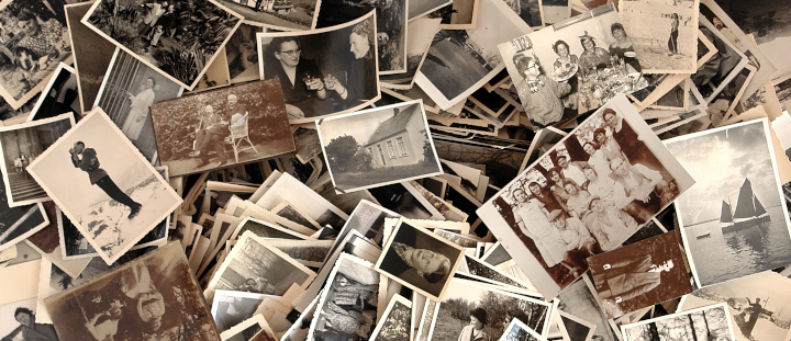
Photo purchased from … www.depositphotos.com
The Printing Industry Exchange Blog is #12 of the best 40 digital printing blogs, as selected by FEEDSPOT.
I’ll believe it when I see it. That’s the meme. (Personally I think the reverse is true as well. Once we believe something, we tend to see it everywhere.)
In this light I was intrigued by a print book my fiancee shared with me. It’s called The Commissar Vanishes (by David King), and it includes numerous versions of propaganda photos from Stalinist Russia.
Paging through this book also dovetailed with the art therapy project we had just done with out autistic students, a paper collage including images of food from the art magazines we collect as well as the students’ own drawings on the cardboard backgrounds.
Even the concept of “paste-up” (making a composite with photos, rule lines, and waxed strips of computer-typeset text and then photographing the results to make a negative and from this a custom printing plate–which is how prepress used to be done before the advent of computer desktop publishing) is based on this same “photo compositing” principle.
And then there’s Photoshop and all of its implications.
You might ask how this swirling collection of art techniques and technologies, approaches to image editing, and computer programs pertain to one another. Here are some thoughts:
Images Pack an Emotional Punch
People relate emotionally (as well as cognitively) to images far more so than to words, especially when images mirror their desires, memories, and aspirations.
We Believe What We See
We have been trained to believe what we see if the image in question is a photo. That said, photos can be retouched or composited to make something that never really happened look like an actual event. In my fiancee’s print book, The Commissar Vanishes, many of the photos have before and after versions in which various leaders are (or are not) present and various collective mobs either are (or are not) reacting to their leaders. The retouched versions provide a very different version of history than the originals. Why is this relevant? Because people believe what they see.
Back in Stalinist Russia, (as noted in The Commissar Vanishes), the photo retouchers used tiny paintbrushes and India ink to doctor up the emulsion of the photo prints. Now photo retouchers use Photoshop. (In my 49 years in the field of publications management and commercial printing I have done both.)
Photo retouchers also composited images by cutting out part of one photo and gluing it into another photo (and then often rephotographing the result to create a single negative). Shortly after the invention of photography by Joseph Niepce, a Frenchman, in 1826, women and children in the Victorian era used to composite photos (like the collages my fiancee and I created with our art therapy students) as part of a collaging and scrapbooking hobby that was very popular at the time. Why? Because it preserved their memories.
How We Present the Images Makes a Difference
For the moment, as you peruse the images on the internet and in magazines, pay particular attention to such things as color, cropping, composition, size, and the simplicity or complexity of a photo.
How you present the content of a photo makes a difference. For instance, if you alter the color of certain things we expect to be a specific hue, that will affect the reader’s perception of the image as well as her or his emotional reaction to it. These colors we’ve come to expect are called “memory colors.” They include the blue of the sky and the green of the grass.
Think about images in cookbooks in which the color of the food is slightly “off” (or different from your expectations). The right color can make you salivate; the wrong color can turn your stomach.
Or think about the content of a photo and its cropping. In my fiancee’s print book, The Commissar Vanishes, removing an angry mob of dissenting rabble from a photo makes the leader’s words from the podium seem more persuasive and also makes it seem that everyone approves.
In contrast (and from a different place and time—China in 1989), the Tiananmen Square photo of a single man staring down a line of tanks displays supreme courage and commitment. It’s not only the subject matter; it’s also the composition of the photo (what is and is not in the photo, and how everything is arranged in the photo). Although this image is more likely to be “factual” than those in The Commissar Vanishes, it was still “selected” for the power of its composition and content.
Moreover, the photo tells a story. It has a purpose. It seeks to make a point on a political and humanitarian level based on this implied narrative. If the person in front of the tank had been presented as being farther away, or in a group rather than alone, this would have affected both the overall feel of the photo and also its message.
The same can be said for non-political photos used for advertising. After all, promotional images come in all varieties, some pertaining to politics, others pertaining to things (or services) we buy or sell. In all cases (political or consumer) the goal really is the same: to evoke a specific feeling and provoke a specific action. To make people feel either good or bad (in the simplest terms) about something. To make them want to do or buy something, or want to avoid something.
Images can give an entirely different impression if there are more or fewer people in the photo, if the photo is taken up close or from far away, or if there are (or are not) distracting elements in the photo unrelated to the subject matter. And now, fortunately, such image editing programs as Photoshop (or GIMP for Linux-based computers) make the collaging process (the photo compositing) much easier. So you can focus more on the goal and less on the technical process.
Moreover, it’s now much easier to make smooth transitions between photos put together in collages so they look more realistic. For my fiancee’s and my art therapy class, for instance, I found a sample image of the Jefferson Memorial with the dome replaced by the top layer of a cupcake and with a huge spoon in front of the memorial. An artist had made the transitions between the disparate elements of the photo so seamless that the content was totally believable. My fiancee and I used the image to illustrate both Pop Art and Surrealism for our class project, but this also shows the sophistication (and hence believability) of the output of today’s image editing software.
The Takeaway
The bottom line is that with skill and practice, you can create a new reality with Photoshop or GIMP rather than just reflect the “actual” reality with which you have been presented.
And the purpose of doing this is to persuade your audience to like something, want something, or do something. You use the images to tell a story, and then when you have touched both the intellect and the emotions (especially the emotions) of the audience, your reader or viewer (or in the fine arts even the attendees at your museum exhibit) will respond—hopefully as you intended.
You can see that all of this has serious and far-reaching moral implications.
I sometimes think there’s no stronger power on Earth than promotional communications (imagery and writing), to be able to make a product or service seem appealing, unique, and something one needs to buy this very instant if not sooner.
Posted in Photos | Comments Off on Custom Printing: Photos Make You Believe What You See
Sunday, April 23rd, 2023
Photo purchased from … www.depositphotos.com
A reader of the PIE Blog posted a comment recently describing problems that have occurred in his transition of some titles from offset printing to digital printing, mostly insofar as his digitally printed halftones (and presumably any area screens) printed lighter than expected.
For my response to this reader, I assumed (from the wording of his question) that he was referring to print books produced on uncoated paper using laser printing technology (also referred to as xerography or electrophotography).
Here’s the reader’s question as well as my answer:
Question:
We have run into problems when moving titles from offset to digital. All grayscale images. Contrary to my expectations, digital print images look washed out, losing in my estimation 10% or more (so a 20% screen looks like 10%). Is this your experience? What is the best strategy for converting existing pdf file to digital print (do we have to go back into InDesign and reprocess all the images?).
Answer:
Thank you for your comment. I can usually tell the difference between digitally printed text, screens, and halftones, and offset printed text, screens, and halftones. To me digital screens and halftones just don’t seem as crisp. Also, the transitions in digital screens and halftones don’t seem as consistent (or even) as those printed via offset lithography.
That said, I have seen a lot of really good inkjet work on coated stock (usually posters). So it is probable that the uncoated vs. coated substrate (print books vs. posters) makes a difference, as does the specific digital technology (laser printing vs. inkjet).
In your case it sounds like you are digitally producing print books (which as I note may be of a lesser quality than offset printed books). With this in mind I would suggest that you request samples from your printer (to help you evaluate the technology), check into the HP Indigo electrophotographic press (a laser-based printer of very high quality that uses toner particles suspended in fuser oil), and ask the printer to gang up a number of photos you have darkened a bit in Photoshop to mitigate the problem.
Ask for suggestions as to whether to darken highlights, midtones, and shadows or just the shadows (there may be a less than even transition, and you don’t want to go from overly light to overly dark images). Making some test sheets (and even trying this test with different commercial printing shops) may help you.
I wish I could say this was simple. For print books you are already producing, your printer may be able to make simple changes to the PDF files directly in PitStop (a preflight program) without your needing to go all the way back to the Photoshop files and then reimport them into InDesign before creating the press-ready PDF files.
So the short answer is to set up a test with the print provider to measure just how much lighter the halftones and screens are than expected (i.e., as created) and then to adjust halftones globally (going forward) using Photoshop. Plus, it may be possible to adjust current halftones slightly at the printer using preflight software.
More Thoughts / More Research
After I sent my reply to the reader and posted it online, I did some more research, which I’d like to share with him and with you.
First of all, a lot of the problems reflect the difference between laser printing and inkjet, and between uncoated paper and gloss coated paper.
But first I’ll start with the reader’s probable motivation for choosing digital printing over offset printing, and his resulting need to control the density of halftones, area screens, and gradations. Most probably it was a print book with a limited press run. Such a book is more economical to print digitally because of the absence of extensive make-ready work needed for offset printing.
As another example, I have a client who needs 50 copies of a 184-page book at present. This is ideal for digital laser printing. While the unit cost of the copies will be high, the overall cost of the entire 50-copy print run will be far less than a comparable print job produced via offset lithography.
(Of course the other reason to choose digital technology is for variable-data printing, which is ideal if there must be a level of personalization from copy to copy.)
The Technology
The technology makes a difference as well. Laser printing, particularly dry laser printing (in which flecks of dry toner are attracted to the printer drum with an electrostatic charge, and then transferred to paper, and then bonded to the paper with heat and pressure) can (in my experience) become problematic because the toner flecks may not be as precisely placed with this digital technology as are halftone dots of printing ink in offset lithography. This can cause a fuzzy or ragged look to laser-printed type and images.
Plus, occasionally there are artifacts in digital printing. These are unintended specs or marks that mar an otherwise pristine halftone, area screen, or gradation. Some digital presses seem to be more prone to this than others. And some values (darker or lighter) in black and white images, or some colors in color images, seem more prone to this.
On the positive side, many high-end digital toner presses are available now. I personally like the HP Indigo, which uses toner particles suspended in fuser oil rather than dry toner particles. I have seen excellent results from this digital press, and I believe a number of other vendors have manufactured similar presses as well.
In addition, there’s always inkjet digital printing. When you look at laser printed samples, you’ll see halftone dots on a regular grid (very similar to the halftone dots of offset lithography). In both offset and laser digital halftones, the halftone dots are larger or smaller depending on the amount of a particular color needed (cyan, magenta, yellow, and black).
In contrast, inkjet-printed halftones are dithered. The halftone dots are not larger or smaller. They are all the same size (minuscule). There are just more of them in areas of denser color. So the overall gradations between colors and between values look almost like a continuous tone image (i.e., they are smoother than laser-printed images).
In short, the choice between digital laser technology and digital inkjet technology could help mitigate this PIE Blog reader’s problem with his print books.
The Paper
Paper makes a difference, too. I’ve seen inkjet printing on gloss coated stock that looks as good as offset commercial printing (just as I have seen toner-based digital printing on uncoated offset paper that is lighter than desired, with uneven gradations and occasional artifacts). The PIE Blog reader might want to experiment with paper substrates (depending on his client’s needs).
Photoshop Controls
I had encouraged the reader to select test images and print them digitally after discussing his concerns with his printer. While a simple solution may involve just darkening the images a certain amount on a consistent basis, this may not be enough. The reader may need a more nuanced solution.
For instance, it is possible to selectively increase or decrease the tones of an image in Photoshop using the “Curves” tool. This tool displays a grid with a diagonal line running from the bottom left to the top right (showing initial tones and the new tones to which you will lighten or darken them). This pertains to both black and white images and color images.
By adding control points (or points) to this diagonal line (you can find out how to do this online) and then pulling them up or down (to change the diagonal line on the grid into an “S” curve), you can selectively lighten or darken the quarter tones, halftones, and three-quarter tones of a photo. That is, you can individually tweak the various levels in a halftone image from the lightest lights through the middle tones up to the darkest darks.
The key here is to run tests (physical printouts) with your commercial printing supplier and then apply what you have learned to all subsequent halftone (or area screen and gradation) work.
One of the articles I found also showed a gray scale that transitioned in equal steps from white through grey to black in 10 percent increments. The PIE Blog reader could create a scale like this and then have his custom printing vendor print the scale on both uncoated paper and coated paper, using both laser digital technology and inkjet digital technology. Then the PIE Blog reader could make decisions for future work based on an analysis of the resulting test sheets.
The Takeaway
Here are my suggestions for those of you with a similar problem to that of the PIE Blog reader:
- Involve your commercial printing vendor early. You may even want to find an ally in the printer’s prepress department. No one will be more knowledgeable (both in general and in terms of that printer’s specific equipment).
- Create tests (inkjet and/or digital laser on various paper substrates). Based on these tests, develop a standard operating procedure to lighten or darken images in Photoshop.
- Don’t assume that such problems (with lightness or darkness of images) will be evident across all values of a halftone. You may want to selectively change highlights, midtones, and shadows using such Photoshop tools as Curves.
Posted in Digital Printing, Photos | Comments Off on Custom Printing: Problems with Digital Halftones
Sunday, April 2nd, 2023
Photo purchased from … www.depositphotos.com
In life, nothing is free. In commercial printing, if you reproduce an image (a photograph or an illustration) that someone else created, you have to pay for the limited rights to do so.
In this light one of my print brokering clients came to me this week noting that she had purchased a subscription to a service that allows her to create pretty much whatever image she wants using an online artificial intelligence application.
My print brokering client regularly prints multiple copies of a small (approximately 2” x 3”) color swatch print book (there are 28 individual master versions) that help fashionistas choose make-up and clothing colors based on their hair and complexion. She also prints copies of a 72-page set of cards (much larger, 8.5” x 11”) with a die cut for the user’s chin, to be held under the user’s face and used in conjunction with the color swatch books. The goal is to help clients look good.
My client also produces print books and ebooks to support this proprietary color scheme (keyed to the seasons), and, for the decade I’ve been working with her, she has been incorporating her own illustrations (of women of various complexions) into these commercial printing products to illustrate her color selection process.
Rights for Reproduction
So, back to the artificial intelligence images. My client called me asking the legal ramifications of reprinting these illustrations in her printed products, for which she will charge money.
I’m not a lawyer, nor do I play one on TV, but I do have 46 years of experience in publications and custom printing. So I had some suggestions.
First of all, when I was a print book designer back in the 1980s, the government education non-profit for which I worked would publish a yearly edition of a print book addressing 10 domestic and 10 foreign policy issues. The cover of the book included four large images, reflecting the edition’s highlighted issues. In addition, an overrun of the book cover became a marketing postcard distributed across the United States to sell copies of the textbook.
This was before photo CDs and before image downloads from the internet. At the time, we made an annual trek to a “picture agency” (a physical location) and provided a list of the kinds of photos (subject matter and format) we wanted to include in these two print products.
The proprietor of the picture agency would bring us sleeves of transparencies (slides), which we would review on light boxes. These were highly intriguing, unique images. We would choose maybe 20 and return to our office, promising to send back the unused, original slides (not even copies of original slides) immediately once we had made our final four selections. The original slides they gave us were so valuable as original art that one year when I sent back multiple sleeves of original slides, I had to insure the package for an exorbitant amount, something over $200,000 as I recall, since our organization could otherwise have been liable for potential loss of the package in the UPS delivery process. Needless to say, buying images now (or the rights to reprint such images) over the internet sidesteps this problem.
Rights-Managed Imagery
Each year we had a specific license called a “rights-managed” license telling us what we could and could not do with these images (the artwork, or in this case photos: the intellectual property rather than its rendering on acetate slides).
For the photo reproduction license, we paid a different amount based on the size, placement, number of reproductions (the press runs of the print products), and physical distribution of the reprinted photos (in print books distributed throughout the United States, for instance).
Some years we bought rights to additional photos we would use within the text. (These cost less.) Cover shots (we eventually decided on four each year) cost more. The number of copies of the book (and the fact that they were for educational rather than promotional use, distributed for free with our government education experience in Washington, DC) also made a difference. I’m sure the cost would have risen had we made a profit on the print books (if they had not been supplemental to the government education seminars we provided).
Our promotional use (in addition to the educational use in the print books) also made a difference. The 60,000 copies of the cover overrun printed on a marketing postcard along with sales language cost more as well.
What we got for all this money was the following. We had explicit rights to reproduce photos from around the world that were truly unique and amazing, reportage shots from war-torn countries as well as more commonplace images for our domestic issues chapters in this print book. All of the images were of the highest quality, and they were one of a kind. That is, few if any other organizations’ print books would include images like these (and certainly not the same ones).
Royalty-Free Images
I’m sure this option was around as well, but I didn’t know about it because we already had a process. Royalty-free images, which I started to see available online in the ‘90s or on CDs including huge assortments of digital art and photos, were a lot cheaper than our rights-managed images. Unfortunately, they were also were more generic.
That said, the lower cost for the reproduction license (in some cases a subscription price to use a large number of images each month with far more latitude than with rights-managed contracts) made this ideal for certain kinds of publications. In fact, when I started my own business in 1998, I used a lot of royalty-free images in the freelance design work I was doing at the time. Everything was affordable, and, as I recall, as long as I credited the company (on the printed product) from which I had bought the rights, I could alter the image if I chose to (posterize or colorize it, for instance, but presumably alter it in other ways as well).
Back to My Client
So when my client contacted me last week about using an online AI illustration generator in her work, I went through the preceding discussion with her. I also described the concept of “derivative work,” which involves altering a photo or illustration she was buying rather than reproducing it exactly as it was originally presented.
(To put this in context, back in the 1980s and early 1990s, when we were buying rights-managed reproduction rights, we never would have thought of altering the images or using them to make a political statement or to sell anything but our specific government education print book.)
Interestingly enough, my client had spoken to her lawyer (which I thought was smart), and he had said that artificial-intelligence-created imagery (which is what she now has) cannot be copyrighted because it is not produced by humans.
I told my print brokering client that getting feedback from a lawyer was a smart move. I also said that the final arbiter would be the specific image reproduction license she had purchased, which would set forth her rights and obligations, along with the duration of the contract, how she could alter the images, etc. I presumed that anything not explicitly stated in the license would be fair game, but I also suggested that she consult her lawyer about image alteration. I also made sure she would remember to credit the agency (as noted in the license) from which she was buying online artificial-intelligence services.
The Takeaway
How does this relate to you as a designer or art director selecting photos or illustrations, presumably through some kind of online service?
- Read the license carefully and abide by it. Some people, for instance, without knowing they have to pay for it, link their web pages to media owned by other people and (even if it’s an accident) wind up paying hefty settlements. Avoid this.
- Understand the concept of “derivative work.” Only alter your images if your license (usually a royalty-free license) says you can do this.
- Understand the differences between a rights-managed and royalty-free license, and know when you will want to use one or the other.
- Understand that an image may be under copyright in one country but not another.
- Consider “public domain” imagery. This is imagery that has fallen out of copyright protection or has never been under copyright protection. Shakespeare’s works (granted they are not images) were created before copyright protection existed. In layman’s terms, public domain means you can use it for free and not hear from a lawyer.
- Ideas cannot be copyrighted, only their expression.
- If you’re designing for the internet, be especially conscious of your actions. I’ve heard that some copyright owners don’t accept your apologizing and then deleting their image from your website (because someone else might possibly have downloaded the image while it was on your website).
- When in doubt, ask a lawyer.
- Finally, remember that copyright is a way that other artists can ensure that their intellectual property is not stolen or used in ways they would disapprove of. So it’s not a bad thing, just one for you to understand and be mindful of.
Posted in Photos | Comments Off on Commercial Printing: Thoughts on Photo and Art Reproduction Licenses
Saturday, February 4th, 2023
Photo purchased from … www.depositphotos.com
Photographs in your custom printing work are essentially a record of the light you witnessed. You are creating with light, making a specific artistic and/or editorial statement. Photos are never added to a publication just for their appearance.
In this light (so to speak), it is helpful to understand some terms and definitions. These will help you either take photos or select photos for the projects you design, whether brochures, banners, or print books.
Depth of Field
For the first ten years of my forty-six years (to date) in graphic design and other aspects of publications management, I shot the photos I used in my graphic design work. I used a film camera, not a digital camera, so you will need to do some online research to apply this information to digital photography.
“Depth of field” identifies the part of a photo that is in perfect, crisp focus and the part of the photo that is a little bit fuzzy. It notes the range (or depth into the picture plane) of crystal clarity, assuming all photos have a foreground, middle ground, and background.
If you are working in bright light (outdoors, for instance, photographing a group of flowers), you can set the lens aperture at a higher number (say f/ 16, or “f-stop” 16), which closes down the adjustable “screen” covering the camera lens in just the same way as the pupil in your eye closes to protect your vision in bright light.
This not only allows less light into the light sensor of the digital camera (or onto the film), but it also allows certain parts of the photo (depths into the picture plane, as noted above) to be in sharp focus or out of focus.
Why would you want to do this? Because it allows you to select the part of the photo you want the viewer to focus on, the subject of the photo, while ignoring or giving less attention to other parts of the photo.
If you’re photographing a bed of flowers (to reference the example noted above), you can highlight one flower and make those flowers closer to the viewer and those farther away less prominent, since they will be out of focus. You can also do this when photographing a person, a model.
From a mathematical point of view, the more closed down the lens can be (to allow less light to enter), the more inclusive the sharp focus will be (the larger the area from crisp focus in the foreground to crisp focus deeper into the background). For example, in this case the camera lens setting might be f/ 16 or greater (maybe even f/ 32). This, of course, requires more light, either natural ambient light or light from an electronic flash.
Going in the opposite direction and lessening the depth of field would require you to “open” the lens more (as the pupil of your eye opens more in lower lighting). An open lens (perhaps f/ 1.2) would make the area of crisp focus (which you could change the position of, within the picture plane, using the focusing control of the camera) be less deep.
High-Key and Low-Key Photos, and Contrast in Photos
Photos make a statement of some kind. Depth of field allows you as the photographer to choose what your viewer will look at. Other tools will do the same or similar things, even leading your viewer to feel a certain way about a photo in a print book or other publication.
In this light here are some terms to consider.
A “high-key” photo is one with predominantly light areas (or white or lighter toned pixels when viewed as a “histogram” graph in an image editing program like Photoshop). To the eye, such a photo just looks very white or bright, if it is either in black and white or color. This can suggest the bright, pristine white of early morning sunlight, for instance. The opposite is a “low-key” photo (in which the Photoshop histogram leans toward the darker tones). This might suggest the more subdued feel associated with sunset.
Closely related to this is the range from high contrast to low contrast within a photo. At noon, the sun casts intense shadows. A photo of a rock outcropping in the mountains, for instance, will have deep shadows and almost completely white highlights. It will be of high contrast. You can do the same thing indoors with an electronic flash (or multiple electronic flashes), with the deep shadows making a man’s face seem more masculine and chiseled.
The alternative would be an image with less contrast. Ambient light (natural light outdoors not augmented by electronic flash) in the afternoon can make a model look softer and more approachable.
As with depth of field, creating images with greater or lesser contrast, or photos that are high or low key will allow you to make a statement about the subject matter. That is, you can lead the viewer to perceive the subject in a certain way and/or have certain feelings and make certain judgments about the subject, all by changing its presentation based on the effects of light.
Electronic Flash and Studio Lighting
A book could be written about this subject. This is just to get you started. Also, you can employ studio lighting techniques away from the studio, using an electronic flash attached to the camera. This will increase the number of ways in which to present your subject (perhaps highlighted and therefore more dramatic or with more subdued light and therefore more approachable).
When I started at the non-profit government education foundation at which I eventually became the art director/production manager, part of my day was spent on Capitol Hill taking photos of students in seminars with senators and congressmen. I had a bounce flash, which I attached to a bracket on the camera. I could tilt it up and bounce the light off the ceiling, which would soften the light that fell upon the people I was photographing. Or I could point the flash directly at the students and legislators. I could also vary the intensity of the light the flash produced, and I could adjust both the camera shutter speed and aperture (see above description of depth of field).
Overall, I could make the lighting more dramatic or more subdued, depending on the tone in which I wanted to cast the subject matter. I even attached a white index card to the bounce flash with a rubber band so I could bounce the flash (the card would deflect the light) if the ceiling were too high.
If I were to replicate these lighting options in a photo studio with large, floor-standing studio lights, I might make the following decisions:
- I might use one flash on the camera and then a fill flash or fill light in the room, separate from the camera. The light on the camera might illuminate the front of the model’s face, while a light on the side of the model might cast other shadows and highlight additional portions of the model’s face (like the cheekbones). It might also make the overall face look more dimensional and less flat than what one light would create.
- I might avoid positioning lights below the model, since this could make the model look ghoulish and scary.
- I might avoid shooting the flash near a window or mirror, so as to avoid a reflected glare.
- I might choose to photograph the model with light coming only from one side (at a 90 degree angle) to subtly accentuate the shadows of the face.
- I might illuminate the model only from behind to create a silhouette effect.
- I might use a “softbox,” a lamp covered with a diffusion screen, to scatter the light and soften the look of the model.
Studio lights would make this easier, since I could see the lighting effect before tripping the flash (less easy to see, since it’s there only for an instant). To the best of my knowledge, studio lights today can be turned on, illuminating the subject, and can then be flashed for an instant for the photograph, to increase their intensity for a good exposure.
The goal of all of this is to brighten the subject and increase the detail created by precisely positioned illumination, without creating harsh shadows. Depending on the equipment, you can either do this in a photographic studio or out in the field (with a flash), without needing to artificially doctor up the image in Photoshop. And in all cases, the goal is to use light creatively and precisely to add a mood or tone or in some other way make a statement about the subject of the photo. And this artistic statement can reinforce the tone or message of the print book, large format print banner, or anything else you’re designing.
Posted in Photos | Comments Off on Commercial Printing: Creating Photos, Recording Light
Sunday, September 25th, 2022
Photo purchased from … www.depositphotos.com
When I was 14, I took a course in photography. It was 1972, so we didn’t have digital photography yet, and everything was based on light and chemistry. Our homework was to take the photos; our classwork was to develop and print them.
One of the things we learned how to do was to “spot” images we had printed on the enlarger. That is, we used an ultra-small, round brush with various inks (or dyes, actually), which we applied spot by spot on the emulsion of the photo print to correct flaws. Fortunately our work was entirely in black and white, since I can’t imagine doing such detailed work using colored inks or dyes.
Keep in mind that photos used in commercial printing are turned into halftones prior to the presswork. (That is, grids of equally-spaced small, medium, and large dots simulate more or less ink coverage and continuous tones, since offset lithography can only print “ink” or “no ink” rather than lighter or darker ink of the same color.)
In contrast, the retouching work I was doing was to correct continuous-tone images produced with silver halide crystals that had been exposed to light. To picture what this looked like, you might want to examine the output of an inkjet printer, in which the ink spots are all the same size, but there are more of them in areas of heavy ink coverage. It’s not exactly the same, but it’s close.
How It’s Done Now
To put all of this in perspective, during the intervening years between 1972 and 2022, we invented digital photography, so all of the retouching I was doing as a 14-year-old has migrated to Photoshop. A lot of the retouching work has been automated, but I have also done my share of detailed work with a virtual pen or brush on my computer. The goal has been the same: to work slowly under high magnification using a small brush. Fortunately we now have the concept of “Undo.” Back in 1972, if I made a mistake, I couldn’t revert to my last saved version, and scraping away spotting dye with a razor blade risked my scratching off the emulsion of the paper.
From Spotting Prints in 1972 to Painting Out Mold on a Poster in 2022
Within this context of photo prints, traditional vs. digital photography, and photo retouching, my fiancee came to me this week with a poster that had been in the garage for (probably) way more than the 18 years we have been together. In fact, it had been commercially printed for a Witkin Museum exhibit in New York in 1981, and the museum itself has apparently been defunct since the ‘90s.
Since the poster had been in the garage for so long, without a frame, in heat and humidity, it had visible mold spots and two tears in the paper. My fiancee remembered that she had loved the image, and she asked me to retouch it. (In part this was because neither she nor I could find a replacement copy of the poster anywhere on the internet.)
Retouching the Poster
I knew the poster would become valueless (financially) once I retouched it (by adding paint to an already printed poster). However, I also knew that my fiancee would have a visually improved poster that would make her happy.
The tears I could fix relatively easily from the back of the poster (a duotone, maybe 2 feet x 3 feet in size, of a child coming out of an egg) using linen tape. Linen tape is alkaline rather than acidic. Therefore it does not turn brown or become brittle after several decades.
This is actually a good concept for you to grasp if you’re a designer or buyer of commercial printing, because you may need to print a job that you want to last a very long time. Choosing what is called an “archival” paper, one that is alkaline, will make all the difference. (Look closely at books from the 1800s that are pristine, and compare them to paperback novels from 1970 that are yellowing and becoming brittle.)
My next step was to choose the paints. First I thought about using watercolors. These I could apply in thin washes, so I could build up areas of color gradually. However, I realized they would be impermanent: able to flake off or be reactivated with the slightest drop of water. Moreover, instead of painting them onto a porous background, into which they could seep, I would be painting the watercolors onto the matte or dull flood coating already printed over the entire poster.
So I chose acrylics. These I could water down to make an initial thin film, so I could retouch the poster gradually, instead of painting a thick film of color that would appear to be laid on top of the poster. And they would dry (or cure) to a permanent state (because acrylic paint actually dries to a permanent color film that can’t be reactivated by water, as watercolors can).
My fiancee had made an attempt herself, before I applied my paints. Unfortunately, she had painted in thick brush strokes and had not left subtle gradations between the original poster and her own painting work. So basically what I did was smooth out everything, making subtle changes between areas of light and shadow. I also repainted complete sections of the poster, for the most part. I didn’t leave a visible transition between my painted areas and the original print. When I couldn’t do this, I used a wet paper towel to thin the color and drag it across the poster, so it would be more transparent, revealing the original poster below.
I mentioned that my fiancee had painted a large area with a yellowish wash. But using my 12-power printer’s loupe, I could see that most of the poster contained minuscule halftone dots of cyan and black. So I was really looking at a cooler tone (a more bluish tint than the warm yellow wash my fiancee had added).
Interestingly enough, I found that white, Payne’s gray (a blue-gray color), and silver actually made a useful mixture (which could be made lighter or darker in accordance with the halftone dots on the printed poster). Then I used primarily white (“stippled” or added as tiny dots with a tiny brush) to obscure the brown mold stains in the whiter background of the poster toward its outer margins.
What We Can Learn from This Case Study
How can touching up a silver halide continuous tone photo and painting acrylics on an already printed poster be relevant to a contemporary graphic designer or commercial printing buyer? Here are some thoughts:
- Be mindful of what you are printing on. Printing ink will seep into an uncoated sheet. This will dull down the color. However, you may want that effect. In contrast, ink will sit up on top of a surface coating like that of a matte, dull, or gloss custom printing sheet. The halftone dots will be crisper, and the colors will be more vibrant. This may be the effect you want. (Neither uncoated nor coated paper is the correct choice; rather, it’s important to understand the different effects each will yield.) Consider the porosity of the substrate as well as its base tone (yellow-white or blue-white).
- Learn how to judge colors from either the halftone dot structure on an already printed poster (or other print job) or the color composition under the “info” cursor in Photoshop (i.e., understand the percentage mix of CMYK inks). This will help you adjust the images on the computer to remove a color cast. It will also help you retouch an image (let’s say you’re working with old photos that have been damaged, and you need to use Photoshop to recreate some detail that has been lost).
- If you’re doing digital retouching in Photoshop, be mindful of the opacity setting. (Can you see through the color or tone you’re adding?) Work at a large magnification, and then check the image at 100 percent size (some flaws will be below the threshold of visibility). Work slowly and delicately, and consider adding transparent colors in layers to achieve subtle transitions between what is already there and what you’re adding.
Posted in Photos | Comments Off on Commercial Printing: A Photo-Retouching Case Study
Sunday, October 10th, 2021
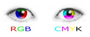
Photo purchased from … www.depositphotos.com
I learned something today. A colleague of mine emailed me saying her book designer planned to save all photos in RGB rather than CMYK format. My colleague asked my opinion. So I did some homework. (more…)
Posted in Photos | Comments Off on Custom Printing: Save Photos in RGB (Not CMYK) Format
Wednesday, October 6th, 2021
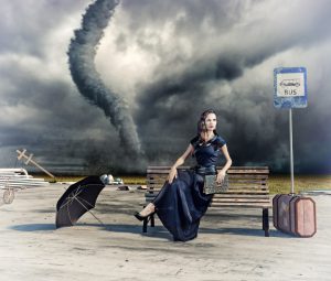
Photo purchased from … www.depositphotos.com
If you look at the photo above, you’ll see a catastrophe in the making, a tornado just about to strike. It’s a powerful image. It also captures the emotions you might experience if you choose a bad photo for an important promotional piece. Believe me. I have made the mistakes noted below. (more…)
Posted in Photos | Comments Off on Custom Printing: Selecting the Best Photos for Publication
Sunday, February 21st, 2021

Photo purchased from … www.depositphotos.com
The Problem with Photos
There is a truism, somewhat unflattering in its wording: “garbage in, garbage out.” In commercial printing, whatever you start with in the way of photographic imagery, once you have digitized it (if it starts as a printed photo), opened it in your image editing software, placed the resulting TIFF photo into InDesign, and then handed off the file to the printer for imaging to the press plate, the image has degraded–at least a bit. Printing it on a paper substrate will degrade the image a bit further. Because of this, it is essential that you start with the very best image possible. (more…)
Posted in Photos | Comments Off on Custom Printing: A Few Tips for Enhancing Your Photos
Tuesday, March 24th, 2020
With the Coronavirus threat upon us, I have had extra time recently, so I have taken this time to brush up on my knowledge of commercial printing. I thought I’d start by reviewing my textbooks on color prepress and custom printing.
In this light, I chose the subject of halftones. I thought my findings might be of interest to you. (more…)
Posted in Photos | Comments Off on Custom Printing: A Few Random Thoughts on Halftones
|
|