Printing Industry Exchange (printindustry.com) is pleased to have Steven Waxman writing and managing the Printing Industry Blog. As a printing consultant, Steven teaches corporations how to save money buying printing, brokers printing services, and teaches prepress techniques. Steven has been in the printing industry for thirty-three years working as a writer, editor, print buyer, photographer, graphic designer, art director, and production manager.
|
Need a Printing Quote from multiple printers? click here.
Are you a Printing Company interested in joining our service? click here. |
The Printing Industry Exchange (PIE) staff are experienced individuals within the printing industry that are dedicated to helping and maintaining a high standard of ethics in this business. We are a privately owned company with principals in the business having a combined total of 103 years experience in the printing industry.
PIE's staff is here to help the print buyer find competitive pricing and the right printer to do their job, and also to help the printing companies increase their revenues by providing numerous leads they can quote on and potentially get new business.
This is a free service to the print buyer. All you do is find the appropriate bid request form, fill it out, and it is emailed out to the printing companies who do that type of printing work. The printers best qualified to do your job, will email you pricing and if you decide to print your job through one of these print vendors, you contact them directly.
We have kept the PIE system simple -- we get a monthly fee from the commercial printers who belong to our service. Once the bid request is submitted, all interactions are between the print buyers and the printers.
We are here to help, you can contact us by email at info@printindustry.com.
|
|
Archive for the ‘Packaging’ Category
Saturday, August 26th, 2023

Photo purchased from … www.depositphotos.com
The Printing Industry Exchange Blog is #12 of the best 40 digital printing blogs, as selected by FEEDSPOT.
The purpose of a box is to “contain.” Boxes, or cartons, keep together all component parts of whatever you’re shipping. They also sell your brand. To do this, they have to look good.
In this light, my fiancee found a corrugated box this week for Spoonful of Comfort. It is simply designed, with text and (what looks like) a woodcut image of a rooster bleeding off the bottom on two sides plus the branding (the name of the company in a box-rule overlaying the rooster images). On one panel is a text-only logo (Spoonful of Comfort) taking up a space about 3” x 5” wide.
All of this is printed in black ink only, directly on the brown kraft paper of the corrugated board. On the final exterior panel is a notation that the contents were packed with care and that someone is thinking of you. This feels very laid back and personal, probably because of the old-time look of the box (the woodcut rooster) and the very readable type.
Ironically, even though there is a flourish (a floral squiggly rule line) on either side of the “of” in the logo, the type still looks somewhat modern. The text is letterspaced (spread out slightly) in three different modern or contemporary typefaces, but they look old because of the black-only treatment, the flourish, and one small raised letter. (The second “o” in “Comfort” in the logo is small and slightly raised, with a graphic mark under the “o,” although it still aligns with the top of the other capital letters.)
So the long and short of this is that by combining the look of the Old West (the rooster and the capitalized, almost “chiseled” letters) with some modern treatments, the logo and the box in general look timeless (old and new simultaneously), comfortable, and personal.
That’s no mean feat with black type only on unbleached, fluted kraft board.
But the piece de resistance is the interior. The interior supports the “unboxing experience.” This is the excitement you feel when the carton arrives on your doorstep (and you pick it up before the porch pirates get it) and you open the carton in the comfort of your own home. You have an experience not unlike opening gifts on Christmas morning (or Hanukkah, Kwanzaa, and so forth). In our hearts we’re all still children.
The inside of this box is orange, with white knock-out geometric forms (mostly interlocking circles, with a white flower in every other chained circle). It reminds me of a chain-link fence the way everything connects.
In contrast to the black-only imagery on the exterior of the carton, the orange of the interior provides the “Wow” factor. Of course, this is heightened by the copy block on one panel mentioning the care that went into the package. It’s effective marketing, but it’s also quite attractive. I was interested, even though I knew the box was empty.
Printing Technology Options
Being a commercial printing nerd, I wanted to know what technology was used to print the boxes. So I started with the usual suspects:
Is It Offset Printing?
No. First of all, since an offset press would crush the “fluting” (the wavy interior paper that looks like back and forth “S”s), the only way to successfully print on the exterior of a carton via offset lithography would be to print a coated or uncoated press sheet and laminate it to the outside of the fluting. This would create a (usually full-color) image on the outside of the box. I’ve seen this done often on cartons containing liquor bottles. Then again, I’ve also seen coated 4-color printed litho paper laminated to cartons containing electronic devices from “big-box” stores.
Is It Flexography?
Flexography involves using rubber (relief) commercial printing plates to image flat corrugated cartons, usually in one color (often black). Unlike offset litho, this does not involve heavy pressure, so the process will not crush the fluting (the purpose of which is to make the cardboard cartons both light in weight and durable).
When my fiancee and I used to assemble “standees” at movie theaters, the back panels of a lot of the standees had been printed via flexography. I knew because the chalky black ink came off on my hands. Also, the graphics were simple, usually just a flood of black ink covering all surfaces not visible to the theater patrons.
Also, at least back in the 1990s when I was getting labels printed via flexography, the letterforms weren’t as precise as offset-printed text. They had “halos,” a slightly thicker or darker stroke visible around the edges of the letterforms. I know flexography has improved a lot in the past 30-something years, but this was a distinguishing characteristic (at least when the job was printed on matte litho paper).
In the case of this particular carton, I would say that maybe it was printed via flexography, although through a 12-power printer’s loupe the ink looks a little more substantial than the water-based flexography ink I am used to. Perhaps it’s custom screen printing ink (i.e., for serigraphy, a.k.a. silkscreen).
Is It Screen Printing?
Custom screen printing involves forcing thick ink through a fabric or wire screen onto a substrate. It’s good for printing boxes and printing garments like golf caps or items like messenger bags. It does, however, take a lot to set up a press run, so custom screen printing is really only useful for longer runs—like this cardboard box, perhaps. And since the orange color inside is a match color (rather than a build of cyan, magenta, yellow, and black), this would lend credence to my educated guess regarding the commercial printing method.
Is It Digital (i.e., Inkjet) Printing?
Inkjet print heads don’t touch the substrate (ink is jetted onto the substrate through nozzles on the inkjet press), so this option for printing on corrugated cardboard definitely would not crush the fluting. That said, it is a slow imaging process compared to custom screen printing and flexography (once preparation or makeready for screen printing and flexo has been completed). So for a longer press run of cartons (in this case without any variable data such as names), digital inkjet would probably not be cost effective.
In addition, if you look very closely, a sample of inkjet printing is composed of a huge number of almost microscopic dots. To my eyes the ink layer on the cardboard carton seems more even-toned than a layer of inkjet ink.
What’s My Guess?
For a very short press run I would say the technology of choice would have been inkjet. For a long run I would say that, since the design is simple with no registration of colors, this may have been printed via flexography. (Also, flexo may be more forgiving on corrugated stock than on matte litho label paper. If so, this might account for the absence of halos on the perimeter of the letterforms in the typography on the box.)
That said, since the unbleached kraft paper that comprises the carton is porous, I would imagine that a water-based commercial printing ink (such as flexographic ink) might seep into the paper substrate more and not appear to be as thick and rich, particularly the orange ink inside the carton. (That is, I’d expect ink that sits up on the surface of a porous cardboard box—like the box I speak of–to more likely be custom screen printing ink than flexographic ink.)
The Takeaway
In your own design work and print buying work, you may want to take this kind of approach to a design and print job. It’s a good habit, since it will make you articulate your goals and address what technology fits these goals best. Think about the length of the press run, the number of colors, the quality of the substrate (whether you want it to be more or less porous).
Consider whether you want to print a detailed, 4-color design or whether black (or a different single color, or two) type and imagery without close register of ink colors would be sufficient.
Do you need to personalize the boxes (by adding people’s names), or is your box part of a versioned run (with so many boxes for each separate segment of an overall promotional initiative)?
Answers to all of these questions and others will help you determine which method of custom printing to choose.
Posted in Packaging | Comments Off on Custom Printing: An Intricate Carton-Printing Design
Monday, July 24th, 2023

Photo purchased from … www.depositphotos.com
The Printing Industry Exchange Blog is #12 of the best 40 digital printing blogs, as selected by FEEDSPOT.
In the recent weeks I have received in the mail or acquired in other ways three marketing initiatives that share a few things in common. They all involve packaging that is out of the ordinary. Most involve some form of cross-media promotion, involving the internet and commercial printing media. And one (which I bought at my fiancee’s and my favorite thrift store) involves actual branding, as in red-hot iron used to burn the company logo onto the wood box.
I would say that the three share in common the marketer’s desire to wow the customer and convert her or him to a lifetime, mutually advantageous relationship, and they use multiple media and/or multiple textures and substrates not only to convey information but also to take care of the customer like a king or queen.
Smalls Cat Food
My fiancee and I recently brought a new cat into our home, a Ragamuffin. He’s big (15.9 pounds), and we want to keep him healthy. So after some extended research, we chose Smalls.
The corrugated cardboard packaging that arrived at our door was clearly printed via flexography (two-color, a yellow and black), but the drawings of the cats were adorable. Clearly, someone at Smalls had a particular appreciation for the playfulness and joy of cats, having worked several drawings into the large Smalls logotype that wrapped around the carton.
All of the language printed on the interior of the box panels was personal, describing (in a friendly typeface with words such as “you” and “us”) just how to care for the food and what to do with the package insulation. (Put it in the sink and watch the water make the cornstarch insulation product disappear.)
A print book accompanied the package. “Hi, human” was the salutation on one page. Other pages included hand-drawn cartoons, and there was a smattering of sweet cat photos. Needless to say, there was also information as to why Smalls is so good for cats and how to transition a cat from their prior food to this food. There was also a discount card (in the same yellow with the same cat drawings), plus another handout letting you know how to treat, defrost, and store cat food of this caliber.
So it was a mix of information and sales literature, but it showed a believably sincere desire to make your experience (and your cat’s experience) with Smalls (the company) and Smalls (the food) a happy, and hopefully lifelong, one.
The piece de resistance was the bagged dry ice that the insulation surrounded, within flexo-printed plastic bags that explained how to safely handle (or rather avoid handling) the dry ice. Again, clearly, the goal was to be 200 percent thorough as well as personable. The company clearly wants your cat to appreciate Smalls food for years to come.
And finally, after we had received the boxed cat food, my fiancee and I started seeing regular TV commercials about the Smalls company. You could say that was a little spooky, given the perfect timing of seeing multiple Smalls commercials just after receiving the product, but as a student of commercial printing and marketing, I was just struck by how many coordinated avenues Smalls has addressed with its cross-media promotion. I was also not surprised to see, under the circumstances, QR codes on the promotional literature. These codes send the recipient to the Smalls website for further information, brand exposure, and communication in general.
And none of this felt like a sales pitch. In fact, all of it felt like a genuine attempt to be helpful. I personally hope Smalls makes a lot of money on this highly coordinated packaging, informational, and promotional work. They deserve it.
The Branded-Wood Fish Box
Ducktrap River Fish Farm, Inc., clearly takes branding seriously. Literally. I found their fish (food, not pets) transport box at my fiancee’s and my favorite thrift store, so I snapped it up, presumably for use in an art project. But then I started to notice its promotional approach, and my interest was piqued.
The words and logo image (a trout, I believe, although I could be wrong) are burned into the wood in the top left corner. The brand has texture (debossed letters) and a charred tone that extends past the letterforms and the fish. So it really looks a bit like the backside of a branded cow (as grisly—and intriguing—as that may sound).
Inside the box is a sheet of printed wax paper with a one-color rendering in green ink of the logotype and fish in a repeated pattern across the wax-paper substrate.
When I looked closely and saw all of this I felt like I was in the Wild West, where securing one’s food involved more than a trip to the grocery store. I liked the feel, the connotations, and the imaginative trip to the rivers beyond the city. Presumably, the packaged product is purchased at a grocery store rather than sent to clients (as is the Smalls cat food noted above), but it projects a similar tone of freshness.
I think anyone at any grocery or specialty store selling this product will be honored to buy this fish and keep the box. And that actually benefits Ducktrap River Fish Farm, Inc., since the customer’s retaining the box all but ensures repeat buying. Who wouldn’t go back for more after spotting the box and Ducktrap River Fish Farm, Inc., logo in one’s house repeatedly?
Since I bought the box at a thrift store, I can only imagine what kind of commercial printing promotions accompanied this box in its first use. I would not have been surprised to find out that the marketers had coordinated the fish packaging with promotional literature and an internet presence. After all, when all three of these are operating in lockstep, a marketing initiative can be unstoppable.
Home Security Superstore Mace
Life is scarier than it used to be, with all the rampant crime. So I decided it was prudent to buy mace or pepper spray. Being totally ignorant of all things in this vein, I did some research online and bought one spray can for my fiancee and one for myself.
The initial contact was through Amazon, but as soon as I had made the connection, I started getting information from the Home Security Superstore. I liked the name, since I wanted to be secure, safe, and protected. I was therefore not only relieved but also impressed that the marketing team had reached out immediately to let me know what I had purchased and when to expect its arrival. Over the next day or so, I received other online promotional and informational materials describing the mace product, its use and care, and what other items might increase my sense of security.
Of course this is what any promotional literature should do. But not all of it does. The Home Security Superstore succeeded. It did this splendidly. Since I needed the product and some explanation of what to expect and how to use it, I was especially pleased and made more confident by the online promotional contact.
When the mace arrived, I even wrote a review of the process (and the sense—through the online information–that the company was right there with me, providing any support I needed). And they sent me a gift, another can of mace. So between us, my fiancee and I now have three spray cans: two big ones and a baby one.
Sales (and promotional literature) are often perceived as intrusive and heavy handed. But when you want to buy something and you need help in making your choice, it doesn’t hurt to have the experience that the company is right there—not selling to you but helping you to buy what you need.
When this can be done in a personal way, that reflects consummate skill: a useful skill, a skill that makes my life better.
The Takeaway
When I want to buy something I need, I actually want a skilled salesperson with me. Sales is not a bad word when it involves assessing my needs and then helping me to buy the appropriate item. In all three of these cases I had that experience. It was reinforced by the custom printing collateral, the packaging, the overall branding, and the link to an online presence.
Posted in Packaging | Comments Off on Custom Printing: The Unboxing Experience and Cross-Media Promotions
Monday, February 13th, 2023
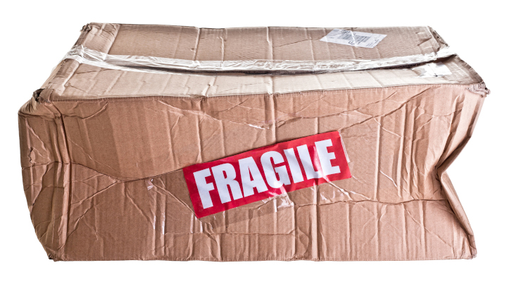
Photo purchased from … www.depositphotos.com
The picture above says it all. Let’s say you have spent months working on a perfect-bound print book, writing and editing it, maybe taking photos, designing the pages lovingly to showcase the content. Once the job has been printed and then delivered, without incident we always assume, it arrives at your office and everyone tells you how good it looks. But maybe this doesn’t happen. Maybe the job has been packed incorrectly by a new employee, or it falls off the skid and gets dinged rather hard, cutting through the cardboard packaging and smashing one or more print books. Or maybe the carton is dropped in a puddle by accident during a rain storm.
You get my drift. The job isn’t complete until you get all of the copies in pristine condition delivered to the exact location you specified. Packing and shipping are vital parts of the process, even though they are completely invisible to most people—until something goes wrong.
What to Do?
I did some research on packing print jobs in Getting It Printed a few days ago. This book by Mark Beach and Eric Kenly is my go-to text on all things about commercial printing, as it has been for the last thirty years.
Beach and Kenly note that making sure the products (print books, brochures, etc.) are not only in the boxes but rigidly secured is of utmost importance. And they need to be horizontally stacked, not vertically stacked. This avoids bowing, I would think, although I’ve always seen envelopes (particularly large 9” x 12” booklet or catalog envelopes) packed vertically.
Regardless (and your commercial printing supplier will know for sure), I think the goal is to work within the laws of physics. If a packaged product will want to move in a certain way in a box or carton and is allowed to do so, its weight coupled with the movement of the carton will cause problems. Make sure it behaves as you want it to, so when you get to the last box of pocket folders, for instance, they are standing upright and are flat and rigid.
Protective Coatings
Scuffing is another issue to avoid. When I was a designer and then an art director, I always used to coat print book covers, pocket folders, and anything else with a heavy coverage of ink. Whether it was aqueous coating, UV coating, or film or liquid laminate, this coating would protect the printed products in transit in the carton.
Shrink wrapping is another good option that Getting It Printed mentions. You can either shrink wrap the items individually (if your job is a long perfect-bound print book, for instance), or you can group items in specific numbers (or “conveniently,” which means your commercial printing supplier can decide how many to group together).
In lieu of shrink wrapping (and you can always ask for the cost of these different approaches when you’re bidding out your job), you can put slip sheets between individual items or groups. A slip sheet is just a piece of paper that keeps two adjacent printed items from rubbing against each other. Or you can paper band stacks of printed products together or even rubber band items together.
The Cartons
Durability of the cartons themselves is also an issue to consider. They need to be able to take a beating. I’ve never done this, but I know you can specify double-wall cartons, which, as their name implies, add another layer of protection.
A related choice I did make when specifying case bound books for one of my clients was to have the printer shrink wrap the individual books and then insert them into “bumper-end mailers.” These had cardboard extensions made specifically to absorb impact, much like the bumper on a car. Before the print book could sustain damage (not only in transit from the printer but in mailing to the customer as well), the bumper-end mailer would absorb the concussion. Again, it helps to consider the laws of physics.
Skid Packing
Handling the packed cartons as a unit (instead of as 50 individual cartons, each containing 20 books) is important as well, according the Getting It Printed. Laying the cartons on top of each other, overlapping like bricks, strengthens the stacks and keeps everything together and stabilized. Also, remember to pack the heaviest cartons on the bottom. Strapping the cartons and shrink wrapping the cartons to the skid also help.
For about five years when my fiancee and I were installing banners and standees at movie theaters, we also had a side gig working for Chanel. We installed exhibits for make-up application, and this included assembling banner stands and other graphics as well as furniture. Needless to say, the contents of the two skids (also known as pallets) we received for each Chanel installation weighed 1,000 pounds or more (comparable to a skid of print books in cartons).
It actually added to my education in commercial printing to learn how to pack a skid, wrap a skid with clear plastic, operate a motorized pallet mover, and operate a freight elevator. All of this experience and information was directly pertinent to the packing and transport of cartons of print books or any other printed product.
Among other things I learned was that everything had to stay dry. This is also true for a skid of cartons of books, perhaps doubly so, since print books and the paper they are made of behave like sponges. The plastic skid wrap sheeting we used (imagine wrapping a skid with saran wrap) is particularly helpful if your books will be in a fulfillment house for a long period of time, since this wrap does keep moisture from getting to the cartons of printed products.
Labeling
Particularly if your print run is long and perhaps destined to be parceled out over an extended period, you may need a fulfillment house. If so, you will want to note on each carton (and on each skid, using a “pallet flag,” which is essentially just a notation on paper) exactly how many cartons the skid contains, and how many books, pocket folders, etc., each carton contains.
Therefore, all of the cartons, except for one, presumably, need to contain exactly the same number of products. The remaining carton, labeled as such, will contain the smaller number of items that rounds out the total.
Then you will want to note all of this on each carton and on the skid in general, so an accurate inventory can be taken at the fulfillment house, and so the pick-and-pack fulfillment people can collect and repack groups of items to send to paying customers.
All of this information can be as simple or as complex as you want, depending on your needs. Getting It Printed notes that in many cases, simply taping a copy of the printed item (perhaps a brochure) to the box is enough. In other cases, for a book publisher, for instance, there may be specific language plus a bar code and even in some cases a QR code to reflect the title, publisher, and perhaps the cost. In this case, information stenciled on the cartons or even printed labels would be needed.
The goal is to decide all of this early and to provide art files the commercial printing supplier can use to add labels, stencils, or even just handwritten notes on the cartons, so everything will be in order once the job has been packed and delivered.
This is one reason, for instance, that I have never been able to get a printer to just finish up maybe two or ten cartons of print books and then deliver or mail them early, while the rest of the print job is finished and packed for transit. Things (including packaging a handful of books) done piecemeal are often done wrong. Or they slow down the job instead of buying time. Actually, one printer was willing to send out an early, partial shipment, but the process would have cost an exorbitant amount and would have wrecked the schedule.
Weight of Cartons
UPS and the US Post Office, as well as other carriers, presumably, have weight restrictions. Your printer probably will know these, but it’s smart to check. If the goal is to treat a carton of printed products as a unit, it defeats your goal to need to have a carton opened, have some items removed, and then have it resealed, just to meet delivery requirements. So plan ahead.
It’s also very important to know how wrapped skids will be delivered. Does the receiving destination have a loading dock? That is, will someone with a forklift or pallet mover be able to drive or walk directly from the loading dock into the back of the delivery truck (at the same level) to retrieve the skids? Or will the delivery truck need to have a lift gate (a little elevator on the back of the delivery truck to lower the skids to the ground). If the latter is the case, will the skid-packed job need to be disassembled and delivered as individual cartons by hand, on a hand-truck, through a building and up the elevator? Obviously this will cost you more because it will involve a lot of extra hand work and heavy lifting.
The Takeaway
The takeaway is that you should consider all of these variables before you hand off a request for quote to your commercial printing vendor. Specify them in detail. Discuss everything with your supplier. The details will dramatically affect your final delivery cost.
Moreover, the details will make the packaging portion of your job, which is the most important part in many ways, ensure that each individual printed item looks as pristine and wonderful the day it is received by the end user as it looked coming off the press and out of the bindery.
Posted in Business Cards, Packaging | Comments Off on Custom Printing: Packing, the Final and Perhaps Most Important Step
Sunday, December 4th, 2022
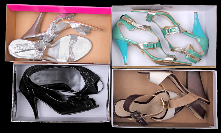
Photo purchased from … www.depositphotos.com
My fiancee and I recently went to Nordstrom Rack for shoeboxes. We’re working with our autistic art therapy students to make Halloween dioramas. They will be miniature rooms with a coffin, spider webs, rats, skeletons, plus any drawings the students wish to add.
As a student of commercial printing, however, I noticed the attention to quality and detail in the construction of the empty shoeboxes. We found about thirty of them for our various classes, and two of them in particular stood out from the rest. I’d like to talk about why they are effective marketing items beyond the shoes they once contained.
Marketing Is a Dialogue
Good marketing is a dialogue. It is personal, even intimate. A brand speaks directly to you. If the company has done research into its clientele, its marketing department will be able to describe exactly who the target buyer will be. This person will have specific likes and dislikes, interests, values. They will share many of these with other buyers and may even have certain similarities in their personal history. The detail of this “persona” is impressive, given all the data the company must collect and digest to envision this model buyer. But the good news is that the marketing research will allow a brand (let’s say in this case a shoemaker) to predict exactly what kind of shoes you will want and to give them to you.
Based on this information, the company (i.e., the brand) will work to communicate its brand values, with which you will presumably resonate. This is true (in the case of the shoeboxes) for both the product and the packaging. The shoes have to be outstanding. Granted. But the packaging has to convince you to open the box (the “unboxing experience”) and try on the shoes.
These brand values, which perhaps will include the quality of workmanship, the stylish nature of the shoes, the social conscience of the company, or on an even more personal level just how good you will look and how you will feel when you wear the shoes—all of this has to be reflected in the packaging (the box) as well as the shoes.
Apparently Nordstrom Rack (at least this one store) recycles more than 300 shoeboxes a day. When my fiancee and I went inside for the boxes, we saw aisle after aisle of shoes, multiple hundreds of boxes vying for the buyer’s attention. Since the shoeboxes have sides that obscure the shoes themselves (a little), a lot was riding on the unique nature of the boxes to sell the products inside.
The Sample Boxes
The first sample box I want to describe is entirely covered with a 4-color comic strip (top, bottom, and all exterior sides). It is a Jeffrey Campbell shoebox covered with empowering and empowered women superheros, including one on a motorcycle and one in space in a meteor shower. It is like a comic strip because one hand-drawn image is set off in a black-edged box, with word bubbles for the character’s dialogue, and there are also other signs and word-bubbles across the surface of the box.
I personally know nothing about Jeffrey Campbell shoes. (I’m sure my fiancee knows a lot, since she is very stylish and knows brands well.) However, with no knowledge except my initial reaction to the box and the words “Women Unite,” Resist,” and such, plus the space imagery and bright colors, I would say that the company’s brand values include not only empowerment but also humor. And humor sells. Most people want to “associate” themselves with (to be “affiliated with”) a product and company that embody these specific values, and the job of the shoebox is to communicate these values.
If you open the box and look closely at its construction (the lamination of the commercial printing press sheet over the thick chipboard), you might say that the company or brand pays attention to detail (in general) and durability (in particular). Not all of the boxes in the store would meet this standard, both for quality package manufacturing and creative, unique graphics. So this goes a long way.
The second box is lime green. In fact, my fiancee picked out a number of boxes in this specific color for our students. When we walked down the aisles looking for empty boxes, these in particular jumped out because of the thick, heavy ink coverage of the lime green, which was almost fluorescent in its luminosity. A box like this is distinctive. In a store with multiple hundreds of boxes of shoes, that’s very important.
As with the first box, the thickness of the chipboard broadcasts durability and quality. Like the first box, the green commercial printing press sheet (with only a white, hand-lettered Sam Edelman script signature and logo on the green) totally covers all chipboard in the box (in contrast to a lot of other boxes in the store). Again, to me this reflects the brand’s attention to detail and overall quality. All edges, folds, and corners are crisp and precise, with the laminated paper square to the sides of the box.
What makes this box unique is threefold. First, as noted, you can see it from across the store. That’s good advertising. Sam Edelman chose not to compete with other brands for the customer’s attention but rather to grab it immediately with the color of the box. Second, the surface of the lime green box has a canvas texture, like a painter’s canvas. It feels good in the hands. You can easily grasp the box. And it also feels strong and rigid.
But to return to my assertion that good marketing is a conversation, the “piece de resistance” is an envelope containing a little saddle-stitched print book included in the box with the shoes.
Here’s why it’s unique.
First of all, the envelope is about 2” x 3”. It has a build of about 1/3” on all sides, allowing for the easy insertion and removal of the print book it contains. The lime green background of the box continues onto this envelope and book, with only a Sam Edelman signature reversed out of the green envelope and the book cover. The booklet is printed on bright blue-white paper, so the words and images “pop.”
There’s something personal about the size of the print book. No one else would know you’re reading it, it’s so small. And inside there are hand-drawn images of a man (Sam, presumably Sam Edelman himself) and a woman (the shoe buyer, Libby) engaged in a dialogue.
All of the dialogue between the two of them (set in a small, sans-serif typeface) centers on where the shoes were made, how they were made, and why they are special. At one point Libby even says, “And because of this I want to keep them forever. Shoes say so much about a person.”
As a reader, I’m the proverbial fly on the wall looking at watercolor images of Sam and Libby while listening to their discussion. Some of the illustrations are even accompanied by hand-lettered callouts describing the Sam Edelman shoes.
Overall, it’s an intriguing and personal conversation. And even though I don’t buy women’s shoes I can appreciate my fiancee’s love for this entire packaging initiative. It shows that a brand can do enough research to understand its buyers and deliver a unique product that will satisfy them and help them look beautiful.
The Takeaway
What can we learn from this?
- Consider this approach. If you wanted a job at a particular corporation, you wouldn’t just mail in your resume. You’d probably study the company’s website and annual report. Maybe you’d visit the company to see what you could learn. You would try to absorb as much as possible about the company to see how you could specifically contribute (or “add value”) to its operations. A good marketer will do this, too, even with a shoebox. Who is the client? What does the client like and dislike? What can a brand create (both product and packaging) that will please the client? In my view, these two shoeboxes reflect this kind of soul searching into what both brands can offer that is unique.
- After a brand is able to articulate the nuances of a buyer’s persona, the brand’s goal is to reflect all of this not only in the product (shoes, in this case) but also in all marketing materials, making relevant design decisions in everything from typefaces to paper choices to color. Every time the buyer interacts with the brand (through signage, a brand’s online presence, catalogs, even “frictionless” interactions with the company’s call center), the brand’s ethos must shine through. That is separate from, but intricately intertwined with, the overall quality and specific attributes of the product.
- As a marketer, it is your responsibility to initiate and maintain such a conversation with your customers.
Posted in Packaging | Comments Off on Custom Printing: A Unique Shoe (Un-)Boxing Experience
Monday, October 3rd, 2022

Photo purchased from … www.depositphotos.com
My fiancee loves Amazon. She can push a button on the computer, and one box or several boxes will come to the door. Amazing.
So when my fiancee makes a comment about packaging, boxes, and custom labels, I listen closely.
What Is Branding?
This is really a case study about branding. Then again, everything is about branding. Even when a company’s only touch point with a client is a box arriving at their door, a vendor must provide an enjoyable experience and must then repeat this experience in successive purchases. It’s part of their brand.
And what a brand is, essentially, is all of the values and associations reflected in everything from the company’s ads and marketing materials to their packaging. Even the tone of the person you get on the phone when the company sends you the wrong item, and the good feeling they work to instill in you when they solve your problem in their first attempt, is part of the brand. Everything is part of the company’s brand. For Starbucks, not only is their two-tailed siren logo part of their brand, but by now even the specific shade of green in the logo is part of their brand.
The Unboxing Experience
I’ve discussed this in prior PIE Blog postings, but it bears repeating. When a box arrives at your door, the experience of opening it matters. According to my fiancee, Amazon has been sending a number of her packages in brown, recycled-looking boxes recently, presumably to remind consumers that the company is environmentally conscious.
My fiancee recently received a specific soil for a collection of rare succulents she is growing called Living Stones (as in “Dr. Living Stone, I presume”–sorry, I couldn’t resist). When I brought the package into the house, the weight prompted me to ask whether my fiancee had ordered bricks. But no, this is soil. Beyond the Amazon packaging, the succulent soil experience encompasses a number of other promotional qualities.
Flexible Packaging
The bag of soil is transparent and durable. You can see the texture of the potting mix (exclusively tiny stones of different colors, no actual dirt). You can also see that the plastic sack will not inadvertently rip open and dump the contents on your rug. You know what you’re getting, and you know the company that sent the bags values quality.
The Label
The label on the bag includes the logo (for immediate identification of the maker of the product), as well as the name of the product (“Premium Lithops Living Stone Potting Mix”), and a description of the product (“Natural Quartzite, Pumice, Sand, Granite Grit, Calcined Clay”). Plus, the custom label notes that the product is “100% natural and organic,” and that it “helps prevent pests, diseases, and contaminants” (www.rootingforyouplantnursery.com). All of these statements are rendered in a tall, narrow gothic sans-serif typeface in all capitals, reflecting the no-nonsense tone of the information. Clearly the company wants you to buy and use the correct product for these fragile Living Stone plants.
Prominent Contact Information
Finally, and most importantly, the Rooting For You company included not only its logo but also a link to its website. This reflects a number of important things. You can contact the company. It’s like the catalogs I was designing in the 1990s, when I was an art director. I made sure the phone number was on every page spread. Don’t make the customer wait. When they want to contact you to reorder more product, you want that experience to be as “frictionless” (as marketers say) as possible. Customers shouldn’t need to look through the printed materials for contact information. It should jump out and bite them.
Why is this important? Among other things, I’ve been brokering commercial printing for over two decades. I have learned to love the sweet sound of an email arriving from a repeat customer (“ping”). Getting new customers is much harder than doing whatever it takes to keep existing customers happy. And having immediate access to a website (and from there, presumably, to a phone if desired) is part of that frictionless experience. Having all of this information immediately accessible on a simple, elegantly designed, custom printed label goes a long way in communicating the necessary information.
To go back for a moment to the website information, I am reminded of the power of multi-channel marketing, or cross-media marketing, or whatever the current terminology might be. Commecial printing augments the online experience, and online marketing reinforces the print experience. Together they are unstoppable. Having well-branded labeling with the company logo and all relevant information visible from four feet away leads the customer to the URL and the website. And the website gives the customer an opportunity to either order more of the same product or to buy additional products. This benefits the brand but only (and this is the beauty of the equation–absolutely only) if the customer values the product, the print collateral, the website, the assistance on the phone, the carton and the “unboxing experience,” and every other “touchpoint,” every other element of the producer’s brand.
The Thank-you Note
When we’re young, our parents teach us to express gratitude when something goes right. It makes a connection with the donor of the gift or experience and its recipient. Everyone gains something. Interestingly enough, in the package of Premium Lithops Living Stone potting mix my fiancee gave me to check out, there was an additional insert, a thank-you note printed on heavy cover stock. The stock is thicker than regular postcard material. It has “snap.” It feels substantial. You would assume the potting mix vendor had spent a little more to make the postcard feel opulent. After all, you’re worth it.
The thank-you note speaks right to you, “We hope you enjoy your purchase” (www.rootingforyou plantnursery.com). On the flip side is the logo: large, in nice earthy colors. The name of the company is in an informal script typeface, and the other words are in a funky sans-serif typeface. You get the sense that Rooting For You loves plants and wants to help you love and care for them as well. Moreover, you get the sense that they don’t take your business for granted. They are grateful for the opportunity to serve you.
Good Marketing
All of this can be–and in this case absolutely is–conveyed through simple type, a transparent and durable container (known as flexible packaging), and a simple thank-you note. And with all of the contact information immediately available, you know right where to go when (not if) you want to reorder.
Now that’s good marketing. And (given my fiancee’s satisfaction with the product), it’s based not only on effective marketing technique but more importantly on the producer’s genuine desire to make the customer so happy with the whole process that she or he will want to come back for more.
Posted in Packaging | Comments Off on Custom Label Printing: Thoughts on Packaging, Boxing, and Labeling
Tuesday, April 27th, 2021
I just read an intriguing article on www.packagingeurope.com (2/13/18) entitled “ToBeUnique: Packaging Becomes Interactive Thanks to StealthCode® Technology.”
Basically, the article is about a new technology created by Tubettificio Favia that turns “aluminum tubes with StealthCode® technology…into a precious tool of corporate storytelling.” (more…)
Posted in Packaging | Comments Off on Custom Printing: Packaging and StealthCode® Technology
Wednesday, December 2nd, 2020
My fiancee and I were in the grocery store a few days ago, and I noticed two packages of brown Jasmine rice. The packages had the same art, typeface, design, etc., but the colors were different. It was only a slightprinted variation. Perhaps no one else would have seen it. But I did, and I pointed it out to my fiancee. (more…)
Posted in Packaging | Comments Off on Custom Printing: Inconsistent Color in Package Printing
Thursday, November 19th, 2020
When I was growing up, peanuts came in a can or a bottle, or sometimes a clear bag. Milk came in a glass bottle and later in a coated paper carton that opened up into a spout. There was no such thing as a bag of apple sauce or a box of apple juice with a little straw you punched through a foil covered hole. (more…)
Posted in Packaging | 2 Comments »
Saturday, October 31st, 2020
Not that long ago (perhaps the 1990s to 2000), I remember sending out perfect-bound book printing jobs that took six weeks to produce and brochures that took five to seven (or even ten) days to print and deliver. That was the norm. Everything was analog (offset lithography). No one said the printers were slow because we had nothing digital to which we could compare the analog work schedules. (more…)
Posted in Packaging | Comments Off on Custom Printing: The Future of “Web to Pack”
Monday, July 27th, 2020
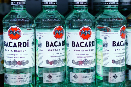
reproduction rights purchased from … www.depositphotos.com
When BACARDI does something, people pay attention. As a contemporary brand, BACARDI is stylish and sexy–on the cusp of the future. (more…)
Posted in Digital Printing, Packaging | Comments Off on Custom Printing: Bacardi’s Direct Digital Bottle Printing
|
|