March 5th, 2023
Posted in Paper and finishing | 2 Comments »
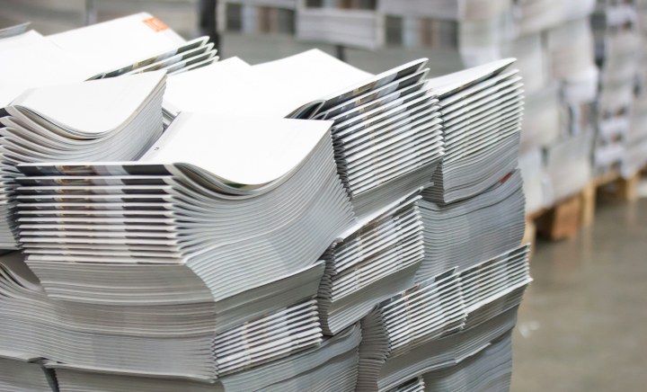
Photo purchased from … www.depositphotos.com
About a year ago I got a phone call from a large commercial printing consolidator (a company that buys and then operates print shops across the nation and sometimes in other countries as well). My contact said the consolidator couldn’t get paper for one of its clients. This would be a huge, recurring job involving custom printing, perforating, and die cutting labels.
It was a sweet job, and I had good contacts, one who could print the job in China and another in the US in the Midwest. But when all was said and done, I didn’t get the job and I’m grateful for that. Between the client’s demands for specific paper and that paper’s unavailability even among my contacts, I learned a lot about the current paper shortages, supply chain issues, lines of ships waiting to dock at US ports, and economics in general. I couldn’t have received a better education back in college.
That said, now it’s a year later. For those of you who produce recurring print jobs (as designers, print buyers, art directors), what is the current status of commercial printing paper?
The Current State of Paper Sourcing
With this question in mind, I went online and found several good articles, which I draw from (and quote) in the following blog posting. If you want to do your own research, you might check out “2023: Will the Paper Chase Persist?” by Toni McQuilken, www.piworld.com, 02/15/2023, and “US Printing Paper Demand Slows Down in a ‘More Normal’ December as Panic Buying Ends,” by Renata Mercante, Fastmarkets, 12/21/2022. Both articles, and others, can be found online.
That said, here is the gist of what I have found.
In the past several years we have had shutdowns due to Covid, labor shortages, weather issues, higher costs for shipping, and general disturbances in the supply chain (both for US-based and imported paper). Also, many paper manufacturers in the US changed from producing commercial printing paper to producing packaging board. This reduced printing paper availability (some grades and weights more than others).
When combined with a healthy (and in some cases increased) demand for commercial printing paper (by customers and therefore custom printing suppliers), the reduced paper supply drove up prices (for the paper component of printing).
This year, 2023, according to John Crumbaugh, product manager of ColorPRO Technology, Media Operations, at HP: “The supply chain for producing printing paper is still tight, but there are signs that it’s beginning to loosen up and should be much improved in 2023.” “In North America, the paper mills are operating at or near capacity, but the analog market appears to be slowing, and imports are beginning to increase, so paper is more available than earlier [last] year” (John Crumbach, as quoted in “2023: Will the Paper Chase Persist”).
One reason the market is beginning to slow, according to this article and others, is that printers have slowed down their panic buying and are now using the inventory they had amassed. Since paper availability has increased and the end users (apparently) are a bit less demanding, printers have recently been able to both use what they have in inventory and also selectively buy paper to add to their in-house supply.
That said, paper imports have arrived a bit faster (with easier access to US ports). However, this is somewhat mitigated by the lower number of domestic mills producing paper (as noted before, a lot of them had been converted to paperboard making). So paper is more available, but its price isn’t coming down anytime soon.
Plus, the concept of “just-in-time delivery,” at least in paper sourcing, is not viable now and will not be for the foreseeable future.
According to Crumbaugh, as quoted in “2023: Will the Paper Chase Persist,” “Pricing for printing grades of paper have increased up to 40% over the past five years.” “Supply chain issues, transportation, and increased cost of production have driven pricing up very quickly. Pricing is likely to stabilize as opposed to dropping quickly, as many of the increased cost factors are still in effect.”
In short, paper is available, but the cost of the paper for a commercial printing job (and this can be a large portion of the total cost of the job—especially for print books) will keep overall custom printing prices high.
According to “2023: Will the Paper Chase Persist,” these are the paper grades affected (Toni McQuilken includes comments by a number of printers in this light as well). According to Crumbach (as noted earlier), these papers include “uncoated text and cover,” “some packaging grades, especially premium grades,” and wood-free paper grades. Plus, “Coated, as well, is difficult for both popular mid-range weights, as well as heavyweight point stocks” (John Crumbach, as quoted in “2023: Will the Paper Chase Persist”).
Importing paper has made things easier, but this has not completely mitigated the effect of many domestic paper suppliers’ having gone offline in the past several years.
At the same time, according to “2023: Will the Paper Chase Persist,” some papers that weren’t available a year ago are now more accessible, such as 70#, 80#, and 100# coated book papers (“mid-range weights, in general”) (“2023: Will the Paper Chase Persist”), and these are accessible in various sheet sizes for different-sized printing presses.
What to Do (for Printers)?
“2023: Will the Paper Chase Persist” suggests the following approach to the current state of paper sourcing, at least through this year:
- Think ahead. “2023: Will the Paper Chase Persist” encourages printers to plan for the workflow rather than stockpiling paper. This means keeping good relations (and open communication) with paper suppliers. McQuilken’s article especially notes that mills do not treat spot-buyers of paper as well as those who have developed mutually beneficial, repeat working relationships with the mills. McQuilken suggests that printers evaluate their projected paper needs for upcoming jobs on a monthly basis (rather than a quarterly basis).
- Don’t buy in a panic, but also don’t assume “just in time” sourcing will work.
- Be flexible. It is smart at this point to be open to alternative papers suggested by mills.
- If you are a printer, McQuilken suggests diversifying. That means perhaps even buying new equipment to be able to handle different commercial printing jobs in different ways on different presses, should paper for one press be more difficult to source. This will at least keep printers, and pressmen, from being idle in difficult times.
The Takeaway for Designers
Many of you who read these PIE Blog articles are not commercial printing suppliers, but rather individual print buyers in for-profit and non-profit organizations. Most of McQuilken’s suggestions will pertain to you as well.
In short, you will benefit from planning jobs earlier than in prior years. You can’t bring printers into the equation too early. Talk to your suppliers. Keep them in the loop.
And depend on their expertise. When they suggest alternative stocks that might work as well as your preferred custom printing paper, keep an open mind.
Posted in Paper and finishing | 2 Comments »
February 27th, 2023
Posted in Printing | Comments Off on Custom Printing: A Primer on Dot Gain in Printing

Photo purchased from … www.depositphotos.com
Thirty years ago I was promoted from designing print books to serving as the art director and production manager of a government education nonprofit organization. When our best designer got a new job, I took over all of her promotional design work and learned to use Quark XPress (page composition software). It was one of the more intensely educational periods of my professional life.
One of the promo items I produced was a 16-page catalog on 70# gloss text with a 100# gloss text cover. The tall and narrow format was approximately 6 1/8” x 10 7/8”. It was a saddle stitched, four-color product with a press run of between 40,000 and 60,000 copies. The nonprofit was flush at the time, and marketing was viewed as an investment. Also, it was before the wide use of the internet for marketing.
To get back to the size, we chose an odd format because it just fit the US Post Office’s definition of a letter. Anything larger (even 1/8”) would have been a “flat” and would have cost more to mail. But in addition, we chose the size because it fit exactly within the roll width and cut off of the heatset web press owned by one of our best commercial printing suppliers. (More specifically, eight pages of the catalog fit exactly on each side of a sheet cut from the web roll, allowing room for bleeds and printer’s marks.)
And for such a long run (the number of pages multiplied by the press run), producing the job on a heatset web was faster and cheaper than printing the job on a sheetfed press. Moreover, since it was produced on gloss stock, we needed a heatset web rather than a non-heatset web (because we needed the ovens to cure the ink through oxidation). So this was exactly the right custom printing press for the job.
Proofing and Dot Gain
When I started regularly checking proofs for this catalog (a repeat job produced every six months), the first thing that struck me was that the proofs were too light. The b/w halftones, the 4-color images, the area screens, everything. At first I was upset, and then the printer explained to me that heatset web presses have higher than usual dot gain, so the separations need to be “opened up” or burned to negatives, proofs, and plates with lower density, so the final printed product would look as I had intended it to look. (We still used negatives back then.)
So I went to school on the subject.
“Separations” were the four sets of negatives and plates, one set for each of the process colors: cyan, magenta, yellow, and black. “Opened up” meant that the halftone dots of any of the process colors would be reduced slightly in size. And “dot gain” meant that certain types of presses, certain printing processes, and certain types of paper will result to a greater or lesser extent in the enlarging of halftone dots on press. (This is also known as “tone value increase.”)
And the heatset web printer’s solution (opening the separations) was the correct approach to eliminate the dot gain problem.
How Does Dot Gain Present Itself?
In the case of my employer’s catalog of government education print books, the overall darkening of all colors that would have occurred had the printer not opened up the separations would have been the result of the dot gain.
But this is not all that can happen.
According to my go-to book on printing, Getting It Printed by Eric Kenly and Mark Beach, “Halftones and separations lose detail, colors shift in separations, screen tints print too dark, color builds don’t match swatches, chokes and spreads [trapping] don’t function properly, and fine lines drop out when printed as reverses” (Getting It Printed, page 65).
How Is Dot Gain Measured?
According to Getting It Printed, if you start with a 50 percent dot and you have 10 percent dot gain, the halftone dot would now be a 60 percent dot (50 plus 10, not 50 plus 10 percent, as I understand it). Unfortunately, dot gain can be different in different screen percentages of a printed product, since different sized halftone dots grow in different amounts (smaller dots grow more than larger ones, for instance).
Plus, if you think about it, the art file for a double-page spread of one of your commercial printing projects, let’s say a print book, may include multiple items that you have generated in different programs (such as InDesign, Photoshop, Illustrator, etc.) prior to placing them in the art file. This can result in different amounts of dot gain in different portions of a page spread.
What Increases or Decreases Dot Gain?
First of all, according to my research, dot gain will be reflected in the series of printer’s marks on your press sheet outside the live matter art. This notation, showing the growth of the dots, may be further broken down into highlights, quarter tones, halftones, etc. So your printer is already actively looking for this problem and seeking to remedy it.
That said, there are certain elements of commercial printing that will make this problem better or worse. According to Getting It Printed:
- Uncoated paper results in more dot gain than coated paper. This is because the ink seeps into the paper fibers and causes the dots to grow. In a similar vein, calendered paper (run between metal rollers during the paper-making process) experiences less dot gain than uncalendered paper. This is because the metal calender rollers create a harder paper surface, and a harder surface allows for less ink absorption into the paper fibers.
- Different printing technologies, such as offset, flexography, gravure, and screen printing, have different amounts of dot gain.
- Different screening algorithms yield different amounts of dot gain. For instance, FM or stochastic screening uses very tiny halftone dots, with more dots in a dark area and fewer dots in a light area. In contrast, AM or traditional screening uses a specified number of dots per square inch, and they are either larger or smaller depending on the percentage of the screen. So these different sized dots will have different amounts of dot gain.
- Higher halftone screen rulings (maybe up to 200 lines-per-inch for coated paper but only 85 lines-per-inch for newsprint) will produce more dot gain since smaller dots grow more than larger dots.
- Different kinds of offset presses cause different amounts of dot gain. For instance, a web offset press is likely to have more dot gain than a sheetfed offset press.
- Inks make a difference. For instance, soy inks produce less dot gain than petroleum-based inks.
- Chemistry makes a difference. Waterless offset printing, which uses silicone-coated plates and no water solution, minimizes dot gain when compared to traditional offset commercial printing.
What Does This Mean to You?
There are prepress applications that deal with dot gain, but since you may have problems in one area of a page and not in another, and since you are probably inserting other kinds of files into your page layout files, my personal recommendation is the following:
- Assume the printer is checking the dot gain charts on the press sheets (printers marks outside of the live-matter page) and adjusting for the dot gain (even if that means burning new printing plates).
- If the quality needs to be above “basic” or “good” (i.e., “showcase” or “premium”), consider attending a press inspection at your printer’s plant, where you can see the press sheets during the press run and make comments and request changes. Let your commercial printing supplier know your plans at the time of the request for quote, however, since a press inspection slows down the overall process (and ostensibly gets factored into a higher price).
- Make your concerns known to your custom printing vendor and ask for feedback if your job needs to be a premium or showcase printed product.
Personally, I’d avoid trying to compensate for dot gain yourself. There are too many variables, and this is the expertise you’re paying your pressmen to bring to your work.
Posted in Printing | Comments Off on Custom Printing: A Primer on Dot Gain in Printing
February 19th, 2023
Posted in Printing | 2 Comments »
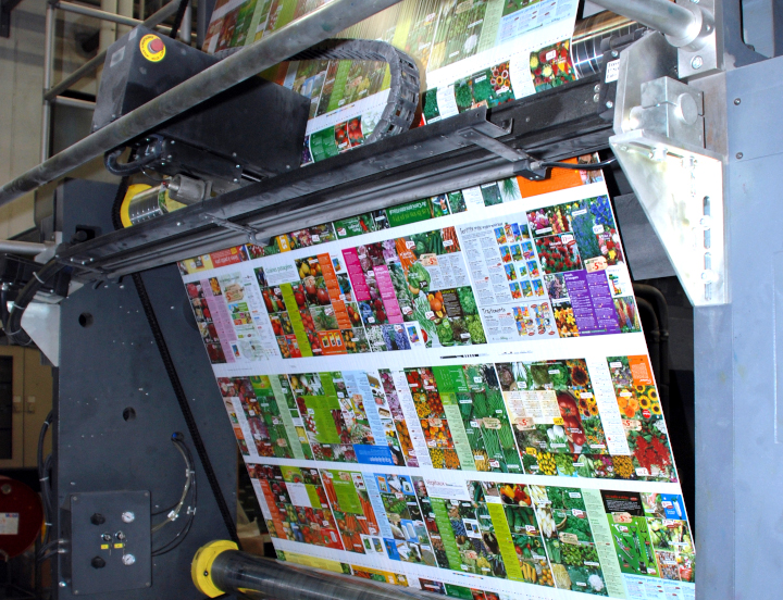
Photo purchased from … www.depositphotos.com
About two decades ago I was a custom printing consultant helping a client produce periodicals analyzing the actions of Congress in Washington, DC. It was a Friday night, and their flagship publication was on press at a local printer on a heatset web press. A tornado came in at that very moment and tore the roof off the commercial printing plant. When I called the sales rep, he said my client’s company was “on its own.” The job would not be printed and sent off to its paying customers that night.
So I contacted a local sheetfed printer I knew wanted the contract for this weekly magazine very, very badly. When I called the plant manager, who was at a bachelor party at the time, he agreed to be my client’s white knight. I sweetened the pot by noting that his successful completion of this job would probably create a vacuum that would suck all of my client’s jobs out of the web-press plant into his sheetfed custom printing plant.
He coordinated a new transfer of all digital data from my client’s office to his shop and produced the magazine via sheetfed lithography. Paying customers received a magazine that looked far better than prior issues. It came out on time as though nothing had happened. Within a year or so, the new printer was producing all of my client’s magazines.
Sheetfed vs. Web
The prior example might read like a fairy tale, but it’s actually true. That said, it was more expensive to print the magazine via sheetfed offset lithography than heatset-web offset lithography. Here are the differences and the reasons to choose one kind of press or the other for your own commercial printing work.
Both kinds of presses print via offset lithography, in which image areas on a flat custom printing plate are treated to receive ink, while non-image areas are treated to repel ink. When the press is running, ink is transferred from a printing plate to a rubber blanket and from the blanket to the paper (hence the term “offset”). So in this particular way, web presses and sheetfed presses are similar.
That said, paper is fed into a sheetfed press as individual sheets stacked in a pile at the front end of the press (even if they had initially come from a roll and had been cut into sheets). The sheets are pulled through all inking units, where they receive ink from the plates and blankets. Stacks of printed press sheets (printed on one side) exit the press and are stored for the ink to dry (via absorption into the paper and/or oxidation into the air, depending on the paper in use). Then the piles of press sheets are turned over and run through the press again to print the opposite side of the sheet (called “backing up the sheet”). Final printed sheets (printed both sides) are then brought into the finishing department for folding, trimming, and other post-press work.
In contrast, on a web offset press, paper comes from a roll. As the press runs, the ribbon of paper coming off the roll is held in tension as it enters the press. Like a sheetfed press, the web press uses plates and blankets on each inking unit to print the job.
If the paper is uncoated and the quality requirement is low (such as a newspaper or newspaper circular), the web press can be an open web (or non-heatset web). The ink dries through absorption only (ink seeps into the uncoated paper).
If, however, the paper is a coated press sheet (or roll, more accurately), the applied ink (usually four colors for this kind of work) has to be dried differently. So once the ribbon of printing paper from the web roll exits the printing units, it must enter the drying ovens, which flash off the solvent from the printed ink with intense heat (i.e., drying by oxidation rather than absorption), hardening the custom printing ink on the surface of the paper rather than letting it sink into the paper fibers. Then the ribbon of paper (the web) travels between the chill rollers, which bring the paper back to room temperature.
At this print, the web press can actually do some of the finishing work in line, getting the press signatures (in the case of my client’s magazines, for instance) ready for binding (some web presses do some kinds of binding in line as well).
Sheetfed presses can’t do this. (Finishing in this case is done in another department.)
Web presses are lightning fast. My random query on the internet notes that a sheetfed press can print 15,000 impressions per hour, while a web press can print 50,000 impressions per hour. (I don’t know how precise these numbers are, but the gist is that web presses are significantly faster than sheetfed presses.)
Moreover, a web press prints both sides of the roll of paper at one pass, unlike a sheetfed press. Either the ribbon of paper is turned over within the printing process using “turning bars” (with four of the inking units printing one side of the paper and then the other four inking units printing the opposite side), or press rollers, plates, and blankets above and below the web of printing paper print both sides simultaneously. This also speeds up the process dramatically.
But speed has its drawbacks. Even a heatset web press (as opposed to a non-heatset web press, which some people call a coldset web) cannot in most cases match the level of quality produced by highly skilled operators on a sheetfed offset press. (This is why my client’s customers who received the tornado edition of their magazine were knocked off their seats by its quality.)
In contrast, speed does yield cost savings. Sheetfed printing involves separate finishing operations in a different department, and overall it progresses more slowly, so the final bill is usually higher, depending on the total press run.
To illustrate, when I was an art director, my employer printed 60,000 copies of a 384-page (approximately) 6” x 9” perfect-bound print book (twelve 32-page signatures). The text was printed on a web press. I believe the 60,000 covers, since they were small, they could be ganged up on a single press plate, and they had to be of very high quality, were printed on a sheetfed press. I’m not good with math, but it seems to me that at 15,000 impressions per hour vs 50,000 impressions per hour, it would take much, much longer to print twelve 32-page press signatures (twelve separate press runs) on a sheetfed press than on a web offset press.
Why Choose One Press Over Another
If you’re buying printing and deciding what kind of printer to approach for a bid, here are some thoughts:
- If you’re producing a textbook, for instance, as was part of my job as an art director, consider the number of pages multiplied by the number of copies. In my case of 60,000 copies multiplied by 384 pages, that would be 23,040,000 book pages. In my experience, that’s definitely a web-offset commercial printing job.
- If you’re printing 60,000 copies of a 8.5” x 11” flyer that will be laid out (imposed) eight-up on a press sheet (eight final copies per 25” x 38” press sheet), then your final print run is actually only a fraction of the total or 7,500 copies, because out of every press sheet you get eight copies. That would most probably be a sheetfed job.
- Quality. Maybe you wouldn’t print an annual report on even a heatset web press. I wouldn’t. Even if it can run coated paper and four-color process ink work, it probably won’t look quite as dynamic as a sheetfed-printed annual report. However, if you’re producing flyers, forms, brochures, newspapers, newspaper circulars–either a heatset web press (for coated printing paper) or a non-heatset web press (for uncoated printing paper) might be a good bet. The key here is the length of the press run.
- So back to press runs. If you’re unsure, ask your printer. But my random check on the internet suggests 10,000 to 15,000 copies as a starting point for web offset, for magazines and brochures. While I would definitely agree with their assessment as it pertains to magazines (multiple custom printing press signatures multiplied by 10,000 or 15,000 copies), I think for brochures or any other work that can be ganged up on a press sheet, your target totals for choosing web offset lithography over sheetfed lithography would be much higher.
But it never hurts to ask your printer.
Posted in Printing | 2 Comments »
February 13th, 2023
Posted in Business Cards, Packaging | Comments Off on Custom Printing: Packing, the Final and Perhaps Most Important Step
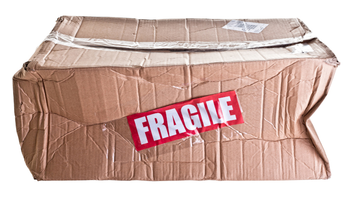
Photo purchased from … www.depositphotos.com
The picture above says it all. Let’s say you have spent months working on a perfect-bound print book, writing and editing it, maybe taking photos, designing the pages lovingly to showcase the content. Once the job has been printed and then delivered, without incident we always assume, it arrives at your office and everyone tells you how good it looks. But maybe this doesn’t happen. Maybe the job has been packed incorrectly by a new employee, or it falls off the skid and gets dinged rather hard, cutting through the cardboard packaging and smashing one or more print books. Or maybe the carton is dropped in a puddle by accident during a rain storm.
You get my drift. The job isn’t complete until you get all of the copies in pristine condition delivered to the exact location you specified. Packing and shipping are vital parts of the process, even though they are completely invisible to most people—until something goes wrong.
What to Do?
I did some research on packing print jobs in Getting It Printed a few days ago. This book by Mark Beach and Eric Kenly is my go-to text on all things about commercial printing, as it has been for the last thirty years.
Beach and Kenly note that making sure the products (print books, brochures, etc.) are not only in the boxes but rigidly secured is of utmost importance. And they need to be horizontally stacked, not vertically stacked. This avoids bowing, I would think, although I’ve always seen envelopes (particularly large 9” x 12” booklet or catalog envelopes) packed vertically.
Regardless (and your commercial printing supplier will know for sure), I think the goal is to work within the laws of physics. If a packaged product will want to move in a certain way in a box or carton and is allowed to do so, its weight coupled with the movement of the carton will cause problems. Make sure it behaves as you want it to, so when you get to the last box of pocket folders, for instance, they are standing upright and are flat and rigid.
Protective Coatings
Scuffing is another issue to avoid. When I was a designer and then an art director, I always used to coat print book covers, pocket folders, and anything else with a heavy coverage of ink. Whether it was aqueous coating, UV coating, or film or liquid laminate, this coating would protect the printed products in transit in the carton.
Shrink wrapping is another good option that Getting It Printed mentions. You can either shrink wrap the items individually (if your job is a long perfect-bound print book, for instance), or you can group items in specific numbers (or “conveniently,” which means your commercial printing supplier can decide how many to group together).
In lieu of shrink wrapping (and you can always ask for the cost of these different approaches when you’re bidding out your job), you can put slip sheets between individual items or groups. A slip sheet is just a piece of paper that keeps two adjacent printed items from rubbing against each other. Or you can paper band stacks of printed products together or even rubber band items together.
The Cartons
Durability of the cartons themselves is also an issue to consider. They need to be able to take a beating. I’ve never done this, but I know you can specify double-wall cartons, which, as their name implies, add another layer of protection.
A related choice I did make when specifying case bound books for one of my clients was to have the printer shrink wrap the individual books and then insert them into “bumper-end mailers.” These had cardboard extensions made specifically to absorb impact, much like the bumper on a car. Before the print book could sustain damage (not only in transit from the printer but in mailing to the customer as well), the bumper-end mailer would absorb the concussion. Again, it helps to consider the laws of physics.
Skid Packing
Handling the packed cartons as a unit (instead of as 50 individual cartons, each containing 20 books) is important as well, according the Getting It Printed. Laying the cartons on top of each other, overlapping like bricks, strengthens the stacks and keeps everything together and stabilized. Also, remember to pack the heaviest cartons on the bottom. Strapping the cartons and shrink wrapping the cartons to the skid also help.
For about five years when my fiancee and I were installing banners and standees at movie theaters, we also had a side gig working for Chanel. We installed exhibits for make-up application, and this included assembling banner stands and other graphics as well as furniture. Needless to say, the contents of the two skids (also known as pallets) we received for each Chanel installation weighed 1,000 pounds or more (comparable to a skid of print books in cartons).
It actually added to my education in commercial printing to learn how to pack a skid, wrap a skid with clear plastic, operate a motorized pallet mover, and operate a freight elevator. All of this experience and information was directly pertinent to the packing and transport of cartons of print books or any other printed product.
Among other things I learned was that everything had to stay dry. This is also true for a skid of cartons of books, perhaps doubly so, since print books and the paper they are made of behave like sponges. The plastic skid wrap sheeting we used (imagine wrapping a skid with saran wrap) is particularly helpful if your books will be in a fulfillment house for a long period of time, since this wrap does keep moisture from getting to the cartons of printed products.
Labeling
Particularly if your print run is long and perhaps destined to be parceled out over an extended period, you may need a fulfillment house. If so, you will want to note on each carton (and on each skid, using a “pallet flag,” which is essentially just a notation on paper) exactly how many cartons the skid contains, and how many books, pocket folders, etc., each carton contains.
Therefore, all of the cartons, except for one, presumably, need to contain exactly the same number of products. The remaining carton, labeled as such, will contain the smaller number of items that rounds out the total.
Then you will want to note all of this on each carton and on the skid in general, so an accurate inventory can be taken at the fulfillment house, and so the pick-and-pack fulfillment people can collect and repack groups of items to send to paying customers.
All of this information can be as simple or as complex as you want, depending on your needs. Getting It Printed notes that in many cases, simply taping a copy of the printed item (perhaps a brochure) to the box is enough. In other cases, for a book publisher, for instance, there may be specific language plus a bar code and even in some cases a QR code to reflect the title, publisher, and perhaps the cost. In this case, information stenciled on the cartons or even printed labels would be needed.
The goal is to decide all of this early and to provide art files the commercial printing supplier can use to add labels, stencils, or even just handwritten notes on the cartons, so everything will be in order once the job has been packed and delivered.
This is one reason, for instance, that I have never been able to get a printer to just finish up maybe two or ten cartons of print books and then deliver or mail them early, while the rest of the print job is finished and packed for transit. Things (including packaging a handful of books) done piecemeal are often done wrong. Or they slow down the job instead of buying time. Actually, one printer was willing to send out an early, partial shipment, but the process would have cost an exorbitant amount and would have wrecked the schedule.
Weight of Cartons
UPS and the US Post Office, as well as other carriers, presumably, have weight restrictions. Your printer probably will know these, but it’s smart to check. If the goal is to treat a carton of printed products as a unit, it defeats your goal to need to have a carton opened, have some items removed, and then have it resealed, just to meet delivery requirements. So plan ahead.
It’s also very important to know how wrapped skids will be delivered. Does the receiving destination have a loading dock? That is, will someone with a forklift or pallet mover be able to drive or walk directly from the loading dock into the back of the delivery truck (at the same level) to retrieve the skids? Or will the delivery truck need to have a lift gate (a little elevator on the back of the delivery truck to lower the skids to the ground). If the latter is the case, will the skid-packed job need to be disassembled and delivered as individual cartons by hand, on a hand-truck, through a building and up the elevator? Obviously this will cost you more because it will involve a lot of extra hand work and heavy lifting.
The Takeaway
The takeaway is that you should consider all of these variables before you hand off a request for quote to your commercial printing vendor. Specify them in detail. Discuss everything with your supplier. The details will dramatically affect your final delivery cost.
Moreover, the details will make the packaging portion of your job, which is the most important part in many ways, ensure that each individual printed item looks as pristine and wonderful the day it is received by the end user as it looked coming off the press and out of the bindery.
Posted in Business Cards, Packaging | Comments Off on Custom Printing: Packing, the Final and Perhaps Most Important Step
February 4th, 2023
Posted in Photos | Comments Off on Commercial Printing: Creating Photos, Recording Light

Photo purchased from … www.depositphotos.com
Photographs in your custom printing work are essentially a record of the light you witnessed. You are creating with light, making a specific artistic and/or editorial statement. Photos are never added to a publication just for their appearance.
In this light (so to speak), it is helpful to understand some terms and definitions. These will help you either take photos or select photos for the projects you design, whether brochures, banners, or print books.
Depth of Field
For the first ten years of my forty-six years (to date) in graphic design and other aspects of publications management, I shot the photos I used in my graphic design work. I used a film camera, not a digital camera, so you will need to do some online research to apply this information to digital photography.
“Depth of field” identifies the part of a photo that is in perfect, crisp focus and the part of the photo that is a little bit fuzzy. It notes the range (or depth into the picture plane) of crystal clarity, assuming all photos have a foreground, middle ground, and background.
If you are working in bright light (outdoors, for instance, photographing a group of flowers), you can set the lens aperture at a higher number (say f/ 16, or “f-stop” 16), which closes down the adjustable “screen” covering the camera lens in just the same way as the pupil in your eye closes to protect your vision in bright light.
This not only allows less light into the light sensor of the digital camera (or onto the film), but it also allows certain parts of the photo (depths into the picture plane, as noted above) to be in sharp focus or out of focus.
Why would you want to do this? Because it allows you to select the part of the photo you want the viewer to focus on, the subject of the photo, while ignoring or giving less attention to other parts of the photo.
If you’re photographing a bed of flowers (to reference the example noted above), you can highlight one flower and make those flowers closer to the viewer and those farther away less prominent, since they will be out of focus. You can also do this when photographing a person, a model.
From a mathematical point of view, the more closed down the lens can be (to allow less light to enter), the more inclusive the sharp focus will be (the larger the area from crisp focus in the foreground to crisp focus deeper into the background). For example, in this case the camera lens setting might be f/ 16 or greater (maybe even f/ 32). This, of course, requires more light, either natural ambient light or light from an electronic flash.
Going in the opposite direction and lessening the depth of field would require you to “open” the lens more (as the pupil of your eye opens more in lower lighting). An open lens (perhaps f/ 1.2) would make the area of crisp focus (which you could change the position of, within the picture plane, using the focusing control of the camera) be less deep.
High-Key and Low-Key Photos, and Contrast in Photos
Photos make a statement of some kind. Depth of field allows you as the photographer to choose what your viewer will look at. Other tools will do the same or similar things, even leading your viewer to feel a certain way about a photo in a print book or other publication.
In this light here are some terms to consider.
A “high-key” photo is one with predominantly light areas (or white or lighter toned pixels when viewed as a “histogram” graph in an image editing program like Photoshop). To the eye, such a photo just looks very white or bright, if it is either in black and white or color. This can suggest the bright, pristine white of early morning sunlight, for instance. The opposite is a “low-key” photo (in which the Photoshop histogram leans toward the darker tones). This might suggest the more subdued feel associated with sunset.
Closely related to this is the range from high contrast to low contrast within a photo. At noon, the sun casts intense shadows. A photo of a rock outcropping in the mountains, for instance, will have deep shadows and almost completely white highlights. It will be of high contrast. You can do the same thing indoors with an electronic flash (or multiple electronic flashes), with the deep shadows making a man’s face seem more masculine and chiseled.
The alternative would be an image with less contrast. Ambient light (natural light outdoors not augmented by electronic flash) in the afternoon can make a model look softer and more approachable.
As with depth of field, creating images with greater or lesser contrast, or photos that are high or low key will allow you to make a statement about the subject matter. That is, you can lead the viewer to perceive the subject in a certain way and/or have certain feelings and make certain judgments about the subject, all by changing its presentation based on the effects of light.
Electronic Flash and Studio Lighting
A book could be written about this subject. This is just to get you started. Also, you can employ studio lighting techniques away from the studio, using an electronic flash attached to the camera. This will increase the number of ways in which to present your subject (perhaps highlighted and therefore more dramatic or with more subdued light and therefore more approachable).
When I started at the non-profit government education foundation at which I eventually became the art director/production manager, part of my day was spent on Capitol Hill taking photos of students in seminars with senators and congressmen. I had a bounce flash, which I attached to a bracket on the camera. I could tilt it up and bounce the light off the ceiling, which would soften the light that fell upon the people I was photographing. Or I could point the flash directly at the students and legislators. I could also vary the intensity of the light the flash produced, and I could adjust both the camera shutter speed and aperture (see above description of depth of field).
Overall, I could make the lighting more dramatic or more subdued, depending on the tone in which I wanted to cast the subject matter. I even attached a white index card to the bounce flash with a rubber band so I could bounce the flash (the card would deflect the light) if the ceiling were too high.
If I were to replicate these lighting options in a photo studio with large, floor-standing studio lights, I might make the following decisions:
- I might use one flash on the camera and then a fill flash or fill light in the room, separate from the camera. The light on the camera might illuminate the front of the model’s face, while a light on the side of the model might cast other shadows and highlight additional portions of the model’s face (like the cheekbones). It might also make the overall face look more dimensional and less flat than what one light would create.
- I might avoid positioning lights below the model, since this could make the model look ghoulish and scary.
- I might avoid shooting the flash near a window or mirror, so as to avoid a reflected glare.
- I might choose to photograph the model with light coming only from one side (at a 90 degree angle) to subtly accentuate the shadows of the face.
- I might illuminate the model only from behind to create a silhouette effect.
- I might use a “softbox,” a lamp covered with a diffusion screen, to scatter the light and soften the look of the model.
Studio lights would make this easier, since I could see the lighting effect before tripping the flash (less easy to see, since it’s there only for an instant). To the best of my knowledge, studio lights today can be turned on, illuminating the subject, and can then be flashed for an instant for the photograph, to increase their intensity for a good exposure.
The goal of all of this is to brighten the subject and increase the detail created by precisely positioned illumination, without creating harsh shadows. Depending on the equipment, you can either do this in a photographic studio or out in the field (with a flash), without needing to artificially doctor up the image in Photoshop. And in all cases, the goal is to use light creatively and precisely to add a mood or tone or in some other way make a statement about the subject of the photo. And this artistic statement can reinforce the tone or message of the print book, large format print banner, or anything else you’re designing.
Posted in Photos | Comments Off on Commercial Printing: Creating Photos, Recording Light
January 29th, 2023
Posted in Design | Comments Off on Business Card Printing: Designing a Corporate Identity Package

Photo purchased from … www.depositphotos.com
I know the words may sound overly business-like: “corporate identity package.” Another term for this is your “collection” of print business cards, letterhead, custom envelopes, and anything else related to your “brand.” This might even include a pocket folder or a coffee mug. All of the items need to look like they go together, but the design of the individual items can’t be so similar as to be predictable or boring.
Why?
Way back when, cowboys with herds of cows branded them to ensure their immediate recognition as “their cows.” A burned-in mark on the cows couldn’t be rubbed off, and a unique mark conveyed more than indisputable ownership. It reflected quality.
Today a brand does the same thing. It reflects quality. It also identifies the owner of the brand. Think about Starbucks. I don’t even drink coffee, and yet I recognize the specific green color, the twin-tailed mermaid (called Gorgona in modern Greek), and every instance of this mark on Starbucks store signage, Starbucks cups and mugs in the thrift store, gift cards my fiancee receives, and even on the Starbucks products and signage at the grocery store, where there’s a lot competing with this signage for my attention.
So how do you create a brand look that can be reflected in all of the printed material a company sends out?
Build (or Grow) Outward from the Logo
When I was an art director/production manager for a government-education non-profit foundation back in the 1990’s, we freshened up our logo. It was still an eagle, to represent the US government, but the style was very different from its predecessor: simpler, more stylized, and more contemporary.
The logo had been designed by an outside design firm, which specialized in corporate re-branding. When their logo design had been approved, it was up to us to implement it. We had to grow, organically (even more so than build out), a recognizable look. It had to be reflected in all print business cards and letterhead materials, but it also had to be reflected in all of the brochures, signs, and print books we produced during the year. Plus, all of these printed items had to retain their own individual look as well.
I was new to this aspect of publications design at this time, and we didn’t have as widespread access to imagery on the internet as we do now, so the in-house graphic designer and I worked together with printed samples that exemplified superior brand design, along with the designer’s own drawings and mock-ups, to implement the logo and create an overall branded look for the non-profit foundation. This was one of the most challenging jobs (at least to do well), and at the same time one of the most important jobs, I participated in during my time as an art director. And I started with the logo and the best in-house designer we had.
Elements of Brand Design
If I were approaching the same job today, the first thing I would do is Google “corporate identity packages.” I would encourage you to do the same, if you need to grow a logo into a complete identity package. When I do this now (using Google Images) and peruse the myriad photos that come up, I see the following general elements of design to consider for such a design task.
The Logo
As noted before, this is the central element of the brand package. This particular discussion presumes that you already have one. (Otherwise, approaching the design of a logo would probably constitute a book-length explanation in itself. This is probably why the bosses of the organization at which I was an art director farmed out this part of the job.)
The logo has to be recognizable and attractive at many different sizes, from very small to very large. Think about the twin-tailed mermaid of Starbucks fame. Throughout its history and its various iterations, it has been simple. Usually just green and white, or maybe green and black and white, with or without the name Starbucks Coffee, and with a logomark (the mermaid) crafted from only a few lines and no gradations. Because of this it is recognizable at a postage-stamp size or on the side of a building as a banner.
A more complex design might be more nuanced, but the few details of the actual logo (flowing mermaid hair, crown, twin tails) make the image more immediately recognizable and understandable. And as with anything else in marketing (particularly in a grocery store where thousands of visual impressions are competing for your attention), immediate recognition is essential. If you can’t get my attention in an instant, you’ve already lost me. Don’t waste my time.
The Typefaces
For a moment I’d like to shift back to the internet, Googling corporate identity again. It’s a lot more general than the Starbucks example, but when you see photo after photo of “laydowns” (like clothes laid down in a clothing catalog photo) of multiple corporate branding elements all together, the design concepts start to sink in. Many of these are probably fictitious. I don’t recognize any of them. It doesn’t matter. I see patterns.
This is what you can learn. In some way or another the logo is on everything. It is prominent, but it is often larger or smaller from item to item, although the treatment of colors is consistent. If the exact same logo colors are not used, it seems (from all the online samples of corporate identities) that solid black versions or logos reversed to white out of a solid color are optional presentations. When business cards, letterhead, custom envelopes, pocket folders, shopping bags, notepads, coffee mugs, caps, etc., are laid down together in these Google Images photos, the same logo, in different sizes, presented in either identity colors or black or white, all look like part of the same family. That, of course, is the goal.
Working organically, a logo is composed of a mark (drawing) of some kind, the name of the company, and sometimes a tag line. These words are rendered in a typeface relevant to the tone, feelings, values, and images one might associate with the company. This specific typeface (or these typefaces) should be repeated elsewhere, brought into the design of the paper coffee cup, calendar, custom label, or anything else the company prints. For instance, there might be additional copy on the pocket folder and surely on a brochure. This typeface, or these typefaces, if they are consistent with the typeface(s) in the logo, will create a cohesive look. Unity: a principle of design. Variety is another principle of design. You can create interest by varying the size and placement of the words set in this typeface.
Color Usage
Many of the samples I see in Google Images incorporate only one, two, or three corporate colors into the overall design. Some of these “paint the press sheet.” That is, they are used in heavy coverage, and they bleed off the edges of the printed item. This provides an “ample” look, a feeling of abundance.
In many cases, from corporate item to corporate item, the colors are used in different (but complementary) ways. For instance, the color of a brown logo printed on one item (in a small-sized space) may be repeated on another item as the background color bleeding off all edges (i.e., what was the accent color on the first item is now used more abundantly on this other item). This creates a “rhythm,” which is another element of art (both the fine arts and graphic design) along with unity and variety.
The Takeaway
The best way to start thinking along these lines (where unity, variety, rhythm, color usage, typography, and such become second nature) is to view collection after collection of corporate identity materials online (which is easier than collecting them all in physical form).
Then, once you have an intuitive grasp of the concepts, once you kind of know on a pre-verbal level what you want to do next, start making thumbnail sketches. Make them simple. That’s why it’s not good to skip this step and move directly to designing on the computer. You’re not committing more than a few seconds to each drawing. The idea is to sketch out as many ideas as you can, free form. Then you can go back, edit them, choose a few you like, and start making more developed mock-ups using your computer. I always try for at least three different approaches (not just alternate iterations of the same concept).
Then you can start applying the logo and surrounding bits of text to the business card, letterhead, custom envelopes, etc. Lay everything out on a table. In fact it doesn’t hurt to print laser proofs and then cut them to size, and tape the laser proofs to a pocket folder or mug (or whatever other physical item you’re working with). See how everything looks together as a family of promotional items.
Then be ruthless in your editing. Decide what works well individually and what works well together. Make changes. Print out new laser proofs and cut and paste them to make your revised collection. If you have a color printer (inkjet is fine), all the better.
Then show people you trust and respect. Consider their suggestions. Make changes. Rinse and repeat. It’s a lengthy process (perhaps even a journey), but each revision will get better and better, and the group of items will look more and more cohesive.
Posted in Design | Comments Off on Business Card Printing: Designing a Corporate Identity Package
January 22nd, 2023
Posted in Digital Printing | 2 Comments »

Photo purchased from … www.depositphotos.com
I would like to begin by saying that there is no right answer to the question I’m about to pose. Rather there is, perhaps, just an approach to answering it in your own print buying and design work. The question is, “How do you determine quality when choosing offset commercial printing vs. production inkjet?”
First a definition. What is production inkjet? It is the blending of inkjet technology with the traditional durability of offset printing presses along with increased custom printing speed. It is a good choice for short- and medium-run print books and magazines and particularly for variable-data work. Production inkjet is not your traditional large-format inkjet press made for wall banners, car- and bus-wraps, and such. It is a hard-core, real commercial printing press in a durable frame.
A Little Background on My Client
In this context I recently bid out a 256-page, 1,000-copy or 1,500-copy, perfect-bound print book for a husband-and-wife-owned publishing house client of mine. In an environment in which perfect-bound books with French flaps, hinge scores, and other elements of superb print production are expensive when compared to the cost of digital electronic books, my clients choose to give their readers the tactile experience of reading. The feel and smell of the paper. The joy of reading a print book.
Pricing for this print book came back to me from three vendors, and one, which was the low bid, had a notation on the bid about J Press printing of the cover. The J Press, which I researched in detail, assuming initially that it was a digital inkjet (production inkjet) press, is made by Fujifilm. Its main selling points, in addition to its variable custom printing capabilities, are its color gamut (even with only four process inks), its flexibility in acceptable printing paper choices, and the minimal set up time (especially when compared to offset commercial printing). Within certain run lengths, all of this translates into high quality and lower costs.
Needless to say, since my clients, with whom I have worked for more than a decade and therefore whose goals for visual and tactile quality I understand and appreciate, had to be comfortable with the technology. The lower price point would not be a good enough reason to choose this vendor.
Moving Toward a Decision
The first thing I did was ask the book printer to send a comparable printed sample to my clients. I knew that nothing would help them make a decision regarding offset printing vs. digital inkjet printing as well as a physical sample. The reader’s eyes and fingers don’t lie.
I also asked the printer to send a sample because I had seen numerous inkjet printed products, and while their color gamut was extraordinary, with vibrant hues and subtle transitions between colors, I had seen in some inkjet samples a lack of crispness in detail. This concerned me. They were not as sharp (the contrast between adjacent edges of color or value) as the offset printed products I had been used to. Without knowing more, I had wondered if this was due to the differences in ink composition and printing paper. After all, inkjet ink is thinner than offset ink. Inkjet ink in this case is also water based unlike oil-based offset inks. (Granted, this had nothing to do with the color range or color fidelity, which I had come to believe usually was equal to that of offset printing.)
I had assumed that the thinner ink would have been more likely to seep into the paper fibers (in contrast to the thicker, oil-based offset ink, which sits up on the surface of the paper). This is called ink “holdout.” It makes for a crisper image and more detail, as well as more vibrant colors.
But when I researched the Fujifilm J Press, I learned that it would also accept more paper substrates than other inkjet printers (including coated paper), that even with only a 4-color inkset it had a remarkable color gamut, and that it incorporated improved ink coagulation technology and heat-based ink drying technology (presumably to allow even an aqueous-based, thinner-than-offset ink to dry or cure on the surface of the paper without bleeding into the paper fibers).
So I decided to keep an open mind and see what my client thought of the printer’s J Press-printed sample (which turned out to be a glamor-based magazine, a perfect-bound book just like my client’s art books of poetry and fiction). The reason the subject matter is relevant is that glamor, food, and automotive are the three best subjects with which to judge both photography and commercial printing. These are subjects that require consummate precision in everything from the photographic lighting to the custom printing technology, and these particular clients (and their marketing agencies) usually spare no expense to ensure quality.
Now we will see what my clients think.
Keeping All Options Open
I have no vested interest in selecting this printer over one of the other two, other than the fact that I have worked with them for many years and trust their quality and integrity (actually good reasons, beyond price, to choose this vendor).
This vendor also has offset printing capabilities. Plus one of the other two printers is very costly, and the other is less expensive but not as willing to absolutely commit to a schedule (in these times of paper shortages, when printers are often taking much longer than in the past to produce custom printing jobs).
So these are the next steps, as I envision them.
My clients have seen the initial sample glamor catalog. They like the brilliance of the color, but they are a little concerned about the images, which seem to be of a slightly softer focus than they would like. They are not sure that this is not intentional, since soft focus is sometimes intentionally used in glamor photography.
Because of this concern, I have asked the printer to provide pricing for a single proof of my client’s actual print book cover on the Fujifilm J Press. If my client likes the sample, we have our printer.
Plan B would be to ask this printer for prices for offset printing the book. This will be more expensive, according to the sales representative. That said, my next questions are more nuanced:
- Since the press run will be 1,000 or 1,500 copies of a 256-page book, I believe we may be at the crossover point at which an inkjet-printed book becomes more expensive than the same book printed via offset lithography (after all, at 1,000 x 256 pages or 1,500 x 256 pages this is a sizable run, and inkjet printing is economically beneficial primarily for shorter-run printed products). Plus, we’re comparing one vendor’s inkjet-printed product to two other vendors’ offset-printed products. We actually don’t know yet that the vendor with the J Press won’t still provide lower offset-printing prices than the other two printers when we shift the pricing model from digital to offset.
- Or, we even may have the option of doing a hybrid job: an offset-printed cover (a short run of 1,000 or 1,500 covers) bound to a digitally-printed book text block. This might cost less than a fully-offset-printed book while still retaining the consummate quality of offset printing for the four-color cover. After all, the interior of the book is, presumably, just black text on a page with no screens or photos. This would be ideal for inkjet printing.
The Takeaway
You may say that this is putting the cart before the horse, adjusting everything to work with a specific commercial printing supplier. But from my vantage point it takes into account that not all printers are as committed to quality and schedule as this one has shown itself to be in past jobs.
Fortunately I also have the luxury of time. I can make sure that my clients see samples until they are either satisfied or ready to move on to an alternate printer. Also, regarding schedules, this particular printer will produce the book in less time than the vendor with the mid-level price but more slowly than the most expensive printer. A longer schedule may compromise my client’s ability to prepare the manuscript and have the book designed and final art files prepared in time. This is because my client’s book distributor has provided an inflexible, hard deadline.
So there are a number of considerations beyond money, including the technology to be used, the schedule, and the quality of the printed product. In your own design and print buying work, I would encourage you to give thorough consideration to all of these factors.
Posted in Digital Printing | 2 Comments »
January 18th, 2023
Posted in Typography | Comments Off on Custom Printing: A Handful of Ways to Improve Your Type Design
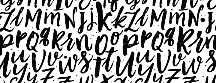
Photo purchased from … www.depositphotos.com
As you can see from the undifferentiated mass of letters above, one major goal of good typography is to organize type for the reader. How should she or he read the brochure, sign, or print book you have designed? It is through your type choices (everything from the typeface to the type point size, from leading to line length to tracking, kerning, and color—as well as your placement of the type on a grid you deem appropriate for the content of your project) that the reader’s eye can know where to go first, second, and third. It’s your responsibility to lead the viewer around the page.
Beyond this, which I would call typographic design, there is another area of tweaks, perhaps subtle ones, which can make reading word after word, page after page, a more pleasurable experience and therefore one leading to better understanding and greater content retention. After all, the reader is usually picturing in her or his mind’s eye the elements of the story your brochure, poster, or print book is telling. Anything that facilitates this is worth doing.
Some Examples
I’m currently reading Graphics for Visual Communication, which I found at a thrift store. It was written by Craig Denton. It’s about thirty years old, but the rules of design are as appropriate now as they were then. Here is a random sampling of rules noted in Denton’s book that will set your type above desktop publishing and into the realm of actual typesetting. Follow along below, and you’ll get some great tips from this print book.
(As an aside, when I started doing graphic design back in the early 1980s, a typesetter would set type on a typesetting machine based on my stated specifications, and I would lay out and paste up the galleys of type using the phototypesetting paper printouts she or he provided. These were two separate professions, actually. Typesetters were artists in their own right, massaging the individual letters to make the copy as readable as technically possible before handing it off to graphic designers for the final layout.)
Letterspacing and Readability
Each line of type is made up of a number of letters. How close they are to one another can either foster readability or impede it. When you are setting type, make sure the letters are neither too close to one another nor too far apart. If there’s too much letterspacing, the words no longer read as complete, individual items. (The reader looks for the shape of a recognizable word. She or he does not read every letter.) If the letters are too close together (with too little letterspacing), the words will all run together. The spaces between the words will disappear and the text will become illegible.
The function in your layout program that you would look for to control letterspacing (hopefully a design tool such as InDesign rather than a word processor) is often called “tracking.” It is different from “kerning,” which controls the space between pairs of letters, such as a capital “A” and a capital “V.” If you’re setting a headline, for instance, such letter pairs as “AV” will often be too far apart. Kerning allows you to tighten them up (much as you would tighten up a full line of type with a tracking command). When you do this, the reader will not get visually stuck at the “AV” letter pair. It will not bring the reader out of her or his imaginative experience of reading to focus on what looks wrong about the typography (just as seeing a typo might derail your train of thought).
Learning how to control both letterspacing and kerning will improve the overall look and the readability of your typeset copy. And as a side note, both of these are more problematic–or visible–in larger type than in smaller type (headlines compared to body text, for instance). I personally do not kern letter pairs in body copy. It would take too long, and it would be below the threshold of visibility for most readers. That said, I believe there are global controls in high-end design applications that will still allow you to automatically kern all problematic pairs of letters you choose. (At least this is what I did in the mid-1980s, before the advent of desktop publishing, when I was setting my own type on a Mergenthaler typesetting machine.)
Line Spacing and Leading
It used to be that typesetters would add extra “lead” (the metal) between lines of type in certain instances. This was before phototypesetting. At that time lines of type were typeset in molten metal (lead) and printed via letterpress rather than offset lithography. Adding lead or leading opened up the space between lines, and this made large blocks of type more legible.
Why? Because once the reader’s eye reaches the end of a line, it must return to the beginning of the next line, back on the left (usually) side of the page. Long lines of type can make it difficult for the eye to travel back to the left and immediately find the starting point of the next line. So adding a little space between lines (or extra leading) can make this task easier.
Type set without extra leading is “set solid.” If you choose 11 pt type and set it without extra leading, this would be noted as 11/11 type. At any line length, this is usually harder to read (although it gets progressively harder as the width, or measure, of the line increases). A more reader-friendly balance would be 11/13 type (11 pt type with two points of lead).
Widows and Orphans
If you have a design with multiple columns of type (actually even when you set print books with a single column extending from page to page), watch for widows and orphans. “A widow is a line less than one-third of the column width at the end of a paragraph or the first line of a paragraph left unattached at the bottom of a column,” according to Graphics for Visual Communication. “An orphan, a portion of a line at the top of a column, must be eliminated by rewriting copy or changing the line spacing or column depth,” according to Graphics for Visual Communication (p. 96).
The reason these are problematic is that they trip up the reader. They look like errors. So they become a distraction. Any short piece of text left at the bottom of a final paragraph (or the top of the initial paragraph) in a column is a distraction.
Type Alignment
I mentioned earlier that the goal of typesetting is to facilitate reading and make it a pleasurable experience. In all cases, the reader’s eye has to return to the beginning of a line once it has finished reading the prior line. Type alignment can either make this easier or harder.
Graphics for Visual Communication notes that the most readable options are flush left type and justified type (in that order). Flush left type has a consistent left-hand margin, but the right-hand margin varies based on the length of the lines, which change based on the length of the words (and any hyphenation of words). In all cases, the space between words is consistent.
In contrast, justified type is set flush with both the left-hand margin and the right-hand margin. What makes this work is the varied spacing between the words. Unfortunately, if the lines are very short, or if the hyphenation is not ideal, the space between some words can be dramatically larger than between other words, leading to “rivers of white,” trapped white areas that appear to run down the page of type.
So justified copy is not quite as legible or attractive as flush-left copy.
Even less readable are the two other alternatives: flush-right text and centered text. In the case of flush-right copy (with a consistent right-hand margin and a left-hand margin that varies depending on the length of the words, but with equal spacing between the words), the eye has to return to a different position to begin each line (on the left), even though each line ends at the same right-hand margin. Actually the same is true for centered copy, but the eye has not only a different right-hand margin but also a different left-hand margin for each line.
This can be a problem. That said, some designers will use flush-right copy, for instance, in a limited amount (perhaps for a few lines of a pull-quote or callout). And maybe that designer will increase the legibility by adding a few extra points of leading between the lines of copy.
All rules can be broken. It’s just prudent to compensate, to find ways to balance things that reduce legibility with things that improve legibility.
Breaking Up Headlines Into Complete Thoughts
Graphics for Visual Communication uses the following headline to make a point: “The Wisely Designed Display Head.”
If you can get the entire headline on one line, that’s great (perhaps over several columns in a newspaper). One complete thought, no breaks. If you can’t do this, what’s the next best option?
Graphics for Visual Communication draws a contrast between typesetting “The Wisely Designed” on one line and “Display Head” on the next (in the first option) and, in the second option, “The Wisely” typeset on the first line, followed by “Designed Display” on the second line and “Head” on the third line.
The first treatment breaks the words of the headline into logically related groups of thoughts. Simplicity in thought makes for easier reading. The second option, according to Graphics for Visual Communication, may better fit the available space, but the words grouped together are not as intuitively and logically related as they are in the first option. And this will slow down the reader.
The Takeaway
All of this may seem like minutiae. And it is. But good typography does not call attention to itself. Rather it makes reading easier and more enjoyable. In typesetting, the details make all the difference.
Posted in Typography | Comments Off on Custom Printing: A Handful of Ways to Improve Your Type Design
January 15th, 2023
Posted in Digital Printing | Comments Off on Commercial Printing: High-end Inkjet for Fine Art Prints
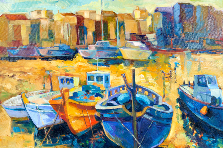
Photo purchased from … www.depositphotos.com
What is a giclee? Actually, the word, which is derived from the French, means to “spray, spout, or squirt” (Wikipedia). It refers to a high-end inkjet print used as a work of art (perhaps like the one printed above).
Back in the 1980s when I was a graphic designer, inkjet was a very new technology. Instead, analog color prepress proofs (Matchprints, Color Keys, and Cromalins) were made from mixed color powders or overlays on a base that was different from the final selected commercial printing paper.
So late in the ‘80s when I started reading about IRIS proofs, and seeing them when our custom printing sales representatives delivered prepress proofs, I was impressed.
And so were a lot of other people, among them fine artists. In the late ‘80s the artists’ community needed a way to reproduce original artwork for sale. For instance, a large, $4,000.00, one-of-a-kind painting might be reproduced in a series (a limited run of high-quality reproductions) for maybe a third of the price of the original.
There has always been a market for prints. I myself have many lithographs (actual art prints without halftone dots but made in a way similar to offset lithography), as well as serigraphs (screen-printed pieces produced with multiple mesh screens each printing a single color on a base paper substrate).
The IRIS Phenomenon
Prior to the inkjetting technology of such printers as the IRIS, these were the options for an artist who wanted to produce multiple copies for sale from a “matrix” (usually but not always a printing plate of some kind): lithographs, engravings, etchings, and custom screen printing. So the IRIS opened up a number of options.
Artists and galleries worked to resolve the two main problems with Scitex’s (eventually bought by KODAK) IRIS inkjet process. The process, which involved wrapping the commercial printing substrate around a metal drum and then jetting colored ink onto the paper, had to be modified for thicker media (such as canvas). And then the image produced via the inkjetting process (which faded over time) had to be made more stable.
After all, when I was getting IRIS proofs from my commercial printing supplier in the late 1980s and early 1990s, all that I (like other designers) needed was to check critical printing color in a continuous-tone (as opposed to halftoned) proof. The proof itself was irrelevant once the job had been printed and delivered.
But the IRIS held promise, in spite of its higher than $100,000.00 price tag, and artists had a new technology to use along with screen printing and etching for a limited series of salable art prints.
The Move to Large-Format Inkjet
Eventually it was no longer necessary to depend on the single IRIS technology. Overall, inkjet technology had improved, and companies such as HP, Canon, and Epson were offering large-format inkjet equipment at a lower price point than the IRIS. Equipment using dyes or fade-resistant, pigment-based archival inks, as well as substrates such as watercolor papers, coated and cotton canvas, and vinyl, replaced the former IRIS technology of choice.
These were now not only archival prints (created using technologies and materials that yielded final art prints with an exceptionally long life span), but they also provided a wider color gamut than before.
For instance, instead of just the four process colors (cyan, magenta, yellow, and black), large-format inkjet printer manufacturers such as Epson, HP, and Canon offered up to 12 colors in an extended inkset, all available at the same time on their inkjet equipment. These might include light magenta; light cyan; maybe an additional photo black; or red, green, and blue; or violet, orange, and green. All of these provided a much wider color gamut (more distinct colors) than a 4-color-only (CMYK) inkset. They also allowed for more subtle gradations from one color to another.
The Marketplace
When my fiancee and I go to the thrift store, we often see framed prints that look like originals. However, under a 12x printer’s loupe I can see the halftone dots of the offset lithographic process. This is different from both a traditional lithograph and a high-end giclee (inkjet print). And given its customarily lengthy press run, the individual offset lithographic prints are not worth much.
In contrast, individual copies from a traditional lithographic run (of maybe 250 copies) are worth a lot more (depending on the esteem in which the artist is held, whether the prints are signed, etc.).
The same is true for a giclee print. In this case, the artist has just used a digital process for creating multiple copies rather than a serigraph screen or etched copper plate. She or he has used the finest archival inks and acid-free paper or canvas, and has been closely involved in the production of the limited edition. Hence, the signed copies do have value, and they will last a long time, just like the prior editions of serigraphs, engravings, lithographs, and such.
Moreover, a fine artist might choose to print copies of the fine art piece one at a time as they are purchased (perhaps a color-corrected, high-quality photographic image of a large oil painting that might otherwise sell for $4,000.00). And the buyer is happy because she or he can afford to buy a piece of art for maybe a third of the price of the original oil painting.
So overall, the production process is much more under the control of the artist, and the prints are much more affordable to the buyer. Plus, the process of giclee custom printing can provide copies of photographs, flat artwork, and even computer-generated art, all meticulously color corrected and color controlled by the artist.
Valuation
Having collected serigraphs, lithographs, monoprints, and such, over four decades, I initially had a distrust for this technology. “How can this be any more valuable than one copy from a press run of many offset-printed posters?” I thought. But over time I came to view giclee custom printing as nothing more than a controllable technology suited for producing a limited run of archival prints, just as the prior technologies had done. I realized that if I couldn’t afford a $4,000.00 oil painting, I could at least afford a giclee at a third of the price. And I knew that the artist’s involvement in the process (attested to by her or his signature and the numbering of copies in the limited press run) had been confirmed.
With this in mind I was interested in the advice I saw online from a number of artists and galleries as to the process of valuing giclees. The general consensus is that artists should factor in all expenses, including materials, time spent in the creation of the giclee, color scanning and correction of the original, and a reasonable amount for profit. That said, the key determinant would also be the renown of the specific artist in question, or how well regarded she or he is by peers and patrons.
It’s a little like pricing your graphic design work. If you’re good, and well known, you can charge more. After all, the value of a piece of art is what a willing buyer will pay to acquire it from a willing seller.
That said, many of the articles also included pricing grids (as a starting point), noting low-end, median, and top-end pricing of giclees based on their size (say 8” x 10” vs 36” x 48”).
And, of course, the press run makes a big difference as well. If you’re an artist and you’re selling 50 copies of your giclee work, you would command a higher price per copy than you would if the press run were 250 copies (the same idea as a custom screen printing or etching run of 50 signed copies rather than 250 copies).
Again, giclee is just the technology used to accurately print a limited run of color-corrected, archivally produced art prints, just like the lithographs and even the IRIS prints that preceded the current spate of Canon, Epson, and HP large-format inkjet giclees.
Posted in Digital Printing | Comments Off on Commercial Printing: High-end Inkjet for Fine Art Prints
January 9th, 2023
Posted in Book Printing | Comments Off on Book Printing: The Beauty of Old—and I Mean Very Old–Books
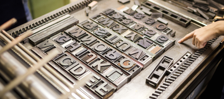
Photo purchased from … www.depositphotos.com
I’ve mentioned before that my fiancee and I consider our second home to be the thrift store. I love the books and CDs. She loves the clothes and furniture. We recently found a new venue that actually has a “free” section that includes two plastic bins of print books.
One of my recent finds is a book of Henry Wadsworth Longfellow’s poetry dated 1899. It’s not in the best shape I’ve seen. (Granted, it’s 123 years old.) But even a cursory observation of the book yields information on typesetting, printing paper, book binding, and foil stamping, to name only a few arenas of print book design.
Here’s what I have seen and learned, and why I find this particular print book worthy of note.
The Text Paper
When I dig through my home library I find books I read in the ‘70s, ‘80s, ‘90s. In many of these, the text pages have yellowed and become brittle. This is because the paper has a number of impurities that make it acidic (rather than basic). This means the pH (which ranges from 0 to 14, with neutral being 7) is below 7. Acidic paper turns yellow and becomes brittle. This can be a problem if you want the books you’re manufacturing, or reading, to last a long time.
In contrast, most of the paper in the older print books I have collected over the years is basic (i.e., the paper has a pH above 7). That is, impurities have been removed in the paper-making process, and in many cases buffering agents such as calcium carbonate have been added. Over time these buffering agents neutralize acidic elements that are either absorbed from the atmosphere or created as the paper ages.
But why would publishers print books on paper that will turn yellow and become brittle? Well, at the present time most paper is acid-free, but back in the 1970s, when I acquired some of these books, presumably the acid-free paper was more expensive. After all, many of my books were novels, intended to be read and then discarded within a few years, so they really didn’t need to be pristine for that long.
As a side note, newsprint is also highly acidic. My fiancee has a number of old newspapers from the 1960s. In all cases these have to be handled carefully, since they are also yellowing and becoming brittle.
But to get back to my 123-year-old book of Longfellow’s poetry, the text paper (it is a case-bound print book without a paper cover) is in exceptionally good condition. Apparently acid-free paper, which is similar to archival paper (which, in addition to not being acidic, also contains no artificial paper brighteners) has a life span of over 200 years. It is especially good for valuable books of poetry and also for ledger books you might buy at Office Depot (since these, too, need to last for a long, long time).
Binding Qualities
The book of Longfellow’s poetry is case bound to increase its durability and longevity. Given how old it is, I wouldn’t be surprised if perfect binding had not yet been invented (actually, I just Googled it, and perfect binding was invented in 1895 but not used in book binding until 1931, according to Advantage Bookbinding (https://www.advantagebookbinding.com/blog/book-binding/things-didnt-know-history-book-binding/).
The spine of the print book has been rounded, which is a process that involves pushing the central pages of the text outward from the spine during binding, such that the pages as seen at the face margin (the front of the book opposite the spine, when you look at it from the side) are concave (curved inward), just as the spine is convex (curved outward).
The book binder also foil stamped the fabric-based cover-casing material using heat and pressure in a “strike-on” process (probably using a letterpress) to transfer the foil material from a roll to the fabric cover of the print book.
There are also fabric headbands and footbands at the binding edge of the book to obscure the glue and folds of the book press signatures where they are attached to the paper “crash,” or “super,” which is hung on the front and back endsheets and binder boards. That is, the interior spine does not touch the outer spine of the book case itself except when the book is closed. This is not a “tight-backed” print book. That is, when the book is opened, the text block (the group of folded and gathered press signatures) moves forward, away from the exterior fabric and paper spine. When the book is closed, the text block moves back into place.
The Printing Process
In the present time, if you want to typeset a print book, you use a computer application like InDesign and burn commercial printing plates directly from these electronic files. Then you hang the plates on an offset press and print the book forms (the flat press signatures prior to folding).
In contrast, the book of Longfellow’s poems (considering the date of publication was 1899) was printed in one of two ways: either via the newly invented offset lithographic process (invented in 1875) or via letterpress.
Offset lithography uses the incompatibility of ink and water to keep the image area full of ink and the non-image area free of ink, using flat printing plates. In contrast, letterpress uses plates with raised image areas (called relief plates).
Even now, letterpress is used occasionally, and a similar technology called flexography–which uses rubber rather than metal relief plates–is used extensively for custom printing sheet plastic (bread bags, for instance) and wrapping paper.
Since the technology was so new when this print book was manufactured, I would not be surprised if letterpress was the technology used.
The Typesetting Process
So what about the typesetting?
Mergenthaler invented the Linotype typesetting machine in 1886 (again, very close to the publication date of my Longfellow poetry book). The Linotype machine allowed type compositors to set an entire line of type at one time. (The machine produced a slug of lead with raised typographic letters for use in the letterpress printing process.)
Prior to this, the type compositor had to select upper and lowercase letters from a wooden case (a box or drawer), one at a time, and compose each line backwards (so it would print forwards) in a composing stick. The lines of type were then laid into a “chase” (along with any incised images, instead of halftones, which hadn’t yet been invented), and then everything was locked up so the various elements wouldn’t move when inked and printed.
Once the print job was done, all of the letters had to be re-sorted into their various job cases (“upper case” letters in the upper case of the type storage unit and “lower case” letters in the lower drawers or cases of the type storage unit). Misfiling these individual metal letters would lead to typographical errors (typos) in the final printed product.
So depending on the reliability of the new technology (and the type compositor’s level of comfort with the new technology), these would have been the two options for typesetting this book of Longfellow’s poetry.
The Process of Printing Images
This book of Longfellow’s poetry has a number of black and white “plates” or images. Had the book been printed today, they would be halftones. But back when this book was published the halftone process for printing had just been invented (in 1869), which may be why the images in this book are engravings instead. You can tell because there are no halftone dots but only hatched and cross hatched lines to simulate shades of gray, depending on how close together or how far apart they are.
And in the front of the print book, between the frontispiece (an engraving on the left-hand page) and title page (on the right-hand page) there is a transparent sheet of tissue paper (glued to the right-hand page close to the binding and slightly smaller than the trim size of the book) for protection of the title page (to keep the ink on the frontispiece plate from offsetting to the title page).
The Takeaway
I personally think that one can appreciate the artistry of an old print book (especially a very old print book) when one understands both the technologies used and the date these technologies were invented. Beyond everything else, book printing and binding are art forms and crafts done by skilled tradesmen who put love and attention into the details of their work.
And it becomes even more intriguing when one realizes that in some cases the materials and techniques employed have allowed people in future years (in this case 123 years after the book was printed) to appreciate the quality workmanship.
Posted in Book Printing | Comments Off on Book Printing: The Beauty of Old—and I Mean Very Old–Books