Printing Industry Exchange (printindustry.com) is pleased to have Steven Waxman writing and managing the Printing Industry Blog. As a printing consultant, Steven teaches corporations how to save money buying printing, brokers printing services, and teaches prepress techniques. Steven has been in the printing industry for thirty-three years working as a writer, editor, print buyer, photographer, graphic designer, art director, and production manager.
|
Need a Printing Quote from multiple printers? click here.
Are you a Printing Company interested in joining our service? click here. |
The Printing Industry Exchange (PIE) staff are experienced individuals within the printing industry that are dedicated to helping and maintaining a high standard of ethics in this business. We are a privately owned company with principals in the business having a combined total of 103 years experience in the printing industry.
PIE's staff is here to help the print buyer find competitive pricing and the right printer to do their job, and also to help the printing companies increase their revenues by providing numerous leads they can quote on and potentially get new business.
This is a free service to the print buyer. All you do is find the appropriate bid request form, fill it out, and it is emailed out to the printing companies who do that type of printing work. The printers best qualified to do your job, will email you pricing and if you decide to print your job through one of these print vendors, you contact them directly.
We have kept the PIE system simple -- we get a monthly fee from the commercial printers who belong to our service. Once the bid request is submitted, all interactions are between the print buyers and the printers.
We are here to help, you can contact us by email at info@printindustry.com.
|
|
Archive for May, 2023
Sunday, May 28th, 2023

Photo purchased from … www.depositphotos.com
Here it is spring already. At this rate it will soon be time for the beach. I can already feel it in the air.
When I think back to visits my fiancee and I have made to Ocean City, DE, one of the things I remember most clearly are the advertisements. I know that makes me a commercial printing nerd, but so be it. Ocean City would not be a thriving center of commerce if not for all the advertisements, from the signage to the banners, that seem to focus on only two things: food and beauty.
Here are some thoughts on the various vehicles for beach advertising and why they are effective.
The Kites
In this case, we are similar to our house cats. We love color and movement. We also want “that,” “the pretty, shiny thing they have,” whatever that might be.
On the boardwalk in Ocean City there is a kite store that has been in business as long as I can remember. They always have kites in the air, presumably tethered to something on the ground. These kites are colorful and diverse, and it looks like it would be fun to own one and fly it on the beach.
Presumably, it is no accident that I feel this way. I’m sure the marketing team at the kite store knows that the vivid color and movement of the kites will attract my attention far more effectively than any signage. At best, signs tell a story, while actual products show you what you’re missing.
Skywriting
At the beach there are a lot of things you can do with a small airplane that go far beyond flying from one location to another.
In my recollection of more than 45 years’ worth of trips to Ocean City, the skywriting has been one of the more intriguing. Maybe it’s because skywriting requires supreme control over the plane. (I’ve never seen one lose control, although I’m sure that happens.) Maybe it’s because of the movement (as noted above with the kites). And perhaps it’s because of our innate desire to know the whole story. Skywriting starts as meaningless lines of airplane exhaust. Then the lines evolve into words. Then a sentence. Once you start watching, you just have to see the whole thing.
Large Format Print Signage Tethered to Boats and Airplanes
I’m sure you could go through piles of photographs of Ocean City and see airplanes and boats trailing banners of some kind, even going back to the ‘50s or ‘60s, or probably even earlier. Back then we didn’t have digital signage. But the idea is related. If your potential clients for a meal with drinks or the newest beachwear are in beach chairs on the sand, nothing works as well as advertising that doesn’t require them to change their positions or even turn their heads.
Just sit, stare straight ahead, and absorb the advertiser’s message. It’s just like watching television.
Digital Signage
The first place I saw digital signage was in Ocean City, maybe 20 years ago. I remember how fascinated I was, and how I tried to wrap my brain around exactly how and why I knew it would be a winner. Then my fiancee and I saw it in the movie theaters during the decade we worked as standee installers. Then it was in the malls. Then it was everywhere.
In the case of Ocean City digital signage, I initially saw what looked like a matrix of individual pixels on which the colors changed in ways that allowed simple text and images to travel across the signs. The large size of the pixels made the signage look computer-generated or artificial in contrast to the digital signs we now see in strip malls near our house (which seem to be of much higher resolution). These images look more like movies projected in endless loops.
In either case, even with the more primitive equipment we initially saw at the beach, what made digital signage stand apart from other large format print signage was not just the movement (like the kites noted above, which would have intrigued a cat as well as a person) but also the ability of digital signage to present a narrative.
In my opinion, digital signage compared to static large format print signage is like a movie compared to a photo. This is due to two characteristics of the medium. Digital signage may include both sound and visuals (print signage only speaks to one sense: the sense of sight). And digital signage can both tell about, and show, multiple events over time. It can transmit more information and, like the kites, tease the viewer with more color and movement.
And, as with any type of advertising, the longer the ad holds your attention, the more chance it has of getting you to buy something.
Vehicle Wraps
These used to be rare. In fact, I think that before vehicle wraps, the kind of similar advertising that caught my attention was the mini-billboard situated in the rear of a small flatbed truck. I saw these in Ocean City, too. The vehicles were small versions of regular delivery trucks, but instead of a covered bed (like the structure built around an 18-wheeler load), there was a double-sided display board running the length of the truck. An advertiser could pay for advertising (like a miniature billboard) that would travel through Ocean City telling the advertiser’s story.
But once inkjet large format printing came into its own, and once advertisers could print imagery on vinyl flexible enough to glue to all exterior plastic panels of a car (or a bus or a truck), there was far more room to advertise.
Having seen wrapped vehicles traveling through Washington, DC, before I saw them in Ocean City, I was still struck by how they stood out from all the other cars. I think this is one of the reasons they are effective. First of all, back in the day they were rare. I would see maybe one car a month completely covered with large format print imagery. Like the panel trucks carrying a two-sided billboard, they stood out because they were unique.
Plus, as noted before, there was a lot more room to advertise, especially with perforated vinyl mesh. (I’ve heard it called 60/40 mesh because 60 percent is the printed image and 40 percent is the matrix of tiny holes.)
You might have seen printed vinyl mesh on a bus. From the outside, the vinyl-printed imagery can cover not only the sides of the bus but but also the windows. This provides an unbroken surface (almost the entirety of the vehicle) on which to advertise. But from the inside, you can still see through the windows because of all the tiny holes in the perforated vinyl.
The Takeaway
So if you’re a designer or marketing person, consider the options you have. Moreover, consider using the same type and imagery across a number of these options distributed across the geographic location in which you are advertising. Brand consistency sells.
Keep in mind that variety, movement, and color will attract attention and allow you to present a memorable sales message.
Novelty is important, too. The digital signage and even the vehicle wraps stood out, for me at least, because I hadn’t seen them before.
And nothing sells like the product itself (when I was growing up, department stores used to have people demonstrating cooking tools right in the middle of the store). The kites in Ocean City, for instance, are a good sales tool because they appeal to the inner child within all of us and evoke our happy childhood memories.
They do a good job of this in Ocean City. Moreover, it’s a seamless, coordinated presentation across multiple media.
Posted in Advertising | Comments Off on Custom Printing: Advertising Options at the Beach
Sunday, May 21st, 2023

Photo purchased from … www.depositphotos.com
The Printing Industry Exchange Blog is #12 of the best 40 digital printing blogs, as selected by FEEDSPOT.
In the 1990’s I was an art director/production manager for a non-profit government education foundation. We produced just under 150 projects each year ranging from textbooks to brochures to forms. Sometimes the jobs would stack up, since many of them came due at specific times during the year (such as the beginning of the school year).
I spent a lot of time planning. I made Gantt charts religiously (horizontal bar charts, representing periods of time, with concurrent projects stacked one above the another). Ideally, not too many projects would be in production at once, since we only had three graphic designers (plus me) to do all the work.
The horizontal lines on the Gantt charts were further broken down (by color) to distinguish between the production phase of each job (which we did) and the custom printing phase (which a selection of maybe 15 printers did).
This chart was something I composed each year prior to budget time. At this point in the year, I also worked out target estimates for each project with detailed specifications. To get to this point I had to envision everything, talk with printers, and crunch numbers. What I was given initially was just a list of projects, press runs, and due dates.
It’s a truism—but it’s also very true and worth repeating–that you can only achieve what you can first picture in your mind’s eye. I have carried this approach to scheduling (which I did as part of my job for about seven years in the ‘90s) into the 24 years since that time during which I’ve been brokering commercial printing.
My Current Print Brokering Client’s Print Books
With this approach to scheduling in mind, I want to share a case study with you. A print brokering client of mine produces books of fiction and poetry. These have to be in the print book distributor’s warehouse by the agreed-upon date (whenever that might be), or they will not be accepted. So keeping to the schedule is always vital with this client.
Moreover, since the onset of Covid several years ago and the shortages of various kinds of commercial printing paper since about that time, scheduling larger jobs like print books has been dicey. In terms of price stability, one printer will only hold pricing on an estimate for 24 hours. In terms of scheduling, another printer will need eight to twelve weeks from proof approval to shipping (when six weeks had been the norm in the 1990s).
It’s a different world. But the main point is that I need to get serious—and realistic—when this particular client comes to me to produce one of their (a husband and wife team of publishers) print books.
This happened to me just this past week. My client came to me with specs for both a “galley version” (or reader’s version) of a particular title and a final version. Both were to be 5.5” x 8.5” perfect-bound books with a length of 256 pages. The galley copy would have only a 10pt cover. The final version would have a 12pt cover, French flaps, a hinge score, and better text paper. My client charges a premium for print books with outstanding tactile qualities you just can’t get on an e-reader. So the books have to be good.
Moreover, the reason for the two versions is to allow for reader comments from select reviewers. These comments will find their way into the final (produced shortly after the galley) version. So it’s really one super-long schedule with 50 copies of the reader galley printed and distributed, then corrections made and a new text file uploaded to the book printer, then the final version proofed and corrected and printed, then boxed, then shipped. And no delays of any kind (including a traffic jam on the final day of shipping) can be allowed to push the final delivery to the book distributor past the agreed-upon date.
The Schedule
In this particular case–again with the post-Covid, paper-shortage rules in play–I approached both printers (one for the galley proof and one for the final version) and asked for their current schedules, from art file upload to proof, and from proof approval to shipping. The digital printing of 50 galley copies would take three weeks from proof approval to ship date, and the final version with French flaps would take five weeks for offset printing.
To these estimates I added an extra two weeks at the onset, so my client could make changes to the proofs and then review corrected PDFs for final approval.
Then I added one full week for shipping, based on prior years’ experience that the books usually were delivered within two or three days.
When I added up the required times for all of these print book manufacturing components on a calendar, starting with the date my client said the galley-version files would be ready to upload to the book printer, and ending with the drop-dead delivery date at the book distributor’s shop, I noticed that I could only fit about two weeks in between the two books (between the “galley” book delivery and the upload of the final-version art files). This would be the entire available time for readers to review the books and the book designer to make all text corrections and prepare final files.
It would be a bit like trying to fit Cinderella’s wicked stepsisters’ feet into the prince’s proverbial tiny glass slipper.
The Options
There are always options. My client has, in the past, renegotiated the drop-dead delivery date, usually by a number of weeks or months. However, it means that sales would be lost, but it is possible.
Not requesting hard-copy proofs (and not requiring the extra days for their delivery and return) would be possible, but confirming accurate color for an important book cover on a computer monitor without physical proofs really is a crap shoot.
The third option, which my client actually suggested, would be to send the selected readers an online, PDF version of the galley. This would decouple the two versions (galley and final copy), save the cost of printing 50 copies of the galley books, and sidestep the possible shipping delays inherent in physical proofing.
After all, the reader galleys have only one purpose. They are for reading and commenting on. They are physical proofs in one of the very few aspects of print book publishing that doesn’t need to be physical.
Hence, we have a plan. Either the galley books go to press earlier (still an option), or the galley proofs get decoupled from the final version with French flaps and become a completely virtual proofing tool.
The Takeaway
There are a number of things I’d like you to consider when you apply this case study to your own design and print buying work:
- Printers’ schedules are often longer than they used to be, or the printers can’t commit to schedules until the art files and upfront cash are in their hands. So start by requesting a conservative, prospective schedule (the longest the printers think they might need). Make your schedule based on this estimate, and then tighten it up as the print book gets closer to the art file upload date.
- Consider all aspects of the schedule: editorial, proofing, printing, binding, packing, and shipping—and anything else I’ve missed that pertains to your specific needs.
- Assume that something will be a problem. It’s like leaving for an important meeting fifteen minutes early to account for the broken traffic light and two emergency vehicles that just might be between you and your office.
- Understand that printers have busy seasons and slow seasons. Ask about your printers’ schedules.
- Ask about sourcing paper. Will your specific paper needs be a problem? If so, ask about options. Be open to substitutions.
- If all of this means your book printing project gets delivered two weeks early instead of on the exact date you need it, consider that to be very good fortune, not an error.
- Apply the preceding list to all commercial printing jobs, not just print books.
We can’t control everything, but we can have a good idea of what might go wrong and plan for contingencies.
Posted in Book Printing | Comments Off on Book Printing: Book-Schedule Case Study
Sunday, May 14th, 2023
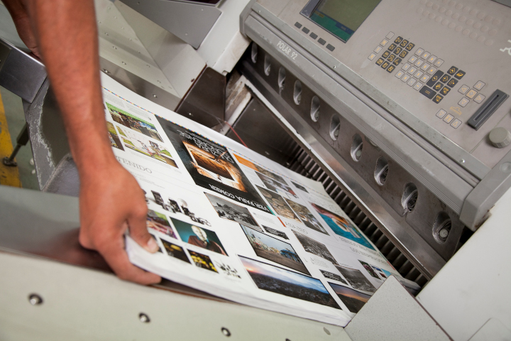
Photo purchased from … www.depositphotos.com
Some commercial printing jobs go south. It’s a fact of life. Here are some lessons you might want to consider based on issues I just had with two of my recent print jobs.
That said, it’s actually helpful to approach things in the following manner. Fixing a problem job for a client who is disgruntled, as well as learning something of value for future jobs, makes you a better print buyer than having all jobs run without a hitch.
The Husband-and-Wife Publishing Team
I recently reprinted a 6” x 9” perfect bound literary print book (i.e., with high production values needed to compete with digital books sold at a lower cost) for a husband-and-wife publishing team. I have worked with this client for over ten years. The two principals of the small publisher love the physical nature of the print book, and they share this love with their literary clientele.
Unfortunately, in this case there were three problems.
The first had to do with folds that were slightly off on the French flaps (3.5” extensions to the front and back cover, folded over the front and back inside covers to give the impression that the book has a dust jacket). These also provide room for additional promotional information. Unfortunately, some of these were not absolutely square (or true).
In addition, the color on some of the book covers was not as saturated or intense as on the original printing of this book.
Finally, in spite of my client’s explicit delivery instructions, all copies of the print book came to her and her husband’s house. They should have received 50 samples. Instead, they received 750 books, 700 of which needed to be at the print book distributor’s warehouse halfway across the country.
Needless to say, I asked my clients to check multiple copies of the books from multiple cartons to determine the extent of the color problem and folding problem, but I addressed the shipping problem immediately because their unsold books needed to be at the book distributor yesterday if not sooner.
Fortunately I had the exact email in which my client had set forth her delivery needs, as well as proof that she had sent this email directly to the printer. With this in hand it was easy to get the book printer to provide appropriate labels for the ten boxes of perfect-bound books to facilitate UPS’s picking them up and re-delivering them immediately.
My client was happy with the speedy service. Having the books picked up and rerouted went a long way.
Furthermore, the printer’s rep for this book offered my client a discount on the problematic books with folding issues and color intensity issues. She hadn’t been asked for this discount. She offered it on her own. My client was especially touched and felt well taken care of in spite of the custom printing issues. At the moment, while her books are being rerouted to the book distributor, my client is tallying up the number of less than perfect books, which already seems to be a smaller number than initially expected.
Moreover, I asked my client to compare the printed book covers to the contract proof she had received from the printer. (The printer had produced two copies: one for their use and one for hers, so my client still had a copy of the cover proof.) Apparently the proof, which my client had initially told me she had liked, did match the final books she had received.
So as the book printer’s speedy attention to making my client and her husband happy moved forward, the scope of the problems gradually decreased.
What We Can Learn
When things go wrong with shipping, which does happen, it always helps to have the email in which you specifically stated what printed copies had to go to which destination point. In fact, it may help to make sure this information is also noted on the printer’s proof sign-off sheet, or to confirm in some other way this information before the cartons ship out. If anything changes, then update the delivery spec sheet and send it to the book printer noting explicitly that it is an update to the original information.
Regarding my client’s color issues and folding issues, I had made an initial assumption that might not have been adequate. I had assumed the art files had been correct for the reprint. What I should have also done is ask my client to send a sample from the initial printing of the book for the printer to match. A physical copy when compared to the ink density and folding issues would have shown exactly what my client wanted. Sometimes the printer’s physical proof and the original art files are not enough (particularly when you’re trying to match a prior press run).
The Fashionista’s Color Chin Cards
I mentioned this job in several past issues of the PIE Blog. My client is producing a set of laminated chin cards. These cards (with a series of full-bleed solid ink hues showing what fabric colors and makeup will be complementary to one’s complexion when held under one’s chin) are 8.5” x 11”, laminated on both sides, and printed on card stock.
I had expressed concern that if produced on a laser printer these cards might have banding problems (uneven lay-down of toner showing streaks through the solid colors). After all, the colors were full bleed, on large cards, with heavy coverage of the colored toner particles. Foreseeing any problems with such banding was my goal in suggesting my client purchase an initial complete set as a proof. Unfortunately, I was right. (I’m usually much happier when I’m wrong.) There was banding. So my client gave the job to another printer.
Rather than lose a client entirely (since she also produces much smaller color swatch books based on the same color system), I thought ahead.
I thought about the HP Indigo color laser printer, which uses much smaller toner particles suspended in fuser oil (rather than the much larger dry color toner particles used in many other digital laser presses). I thought this might minimize banding. I realized this flaw occurs in many cases where the color is built up with multiple layers of cyan, magenta, yellow, and black toner particles, and thought it would be more evident in a large space, like an 8.5” x 11” full-bleed chin card. But I thought the HP Indigo process might be more forgiving.
That said, I also thought back to the three times this job had been printed without incident, without banding. The printer I had used had actually brokered out this digital job himself. I happened to know the kind of press he had used (a Fujifilm J Press, a production inkjet press, rather than the HP Indigo, the color laser digital press I was considering).
I thought a bit further and spoke with a printer who has this digital press. Apparently, since it is an inkjet press, it builds color with minuscule dots (more or less of the cyan, magenta, yellow, or black ink just means more or fewer minuscule dots). This was the technology used for the prior three printings of the chin cards without any visible banding.
At this point, although I know that even inkjet print heads clog from time to time and yield poor quality printing work, I still thought this might be a future option to win back this job. Granted, it will require my client’s seeing samples from this J Press and probably also paying for a full-size, complete proof of all the color chin cards. Since this job is reprinted at least once a year, it doesn’t hurt to have a new printer in the wings who can potentially produce quality work, with consistent color and no banding, for each reprint.
What We Can Learn
Never give up. Actually, that’s the gist of the lecture I received from my fiancee.
My own suggestions have to do with research and being open to multiple technologies. My client’s job was too small (too short a press run, 50 sets of 72 pages, back and front, or 36 leaves) for offset lithography. The only option was digital. That said, there was traditional dry toner (the toner particles don’t always land as precisely as offset ink). There was HP Indigo’s minuscule toner particles suspended in fuser oil. And there was production inkjet, with colors built from process inks using minuscule stochastic spots rather than much larger halftone dots.
At least this is my current assessment, my hypothesis. But I do have to see this hypothesis confirmed with printer’s samples and a physical proof.
I urge you to take the same approach with the commercial printing jobs you buy.
Posted in PrintBuying, Printing | Comments Off on Custom Printing: What to Do When a Job Goes South, Chapter 2
Saturday, May 6th, 2023

Photo purchased from … www.depositphotos.com
A good working relationship with a printer is like a marriage. It takes work. It also doesn’t always go the way you want it to. Sometimes a job goes south. This doesn’t mean it’s time to get up and leave. It just means you need to find a solution that works for both you and the printer. I think most people would not necessarily acknowledge this, since it’s human nature to be angry and get into blame when something goes wrong.
Examples
I used to be a lot harsher, back in the ‘90s when I was an art director and production manager at a government education nonprofit foundation. I remember sending back a delivery of stationery in which the two colors of the logo were out of register. I told the first printer I didn’t want to see a bill, and I sent the job to another printer. Maybe this was, in fact, the right approach. After all, this stationery was for the CEO of the company.
Another time, I sent back a job in which a photo had been flopped (printed backwards). This didn’t show up in the blueline proof (we didn’t yet scan our own photos). The image had been “right reading,” but in the final print job it was “wrong reading.” The photo included the company’s logo pictured prominently (and backwards). I asked for this job, a newsletter, to be reprinted. Now that I think of it, maybe this was the right approach.
Unfortunately, we started to get a reputation among the printers we used (I and the three designers who worked for me). Some printers were hesitant to work with us.
I was slightly more than half my current age. I’ve mellowed a bit since then. Now I prefer a mutually agreeable solution.
How Bad Is Bad?
About 15 years ago I brokered a book printing job for (as I recall) the Embassy of Chile in Washington, DC. The problem was that all the pages in all of the print books were wavy (as opposed to completely flat). My client at the embassy had followed my suggestion and had checked random samples within all of the cartons of books. So there was a reasonable expectation that the problem was pervasive.
This time, instead of sending everything back, I called the printer and asked for suggestions. He said I should turn the cartons of books over (to change how the books lay in the cartons in order to adjust their weight distribution) and then wait. Within a week’s time they had flattened out. The pages were no longer rippled or wavy. My client was very happy and more than a little impressed (as was I by the book printer’s ability to solve the problem).
(My guess at this point was that the covers had been printed via sheetfed offset lithography and the text blocks of the books had been printed via heatset web offset lithography. The books were probably bound and trimmed without letting the text blocks absorb ambient moisture after traveling through the heating units of the web press and then being cooled abruptly by the chill rollers.)
The reason for the problem was actually less relevant than the fact that the book printer solved my client’s problem. Moreover, the print books (while not great when they had wavy pages) were still usable for initial distribution (of a few copies), and as soon as the waviness had relaxed, everything was good to go.
But what if the waviness had never gone away?
How bad is bad? This was fixable. Another project was not. The covers of the print book I brokered for another client were “painted” (heavy coverage of a solid color) with full-bleed black ink from which the cover photo was knocked out. It was rather dramatic.
Unfortunately, the book-cover lamination was added before the ink was completely dry. The slightly wet cover ink gassed out (gave off a gas), which produced bubbles that lifted the lay-flat laminate off the press stock. Again, it was bad in different ways, but for the most part it affected all copies.
So I had the book printer take off the covers and reprint them, wait longer this time for the ink to dry, and then rebind and retrim the print book. Unfortunately the trim size was then slightly smaller than originally intended. In itself, this could have caused horrible design problems. Design elements could have been too close to the trim and been chopped off (or, on an intuitive level, they could have felt like they were too close to the trim). I myself had actually designed the book and had left adequate margins, so everything was good.
The printer was not happy, but he wanted my future business (this is why it’s good to nurture mutually-advantageous commercial printing relationships with your vendors). He also had to trim every book by hand one at a time (not really by hand, since he did use mechanical trimming equipment, but it was a slow and arduous process).
In this case the printer’s cost in lost revenue was less than the cost to reprint the entire book. My client would have accepted nothing less (and certainly not just a discount). Why? Because she was selling the print book and it was ugly (i.e., unusable and unsalable) until the problem had been remedied.
Another client regularly reprints her (approximately) 2” x 3” color swatch books, which people use to choose colors for makeup and clothing that complement their complexions. I forgot to adequately explain to the printer how the job was to be laminated. In haste I made a mistake. So I paid out of my pocket to have the job reprinted.
In this case it was not the printer’s problem. It was mine, as my client’s broker. Unlaminated cards would not have been salable (would not have suited my client’s needs). The problem was pervasive (it affected all color swatch books). There was no other answer but to reprint.
What to Do
Boom. The job arrives. Look at it immediately. With a critical eye. Don’t put this off. You haven’t accepted delivery of the job until you have checked it and responded to the printer. That’s how I’ve always looked at this process.
If there are problems, alert the printer immediately and start to check random samples in a number of the cartons to get a good sense of the extent of the problem. You don’t have to check every item. You will start to see patterns. For instance, maybe the problem is only in samples taken from one carton. Maybe the color shifted in a handful of press sheets, and the pressman didn’t catch the error.
Then document everything with photos and a written description of the problem and its extent.
For instance, recently the client with the color swatch books had color shifts in her finished books. She did what I just suggested and told me the problem was evident in 10 books out of 200. Five percent. They were usable. One client complained.
We settled on free shipping for the next reprint plus an agreement to use a different digital press and a more robust sample-press-sheet checking process. My client was happy (above all else, this is the goal). How did we arrive at the amount? Ten books at I believe about $15 each (total cost of the job divided by 200 books). A fair trade: the shipping cost for free.
I had another issue once with a printer in Canada. He was producing a magazine regularly for one of my clients. As I recall, he had to reprint a press signature of the magazine for some reason. We agreed to “split the difference,” to share the cost of the extra press run. Without my remembering the details (it was 23 years ago), I do remember that in this case the reprint was necessary and not clearly the printer’s fault, so the resolution was fair. Both parties (the printer and my client) were not happy but also didn’t feel taken advantage of. My client printed the magazine at this vendor’s shop for many issues going forward.
(In your own work, another approach might be to ask the vendor about reprinting the job at his actual cost rather than at your normal cost including the printer’s mark-up.)
Overall, this is a judgment call. Do the research into the problem, its cause, and its extent. Then decide what will make you whole. Can you accept the job at a discount? Or do you need a reprint?
Overall, the goal is to get a satisfactory printed product and also to be able to continue one’s long-standing, mutually beneficial working relationship with the commercial printing vendor. This depends in large part on the lines of communication and mutual trust you have nurtured over a number of custom printing jobs.
A printer friend of mine calls a job printed for a client who has never printed with the company before, who probably chose the printer based solely on price, and who is not likely to work with the printer again a “drive by.” This is what you don’t want to be and understandably so. It actually benefits you as well as the printer–over your time working together on multiple print jobs–if both you and the printer “win” rather than if one of you loses.
That’s why I say it’s like a marriage.
Posted in PrintBuying | Comments Off on Custom Printing: What to Do When a Job Goes South
|
|