Printing Industry Exchange (printindustry.com) is pleased to have Steven Waxman writing and managing the Printing Industry Blog. As a printing consultant, Steven teaches corporations how to save money buying printing, brokers printing services, and teaches prepress techniques. Steven has been in the printing industry for thirty-three years working as a writer, editor, print buyer, photographer, graphic designer, art director, and production manager.
|
Need a Printing Quote from multiple printers? click here.
Are you a Printing Company interested in joining our service? click here. |
The Printing Industry Exchange (PIE) staff are experienced individuals within the printing industry that are dedicated to helping and maintaining a high standard of ethics in this business. We are a privately owned company with principals in the business having a combined total of 103 years experience in the printing industry.
PIE's staff is here to help the print buyer find competitive pricing and the right printer to do their job, and also to help the printing companies increase their revenues by providing numerous leads they can quote on and potentially get new business.
This is a free service to the print buyer. All you do is find the appropriate bid request form, fill it out, and it is emailed out to the printing companies who do that type of printing work. The printers best qualified to do your job, will email you pricing and if you decide to print your job through one of these print vendors, you contact them directly.
We have kept the PIE system simple -- we get a monthly fee from the commercial printers who belong to our service. Once the bid request is submitted, all interactions are between the print buyers and the printers.
We are here to help, you can contact us by email at info@printindustry.com.
|
|
Archive for August, 2023
Saturday, August 26th, 2023

Photo purchased from … www.depositphotos.com
The Printing Industry Exchange Blog is #12 of the best 40 digital printing blogs, as selected by FEEDSPOT.
The purpose of a box is to “contain.” Boxes, or cartons, keep together all component parts of whatever you’re shipping. They also sell your brand. To do this, they have to look good.
In this light, my fiancee found a corrugated box this week for Spoonful of Comfort. It is simply designed, with text and (what looks like) a woodcut image of a rooster bleeding off the bottom on two sides plus the branding (the name of the company in a box-rule overlaying the rooster images). On one panel is a text-only logo (Spoonful of Comfort) taking up a space about 3” x 5” wide.
All of this is printed in black ink only, directly on the brown kraft paper of the corrugated board. On the final exterior panel is a notation that the contents were packed with care and that someone is thinking of you. This feels very laid back and personal, probably because of the old-time look of the box (the woodcut rooster) and the very readable type.
Ironically, even though there is a flourish (a floral squiggly rule line) on either side of the “of” in the logo, the type still looks somewhat modern. The text is letterspaced (spread out slightly) in three different modern or contemporary typefaces, but they look old because of the black-only treatment, the flourish, and one small raised letter. (The second “o” in “Comfort” in the logo is small and slightly raised, with a graphic mark under the “o,” although it still aligns with the top of the other capital letters.)
So the long and short of this is that by combining the look of the Old West (the rooster and the capitalized, almost “chiseled” letters) with some modern treatments, the logo and the box in general look timeless (old and new simultaneously), comfortable, and personal.
That’s no mean feat with black type only on unbleached, fluted kraft board.
But the piece de resistance is the interior. The interior supports the “unboxing experience.” This is the excitement you feel when the carton arrives on your doorstep (and you pick it up before the porch pirates get it) and you open the carton in the comfort of your own home. You have an experience not unlike opening gifts on Christmas morning (or Hanukkah, Kwanzaa, and so forth). In our hearts we’re all still children.
The inside of this box is orange, with white knock-out geometric forms (mostly interlocking circles, with a white flower in every other chained circle). It reminds me of a chain-link fence the way everything connects.
In contrast to the black-only imagery on the exterior of the carton, the orange of the interior provides the “Wow” factor. Of course, this is heightened by the copy block on one panel mentioning the care that went into the package. It’s effective marketing, but it’s also quite attractive. I was interested, even though I knew the box was empty.
Printing Technology Options
Being a commercial printing nerd, I wanted to know what technology was used to print the boxes. So I started with the usual suspects:
Is It Offset Printing?
No. First of all, since an offset press would crush the “fluting” (the wavy interior paper that looks like back and forth “S”s), the only way to successfully print on the exterior of a carton via offset lithography would be to print a coated or uncoated press sheet and laminate it to the outside of the fluting. This would create a (usually full-color) image on the outside of the box. I’ve seen this done often on cartons containing liquor bottles. Then again, I’ve also seen coated 4-color printed litho paper laminated to cartons containing electronic devices from “big-box” stores.
Is It Flexography?
Flexography involves using rubber (relief) commercial printing plates to image flat corrugated cartons, usually in one color (often black). Unlike offset litho, this does not involve heavy pressure, so the process will not crush the fluting (the purpose of which is to make the cardboard cartons both light in weight and durable).
When my fiancee and I used to assemble “standees” at movie theaters, the back panels of a lot of the standees had been printed via flexography. I knew because the chalky black ink came off on my hands. Also, the graphics were simple, usually just a flood of black ink covering all surfaces not visible to the theater patrons.
Also, at least back in the 1990s when I was getting labels printed via flexography, the letterforms weren’t as precise as offset-printed text. They had “halos,” a slightly thicker or darker stroke visible around the edges of the letterforms. I know flexography has improved a lot in the past 30-something years, but this was a distinguishing characteristic (at least when the job was printed on matte litho paper).
In the case of this particular carton, I would say that maybe it was printed via flexography, although through a 12-power printer’s loupe the ink looks a little more substantial than the water-based flexography ink I am used to. Perhaps it’s custom screen printing ink (i.e., for serigraphy, a.k.a. silkscreen).
Is It Screen Printing?
Custom screen printing involves forcing thick ink through a fabric or wire screen onto a substrate. It’s good for printing boxes and printing garments like golf caps or items like messenger bags. It does, however, take a lot to set up a press run, so custom screen printing is really only useful for longer runs—like this cardboard box, perhaps. And since the orange color inside is a match color (rather than a build of cyan, magenta, yellow, and black), this would lend credence to my educated guess regarding the commercial printing method.
Is It Digital (i.e., Inkjet) Printing?
Inkjet print heads don’t touch the substrate (ink is jetted onto the substrate through nozzles on the inkjet press), so this option for printing on corrugated cardboard definitely would not crush the fluting. That said, it is a slow imaging process compared to custom screen printing and flexography (once preparation or makeready for screen printing and flexo has been completed). So for a longer press run of cartons (in this case without any variable data such as names), digital inkjet would probably not be cost effective.
In addition, if you look very closely, a sample of inkjet printing is composed of a huge number of almost microscopic dots. To my eyes the ink layer on the cardboard carton seems more even-toned than a layer of inkjet ink.
What’s My Guess?
For a very short press run I would say the technology of choice would have been inkjet. For a long run I would say that, since the design is simple with no registration of colors, this may have been printed via flexography. (Also, flexo may be more forgiving on corrugated stock than on matte litho label paper. If so, this might account for the absence of halos on the perimeter of the letterforms in the typography on the box.)
That said, since the unbleached kraft paper that comprises the carton is porous, I would imagine that a water-based commercial printing ink (such as flexographic ink) might seep into the paper substrate more and not appear to be as thick and rich, particularly the orange ink inside the carton. (That is, I’d expect ink that sits up on the surface of a porous cardboard box—like the box I speak of–to more likely be custom screen printing ink than flexographic ink.)
The Takeaway
In your own design work and print buying work, you may want to take this kind of approach to a design and print job. It’s a good habit, since it will make you articulate your goals and address what technology fits these goals best. Think about the length of the press run, the number of colors, the quality of the substrate (whether you want it to be more or less porous).
Consider whether you want to print a detailed, 4-color design or whether black (or a different single color, or two) type and imagery without close register of ink colors would be sufficient.
Do you need to personalize the boxes (by adding people’s names), or is your box part of a versioned run (with so many boxes for each separate segment of an overall promotional initiative)?
Answers to all of these questions and others will help you determine which method of custom printing to choose.
Posted in Packaging | Comments Off on Custom Printing: An Intricate Carton-Printing Design
Sunday, August 20th, 2023
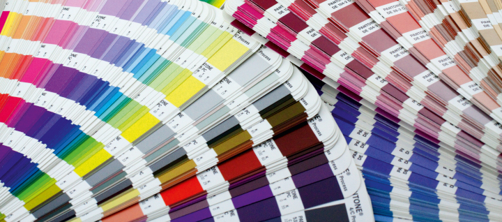
Photo purchased from … www.depositphotos.com
The Printing Industry Exchange Blog is #12 of the best 40 digital printing blogs, as selected by FEEDSPOT.
What is the difference between PMS match colors and 4-color process colors?
First of all, let’s step back for a moment. Color is a function of light and the interaction between the rods and cones in your eyes and the lighted subject you are observing. People see color differently, especially men and women, and if you cover one eye and then the other, you’ll see a slightly different hue with each eye. Also, if the light is different, the color will be different.
So color is quite subjective.
The number of distinct colors you can see is far greater in real life than the colors a computer display can reproduce (using red, green, and blue phosphors), and the RGB color gamut is much larger than the colors you can reproduce with colored toners or inks (the process colors: cyan, magenta, yellow, and black).
(You can find diagrams of each of these color spaces on Google Images. Many of these images show one color gamut superimposed over the others, showing the visible spectrum as being much larger than the CMYK color gamut.)
4-Color Process Offset and Digital Commercial Printing
In many cases this is not a problem. After all, on an inkjet printer or an offset press, the process colors will reproduce the majority of distinct hues.
The way an offset press (or a laser printing press) creates colors is to layer halftone screens of the process colors over one another at specific angles such that the halftone dots do not cover one another. Since the halftone dots are different sizes (the same number per square inch, in rows, but larger or smaller as needed for the four process colors to create–together–all manner of different hues).
Inkjet commercial printing works in a slightly different way. Inkjet printers spray more or fewer dots of cyan, magenta, yellow, and black ink (minuscule but all the same size) as needed to create—when seen together—all manner of hues. Unlike most but not all offset presses and most but not all laser printing presses, inkjet presses often include additional colors in their inkset. Perhaps this would include a light magenta and light cyan, or even a purple and a green, or a red and blue. The goal is to expand the number of colors the inkjet press can render.
To do this on a laser press involves adding more toners. For instance, you can add more liquid toners (very tiny particles of physical toner suspended in fuser oil) to the colors used on an HP Indigo press (and presumably other presses, such as the Kodak NexPress).
If you want to do the same thing on an offset press, however, you would need to use more inking units. For instance, instead of using a 4-color press with four inking units, you might need an 8-color press. You might use four of these color stations for the process colors (CMYK), and then you might add one or two PMS colors (which I will describe shortly) and perhaps a gloss varnish and a dull varnish.
Keep in mind that the 8-unit press would cost considerably more to run than the 4-unit press. So the price of your print job would go up. Moreover, not every commercial printing supplier would have an 8-color offset press, so this might limit your choice of custom printing vendors.
What Are PMS Colors?
Beyond the four process colors, which are laid over one another to produce multiple additional hues, there is a set of colors called PMS (or Pantone Matching System) colors. You can find samples of these in PMS books of various kinds. These match colors or spot colors, unlike the process color builds, are actually mixed (like a recipe for a cake). Companies specifically mix so many parts of one color (like Rubine Red) with so many parts of another color to achieve the exact hue you have chosen from one of the PMS color books.
One benefit of this system is that all custom printing suppliers across the globe can communicate the precise color they want using this agreed-upon standard, and all PMS 199s or 286s will look the same.
(If you use these books, it’s still always best to choose from printed samples in the books rather than from simulations of PMS colors on your computer monitor. Your color samples will be more accurate.)
Why Would You Want to Do This?
Usually, if you’re printing a color job on an offset press, the four process inks will be enough. You can produce brilliant color. You just can’t produce all of the brilliant colors in the visible spectrum. If you’re designing and custom printing a coffee-table art book including vivid oranges, violets, or greens, these colors in the printed job might not be as vibrant as you would like if you only use the process inks.
In that case, you can separate the color images onto more than four printing plates. In the late ‘90s I read about and saw examples of Hexachrome and High-Fidelity Color, which included extra colors like the green, orange, and violet noted above. In this case the separations might include halftones of cyan, magenta, yellow, and black plus “touch plates,” “bump plates,” or “kiss plates” using match green and match violet inks to enhance certain colors in specific areas of the photos.
Another way you can use additional PMS colors on an offset press is to print flat art (solid areas of color, screens, or type, for instance). This would be separate from the photos. That is, you can add a green PMS color as a background screen, or you can set the headlines of the text sections in a solid PMS color without needing to layer process inks over each other to do this.
A flat color, spot color, or match color (all of these are different names for the same thing) will yield much crisper type letterforms than 4-color type (a build of four colors) because there will be no halftone dots used to create the colored type. This would be especially useful if you want to set the text type in a dark gray, for instance, instead of black, since small type rendered in multiple 4-color process colors would be less crisp and harder to read than type printed in a single PMS color.
Another good reason to add PMS colors is to reproduce your corporate logo colors exactly and consistently. When I was an art director in the 1990s, the non-profit government education organization for which I worked included PMS 199 red and PMS 286 blue for it’s red and blue eagle logo in addition to the process colors used for the full-color photographs.
So another benefit of using match colors is their absolute consistency.
For instance, let’s say your job is a 16-page booklet. On the press sheet there would be eight pages on either side, with four across the top and four more pages immediately below these, plus the other eight pages on the back of the press sheet.
Let’s say your backgrounds on some of the pages include heavy coverage ink. Or maybe some have large photographs and some do not. Maybe the commercial printing pressman identifies a color cast in one of the photos and therefore adjusts the ink mix, adding more or less of one or more of the process inks. In the page layout (imposition) of four pages above four more pages on one side of the custom printing sheet, changing the ink composition to fix the colors in one of the large photos might change the appearance of the process color build on the page immediately below it.
If your background color (maybe a green color build behind all other graphic elements on every page) shifts due to the printer’s having adjusted the color to benefit one photo, that change would stand out like a sore thumb. Your background colors would no longer match. However, if you use a match color for all backgrounds on all pages in the 16-page booklet, you wouldn’t have this problem. All of the backgrounds, printed in the same extra color (as a solid PMS color rather than a CMYK build) would be absolutely consistent.
The same is true for your logo colors. These won’t vary from one logo image to another because the PMS colors are always the same.
Duotones
PMS colors can also be used in duotones (images made up of halftone dots like four-color images but created with two inks rather than all four process colors). In this case you might want to use a black and a gray ink, or perhaps a black and a dark green ink, to add color to the image. In this example PMS match colors would be helpful, particularly since you could use the dark green color in both the duotone and elsewhere on the page, perhaps as a highlight color for the headlines of the text in the book you’re producing.
Unfortunately, though, if you’re creating duotones, you can’t really get an exact match when you’re proofing the colors. This is because almost all proofing devices are based on CMYK inks. Therefore, the only way to accurately proof them is on a small proofing press (i.e., by doing an actual, but very short, press run). I will also mention that drawdowns of PMS colors are useful (a colored ink smeared on the paper substrate of choice to give an approximation of the final look of the ink).
Sample PMS Books
Talk with your commercial printing vendor about buying Pantone sample books. The most useful of these is the PMS swatch book that shows all possible PMS colors. (This long and narrow book of color strips will probably comprise more than one volume.) With this swatch book you can select your PMS colors in good room light or sunlight from physical samples on paper rather than images on a computer monitor.
There are also books that show each Pantone Color with its closest CMYK build. This way you can see whether you can create an adequate version of a specific color using process inks, or whether you will need one or more additional PMS colors.
There are also books that show halftones in a particular color, as well as type surprinted on and reversed out of an image or a solid or a screen.
All of these give the designer an approximation of the final printed appearance of the piece she or he is designing.
Better to know what to expect before your printer puts ink on paper.
Posted in Color Theory | Comments Off on Custom Printing: What Is the Difference Between CMYK and Pantone Colors?
Sunday, August 13th, 2023
Photo purchased from … www.depositphotos.com
The Printing Industry Exchange Blog is #12 of the best 40 digital printing blogs, as selected by FEEDSPOT.
On our local free-goods website this past weekend, my fiancee and I found a print, on stretched canvas, of a Gustav Klimt painting. This is better than Craig’s List or even our two favorite thrift stores because, as I noted before, everything is free.
That said, free comes at a price, and in this case the painting, with which we were both familiar, had been cropped severely into the subject matter. Moreover, the gold coloration (Klimt used a lot of gold paint in his patterned images of women) registered as brown because of the porous substrate. It was canvas, but the holdout of the inkjet inks on the primed canvas was mediocre, which dulled down the overall look of what otherwise would have been a striking copy of this Symbolist painting.
Giclee Technology
I have written about giclee printing before. The word means “spurt.” It is high-end inkjet custom printing done with archival inks, archival paper (i.e., acid-free or alkaline paper), and the close attention of the artist (or in this case the close attention of fine arts professionals who had studied Klimt’s work as art rather than as home décor).
Giclee drives up art prices in two ways. The edition of a particular print is sometimes limited. That is, artists may elect to only print a certain number of copies of their original, and this scarcity will increase the monetary value of each copy. The opposite of a “limited edition” is an “open edition,” which can be added to (with more prints) at will by the artist, further diluting their value.
Keep in mind that value comes in two flavors. If you want to make money on art, the more copies that are in existence, the less each copy is worth. If, on the other hand, you love the painting and want to be able to afford a copy, this is a good way to start. In this case the monetary value doesn’t really matter.
In contrast, limited editions or original works of art sold at art galleries and art auctions, such as large paintings even by relatively unknown artists, can run upwards from several thousands of dollars (or much, much more for anything by anyone as famous as Gustav Klimt).
So inkjet commercial printing makes art affordable. This is actually what happened with Alfonse Mucha (and other fine artists, such as Toulouse Lautrec, who made money in the commercial arts as well as the fine arts), especially after the invention in the late 1870s (for printing on tin) or early 1900s (for printing on paper) of offset commercial printing. Regular people could not only see more art but also own it as prints.
With this in mind I thought about other prints I have bought at auction, and I also remembered an early version (from the ‘80s) of an inkjet printer used specifically for proofing custom printing jobs, the Iris. It was an inkjet printer, but due to the technology and the color set, it was not only continuous tone (like a photo print rather than a printed halftone) but also rich in ink coverage and accurate in color reproduction. So it made for an especially good contract commercial printing proof. I never bought one for a job, but I always paid attention to the technology.
Ironically, as noted above, the specific technology was intended to be an interim step in offset custom printing, an especially faithful proof. However, over the years the Iris print has actually became a final art piece to be coveted by collectors.
Old-time Etchings, Engravings, and Other Prints
If we step back in time a bit, artists used to use either sharp instruments to incise metal custom printing plates for fine art line work or establish tones on the printing plate using acids, and resist materials, to either burn away the metal or keep it from being burned away, all to vary the darkness of tones later printed with ink rolled onto the plate.
This meant that in most cases the plate was used to make not a single, original art piece but rather multiple copies. Once burned with acid or cut with an engraving tool, the plate could be printed any number of times on a custom printing press, and the value would rise or fall not only depending on the skill and renown of the artist but also on the scarcity of the limited edition.
In contrast, the kinds of prints that used to be produced via inkjet technology on the Iris proofing device or in modern times on large-format inkjet equipment were in my experience mostly reproductions of paintings and other colorful, flat art.
In my fiancee’s and my case with the Klimt print, we were looking at ways to reproduce colorful paintings, not monochromatic etchings, drypoints, engravings, or mezzotints.
Back to the Present
To come back to present times, our free Gustav Klimt image led us to a couple of solutions. The first involved my fiancee’s touching up areas of the print with metallic paint. (Like metallic printing ink, metallic paint contains small flecks of actual metal: aluminum–or copper and zinc–for silver and brass for gold). This provides a metallic lustre or sheen. My fiancee painted right on the canvas.
She was satisfied with the result but wanted an uncropped image of Klimt’s painting, so we went online to find an art printer.
In my opinion, what makes an art printer more appropriate for this work is that he or she will have the proper inkjet equipment (using pigment-based inks rather than water-based dyes) and archival inks and papers (or canvas). And she or he will have control (as the artist himself or herself would have had) of the overall look of the final giclee (again, not offset custom printing but high-end inkjet, with no halftone dots but instead only minuscule inkjet dots giving a continuous-tone appearance).
The Art Supplier’s Paper Choices
This particular online printer, Fine Art America, offered different sized prints on a number of substrates. I was surprised that canvas was not one of them, although I’m sure their roll-fed printers could accommodate rolls of canvas that might later be stretched over wood stretcher strips. Perhaps for some aesthetic reason Fine Art America offered only paper of various kinds.
When my fiancee and I thought about which paper substrate to use, we looked online but were somewhat confused. We knew that, as with any inkjet or even offset print produced on paper, the substrate (color and texture) would affect the overall look of the print.
In my experience uncoated papers dull back the coloration of inks (of any kind), and gloss-, matte-, or dull-coated papers provide more crisp hues because the ink sits on the surface of the paper rather than seeping into the paper fibers. (I assumed fine art printing and commercial printing would be comparable in these assumptions.)
Fine Art America offered different sizes on different papers. I asked for more detailed descriptions of the paper options and was pleased to receive a list noting specific details of the surface formation and potential appearance of each printed paper stock.
(Remember that the Klimt painting reproductions would have metallics in the inkset. Although we haven’t gotten that far yet with negotiations, it is my understanding that the expanded inksets of professional-grade inkjet printers can include metallic inks–also made, presumably, with flecks of metal in their ink mix.)
In the list of paper options, we looked for such words as “neutral white,” since we didn’t want the hue of the paper to shift the color of the inkjet printed image. Fine Art America included archival matte paper in their offerings, but I was a bit concerned that this would dull down the metallic sheen.
The next three offerings were photo paper (gloss, luster, and photo matte), but my fiancee and I were concerned that this might not give a warm enough feel to the colors and might give somewhat of a metallic sheen to the print (which would not necessarily be bad given the gold in the original).
The next option was a picture “rag” (cotton-, rather than wood-based paper), but we were again concerned that the uncoated nature of the paper would dull down the look of the metallic ink.
The three other options were a watercolor stock, a metallic paper, and a velvet (paper with a bit of texture and yet some smoothness). This cotton rag paper softens the look of the final art, which might make the Klimt image look sensuous and inviting but might also dull down the gold. Watercolor paper we liked for the texture and thickness, but for the metallics we had the same concern about potentially dull ink coloration.
One item noted, however, in Fine Art America’s description of their paper options did catch my interest. Their metallic paper intrigued me. This is how they describe it: “provides an exceptionally vibrant print with the shine and shimmer of metal. This highly durable paper is mostly white with a signature metallic finish, making it ideal for a wide range of images including white and flesh tones” (Fine Art America).
To me, one of the most important characteristics of this paper stock is that it is “mostly white.” So it will not add an unwanted color cast to the final print. This was one concern I had. But it will provide “the shine and shimmer of metal” (Fine Art America). Hence, it might very well provide a realistic appearance of gold in Gustav Klimt’s nudes.
Granted, the best way to make the decision would be to buy one copy (the smallest available copy) of several of the paper options, perhaps including the metallic and the archival matte stock, and make a decision with our own eyes rather than visualizing the results in our mind’s eye.
The Takeaway
This shows just how much of an art form giclee prints have become. The attention to detail, color fidelity, and longevity place this method of reproduction alongside traditional etchings, engraving, screen prints, and art lithographs, as worthy of serious consideration.
And if this interests you, you will see that your own understanding of the principles of traditional offset lithography along with your understanding of various inkjet commercial printing technologies and paper options will be most helpful in your decisions.
But remember to get samples and trust your own eyes rather than just descriptions of paper characteristics. And be mindful of just how the color and texture of the paper substrate will alter the appearance of the final art.
Posted in Fine Art Printing | Comments Off on Custom Printing: Giclee Art Prints and Paper Choices
Monday, August 7th, 2023

Photo purchased from … www.depositphotos.com
The Printing Industry Exchange Blog is #12 of the best 40 digital printing blogs, as selected by FEEDSPOT.
Decor is very big in the digital commercial printing world at the moment. Through the Google aggregator I use, I see almost daily articles on bathroom accoutrements, living room décor, even bedroom sheets, bedspreads, and pillowcases. Why not? You can create your own design, upload the art files, and have a service bureau produce and send you furnishings that all match. If you’re a good designer, that is a great thing.
For this PIE Blog posting, let’s focus on the bathroom. I did some research to find out what people print and how this is done.
Shower Curtains
In addition to online research, I checked all of my fiancee’s and my bathrooms, and I noticed that all of them had fabric curtains that hung outside the bathtub and inside liners that hung into the tub.
When I researched the subject online I found what I had expected, that polyester-based fabrics lent themselves to dye sublimation custom printing, in which a solid ink is heated to the point of being a gas. This gas travels into the polyester fabric and then actually bonds to the polyester fibers. This makes the connection between ink and fabric very strong, so the coloration (in addition to being very bright) is very durable.
Interestingly enough, even if the shower curtain fabric is a cotton-poly blend (or even some other materials), it appears to be possible to treat the fabric with a liquid that will accept dye sublimation printing. In cases where this is not an option, inkjet printing would be the technology of choice.
One thing I did find in my research is that liners are very useful in keeping the printed fabric of the shower curtain away from the water in the shower. Since all printed shower curtains and other digitally decorated (or screen printed) fabrics may have at least some issues with rub resistance (less so with dye sublimation), having a liner is a smart idea.
But what if your shower curtains are vinyl? After all, non-porous materials will not absorb the gaseous pigments of dye sublimation custom printing as polyester fabrics will.
In this case, you would want to use some form of vinyl applique. You can even find videos online showing you how to print these at home. Some form of adhesive (preferably one that can tolerate the heat and moisture of the bathroom) would then be used to attach the appliques to the exterior of the shower curtain. In this case it would be even more important to have the vinyl applique on the outside vinyl sheet and also a liner hanging into the tub.
What about inkjet printing using UV inks? I didn’t find anything on this, but it seems to me that printers with large-format roll-fed or flatbed inkjet equipment with UV lamps could print on the non-porous surface of the vinyl and both cure the UV inks with light and allow the UV inks to stay bonded (for at least a certain amount of time) to the vinyl sheeting. After all, you can inkjet print on glass or metal (or other non-porous surfaces) with UV inks cured with UV light.
Or there’s custom screen printing. Ink for screen printing (a process in which ink is forced through a mesh with a squeegie, with block-out stencils holding back the ink from non-image areas while allowing the ink to flow through the screen onto image areas) can also sit up on top of plastic (or fabric for that matter).
In fact, screen printing is a very dynamic choice since the inks are thick and brilliant in color. They sit up on top of the substrate, unlike dye sublimation inks and inkjet inks. Based on my reading, it seems that some water-based custom screen printing inks are less viscous than traditional screen printing fabric inks (like oil-based Plastisol), so these inks can get the pigment to migrate deeper into the shower curtain fabric (again, fabric in this case, not vinyl).
One reason you might want the ink (whether inkjet, dye sublimation, or custom screen printing ink) to travel further into the fibers of the fabric is that the “hand” or “feel” of the printed shower curtains will be softer. This is also true when you’re buying printing for a fabric flag or banner for a trade show or convention, or even if you’re buying printing for sheets and pillowcases.
Ink of whatever kind that sits up on the surface of the substrate (whether a shower curtain, bed sheet, or even a shirt) the way oil-based screen printing ink does can cause one other problem. Over time and use the ink film on the surface of the item will crack. This is also true, presumably, for printed vinyl appliques, as noted before, that you might attach to vinyl with an adhesive, or attach to fabric with a heat press. The newer water-based screen printing inks seem to not experience as much of this problem because they migrate below the surface into the fibers of the fabric (in ways similar to water-based inkjet inks and dye sublimation inks).
If you choose to print on shower curtains, go online. There’s no shortage of web-to-print applications that will allow you to upload your own designs and then receive a box in the mail containing your new shower curtain. Based on my reading, it seems that some would be stitched together and others printed in one piece, depending on the width of the inkjet equipment or (the smaller) dye sublimation equipment, and all would be drilled at the top (using various options such as holes or slits) for the hooks that hold the shower curtain on the shower curtain rod.
Going Beyond the Shower Curtains
You may also want towels, a bathmat for the floor, or even wallpaper. All of these are possibilities. Just go to the internet. You will want to consider the best adhesives to use, given the heat and humidity of the room. (It seems that décor for the bedroom would undergo less stress from ambient conditions.)
That said, this is where one’s design acumen will make a difference, since coordinating all aspects of the printed environment will require aesthetic judgment and an understated approach to avoid visual chaos.
Hand towels and wash cloths may be problematic, as noted before, because you will need to consider regular laundering as well as rub resistance during general use.
In this light, if you’re not going to use a dye to color the towels and other terrycloth materials (which would only introduce coloration and would not allow for printing patterns or images), you might want to research “fiber reactive printing.”
I don’t completely understand fiber reactive printing yet, but it seems to allow designs to be deeply and permanently embedded in the fabric. Apparently, precisely positioned “discharge” ink allows you to extract the dye (background color) of the towel, bathmat, washcloth, etc., and then add the coloration of the ink where the dye had been removed. This technique uses heating or steaming to remove the dyes while setting the inks you have added, allowing for durability, inks that are set deeply into the fabric substrate, and brilliant coloration.
When you consider how these last three qualities are the very ones that have caused problems for each of the aforementioned custom printing technologies, fiber reactive printing seems to hold promise for the printing of home décor items (presumably even rugs). In fact, it seems to me that all of the benefits of dye sublimation technology are present. I personally will be watching this technology going forward.
The Takeaway
You may or may not be designing items for home décor, but since this is a growing field (one of the hottest in commercial printing), it still behooves you to study it. You can see what the technological options are, but you can also see that these are functional products, so they must be washable, color fast, and durable as well as beautiful. They must stay pristine, and fortunately the technologies are improving along these lines.
Moreover, it’s fun (on a personal level) and intriguing (on a global level) to see how digital custom printing allows us to move away from the long press runs of custom screen printing and other analog processes, while giving us the option of creating a home (bedroom, bathroom—or even a closet full of clothes) that expresses the tastes and design acumen of each individual person.
Posted in Fabric Printing | Comments Off on Custom Printing: Printing All of the Bathroom Decor
|
|