Printing Industry Exchange (printindustry.com) is pleased to have Steven Waxman writing and managing the Printing Industry Blog. As a printing consultant, Steven teaches corporations how to save money buying printing, brokers printing services, and teaches prepress techniques. Steven has been in the printing industry for thirty-three years working as a writer, editor, print buyer, photographer, graphic designer, art director, and production manager.
|
Need a Printing Quote from multiple printers? click here.
Are you a Printing Company interested in joining our service? click here. |
The Printing Industry Exchange (PIE) staff are experienced individuals within the printing industry that are dedicated to helping and maintaining a high standard of ethics in this business. We are a privately owned company with principals in the business having a combined total of 103 years experience in the printing industry.
PIE's staff is here to help the print buyer find competitive pricing and the right printer to do their job, and also to help the printing companies increase their revenues by providing numerous leads they can quote on and potentially get new business.
This is a free service to the print buyer. All you do is find the appropriate bid request form, fill it out, and it is emailed out to the printing companies who do that type of printing work. The printers best qualified to do your job, will email you pricing and if you decide to print your job through one of these print vendors, you contact them directly.
We have kept the PIE system simple -- we get a monthly fee from the commercial printers who belong to our service. Once the bid request is submitted, all interactions are between the print buyers and the printers.
We are here to help, you can contact us by email at info@printindustry.com.
|
|
Archive for December, 2022
Monday, December 26th, 2022
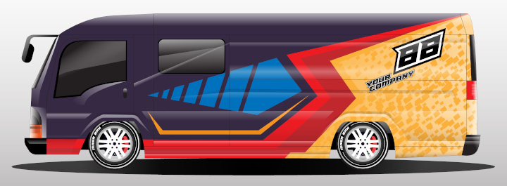
Photo purchased from … www.depositphotos.com
My fiancee and I were out driving the other day, and she pointed out a bus entirely covered in graphics. Even the windows were covered. And there were several QR codes strategically positioned so other drivers could take advantage of what was essentially a billboard.
In advertising, whatever stands out promotes the brand. And as with bottles in the grocery store that have shrink sleeves stretching the graphics across every inch of a product, a bus covered in graphics stands out from every other vehicle on the road.
After all, we are effectively bombarded each day with a huge number of ads (6,000 to 10,000, depending on what you read). And everything from a billboard to a cereal box really is an ad. Everything competes with everything else for your attention.
Analyzing the Bus Wrap
When my fiancee pointed out the vehicle, I quickly whipped out my cell phone and took several photos for later consideration. The bus was for local transport, so it wasn’t huge. And its design presentation, in addition to noting the name of the company, included a background map of the area, a few graphic images, and several QR codes. The overall color (or most prominent tone) was a deep green with other areas in lighter shades of green.
Upon my further reflection, these were the three areas I thought might be of interest to you as readers of the PIE Blog:
- Increasing marketing power with a large graphic.
- Covering windows without obstructing vision.
- Using QR codes to drive traffic to a brand’s website.
The first issue I started to address above. If you want your marketing materials to stand out (in this case a large format graphic), size makes a difference. Covering the entire surface (in this case the entire surface of a vehicle) makes the large format print graphic stand out far more than a simple sign on the side of the bus. It is expansive. It feels larger than life. And there’s nothing else to distract the viewer from the graphic image (no visible windows, lights, bumpers, or anything else that’s part of a bus).
This leads to the second issue noted above, covering the windows. The windows of the bus my fiancee and I saw were completely covered with inkjet graphics printed on perforated window film. From a distance, this appears to be a solid, flat surface on which the large format print images have been produced. But due to the graphic’s being a printed image on a perforated substrate, it is possible to look out of the bus easily without those outside the bus being able to look in. So perforated window vinyl has an added benefit beyond its ability to extend the large format print graphic across the entire surface of the bus. That is privacy.
To give you a little extra information, this mesh product (to me) looks a bit like the 60/40 window mesh I’ve seen advertised (which presumably refers to the printed vs unprinted percentage–of the full 100 percent total area–of what would otherwise be solid, unperforated vinyl for large format inkjet printing).
I’ve also seen material like this used on interior windows of restaurants, on shops in a mall that are under construction (to avoid unsightly boarded up sections and to advertise the brand offerings of the upcoming tenant). I’ve even seen large format print graphics produced on similar perforated material stretched across exterior fences to advertise a company in an attractive way.
And the third benefit of such a bus wrap (or vehicle wrap or fleet wrap) is that once you add QR codes, you allow for a two-way conversation between the consumer and the brand. The person (like myself) who sees the bus and is impressed (or wants more information) can point her or his cell phone camera at the black and white image on the bus, and, using software that can be downloaded to a cellphone, she or he can be directed to a website. Presumably, having reached this website, the interested person can then request more information, or email or call to interact with the company.
The QR code is a cross-media device providing a bridge between print advertising or marketing and an internet experience. And market research has determined that nothing cements brand recognition in the mind of the viewer as well as a blend of print and online marketing. Repetitive, consistent exposure drives up brand awareness.
Elements of the Bus Wrap
What do you need to consider if you’re researching bus wraps or any other large format print vehicle wraps in your own work? Here are some thoughts:
- Find a dedicated vehicle wrap company that can print the graphic and install it. These are two different skills. It is worth paying for both kinds of expertise.
- Consider the length of time you will need the vehicle wrap to be pristine. Depending on what I have read, the life span of a vehicle graphic ranges from two years to six or even ten years. Presumably, this will depend to a good extent on whether the vehicle is parked outdoors or in a garage, since exposure to sunlight, rain, snow, and rocks being thrown up against the vehicle by other traffic will all shorten the lifespan of the vehicle wrap.
- However, choosing the right construction materials makes a huge difference. These include the substrate (a vinyl specifically made for vehicle wraps) and the inkjet inks (latex, solvent, eco-solvent, or UV inks, all specifically fabricated for exterior use). On a side note, one benefit of latex ink beyond it’s being more eco-friendly than solvent inks is its ability to stretch. When you consider the fact that a vehicle wrap is applied with heat and adhesive to a three-dimensional surface with bulges and indentations, the flexibility of the ink can make a big difference in its installation, appearance, and durability.
- You will also want to consider the specific adhesive you will use to affix the printed vinyl vehicle wrap to your bus, truck, or car. These large format print graphics can be removed, so a vehicle wrap need not destroy the underlying paint job. However, it is wise to remove and replace the vehicle wrap before the stated lifetime. As time passes beyond this point, the adhesive gets harder to remove, potentially threatening the underlying auto paint.
- You might also consider an overcoat of some kind, like a laminate or some other barrier to UV light, to keep the inkjet color intensity from fading in the sunlight.
- If you think you can install/apply the graphic yourself, think again. This is highly specialized work. It’s worth every penny to find a skilled installer who knows just how to bend and shape the printed vinyl and wrap it into all the indentations of the vehicle, overlapping the printed segments of the image in such a way that the installed large format print graphic looks like a single printed photo. In addition, the graphic is installed with an adhesive and heat as well as pressure, and a skilled installer knows how to get rid of the creases and air bubbles.
- The good news is that if you scratch or ding a vehicle wrap, it can often be repaired. You don’t have to remove and reinstall the entire image. You just need to print out the damaged portion and reattach it. And this might go a long way in lengthening the life of a vehicle wrap.
The Takeaway
Here are some thoughts:
- Personally, I think this would be a great avenue for creative expression, appealing to designers who like to work on bold, sophisticated imagery. Overall, vehicle wraps are affordable, so advertising agencies presumably need graphic artists to do this kind of work for their clients.
- Study the physics behind the products (inks, substrates, coatings, as well as general aspects of installation) so you can direct a photo shoot if necessary and communicate knowledgeably with the inkjet printing staff and installers. The more you understand the physical process as well as the design process, the better.
- Regarding QR codes being incorporated into the design of vehicle wraps, you might want to study cross-media marketing (the synergistic effect of combining print marketing with digital marketing).
Becoming proficient in all of this will make you indispensable as a marketing creative.
Posted in Large-Format Printing | Comments Off on Custom Printing: More Than Just a Bus, It’s a Billboard
Sunday, December 18th, 2022

Photo purchased from … www.depositphotos.com
Everything I learned about graphic design, I learned on my own by observing. My degree is in English Literature. That said, I’ve been observing, analyzing, and practicing graphic design for 48 years now, ever since I laid out my first high school yearbook.
Last week my fiancee found a print book at a thrift store that immediately caught my interest due to its design or, more specifically, due to the organization of its content and its visual flow from page spread to page spread.
Two Principles of Organization
To illustrate these two concepts, let’s start with the organization of content. Forty years ago, as a print book designer, I would receive a manuscript in which all text was the same size and typeface (written on a mainframe computer). At that stage, a reader would have had no idea of which paragraphs were of greater or lesser importance, which pertained to the front matter of the print book, or which were text, captions, callouts, or sidebars.
It was an undifferentiated mass of text, like some modern novels I have read. My first goal was to break up the text into related chunks, to place these separate text groupings onto appropriate pages, and then to use such tools of graphic design as typeface and point size to either connect these text blocks to one another or to set them apart—based on their content and their levels of importance.
The second concept is more sensory (less cognitive). It is the visual flow of the print book. In this vein, the reader’s eye appreciates contrast. Contrast helps the reader identify related (vs. unrelated) chunks of copy as well as related ideas presented with visuals. It also gives the reader a break from undifferentiated words on a page (as do type size and typeface choices, as noted above).
Analyzing the Book
The print book my fiancee found at the thrift store is called The 9-Inch “Diet” by Alex Bogusky and Chuck Porter. Intriguingly, it is 9” x 9” in format (which is congruent with its title), and it is perfect bound. The content addresses how commercially sold food has been super-sized to the detriment of our health.
As with the books I produced prior to becoming an art director, The 9-Inch “Diet” was initially an undifferentiated manuscript produced in a word processor on a computer. A print book designer made sense out of all the material, and because of this I, as a reader, can now more easily grasp the points Bogusky and Porter make.
Let’s tease out the specific things the book designer did.
Contrast of Size
The running text of the book is set in an easy to read serif typeface in two columns at what looks like about 11 pt. with extra leading (space between lines of type). For ease of readability, the body copy is set ragged right (which is easier to read than justified copy).
Introductory material in the front of the book spans the two columns and is set in a larger point size.
Headlines are set in what looks like a 36 pt. slab serif typeface in all capital letters. Since they are separated from the text with adequate space, the uppercase headlines are still readable (even though an all capitals headline treatment does slow down reading).
The headlines either span two columns (above the text) or fill the column next to a column of body copy.
And there are callouts. If they appear on a page with text, they are slightly smaller than headlines (and are written in a conversational tone), and if they appear alone on a page spread, they are much larger and yet are still set in the same slab serif typeface in all capital letters.
I wouldn’t be surprised if all of this granular information isn’t mind numbing. However, my point is that consistency sets up patterns (and therefore expectations) for the reader to consciously or unconsciously absorb. For the treatment of body text, headlines, and callouts, there is a pattern—and a rhythm—that allows the reader to group information and grasp salient points. Contrast is the tool that makes this happen.
But contrast in this book goes further. There are dramatically different single pages, and double-page spreads, that add variety to the book (and allow the reader to pause in reading the text). Large, all-caps, slab serif typeface blocks of copy (in a conversational tone) are laid out on black, full-bleed backgrounds and white backgrounds.
The large size (the single white or black page or page spread) adds a periodic pause (and a pithy statement) breaking up the flow of the body copy (the running text of the book). This makes these pages stand out, reinforces their importance, and gives the reader a break in reading the text.
Full bleed, double-truck (spanning a full two-page spread) images as well as images that don’t bleed further punctuate the book. In contrast to the complex pages of body text (which often have ample white space around them, reflecting another contrast, one of content vs. no content), these pages are simple, giving the reader only one thing to focus on at the moment.
Visual Flow
Flow is more general (it affects the whole print book rather than just one page), but like contrast of type size and contrast of value (huge white type against a black background and huge black type against a white background), page flow breaks up the book and carries the reader through the text with an implied (and expected) rhythm.
For example, the The 9-Inch “Diet” book designer used “implied lines” to direct the reader. For instance, in one photo a man’s finger points at a single pea on a plate. His arm (in a suit), his hand, and a finger create a diagonal line from the top left to the bottom right of the page, drawing the reader’s eye to the pea (also highlighting the contrast in size of the arm and the pea), while on the opposite page there are two ragged-right columns of type and above these a large amount of white space (this spread opens a chapter, justifying the large white space at the top).
And I just saw this. There’s a tiny head shot to the right of the two columns on the right hand page (i.e., in a scholar’s margin). It is visually analogous to the pea on the plate on the opposite page (the same visual weight). It is also almost exactly aligned horizontally with the man’s finger and the pea.
What this means is that the reader’s eye sees a headline reversed out of the photo of the man’s hand, then the pointing finger, then the pea, then the tiny head shot on the opposite page. So the book designer has led the reader’s eye through the double-page spread. This is exactly what a designer should do, and it happens in a number of other places throughout the print book as well.
More Visuals: Drawings and Silhouettes
Line drawings and photo silhouettes round out the collection of visuals. In some cases the line drawings are informational (i.e., explanatory). In other cases they seem to be used for contrast with photographic images for visual variety.
What makes the numerous photo silhouettes interesting to me is two-fold. In many cases there will be a photo of a food: let’s say a plate of fries in London (5.5 oz) next to a McDonald’s “Super-Size” box of fries (7 oz.). Because of the nature of the silhouette (a total focus on the subject with no distracting background), the presentation highlights the dramatic increase (over time) in food portions in the United States.
The same visual device is used to contrast a plate of baked chicken and vegetables with a much more amply laden plate of fried chicken, potatoes, pasta, and veggies. The first photo has the word “Realistic” reversed out of it. The second has the words “You wish” reversed out of it.
So the visual device of silhouetting an image is congruent with the focus on size (and size differences) that the designer wants to illustrate. It is not a gratuitous effect.
However, as an aside, the silhouetting effect does amplify the white space on the page, which, as noted above, gives the reader a visual break in an otherwise full-to-capacity visual field.
The Takeaway
What can you learn from this discussion? Here are some thoughts:
- All visual techniques and tricks should be pertinent. You as a designer should pick the appropriate tool both to reinforce the points stated in the text and also to show the reader what to read first, second, and third.
- Contrast is a valuable tool for organizing visual and textual material. Consider type size, typeface, background screens, photos. Use generous white space to set apart (and group together) related items.
- Find books and other publications you like, deconstruct them, and be able to articulate how the tools of graphic design were used to reinforce the meaning/content of the book/brochure/etc.
Posted in Design | Comments Off on Commercial Printing: A Striking Book-Design Case Study
Sunday, December 11th, 2022
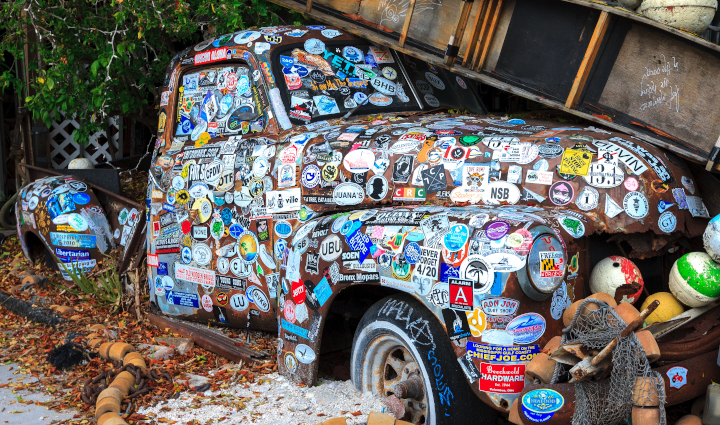
Photo purchased from … www.depositphotos.com
Think of a bumper sticker as a miniature billboard. You can share your message with every driver who winds up behind your car. Or, as the photo above suggests, you can broadcast an almost unlimited number of messages at once. It’s a cheap way to advertise. In fact, you can even make a few bumper stickers at home on an inkjet printer or a Cricut personal die cutter.
Design Issues to Consider
Unless a driver is caught behind you in gridlock traffic on a snowy day, with your bumper sticker visible potentially for hours, you have a small window of opportunity to make a big impression. So think simple. One provocative image and a few words. Your viewer shouldn’t have to think about it. However, if it’s humorous–if it includes a play on words–all the better.
Readability is paramount. That means typeface choice is important. I’ve read that serif typefaces are easier to read than sans-serif faces, but with only a few words on a bumper sticker, to me that choice is less important. What is important is to set the type in one line, ideally, with reasonable letterspacing, in uppercase and lowercase letters.
Why uppercase and lowercase letters? Because we don’t read words letter by letter. We read them based on their shape, the contour around the letters. We absorb a word as a single unit. Setting copy in all capital letters makes all words into a rectangle (there are no ascenders and/or descenders in the letterforms to give the word a unique shape). That makes the word much harder to absorb.
Now for the colors. Keep colors vibrant, and be mindful of the contrast between color values (light and dark). Remember that type reversed out of a solid color (or type set in a color) is harder to read than type printed in black ink. Moreover, type printed in a color can be too light to read easily and quickly. The most readable contrast for type is black type on a white background.
That said, since you probably want to add color, just make sure the words will be dark enough to read, ideally from a distance. For instance, light green may look great as a swatch in a PMS book, but once you reduce the ink coverage to the thin and graceful lines of a typeface (rather than a square ink swatch), the text may look much lighter than you expect. This alone may be a good reason to use a blocky sans-serif typeface (rather than a serif face) for the text of your bumper sticker. You won’t have to worry that the thin serifs of a serif typeface will be invisible.
On a final note, consider the logistics of reading a bumper sticker. Your reader will be in a car a certain distance behind you. Both of you will be driving at a good clip and focusing on other things. Fortunately, your viewer will be directly behind you, unlike a driver who sees a banner on the side of a building or sees a billboard at a distance (and perhaps an angle). That said, the bumper sticker will be much smaller than the billboard or fabric banner hanging from the side of a building. Keep all of this in mind when you choose the wording and image for the bumper sticker as well as the typeface and colors.
When in doubt, print out a color copy on your inkjet printer, and look at it from a number of angles and distances.
Commercial Printing Issues to Consider
Durability is paramount for bumper stickers. After all, unlike a brochure, they’re going to be exposed to the elements, the UV rays of the sun, the rain, the snow, even the salt thrown up onto your car by other winter drivers.
Therefore, talk with your commercial printing representative when you print your bumper stickers. Ask about the substrate, for starters. You will probably want some kind of vinyl rather than a wood-based paper. At the very least, synthetic paper like Yupo would withstand exposure to the rain better.
This also pertains to the types of inks used. They will need to tolerate moisture, street chemicals, and sunlight. In addition, you may need some kind of coating to protect the bumper stickers, something like a laminate. Your custom printing vendor will be a great resource when you’re making these decisions.
Next is the adhesive. The bumper sticker has to stay on your bumper and not peel off. As a personal anecdote, I once had a bumper sticker I liked (and that I assumed was close to permanent). It was actually printed on paper, and the adhesive wasn’t very good. So overall the bumper sticker didn’t last very long. Moreover, it looked ugly as the type and image gradually wore away and the paper started peeling up.
Unlike banners that might be on display for only a short time, a bumper sticker really has to be durable and has to stay attached to the car.
So ask your printer about adhesives as well as custom printing stocks and inks.
Doing It Yourself
If you need 1,000 bumper stickers, you will probably have them offset printed. If you need 300 bumper stickers, you will probably have them digitally printed on inkjet equipment (with appropriate inks and substrates).
But if you only need a handful of bumper stickers, you still have options. You can research inks and vinyl bumper sticker substrates for your personal inkjet equipment. These are available. You just need to do a little research. For instance, you may need to select specific vinyl bumper sticker blanks, use special inks, and/or laminate the bumper sticker to protect it.
Moreover, you can even die cut odd shapes and sizes of bumper stickers using a Cricut personal die cutting machine (available in craft stores such as Michaels). These cut the vinyl with a moving knife blade in the Cricut die cutting machine using digital information from your computer application. Then you just “weed” the die cut bumper stickers (i.e., peel away the waste vinyl using a sharp tool).
Although this will pertain to professionally produced bumper stickers as well, when you print your own bumper stickers it will be prudent to apply them using a credit card to rub down the bumper stickers. This will ensure good contact between the sticker and the bumper, while forcing the air bubbles toward the edges of the sticker, where they can be released. (If you do this, first cover the bumper sticker with wax paper to keep from marring its surface.) This will help extend the life of the bumper sticker on your car.
The Takeaway
Your company image is of paramount importance, and a bumper sticker is an ad for your company. Make sure you select a custom printing technology (ideally commercial printing rather than do-it-yourself printing), a substrate, inks, adhesives, and a coating for the bumper stickers, if any, that will ensure that your bumper stickers look good for a long time. (In my online research I noticed a 3- to 5-year guarantee from some companies on their commercially printed bumper stickers.) It would be wise to keep this in mind and to think about how long you want the bumper sticker to remain pristine. Make sure your commercial printing vendor is knowledgeable in this printing arena. (In fact, I’d check for printers who specialize in this kind of work.)
Don’t cut corners with your bumper sticker printing. Consider it an investment rather than an expense. This way you won’t be disappointed, and the condition of your bumper stickers will project an image of crispness and quality rather than discoloration and decay.
Posted in Bumper Stickers and Decals | Comments Off on Custom Printing: Make Your Mark with a Bumper Sticker
Sunday, December 4th, 2022
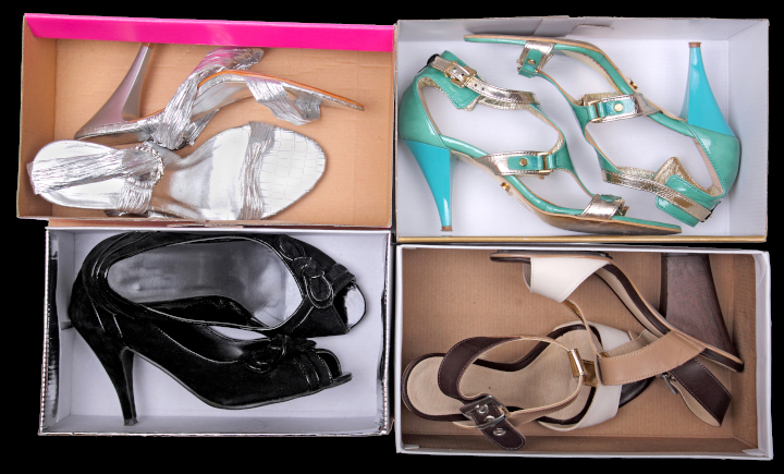
Photo purchased from … www.depositphotos.com
My fiancee and I recently went to Nordstrom Rack for shoeboxes. We’re working with our autistic art therapy students to make Halloween dioramas. They will be miniature rooms with a coffin, spider webs, rats, skeletons, plus any drawings the students wish to add.
As a student of commercial printing, however, I noticed the attention to quality and detail in the construction of the empty shoeboxes. We found about thirty of them for our various classes, and two of them in particular stood out from the rest. I’d like to talk about why they are effective marketing items beyond the shoes they once contained.
Marketing Is a Dialogue
Good marketing is a dialogue. It is personal, even intimate. A brand speaks directly to you. If the company has done research into its clientele, its marketing department will be able to describe exactly who the target buyer will be. This person will have specific likes and dislikes, interests, values. They will share many of these with other buyers and may even have certain similarities in their personal history. The detail of this “persona” is impressive, given all the data the company must collect and digest to envision this model buyer. But the good news is that the marketing research will allow a brand (let’s say in this case a shoemaker) to predict exactly what kind of shoes you will want and to give them to you.
Based on this information, the company (i.e., the brand) will work to communicate its brand values, with which you will presumably resonate. This is true (in the case of the shoeboxes) for both the product and the packaging. The shoes have to be outstanding. Granted. But the packaging has to convince you to open the box (the “unboxing experience”) and try on the shoes.
These brand values, which perhaps will include the quality of workmanship, the stylish nature of the shoes, the social conscience of the company, or on an even more personal level just how good you will look and how you will feel when you wear the shoes—all of this has to be reflected in the packaging (the box) as well as the shoes.
Apparently Nordstrom Rack (at least this one store) recycles more than 300 shoeboxes a day. When my fiancee and I went inside for the boxes, we saw aisle after aisle of shoes, multiple hundreds of boxes vying for the buyer’s attention. Since the shoeboxes have sides that obscure the shoes themselves (a little), a lot was riding on the unique nature of the boxes to sell the products inside.
The Sample Boxes
The first sample box I want to describe is entirely covered with a 4-color comic strip (top, bottom, and all exterior sides). It is a Jeffrey Campbell shoebox covered with empowering and empowered women superheros, including one on a motorcycle and one in space in a meteor shower. It is like a comic strip because one hand-drawn image is set off in a black-edged box, with word bubbles for the character’s dialogue, and there are also other signs and word-bubbles across the surface of the box.
I personally know nothing about Jeffrey Campbell shoes. (I’m sure my fiancee knows a lot, since she is very stylish and knows brands well.) However, with no knowledge except my initial reaction to the box and the words “Women Unite,” Resist,” and such, plus the space imagery and bright colors, I would say that the company’s brand values include not only empowerment but also humor. And humor sells. Most people want to “associate” themselves with (to be “affiliated with”) a product and company that embody these specific values, and the job of the shoebox is to communicate these values.
If you open the box and look closely at its construction (the lamination of the commercial printing press sheet over the thick chipboard), you might say that the company or brand pays attention to detail (in general) and durability (in particular). Not all of the boxes in the store would meet this standard, both for quality package manufacturing and creative, unique graphics. So this goes a long way.
The second box is lime green. In fact, my fiancee picked out a number of boxes in this specific color for our students. When we walked down the aisles looking for empty boxes, these in particular jumped out because of the thick, heavy ink coverage of the lime green, which was almost fluorescent in its luminosity. A box like this is distinctive. In a store with multiple hundreds of boxes of shoes, that’s very important.
As with the first box, the thickness of the chipboard broadcasts durability and quality. Like the first box, the green commercial printing press sheet (with only a white, hand-lettered Sam Edelman script signature and logo on the green) totally covers all chipboard in the box (in contrast to a lot of other boxes in the store). Again, to me this reflects the brand’s attention to detail and overall quality. All edges, folds, and corners are crisp and precise, with the laminated paper square to the sides of the box.
What makes this box unique is threefold. First, as noted, you can see it from across the store. That’s good advertising. Sam Edelman chose not to compete with other brands for the customer’s attention but rather to grab it immediately with the color of the box. Second, the surface of the lime green box has a canvas texture, like a painter’s canvas. It feels good in the hands. You can easily grasp the box. And it also feels strong and rigid.
But to return to my assertion that good marketing is a conversation, the “piece de resistance” is an envelope containing a little saddle-stitched print book included in the box with the shoes.
Here’s why it’s unique.
First of all, the envelope is about 2” x 3”. It has a build of about 1/3” on all sides, allowing for the easy insertion and removal of the print book it contains. The lime green background of the box continues onto this envelope and book, with only a Sam Edelman signature reversed out of the green envelope and the book cover. The booklet is printed on bright blue-white paper, so the words and images “pop.”
There’s something personal about the size of the print book. No one else would know you’re reading it, it’s so small. And inside there are hand-drawn images of a man (Sam, presumably Sam Edelman himself) and a woman (the shoe buyer, Libby) engaged in a dialogue.
All of the dialogue between the two of them (set in a small, sans-serif typeface) centers on where the shoes were made, how they were made, and why they are special. At one point Libby even says, “And because of this I want to keep them forever. Shoes say so much about a person.”
As a reader, I’m the proverbial fly on the wall looking at watercolor images of Sam and Libby while listening to their discussion. Some of the illustrations are even accompanied by hand-lettered callouts describing the Sam Edelman shoes.
Overall, it’s an intriguing and personal conversation. And even though I don’t buy women’s shoes I can appreciate my fiancee’s love for this entire packaging initiative. It shows that a brand can do enough research to understand its buyers and deliver a unique product that will satisfy them and help them look beautiful.
The Takeaway
What can we learn from this?
- Consider this approach. If you wanted a job at a particular corporation, you wouldn’t just mail in your resume. You’d probably study the company’s website and annual report. Maybe you’d visit the company to see what you could learn. You would try to absorb as much as possible about the company to see how you could specifically contribute (or “add value”) to its operations. A good marketer will do this, too, even with a shoebox. Who is the client? What does the client like and dislike? What can a brand create (both product and packaging) that will please the client? In my view, these two shoeboxes reflect this kind of soul searching into what both brands can offer that is unique.
- After a brand is able to articulate the nuances of a buyer’s persona, the brand’s goal is to reflect all of this not only in the product (shoes, in this case) but also in all marketing materials, making relevant design decisions in everything from typefaces to paper choices to color. Every time the buyer interacts with the brand (through signage, a brand’s online presence, catalogs, even “frictionless” interactions with the company’s call center), the brand’s ethos must shine through. That is separate from, but intricately intertwined with, the overall quality and specific attributes of the product.
- As a marketer, it is your responsibility to initiate and maintain such a conversation with your customers.
Posted in Packaging | Comments Off on Custom Printing: A Unique Shoe (Un-)Boxing Experience
Thursday, December 1st, 2022
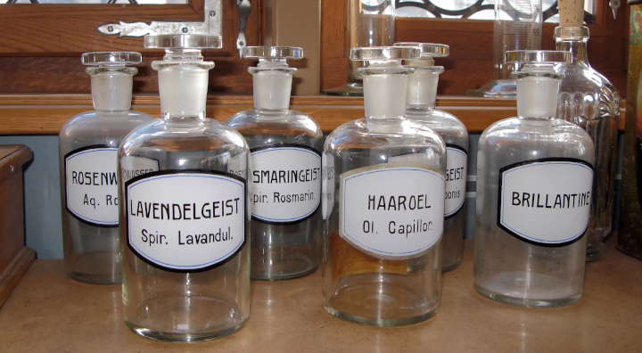
Photo purchased from … www.depositphotos.com
For about thirty years, I’ve believed that everything is advertising. Everything you present to someone from a business card to a mug sells your brand, broadcasting all aspects of your business from your values to your attention to detail.
That said, a physical object that your prospective client can actually use says more than just a promotional brochure on paper or an email sent to a client over the internet.
In this light, when I was casting about for a PIE Blog article subject this week, my fiancee handed me about ten printed glass bottles. They range from a milk bottle to a Whole Foods bottle promoting both Whole Foods in general and the Whole Foods Beer Market in particular.
An Antique Bottle
The Sealtest milk bottle is an antique, and for me it brings back memories of a simpler time when our milk was delivered to our door (even in our apartment building, even as late as the 1960s).
From the vantage point of a student of commercial printing and a student of graphic design and marketing, I think this is an interesting artifact for a number of reasons.
Marketing
As a marketing piece, it reflects not only the overall Sealtest brand and Sealtest’s dairy products, but it also gives a nod to the Western Maryland Dairy in Baltimore, MD. Printed notations on the bottle not only identify the dairy location but also speak to the science behind the milk product (in terms of its quality checks and its being pasteurized).
So a cursory reading of the custom printing on the bottle links healthfulness and reliability with the Sealtest brand and the Western Maryland Dairy brand. If you had been a child or adult back in the 1960s and had found this bottle outside your door, you would have relied on it as a healthful and tasty addition to your meal. Such advertising is priceless.
Printing
This bottle exemplifies custom screen printing. If I closely examine the printing with a 12x printer’s loupe, I can see that an initially thick film of ink had been applied to the bottle (presumably) 50 or 60 years ago, and that this film had been scratched away in places over these five or six decades through heavy use and overall age. To me it almost looks like pigment that was scratched off a layer of glue, and if I didn’t know better I’d assume the writing was an applique attached to the glass bottle after the molten glass had cooled. However, I know that for multiple decades custom screen printing has been the method of choice (prior to digital printing) for decorating glass.
Why? Because once the screen-printing frames have been prepared and the stencils attached to the mesh, this is the most economical way to print on glass. Also, the thickness of custom screen printing inks lends itself to rich, dynamic colors. And yet screen printing multiple colors requires a lot of make-ready. So the fact that the Sealtest bottle is printed only in the Sealtest brand color red would lend further credence to my guess that the commercial printing was done via custom screen printing (also known as serigraphy).
The bad news is that custom screen printing is ideal only when printing a few colors (and simple graphics). The good news is that it is perfect (and cheap per unit cost) for simple graphics and mid- to long-run jobs–even at the present time, and even with the availability of digital glass printing.
A Shot Glass, Frosted Absolut Glass, Two Beer Glasses, and the Whole Foods Beer Bottle
What all of these have in common, and how they differ from the Sealtest milk bottle, goes way beyond drinking milk vs. drinking alcohol, although this is a part of the story.
Marketing
Milk (and the staid nature of the branding on the bottle) is for people of all ages. It is a staple of one’s diet, and the tone of the marketing on the bottle is serious, reflecting Sealtest’s reliability and the healthful nature of the milk the bottle contains.
In contrast, the Blue Bell shot glass, with its frosted ultramarine blue background and its silhouette of a young girl in a bonnet leading a cow by a rope (plus the words Blue Bell printed below the image), suggests a transition from milk (the cow) to alcohol (the shot glass). The branding, while traditional, is more dramatic in nature, given the contrast between the ultramarine background and the white, thick, screen printed ink (this time I’m sure, because the ink is so abundant).
And there’s a little humor in custom printing milk imagery on an alcoholic shot glass. Beyond everything else, if you can make someone laugh (as a marketing professional), you have their tacit approval. You’re half way to the sale because the prospect is having fun.
The frosted Absolut glass takes the same marketing route. The vertical lines of the mixed drink glass echo the vertical lines of the Absolut Kurant Imported logo typescript. (The marketing artwork is an ad in black and purple printed on an opaque plastic applique, a bit like a shrink sleeve.) The background black script typeface and a line drawing of a leaf with currant berries make the whole glass into an advertisement. But it looks upscale, so if you’re holding the glass, you can be a part of the leisure class.
The two brown beer glasses and the Whole Foods Beer Market bottle form the final group of glassware. The background glass color is a deep brown, and there is a nice heft to all three pieces. The custom printing is all in white, except for the blue Whole Foods logo on one side of the bottle. On one of the glasses, there is a chatty tone in the printed commentary about making beer glasses out of beer bottles. On the other glass is a notation about how if you can read the type on the glass (which is upside down), then you’ve spilled your drink.
So most of this is light, chatty, and above all funny. Humor, as noted above, sells. Remarkably well.
Printing
Since all three of these final pieces were crafted close to the present time (when compared to the Sealtest bottle, the shot glass, and even the Absolut tumbler glass—presumably), it is much easier to see what techniques were used for the custom printing work. In fact, I would venture that all of them were printed via custom screen printing. Why? Again, because of the thick, rich application of ink. There is something opulent about such a generous laydown of pigment. Like butter.
What Are the Printing Options?
Here’s the rundown:
- Custom screen printing is great for printing a few colors (the beer glasses and bottle all have white ink on the brown glass).
- Screen printing is great for mid- to long-run printing. If you’re doing a short run of bottles for a craft brewery, consider UV inkjet or digital ceramic printing.
- Unfortunately, since custom screen printing is time consuming to set up, it requires long runs, and that might lead to extra storage costs (warehousing, inventory, etc.).
- Screen printing is not great for multiple colors or photo-realistic imagery.
- Screen printing is out of the question for variable data.
- UV inkjet is an ideal option for short-run, multi-color, variable-data printing on glass. The UV inks cure instantly when exposed to UV light. And you can use a non-permeable substrate (like glass).
- Unfortunately, UV ink application just sits up on the surface of the glass, so it can be scratched off over time. Longevity and hard use must be taken into consideration.
- That said, there are ways to digitally print ceramic inks on glass (containing “frit,” actual particles of glass along with the pigment). Using ceramic digital inks you can print the glass and then fire it such that the printing actually becomes a part of the glass. (The ink doesn’t just sit up on the surface of the glass as it does with UV inkjet printing.)
- When all is said and done, if you want to pursue a less high tech (and presumably less costly) route, you can always print and apply clear-backed labels. These would probably be printed via flexography (water based ink printed with rubber printing plates). Unlike screen printing inks, however, flexographic inks are not particularly opaque, dense, or rich because they are not as thick as custom screen printing inks.
The Takeaway
So at least you have some options. And, as I’ve noted regarding the various printed glass items my fiancee gave me for analysis, what you’re selling (the brand, the product) and the image you’re trying to convey will be as important in choosing a commercial printing technology as are the length of the press run, the detail in the imagery, and the number of ink colors you want to use.
Posted in Ceramic Printing | Comments Off on Custom Printing: A Collection of Promotional Glass-Printed Items
|
|