Printing Industry Exchange (printindustry.com) is pleased to have Steven Waxman writing and managing the Printing Industry Blog. As a printing consultant, Steven teaches corporations how to save money buying printing, brokers printing services, and teaches prepress techniques. Steven has been in the printing industry for thirty-three years working as a writer, editor, print buyer, photographer, graphic designer, art director, and production manager.
|
Need a Printing Quote from multiple printers? click here.
Are you a Printing Company interested in joining our service? click here. |
The Printing Industry Exchange (PIE) staff are experienced individuals within the printing industry that are dedicated to helping and maintaining a high standard of ethics in this business. We are a privately owned company with principals in the business having a combined total of 103 years experience in the printing industry.
PIE's staff is here to help the print buyer find competitive pricing and the right printer to do their job, and also to help the printing companies increase their revenues by providing numerous leads they can quote on and potentially get new business.
This is a free service to the print buyer. All you do is find the appropriate bid request form, fill it out, and it is emailed out to the printing companies who do that type of printing work. The printers best qualified to do your job, will email you pricing and if you decide to print your job through one of these print vendors, you contact them directly.
We have kept the PIE system simple -- we get a monthly fee from the commercial printers who belong to our service. Once the bid request is submitted, all interactions are between the print buyers and the printers.
We are here to help, you can contact us by email at info@printindustry.com.
|
|
Archive for September, 2022
Sunday, September 25th, 2022

Photo purchased from … www.depositphotos.com
When I was 14, I took a course in photography. It was 1972, so we didn’t have digital photography yet, and everything was based on light and chemistry. Our homework was to take the photos; our classwork was to develop and print them.
One of the things we learned how to do was to “spot” images we had printed on the enlarger. That is, we used an ultra-small, round brush with various inks (or dyes, actually), which we applied spot by spot on the emulsion of the photo print to correct flaws. Fortunately our work was entirely in black and white, since I can’t imagine doing such detailed work using colored inks or dyes.
Keep in mind that photos used in commercial printing are turned into halftones prior to the presswork. (That is, grids of equally-spaced small, medium, and large dots simulate more or less ink coverage and continuous tones, since offset lithography can only print “ink” or “no ink” rather than lighter or darker ink of the same color.)
In contrast, the retouching work I was doing was to correct continuous-tone images produced with silver halide crystals that had been exposed to light. To picture what this looked like, you might want to examine the output of an inkjet printer, in which the ink spots are all the same size, but there are more of them in areas of heavy ink coverage. It’s not exactly the same, but it’s close.
How It’s Done Now
To put all of this in perspective, during the intervening years between 1972 and 2022, we invented digital photography, so all of the retouching I was doing as a 14-year-old has migrated to Photoshop. A lot of the retouching work has been automated, but I have also done my share of detailed work with a virtual pen or brush on my computer. The goal has been the same: to work slowly under high magnification using a small brush. Fortunately we now have the concept of “Undo.” Back in 1972, if I made a mistake, I couldn’t revert to my last saved version, and scraping away spotting dye with a razor blade risked my scratching off the emulsion of the paper.
From Spotting Prints in 1972 to Painting Out Mold on a Poster in 2022
Within this context of photo prints, traditional vs. digital photography, and photo retouching, my fiancee came to me this week with a poster that had been in the garage for (probably) way more than the 18 years we have been together. In fact, it had been commercially printed for a Witkin Museum exhibit in New York in 1981, and the museum itself has apparently been defunct since the ‘90s.
Since the poster had been in the garage for so long, without a frame, in heat and humidity, it had visible mold spots and two tears in the paper. My fiancee remembered that she had loved the image, and she asked me to retouch it. (In part this was because neither she nor I could find a replacement copy of the poster anywhere on the internet.)
Retouching the Poster
I knew the poster would become valueless (financially) once I retouched it (by adding paint to an already printed poster). However, I also knew that my fiancee would have a visually improved poster that would make her happy.
The tears I could fix relatively easily from the back of the poster (a duotone, maybe 2 feet x 3 feet in size, of a child coming out of an egg) using linen tape. Linen tape is alkaline rather than acidic. Therefore it does not turn brown or become brittle after several decades.
This is actually a good concept for you to grasp if you’re a designer or buyer of commercial printing, because you may need to print a job that you want to last a very long time. Choosing what is called an “archival” paper, one that is alkaline, will make all the difference. (Look closely at books from the 1800s that are pristine, and compare them to paperback novels from 1970 that are yellowing and becoming brittle.)
My next step was to choose the paints. First I thought about using watercolors. These I could apply in thin washes, so I could build up areas of color gradually. However, I realized they would be impermanent: able to flake off or be reactivated with the slightest drop of water. Moreover, instead of painting them onto a porous background, into which they could seep, I would be painting the watercolors onto the matte or dull flood coating already printed over the entire poster.
So I chose acrylics. These I could water down to make an initial thin film, so I could retouch the poster gradually, instead of painting a thick film of color that would appear to be laid on top of the poster. And they would dry (or cure) to a permanent state (because acrylic paint actually dries to a permanent color film that can’t be reactivated by water, as watercolors can).
My fiancee had made an attempt herself, before I applied my paints. Unfortunately, she had painted in thick brush strokes and had not left subtle gradations between the original poster and her own painting work. So basically what I did was smooth out everything, making subtle changes between areas of light and shadow. I also repainted complete sections of the poster, for the most part. I didn’t leave a visible transition between my painted areas and the original print. When I couldn’t do this, I used a wet paper towel to thin the color and drag it across the poster, so it would be more transparent, revealing the original poster below.
I mentioned that my fiancee had painted a large area with a yellowish wash. But using my 12-power printer’s loupe, I could see that most of the poster contained minuscule halftone dots of cyan and black. So I was really looking at a cooler tone (a more bluish tint than the warm yellow wash my fiancee had added).
Interestingly enough, I found that white, Payne’s gray (a blue-gray color), and silver actually made a useful mixture (which could be made lighter or darker in accordance with the halftone dots on the printed poster). Then I used primarily white (“stippled” or added as tiny dots with a tiny brush) to obscure the brown mold stains in the whiter background of the poster toward its outer margins.
What We Can Learn from This Case Study
How can touching up a silver halide continuous tone photo and painting acrylics on an already printed poster be relevant to a contemporary graphic designer or commercial printing buyer? Here are some thoughts:
- Be mindful of what you are printing on. Printing ink will seep into an uncoated sheet. This will dull down the color. However, you may want that effect. In contrast, ink will sit up on top of a surface coating like that of a matte, dull, or gloss custom printing sheet. The halftone dots will be crisper, and the colors will be more vibrant. This may be the effect you want. (Neither uncoated nor coated paper is the correct choice; rather, it’s important to understand the different effects each will yield.) Consider the porosity of the substrate as well as its base tone (yellow-white or blue-white).
- Learn how to judge colors from either the halftone dot structure on an already printed poster (or other print job) or the color composition under the “info” cursor in Photoshop (i.e., understand the percentage mix of CMYK inks). This will help you adjust the images on the computer to remove a color cast. It will also help you retouch an image (let’s say you’re working with old photos that have been damaged, and you need to use Photoshop to recreate some detail that has been lost).
- If you’re doing digital retouching in Photoshop, be mindful of the opacity setting. (Can you see through the color or tone you’re adding?) Work at a large magnification, and then check the image at 100 percent size (some flaws will be below the threshold of visibility). Work slowly and delicately, and consider adding transparent colors in layers to achieve subtle transitions between what is already there and what you’re adding.
Posted in Photos | Comments Off on Commercial Printing: A Photo-Retouching Case Study
Wednesday, September 21st, 2022
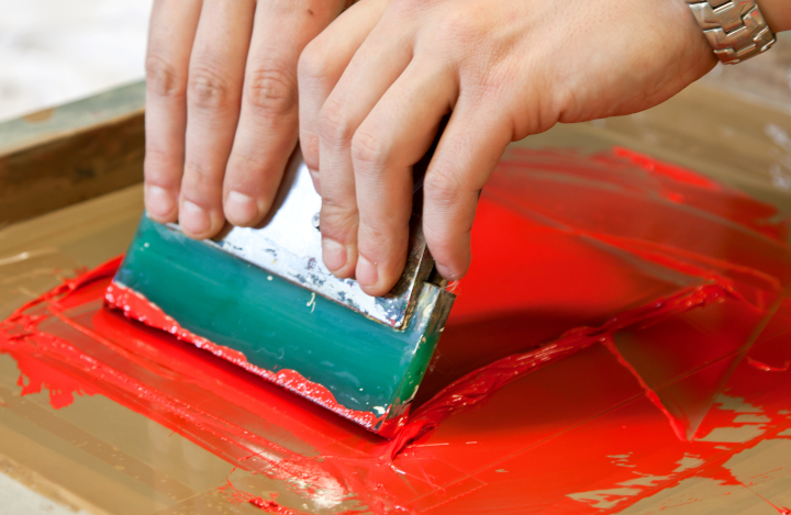
Photo purchased from … www.depositphotos.com
Custom screen printing is one of the oldest technologies for decorating fabric. I’ve even read about its having existed in ancient China. But if it’s this old (and if it really hasn’t changed much in the time since then), why has it been going so strong even with digital commercial printing in existence?
First of all, here’s a refresher on custom screen printing. A block out stencil is attached to a nylon (or even metal) screen. Image areas are open, while non-image areas are covered with the stencil. When a rubber squeegee is used to force screen printing ink through the screen onto the substrate (such as a garment), the open areas allow ink to print.
This process has to be repeated again and again for each color (after cleaning everything up and applying a new stencil to the screen). Different colors can be printed in register with one another, and you can even chemically produce halftone images on the screens, but overall they are of a coarse halftone ruling, so you wouldn’t get the detail available with inkjet or dye sublimation. Also, since preparatory work (and clean up) take a long time, you would use custom screen printing for longer press runs rather than shorter ones.
Regarding the popularity of screen printing for garments, I recently found an article entitled “Opportunities Ahead for Screen Printing,” by David Savastano, dated 06/23/22, that answers this question.
Here are some thoughts:
A Broad Range of Substrates
If you print on cotton, you need to use inkjet technology rather than dye sublimation, and the printed piece will fade over time with multiple washes. Pre- and post-treatment with water and heat will apparently extend the life of the design, but not indefinitely. Dye sublimation will sidestep this problem, since the dyes bond with the polyester fibers. However, dye sublimation is only appropriate for polyester fabrics.
In addition, if you use heat transfer vinyl (bonding cut-out lettering or flat graphics to fabric using heat–which is not itself a screen printing process but which is still a good, durable garment-decorating option), you have to consider the heat resistance of the substrate. Some fabrics such as nylon and polyester break down with exposure to high heat.
That said, custom screen printing faces none of these problems. The ink is thick and vibrant as well as durable. It not only seeps into the fibers of the garment but also provides a thick, raised pigmented surface. And you can use cotton, polyester, or pretty much any other fabric without much concern for the durability and washability of the final printed garment.
You can even print on water repellent fabrics.
In short, you have a lot more flexibility regarding substrates.
Special Inks
The plastisol inks (water-based fabric inks) used in custom screen printing (among other inks) have many more options than do inks for other processes. For instance, you can use “glitters, puff, textures, and high build” as well as “mirror inks, pearlescent, and metallic inks” (“Opportunities Ahead for Screen Printing”).
Available inks cover a wide range of the Pantone Matching System colors, and they can be transparent or opaque (“Opportunities Ahead for Screen Printing”).
The screen printing inks “have high wash durability, strong print opacity, and vibrant colors, and excellent stretch and elasticity…excellent screen runnability and long open times, ready-to-use straight out of the tub” (“Opportunities Ahead for Screen Printing”). This means that once you have set up a print run (even if it takes a long time), you can proceed with the job smoothly without incident. And the inks are striking and durable. Plus for flexible fabrics, such as “athleisure” and athletic garments, the inks stretch and move with the fabric.
Industrial Uses
But it’s not just for garments. For a long time, screen printing has been a mainstay of functional (or industrial) printing as well. When you look at the dashboard in your car, or even the words and numbers on your microwave oven, you’re looking at functional printing. The goal is to inform the user in a few words just how to operate a machine. Your phone and computer reflect two more examples of functional printing.
Screen printing is ideal for functional printing.
First of all, you can screen print on films, which can then be used in injection molds when manufacturing printed bottles without separate labels. CCL Label defines in-mold-labeling as:
“IML (In-Mould Labeling) is the integration of the label with the packaging during the injection. In this process, the label is placed into the IML injection mould, then melted thermoplastic polymer combines with the IML label and takes the shape of the mould.” (https://ccllabel.com/product/food-dairy-in-mould-labels/).
Combined with injection-molding packaging technology, custom screen printing is ideal for decorating and labeling the bottles. Screen printed in-mold labels on film can withstand the heat and the physical manipulation and stresses of this molding process, since the inks are flexible and since they adhere well to the film used in this process (“Opportunities Ahead for Screen Printing”). You can even print on the back of films and then integrate them into auto consoles (for instance) due to the flexibility of the inks. (This kind of screen printing would essentially be inside the plastic auto parts, so this would increase the durability of the ink.)
In addition, screen printing is great for printed electronics. That is, the circuit boards used in electronic devices can be screen printed with conductive inks, which can carry the electric charges that travel through the printed circuitry. All of this also lends itself to the interior electronic workings of automobiles (not just words on the information panels but also the printed pathways on the actual electronic circuits that control the car).
Plus you can print on glass, plastic, or metal. You can even print information on white goods such as refrigerators.
The Takeaway
Custom screen printing is flexible, vibrant, and durable. It lends itself not only to printing on garments but also to printing on appliances, cars, and computers. I’ve even seen screen printing being used to apply explanatory text to the walls of an art museum exhibit.
That said, it requires a lot of make-ready work, so it’s best for longer runs. Also, it lends itself to one-, two-, or three-color work rather than photo-realistic imagery. In part this is because the inks are thick and will plug up screens for images with a fine halftone-line-screen ruling (you can’t really print the high-resolution, 4-color imagery you can print with inkjet equipment).
So for work within it’s niche–keeping in mind its assets and limitations–it’s a good idea to know something about screen printing if you’re a designer or an art director. Perhaps you will want to print on pens, fabric messenger bags, umbrellas, even fold-up lawn chairs. Or sports caps. For these as well as the functional printing noted above, this time-honored technology is absolutely indispensable.
Posted in Screen Printing | Comments Off on Custom Printing: Why Screen Printing Will Always Have a Niche
Sunday, September 18th, 2022
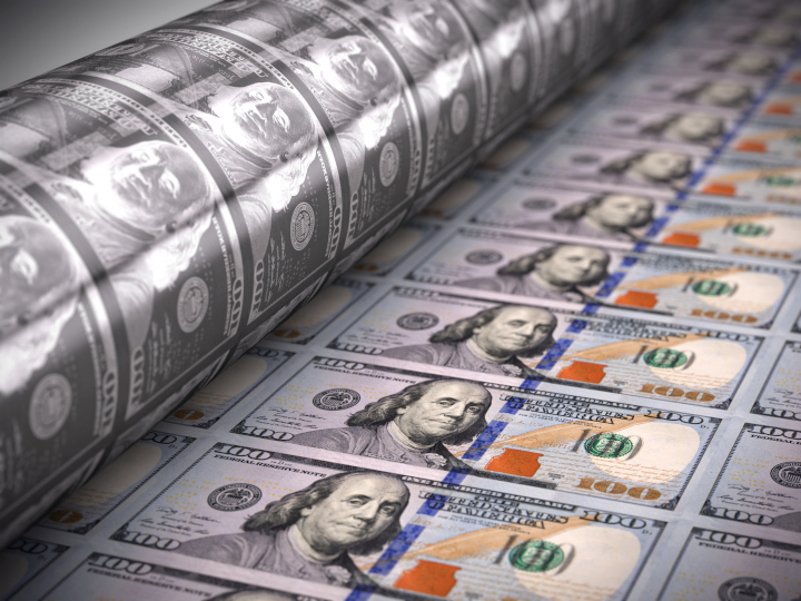
Photo purchased from … www.depositphotos.com
While it’s still considered legal tender, open your wallet and look closely at some of the paper money, the bills, of various denominations. How are they printed, where are they printed, and by whom are they printed?
Where And By Whom?
The easiest answers are where and by whom. All paper bills are printed by the US Bureau of Engraving and Printing, which has one plant in Washington, DC, and one plant in Fort Worth, Texas. The Bureau of Engraving and Printing also designs all the various denominations and checks all the printed bills for accuracy before trimming and wrapping them.
But How Are They Printed?
Let’s start with the paper substrate. Currency paper is composed of 75 percent cotton fibers and 25 percent linen fibers. After all, bills have to tolerate heavy use over a long period of time, and this stock is very durable. It is also highly controlled and tracked (each and every sheet) to prevent theft by counterfeiters. In addition, the paper is laced with various colored threads, called “security threads” (some of which glow under UV light) to distinguish the stock from non-currency paper, again to minimize counterfeiting.
Now, the inks. For the graphics (text, numerals, and image on the back, and portrait, text, serial numbers, and such, on the front), custom printing inks include green for the back (primarily, although I see a little yellow as well on my $20), as well as black, green, metallic, and color-shifting ink (which changes color depending on the viewing angle) for the front of the bills. These are proprietary inks developed by the Bureau of Engraving and Printing.
In addition to being used for the numerals, text, and portraits, the inks are used for various security features such as micro printing, and the paper contains watermarks of various kinds (portrait and numeric). There’s even a 3D strip woven into the new $100 bills to prevent counterfeiting.
Now for the commercial printing technology. I had initially expected the bills to have been printed via gravure technology (a direct-printing technology using etched custom printing cylinders with little wells to collect and transfer the ink). Why? Because it’s supremely economical for exceptionally long press runs.
So I was surprised to discover in my research that gravure is not used. Instead the bills of all denominations are printed via both offset lithography and dry intaglio custom printing.
The offset printing component is done first, with the background green color being applied to both the back and the front of the bills, with 72 hours’ of drying time in each case before the following step.
Each printed sheet contains 32 notes, side by side, before they are cut down into individual bills. But this was not always the case. Initially the bills were larger, and were printed eight-up (eight rather than 32 bills on a press sheet). Changing the ink formulation over the years (plus changing the chemistry to eliminate water from the mix) allowed for faster drying and the inclusion of more bills on each press sheet.
After the offset printing step (which prints from metal plates first onto rubber press blankets and from these press blankets onto the custom printing paper), the next step is the dry intaglio printing (the engraving).
Intaglio plates have recessed image areas. (This is in contrast to offset plates, on which image areas and non-image areas are on the same flat plate. This process works due to the inability of ink and water to mix. Image areas are treated to attract ink and repel water; non-image areas are treated to repel ink and attract water.)
The intaglio printing process is used specifically for the fine detail work on both sides of the currency. This includes the portraits, some of the numerals, scrollwork, etc. First the plates are inked up, allowing ink to seep into the recesses of the etched plates (artwork is designed separately and then etched into the plates with sharp tools and acids in a process called “siderography”). Then the ink is wiped off the surface of the plates (although ink that has seeped into the recesses of the plates stays in these etched image areas). Finally, the intense pressure of the intaglio rotary press actually forces the paper into the etched areas, making the paper absorb ink and also rise up slightly above the otherwise flat surface of the custom printing stock.
The dry intaglio process prints the backs of the press sheets first and then the fronts. Each side is allowed to dry for 72 hours. Again, the benefit of this process is that it yields very delicate lines with precise detail (i.e., more so than the initial offset printing work). The benefit of the “dry” part of the dry intaglio printing is that the custom printing paper does not expand and contract as it would when wet (or when drying), so there can be more precision in the positioning of the text and images (and more currency bills printed on each press sheet).
To quote from “How Paper Money Is Made,” by www.Littletoncoin.com, “All US paper money features green ink on the backs, while the faces use black ink, color-shifting ink in the lower right corner of $10-$100 notes, and metallic ink for the freedom icons on $10, $20, and $50 bills. The ‘bell in the inkwell’ freedom icon on $100 notes uses color-shifting ink.”
Inspection
Then after all printing (both sides) and adequate drying time comes inspection, using the Bureau of Engraving and Printing Upgraded Offline Currency Inspection System (UOCIS). This equipment “integrates computers, cameras, and sophisticated software to thoroughly analyze and evaluate untrimmed printed sheets” (“How Paper Money Is Made,” by www.Littletoncoin.com). In 3/10 of a second the software accepts or rejects the sheets based on ink density and color register. Then it trims the 32-up sheets into two 16-up sheets.
Additional Printing
“COPE-Pak adds the two serial numbers, black Federal Reserve seal, green Treasury seal, and Federal Reserve identification numbers” (“How Paper Money Is Made,” by www.Littletoncoin.com). During this process, the COPE Vision Inspection System (CVIS) checks the sheets for accuracy and either passes them or rejects them, replacing the rejected sheets “with a ‘star sheet.’ Serial numbers of notes on star sheets are identical to the notes they replaced, except that the star appears after the serial number in place of the suffix number” (“How Paper Money Is Made,” by www.Littletoncoin.com).
Trimming and Packaging
Finally the 16-note sheets are cut down into individual bills using guillotine cutters. These individual bills are shrink wrapped in stacks of 4,000 notes and then transferred to the Federal Reserve.
The Takeaway
Here are some thoughts:
- Printing money is an education in itself regarding the use of multiple commercial printing techniques on a single job, with the best technology used for each element of the overall process.
- Using color-shifting ink, special strips, watermarks, etc., the Bureau of Engraving and Printing minimizes the chance of counterfeiting. These are extraordinarily sophisticated devices. Keep in mind that printing paper money is actually an example of “functional” or “industrial” commercial printing, since the goal is utilitarian rather than informative or promotional. The overall design has to work. That is, it must carry financial value (intrinsically, in each note) while making it hard if not impossible for others to duplicate. To these ends, currency designers employ special inks and special papers (that have to be tightly tracked) with watermarks, security threads, and interwoven strips.
- Moreover, since it is an example of functional commercial printing, the process of printing paper money needs to ensure the durability of these notes as they change hands (i.e., accounting for bodily oils from the hands, folding the bills, and the bills’ rubbing against other items in wallets). So the length of time the bills can be used is a testament to the durability of the 75 percent cotton/25 percent linen mix of the currency paper fibers.
Posted in Printing | Comments Off on Custom Printing: How Is Paper Money Printed?
Sunday, September 11th, 2022

Photo purchased from … www.depositphotos.com
A commercial printing client of mine produces approximately one to three book titles each year. She and her husband value the production qualities of their print books (as do their clients), so the final copies are produced via offset lithography on 12 pt. cover stock with a 60# text sheet for the interior book block as well as French flaps and a hinge score parallel to the spine.
Along with these copies (1,000 or 1,500 for the initial commercial printing), my client produces about 50 galley copies digitally (on HP Indigo equipment or comparable, depending on the print supplier). These copies have 10 pt. covers without French flaps, and the text blocks are printed on 70# text stock.
That said, at the moment two different printers produce these books. One is more cost effective for digital (with a superb turn-around time). The other is a little pricey for offset lithography but can manufacture the books in five weeks (as opposed to the 16 weeks many other vendors are offering due to paper shortages).
The task, then, is to coordinate a digital and an offset press run at different printers and make sure the two books go together.
Issues That Have Arisen: Matching Digital and Offset Output
Matching digital and offset printing for the text and cover, in general, is a huge if not impossible task. In my client’s case, though, there will be no problem, since the text of the books is black only without halftones printed on a rough textured sheet. And even though the covers will be printed digitally (for the galley copies) and via offset lithography (for the final version), the galleys are only review copies and therefore don’t need to be of the same high quality as the final print books.
In your own work, however, you may have problems matching the look of digital printing and offset printing (both the color and the overall surface feel and look of the ink or toner). The key problem is that digital printing uses toner on paper (for laser printing) or a thinner ink mixture than offset inks (for inkjet printing). So even if the paper is the same, the look may be different.
So what can you do? You can standardize the paper (text and cover) used in the two versions. Then, before the final deadline you can get digital proofs on the papers of choice (so you’ll see the texture). Short of running a press proof (an expensive proposition for only a few copies of an offset printed cover), you can look closely at similar covers produced via offset lithography to get a general idea of how your digital and offset books will look together. You will probably need to make allowances for some difference (as my clients have learned), but depending on why you’re printing both a digital (laser or inkjet) version and offset version of your book, this may not be a problem (as it is not for my clients). Just choose offset for the higher level and digital for the lower and don’t expect an exact match.
Another option would be to offset print all the covers (in my client’s case both the galleys without French flaps and the final books with French flaps). Then the interior of the books can be either offset printed or digitally printed. The high-value text blocks will contain a little denser type than the digitally printed version, but the covers will be the same (except some may have French flaps, like my clients’ book).
In either case, in my experience it’s better to review both laser and inkjet samples before you decide. Inkjet seems to have superior color. Then again, the HP Indigo press, for instance, provides stellar color and coverage with laser technology (minuscule toner particles in a fuser oil).
For me, the takeaway is to look closely at laser, inkjet, and offset printed samples to see what you can expect.
Issues That Have Arisen: Preparing Covers
I sent both the cover designer and the text designer a list of specifications for the two jobs. The text in both cases was to be 256 pages. In one case (the final books), the text paper was 60#; in the other case (50 galley copies) the text paper was 70#. Therefore, the thickness of the spine needed to be different for each version (256 text pages of 70# stock are thicker than 256 pages of 60# stock).
The cover designer didn’t think about this. He assumed both text blocks would be the same because they had the same page count. Therefore, to fix the problem one cover art file had to be adjusted and resubmitted. To make this clear to the cover designer, I had received a complete cover template from one book printer and just the spine width (without a complete cover template) from the other.
In your own work, ask the printer for a complete book cover template with the back cover on the left, attached to the spine in the center, attached to the front cover on the right. These templates will also show where to position type on the spine (and how much room to use for text on the spine to avoid having anything wrap onto the front or back cover). Plus cover templates show required bleeds. Personally I find these invaluable. The book printer computes and automatically draws them based on the size of your book (5.5” x 8.5” in my client’s case), the page count, and the thickness (in pages per inch) of your text paper.
Check your proofs, but first, to avoid error, follow the cover template religiously.
Issues That Have Arisen: Bleeds
My client’s cover designer prepared two covers: one with and the other without French flaps. For the galley version (digital), he omitted the flaps but neglected to add bleeds. When I explained to him that live matter art either ends before the page trim or extends 1/8” past the trim for bleeds, he understood and revised the artwork for the galley-version cover.
Issues That Have Arisen: Photo Format
The text designer wanted to add one black and white photo (provided originally as a color image). She asked me if an RGB JPEG would be acceptable. This is what I told her. In making the PDF from the InDesign file, the software can convert images from RGB to CMYK automatically (not a problem in her case, since the photo would be black ink only).
However, in your own work, if you’re converting automatically from RGB (used for computer screen images) to CMYK (used for commercial printing), there can be unexpected color shifts in the translation. If you make the conversion to CMYK yourself, at least you will see the color shifts before the proof.
Regarding TIFF vs. JPEG, JPEG is a “lossy” file format (i.e., the compression algorithm). It provides a smaller file than a TIFF, but over multiple changes to, and savings of, the photo file, the JPEG will lose picture information. This doesn’t happen with TIFFs (which are “lossless”).
In your own design work, you can use either workflow. An RGB JPEG (which used to trigger the printer’s sending the file back to you for correction) can in my understanding now be automatically converted in the transition from InDesign format to PDF format. Ask your printer to be sure. And consider what you may lose when not making this change yourself.
That said, since RGB has a larger color gamut than CMYK, it’s smart to make all color changes in RGB first, and then convert the images to CMYK. Personally I like TIFF more than JPEG, since there’s less risk of lost (visible) picture information. I also like to distill files into PDFs rather than submit them as native InDesign files. Therefore, I prefer to place CMYK TIFF images in InDesign and then distill press-ready PDFs to hand off to the printer.
Issues That Have Arisen: Workflow
The printer with the digital workflow (for the galley copies of my client’s print book) works with InSite. InSite allows for file uploading, proofing, file approval, and probably other actions as well. I don’t believe it has preflight capabilities. (Based on my research, preflight actions seem to be applied in Prinergy, and then the results are brought into InSite.) But at least it provides an online portal for all reviewers to check and approve the accuracy of the files.
(A commercial printing vendor I’m working with on another job at the moment just sent me PDF proofs with bleeds and trim–a red rule around the pages—for a series of flyers. This is another workflow option some printers use–i.e., much simpler than InSite. I’m not sure what the book printer producing the final version of my client’s book—the one with French flaps–will send yet.)
That said, uploading files to InSite seems to be a little bit more complex (until you learn the process) than just using a printer’s FTP file upload site. In my client’s case, however, one reason the price and schedule are so good is that everything is automated. The other book printer (for the final version) charges more, and is producing the final version of the book via offset lithography. The third printer I mentioned (for a separate client’s flyers), who just sent PDF proofs, illustrates a PDF (virtual proof) workflow distinct from InSite.
So, in your own work, decide whether you need hard-copy proofs or digital (virtual) proofs. With my client’s printer’s InSite option (for the discounted price), everything has to be digital/virtual. (There are no hard-copy proofs in this workflow.) For the printer producing the final version, I have requested a hard-copy cover proof (and a virtual text proof). This way (for the more crucial of the two print book versions), my client will see a high-quality proof of the cover. In this case a hard-copy proof is important. And my client is paying more to get it.
In your own design and print buying work, decide first whether you need a virtual proof or a hard-copy proof, and then ask the book printer how he can accommodate you.
Posted in Book Printing | 2 Comments »
Thursday, September 8th, 2022
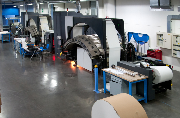
Photo purchased from … www.depositphotos.com
“Production inkjet.” When I hear the word “production,” I immediately think high volume. The company, or industry, is serious about getting the work out.
When I used my first inkjet printer, I was an art director/production manager for a large non-profit educational foundation. It was the ‘90s. The inkjet was slow, and the colors were somewhat garish, but we were happy to be able to see the overall look in mock-up form. The output was good enough for us to visualize the printed end result and communicate this appearance to clients. We were grateful.
Over the ensuing decades the quality of inkjet color improved dramatically, and the speed increased as well, but compared to offset commercial printing it was not adequate. Here’s a random comparison from one online writer. A laser printer can produce 100 pages a minute. An inkjet printer can produce 16 pages per minute. An offset press can produce 18,000 sheets per hour (300 sheets per minute). Moreover, since some offset presses accommodate 28” x 40” press sheets or larger, you can get a lot of pages, laid out side by side, printed in that 18,000-sheet-per-hour window of time.
Granted these are general numbers, but the comparison is not only relevant but also true in my experience. Inkjet is slow when compared to other printing technologies. The color is spectacular, due in part to all the additional colors beyond cyan, magenta, yellow, and black that many inkjet presses use, and the resolution is great. But they’re slow.
On the plus side, however, there are characteristics of inkjet printing absent in offset lithography. Inkjet presses can include variable data, and due to the minimal makeready (when compared to offset lithography), they are exceptionally economical for short press runs.
But The Issue with Speed Is Changing Now
I just read a few press releases from Kodak about their new Prosper 7000 Turbo Press, and the development of the technology is very encouraging. In fact, production inkjet may well be the future of commercial printing. Color fidelity is, and has been for a while, extraordinary, but the speed of this custom printing technology (as that word “production” suggests) is now increasing significantly as well.
Speed, quality, number of available paper substrate options. All of these are pertinent to the recent improvements in production inkjet. To put this in perspective, let’s say you’re printing a thousand copies of a 300-page print book, you will want the text to be clear and the photos to be crisp and detailed. But you’ll also want the overall time on press to not be excessive (or, as noted above, 300 pages x 1,000 copies at 16 pages per minute).
According to their press release, Kodak is now meeting these goals with the Prosper 7000 Turbo Press.
Here’s a description of its capabilities:
- Up to 5,523 A4/letter pages per minute.
- Far more substrate options than before, including newsprint, coated and uncoated papers, specialty papers, and recycled papers.
- Variable quality (affecting both speed and resolution, inversely), which allows the printer to match the job to the specific visual requirements. (A newspaper, for instance, doesn’t require the same level of quality as a promotional piece. Nor does a textbook need the same level of quality as a promotional piece.)
- Sustainability. “The Prosper 7000 Turbo Press uses eco-friendly, water-based Kodak nanoparticulate pigment CMYK inks,” which support “efficient drying even at peak press speeds” (“Kodak Announces Fastest Inkjet on the Market with Kodak Prosper 7000 Turbo Press,” 06/16/2022 press release from Kodak).
Let’s break this down. First of all, unlike most of the inkjet presses you may have seen (including office inkjets and even the large-format inkjet presses that produce signs), the Prosper 7000 Turbo Press is a web press (i.e., roll fed). Like a heatset web press used for offset lithography, it is designed to move very quickly.
However, speed isn’t everything. If the ink weren’t to dry quickly, all would be lost. But with the Kodak Prosper 7000 Turbo Press, the equipment is set up to dry the ribbon of paper traveling through the press using near infrared technology (NIR). This ensures that ink dries quickly on the surface of the press sheet.
Why is this important? Because it allows for thicker ink films, like those used in offset commercial printing. Denser ink coverage contributes to the striking color. Granted, all of this is either better or worse depending on the variable speed and resolution. (Kodak Prosper 7000 Turbo has three modes: Quality, which is similar to offset and which uses a 200-line halftone screen; Performance, which uses a 133-line screen and is good for textbooks; and Turbo, which uses an 85- to 100-line screen and is good for newspapers with low ink coverage.) This variability addresses both quality and overall ink coverage, maintaining the best resolution and speed for the specific output needed.
Why Should I Care?
Before I go any further, this is why I think this is relevant. Because a quick, accurate alternative to offset custom printing that allows for short and longer runs and also variable data printing will move a lot of jobs that had been printed on offset equipment onto digital equipment. This will not only enhance the quality and options for custom printing, but for a lot of jobs this will also save money. And (as Kodak notes), with supply chain issues and increased costs for offset prepress consumables, this will help printers (and hence their clients) measurably.
More Specs
Here are some more features:
- The throughput of 5,523 A4/letter pages translates to a printer “almost 35% faster than its nearest competitor” (“Kodak Announces Fastest Inkjet on the Market with Kodak Prosper 7000 Turbo Press”).
- The paper range is 42 to 270 gsm. Check this on a calculator. It allows for text and cover weights.
- The web width is 8” to 25.5”; cut-off is up to 54”. What this means is that for press signature work such as print books, you can get more pages on a roll of press stock in proper signature layout to allow for folding and trimming into larger press signatures, and therefore you can produce your print book work faster.
- The press is meant to be run 24 hours a day, every day, with a 200-million-page duty cycle per month. That means the press is durable and meant for hard use. So it’s not going to sit idle while you wait for repairs.
The Takeaway
Interestingly enough, with automation and increased productivity, offset presses can do shorter press runs efficiently. At the same time, production inkjet presses like the Prosper 7000 Turbo Press can do longer press runs efficiently. (The two technologies are gradually approaching one another in terms of speed and flexibility.)
I don’t think either technology will cease to exist, with one eclipsing the other completely, at least not anytime soon.
I think that digital inkjet (both production inkjet and grand-format inkjet) and the increasingly efficient offset printing (with automated plate changing, and closed-loop, electric-eye color monitoring and calibration) will both thrive, with each being appropriate for different work. After all, you’re not going to produce variable data work on an offset press, and you’re not going to produce 500,000 copies of anything on a digital inkjet press.
In my view the takeaway is that you should study both technologies and decide which works for each type of job you’re producing. Ideally, you should find the best vendor for each technology, and then select the right one for the specific commercial printing job at hand.
The more you learn about all of this, the more ready you will be for the future of commercial printing. And, in my reading, I’m seeing that in spite of current paper shortages, both offset and digital printing have a spectacular future coming. At least that’s what I see in my crystal ball.
Posted in Digital Printing | 2 Comments »
Sunday, September 4th, 2022

Photo purchased from … www.depositphotos.com
Pick a card, any card. Postcards, wedding invitations, invitations to your kid’s graduation. They’re a little like business cards only larger (they give a powerful first impression). Or perhaps they’re more like miniature billboards. You have your reader’s rapt attention and can communicate your message immediately and directly.
When I mentioned this concept to my fiancee, she went through the house and collected at least 25 cards we had received (in envelopes) from just about everybody. And I’ve spent the last few days taking some time to go through the pile to see what I can learn.
First of all, there are no postcards. We’ll treat that later in the blog article. Some marketing textbooks say that no promotional item gives you more bang for the buck than postcards, because (as noted above) you have the buyer’s attention, because postcards are cheap to produce and cheaper than letters to mail to prospects, and because you can even add business reply information and prepaid postage (an indicia) so your prospects can return them to you for free (free to them, not to you) to request more information (to continue the conversation, as they say).
Attributes/Qualities of My Fiancee’s Cards
The first thing I noticed is that all of the cards are different sizes. None of them are squares. All are rectangles (horizontal rather than vertical, but in your own work you may want to change things up and design vertical cards so they’ll stand out from the crowd).
They are also printed on very thick cover stock. In my online research, it looks like web-to-print vendors who sell these cards print them on 110# to 140# cover stock. As long as these weigh less than an ounce, you apparently don’t need to add extra postage when you mail them out in an envelope. In addition, on the plus side, thick cards provide a sense of gravitas. They feel important, certainly more important than 80# cover, which is what business cards used to be printed on.
Also, there are a variety of coatings: gloss, matte, satin, and even uncoated. When I run my fingers across their surfaces, the uncoated cards (and even the satin or dull ones) feel a bit more personal, while the gloss coated cards both look and feel more corporate, less inviting, more salesy.
Interestingly enough, one of the pieces of promotional collateral, a card selling naturally dyed clothing, has a more intimate feel even though it is sales literature.
Most of the cards bleed off the edges, making them seem larger than their trim size (none are larger than 6” x 8”, most are smaller).
One thing that all of the cards share is that they are completely covered with text, photos, and areas of solid ink coverage. This is because none of them are postcards. Hence there’s no need for addressing information, postage (stamp, meter imprint, or indicia), etc.
One of the cards is actually a magnet on one side. The other side includes text and family photos. All of this reminds me that the refrigerator is covered with magnets that are essentially advertisements for real estate agents. They have calendars on one side and a magnetic surface on the other. Every time we open the refrigerator, this particular sales agent gets our attention. Needless to say, we know her name now. That’s priceless advertising for the cost of a single magnet card.
Personal Printing (Web to Print)
As a commercial printing broker I would normally have cards like these printed for various clients. However, they would probably be businesses, not individuals. But if you look through the cards my fiancee gave me, at least half are from family members. These cards (if you look very closely) are branded through Minted, Shutterfly, TinyPrints, and Vistaprint. I’m sure there are many other vendors like these if you check online. My presumption is that all of these were also accessible through an online web-to-print portal.
Based on past research online, I found that you can upload items (like photos), and then add text and solid color blocks, almost as if you were using InDesign right on your own computer. But you’re creating your card online on the vendor’s website (hence web-to-print).
Then you can choose paper thickness, paper tint (presumably), cover coating (such as matte, satin, or gloss), and you’re ready to add shipping and tax and then pay by Visa. Push a button and the box comes to your door.
It used to be that you could do this with business cards (you probably still can), and the company would send them to you at a reduced price if you kept their logo in a prominent place on your business card. I think this is a similar idea. What’s so good about it is that regular people who know nothing about commercial printing can take their snapshots and turn them into holiday cards and event reminders. It’s very personal and very affordable.
Postcards
Now, postcards. One thing all of the cards my fiancee gave me have in common is that they all came in envelopes, presumably standard envelopes (i.e., of a particular standard size) to avoid the cost of making a metal die to die cut a non-standard-sized envelope. None are square because that would incur a surcharge from the Post Office. All are smaller than 6 1/8” x 11 1/2”. That’s because letter rate at the Post Office is cheaper than “flat” rate (for anything larger than 6 1/8” x 11 ½”). This postage adds up when you’re doing a mailing for a company as opposed to sending out cards for your family (with graduation, holiday, or wedding information).
(According to USPS online information, “for a mailpiece to be eligible for First-Class Mail letter rates, it must be at least 3-1/2 inches by 5 inches by 0.007-inch thick, and no more than 6-1/8 inches by 11–1/2 inches by 1/4-inch thick.”)
So this explains the size and paper thickness of the cards from my fiancee, but the US Postal Service is a bit more strict with postcards (and other business mail). If your job involves designing such mail, you can either read all of the requirements online or presumably pick up a business reply mail preparation print book (which is what I used to do as a designer and art director). I think it’s also useful to find a business reply mail specialist at your Post Office, so you can show her/him printed mock-ups of your postcard designs to make sure they adhere to USPS requirements.
(One thing to keep in mind is why the USPS has these requirements. Everything is automated. Therefore, if the size, aspect ratio of length to width, thickness, and material of your individual mail product fits USPS requirements, everything will go through the machines smoothly. This will cost the Post Office less, and you will reap the benefits in lower costs.)
The same holds true for all of the markings on business reply mail (let’s say you want to include business reply barcodes and other markings on one panel of a two-panel postcard, so your potential client can return a portion of the card to request further information). These markings include not only your business address but also the indicia (postage paid by and your permit number), FIM (facing identification marks), horizontal bars (like zebra markings) and Intelligent Mail Barcode.
All of these printed bars pertain to sorting, tracking, and orienting mail in the automated machines at the Post Office and throughout the mail stream. They ensure that your postcard gets to the right place. All of this involves scanning hardware and software, so the size and placement of these marks is important. It’s also important to avoid putting any extraneous marks where they shouldn’t be. Hence, it helps to read the requirements online or in print book form (current versions, if you can get them), and make friends with the business reply mail specialist. Follow the rules and you will save money. More importantly, you won’t be in a panic when the Post Office refuses your bulk mail drop because it’s not “to spec.”
The Takeaway
- Printed cards are a good use of your money. If you’re a marketer, you can either print cards and send them out in an envelope, or you can print postcards. One benefit of the non-postcard cards is that you can leave stacks of cards in various locations for prospective clients. You can use them to build your brand.
- Postcards may be an even better use of your money, but they have US Postal Service requirements with which you must comply.
Posted in Cards | Comments Off on Custom Printing: Pick a Card, Any Card
|
|