Photo purchased from … www.depositphotos.com
The Printing Industry Exchange Blog is #12 of the best 40 digital printing blogs, as selected by FEEDSPOT.
What is the difference between PMS match colors and 4-color process colors?
First of all, let’s step back for a moment. Color is a function of light and the interaction between the rods and cones in your eyes and the lighted subject you are observing. People see color differently, especially men and women, and if you cover one eye and then the other, you’ll see a slightly different hue with each eye. Also, if the light is different, the color will be different.
So color is quite subjective.
The number of distinct colors you can see is far greater in real life than the colors a computer display can reproduce (using red, green, and blue phosphors), and the RGB color gamut is much larger than the colors you can reproduce with colored toners or inks (the process colors: cyan, magenta, yellow, and black).
(You can find diagrams of each of these color spaces on Google Images. Many of these images show one color gamut superimposed over the others, showing the visible spectrum as being much larger than the CMYK color gamut.)
4-Color Process Offset and Digital Commercial Printing
In many cases this is not a problem. After all, on an inkjet printer or an offset press, the process colors will reproduce the majority of distinct hues.
The way an offset press (or a laser printing press) creates colors is to layer halftone screens of the process colors over one another at specific angles such that the halftone dots do not cover one another. Since the halftone dots are different sizes (the same number per square inch, in rows, but larger or smaller as needed for the four process colors to create–together–all manner of different hues).
Inkjet commercial printing works in a slightly different way. Inkjet printers spray more or fewer dots of cyan, magenta, yellow, and black ink (minuscule but all the same size) as needed to create—when seen together—all manner of hues. Unlike most but not all offset presses and most but not all laser printing presses, inkjet presses often include additional colors in their inkset. Perhaps this would include a light magenta and light cyan, or even a purple and a green, or a red and blue. The goal is to expand the number of colors the inkjet press can render.
To do this on a laser press involves adding more toners. For instance, you can add more liquid toners (very tiny particles of physical toner suspended in fuser oil) to the colors used on an HP Indigo press (and presumably other presses, such as the Kodak NexPress).
If you want to do the same thing on an offset press, however, you would need to use more inking units. For instance, instead of using a 4-color press with four inking units, you might need an 8-color press. You might use four of these color stations for the process colors (CMYK), and then you might add one or two PMS colors (which I will describe shortly) and perhaps a gloss varnish and a dull varnish.
Keep in mind that the 8-unit press would cost considerably more to run than the 4-unit press. So the price of your print job would go up. Moreover, not every commercial printing supplier would have an 8-color offset press, so this might limit your choice of custom printing vendors.
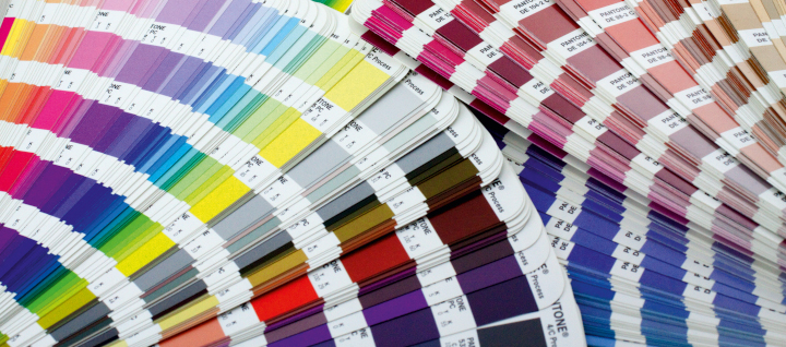
What Are PMS Colors?
Beyond the four process colors, which are laid over one another to produce multiple additional hues, there is a set of colors called PMS (or Pantone Matching System) colors. You can find samples of these in PMS books of various kinds. These match colors or spot colors, unlike the process color builds, are actually mixed (like a recipe for a cake). Companies specifically mix so many parts of one color (like Rubine Red) with so many parts of another color to achieve the exact hue you have chosen from one of the PMS color books.
One benefit of this system is that all custom printing suppliers across the globe can communicate the precise color they want using this agreed-upon standard, and all PMS 199s or 286s will look the same.
(If you use these books, it’s still always best to choose from printed samples in the books rather than from simulations of PMS colors on your computer monitor. Your color samples will be more accurate.)
Why Would You Want to Do This?
Usually, if you’re printing a color job on an offset press, the four process inks will be enough. You can produce brilliant color. You just can’t produce all of the brilliant colors in the visible spectrum. If you’re designing and custom printing a coffee-table art book including vivid oranges, violets, or greens, these colors in the printed job might not be as vibrant as you would like if you only use the process inks.
In that case, you can separate the color images onto more than four printing plates. In the late ‘90s I read about and saw examples of Hexachrome and High-Fidelity Color, which included extra colors like the green, orange, and violet noted above. In this case the separations might include halftones of cyan, magenta, yellow, and black plus “touch plates,” “bump plates,” or “kiss plates” using match green and match violet inks to enhance certain colors in specific areas of the photos.
Another way you can use additional PMS colors on an offset press is to print flat art (solid areas of color, screens, or type, for instance). This would be separate from the photos. That is, you can add a green PMS color as a background screen, or you can set the headlines of the text sections in a solid PMS color without needing to layer process inks over each other to do this.
A flat color, spot color, or match color (all of these are different names for the same thing) will yield much crisper type letterforms than 4-color type (a build of four colors) because there will be no halftone dots used to create the colored type. This would be especially useful if you want to set the text type in a dark gray, for instance, instead of black, since small type rendered in multiple 4-color process colors would be less crisp and harder to read than type printed in a single PMS color.
Another good reason to add PMS colors is to reproduce your corporate logo colors exactly and consistently. When I was an art director in the 1990s, the non-profit government education organization for which I worked included PMS 199 red and PMS 286 blue for it’s red and blue eagle logo in addition to the process colors used for the full-color photographs.
So another benefit of using match colors is their absolute consistency.
For instance, let’s say your job is a 16-page booklet. On the press sheet there would be eight pages on either side, with four across the top and four more pages immediately below these, plus the other eight pages on the back of the press sheet.
Let’s say your backgrounds on some of the pages include heavy coverage ink. Or maybe some have large photographs and some do not. Maybe the commercial printing pressman identifies a color cast in one of the photos and therefore adjusts the ink mix, adding more or less of one or more of the process inks. In the page layout (imposition) of four pages above four more pages on one side of the custom printing sheet, changing the ink composition to fix the colors in one of the large photos might change the appearance of the process color build on the page immediately below it.
If your background color (maybe a green color build behind all other graphic elements on every page) shifts due to the printer’s having adjusted the color to benefit one photo, that change would stand out like a sore thumb. Your background colors would no longer match. However, if you use a match color for all backgrounds on all pages in the 16-page booklet, you wouldn’t have this problem. All of the backgrounds, printed in the same extra color (as a solid PMS color rather than a CMYK build) would be absolutely consistent.
The same is true for your logo colors. These won’t vary from one logo image to another because the PMS colors are always the same.
Duotones
PMS colors can also be used in duotones (images made up of halftone dots like four-color images but created with two inks rather than all four process colors). In this case you might want to use a black and a gray ink, or perhaps a black and a dark green ink, to add color to the image. In this example PMS match colors would be helpful, particularly since you could use the dark green color in both the duotone and elsewhere on the page, perhaps as a highlight color for the headlines of the text in the book you’re producing.
Unfortunately, though, if you’re creating duotones, you can’t really get an exact match when you’re proofing the colors. This is because almost all proofing devices are based on CMYK inks. Therefore, the only way to accurately proof them is on a small proofing press (i.e., by doing an actual, but very short, press run). I will also mention that drawdowns of PMS colors are useful (a colored ink smeared on the paper substrate of choice to give an approximation of the final look of the ink).
Sample PMS Books
Talk with your commercial printing vendor about buying Pantone sample books. The most useful of these is the PMS swatch book that shows all possible PMS colors. (This long and narrow book of color strips will probably comprise more than one volume.) With this swatch book you can select your PMS colors in good room light or sunlight from physical samples on paper rather than images on a computer monitor.
There are also books that show each Pantone Color with its closest CMYK build. This way you can see whether you can create an adequate version of a specific color using process inks, or whether you will need one or more additional PMS colors.
There are also books that show halftones in a particular color, as well as type surprinted on and reversed out of an image or a solid or a screen.
All of these give the designer an approximation of the final printed appearance of the piece she or he is designing.
Better to know what to expect before your printer puts ink on paper.