Printing Industry Exchange (printindustry.com) is pleased to have Steven Waxman writing and managing the Printing Industry Blog. As a printing consultant, Steven teaches corporations how to save money buying printing, brokers printing services, and teaches prepress techniques. Steven has been in the printing industry for thirty-three years working as a writer, editor, print buyer, photographer, graphic designer, art director, and production manager.
|
Need a Printing Quote from multiple printers? click here.
Are you a Printing Company interested in joining our service? click here. |
The Printing Industry Exchange (PIE) staff are experienced individuals within the printing industry that are dedicated to helping and maintaining a high standard of ethics in this business. We are a privately owned company with principals in the business having a combined total of 103 years experience in the printing industry.
PIE's staff is here to help the print buyer find competitive pricing and the right printer to do their job, and also to help the printing companies increase their revenues by providing numerous leads they can quote on and potentially get new business.
This is a free service to the print buyer. All you do is find the appropriate bid request form, fill it out, and it is emailed out to the printing companies who do that type of printing work. The printers best qualified to do your job, will email you pricing and if you decide to print your job through one of these print vendors, you contact them directly.
We have kept the PIE system simple -- we get a monthly fee from the commercial printers who belong to our service. Once the bid request is submitted, all interactions are between the print buyers and the printers.
We are here to help, you can contact us by email at info@printindustry.com.
|
|
Archive for the ‘Design’ Category
Tuesday, November 14th, 2023

Photo purchased from … www.depositphotos.com
The Printing Industry Exchange Blog is #12 of the best 40 digital printing blogs, as selected by FEEDSPOT.
A colleague of mine edits and designs print books for the World Bank, NATO, and several other government agencies. This week she mentioned her frustration in designing a physical book that will be repurposed as a book for online reading in Nairobi, at least on a computer and possibly on a handheld device as well.
Clearly there are a number of differences in design (both technical and aesthetic) that need to be addressed for this to provide an optimal reading experience. In my colleague’s case, for instance, a physical book designed to be read in two-page spreads will be much larger in format (and the design will be more complex, including charts and graphs as well as photos) than an ebook or a document to be read on a tablet or smartphone.
In addition, readers in Nairobi might not be able to access especially large files (in terms of storage space and/or required computer memory) for the online version of the print book my colleague is designing.
Specific Design Differences
Right off the top of my head here are some things to consider.
There will be differences in computer programs (and devices) used, differences in page formats and image resolution, differences in reader eye movements around the physical book page vs. web page vs. ebook page, and differences in reading backlit computer screens vs. reading text illuminated by reflected ambient light (for physical books).
And yet on the positive side, there will be the opportunity on digital reading devices to incorporate video and audio (as an alternative to the missing tactile qualities only available in physical books).
For instance, one designs a print book in double-page spreads. The reader’s eye can travel across and around a larger space than in an ebook or on a web page (both of which are usually designed for optimal reading on either a small vertical screen or a larger horizontal screen but, unlike print books, usually not as a two-page spread).
Therefore, if the goal is to move the reader’s eye through a double-page spread and on to successive, similarly designed pages, this becomes much harder with an ebook or web page (especially when you take into consideration needing to navigate the links to other pages inherent in a computer-based publication).
The bottom line is that the design and pacing will always be different when you compare a print book to an ebook or web page.
Book design becomes even more challenging when you design one publication for use as both a physical book and an ebook. For instance, the books my colleague produces for NATO and The World Bank often must be viewable online as well as in print.
In this case, my colleague might have two choices. She could save the finished print book as a PDF file, which would be readable on a desktop or laptop computer, computer tablet, cell phone, or ebook reader. Unfortunately, although the design would be faithful to the original (printed on paper), in most cases the reader would need to scroll around the two-page-spread design (even if the book pages were saved independently). And since the reader’s view on many of the devices (in other parts of the world) would be much, much smaller than the 8.5″ x 11″ (give or take) format in which the physical book had been originally designed, the overall effect of the design would be compromised on an electronic reader.
Of course, the alternative would be for my colleague to create a completely different design for the ebook. However, in many cases given the number of ebook formats and the plethora of e-reader devices, there would be a likelihood of formatting problems occurring (for instance, problems in anchoring drop capital letters to paragraphs, or problems with anchoring photos or charts to a particular page or paragraph, or even general problems with type formatting not appearing as planned).
Beyond this, the nature of an e-reader is to allow the user to change the font, point size, and other text attributes. What this means is that the designer’s vision of a particular publication, which had originally been fixed and immutable in a physical book, may be very fluid on a computer or e-reader (and beyond the control of the book designer), and this will make it a very different design challenge.
In addition, photos for print books need to be saved at a much higher resolution (300 dpi rather than the 72 dpi that is adequate for the web or ebooks). Anything of a higher resolution used on a computer (web page or e-reader) will slow down the computer’s displaying the page. But in a physical book, anything of a lower resolution than 300 dpi will look fuzzy or will have pixellation.
In addition, designing for the internet or an ebook cannot take advantage of any tactile characteristics inherent in a physical book, such as the smoothness of a soft-touch matte film laminate or a foil stamp, or the roughness of an uncoated book paper. On a computer, these are irrelevant to the reading experience, whereas when reading a print book, the feel of the paper is an important component of the overall experience.
Finally, a publication designed for reading on the internet or an e-reader depends on a backlit screen, whereas a print book only depends on reflected, ambient light for reading. Reading text on a backlit screen tires the eyes. Granted, many of the e-readers with less contrast between the text and the gray background will minimize this eye fatigue, but overall the reading of electronic matter is more tiring to the eyes than the reading of printed matter.
Therefore, many if not most people don’t actually read web pages and e-books. They scan them, taking less time to absorb individual words and/or just plain skipping words. So the medium actually changes the reading process as well as the reader’s approach to absorbing the design and navigating an e-book page, web page, online brochure, etc.
In this light I have seen online periodicals (over the years) that have sought to replicate the page-turning approach to reading a print book or magazine. You can see two pages side by side, and you can click on a specific location on a page to enlarge it. Moreover, since one of the features of an online publication is the ability to include links to video or audio, such online publications can set themselves apart from physical books in these new ways as well. (As with physical books, it’s prudent to play to the strengths of the medium when designing computer-based publications as well.)
I’ve also seen combined designs incorporating both printed text and computer imagery. One in particular comes to mind that had a physical book attached to the left side of a two-panel folder and a small, flat computer screen attached to the right panel. I believe it contained a sales message for a high-end graphic novel for adults. By incorporating both the benefits of print and the benefits of electronic reading devices (such as sound and video), this promotional device made for a completely immersive experience. The only thing that would have improved the experience would have been a link to a virtual reality program, which I assume would have been included in future iterations of the device (it was a number of years ago).
Presumably the future of the ebook (or web page) and the print book will be for both electronic media and print media to continue to coexist, with each requiring different approaches to design and navigation, and with each offering specific benefits the other lacks (sound and movement for the computer-based publication and physical qualities like paper texture for physical books).
The Takeaway
So what can you do with this information as graphic designers, presumably designing for both print publications and electronic reading devices?
- If at all possible, design a different publication for each medium. Don’t expect a print product posted online to be as readable as the original paper version.
- Simplify the design for online reading.
- Present small chunks of content online (use short paragraphs and bullet points, for instance).
- Find websites you like and deconstruct the design. Think about how the designer used colors and fonts. Think about how how the website leads the reader’s eye through one screen, through an entire (scrolled-down) page, and from one linked page to another. Do the same kind of analysis for an ebook product. Think about how you can present small chunks of information and imagery in such a way that the reader will know what is of major importance and what is of minor importance.
- Do the same for books, brochures, and other printed products.
- Now the hard one. Think of how you can visually relate a print product to a web page or to a digital version of a book. Think about the fonts, colors, imagery. What can you do to make the print design and the electronic design coherent, such that they will present a single brand image?
- Now discuss the technical ramifications of what you are doing with a savvy computer geek to determine the computer requirements and the potential pitfalls.
- Good luck. If you can do this well, you’ll be in consummately high demand as a designer.
Posted in Design | 2 Comments »
Monday, October 30th, 2023

Photo purchased from … www.depositphotos.com
The Printing Industry Exchange Blog is #12 of the best 40 digital printing blogs, as selected by FEEDSPOT.
Every so often I come upon a book that reminds me why book printing has not disappeared, in spite of rumors over the past several years. In fact, based on my recent research, it seems that there has been a resurgence in the printing of physical books. After all, ebooks do not have a tactile component—at all. None. There’s no smell or feel of the paper, and no difference in coating texture between various elements on the cover of an ebook. Don’t get me started.
At the very least I’m pleased that my print brokering clients who produce print books on a regular basis continue to do just that.
In this light I have collected a number of books in the past several weeks and will endeavor to break down for you those elements of cover design that go beyond just the visual enhancements.
Varnish vs. Foil Stamping vs. Embossing
My fiancee has a book about statins (drugs that reduce cholesterol) called A Statin Nation. The background of the front cover (the front of a pill bottle on a light blue screen) as well as the spine and the back cover (exclusive of most of the text) are flood coated with a dull varnish (or a matte film laminate). This absorbs all light rather than reflecting it back to the reader’s eyes.
In contrast, the print book designer has flood gloss coated the title, A Statin Nation, on both the front cover and the spine. Because of this, the title jumps off the page whenever the reader moves the book and these words catch the light.
In short, by accentuating the difference between the matte coating on the overall background of the perfect-bound book cover and the selected text highlighted in gloss varnish, the book designer has produced what looks like a multi-dimensional, as well as multi-textured, cover treatment. You can even run your fingers across the gloss and matte finishes and experience on a physical level the difference between the two.
Something like this could never have been accomplished on an ebook. And it works on more than an aesthetic level. On a cognitive level it separates the title from the rest of the cover as being of the highest importance.
Now the same thing achieved by playing dull and gloss varnish against one another can be achieved with a matte and gloss laminate. In your own print design and print buying work you may want to ask your book printer which of these capabilities he has in house and which might be more expensive or less expensive. If he has to subcontract out such work because he does not have one of these technologies on the pressroom floor, your print book will cost more. Also, it’s wise to request printed samples so you will know how each option will look and feel.
In most cases, if your printer can apply the cover coating in house, the extra cost should not be excessive, because this coating process usually involves only the custom printing plates.
That said, UV coating and lamination will outlive varnishes, which will tend to yellow over time. Therefore, you might want to use a dull laminate on the background for the softer effect and then use a spot gloss UV coating for the highlights.
Based on my research, the laminate for the background is either a transparent flat sheet (a film) applied to the underlying press sheet or a gloss liquid spread on top of the press sheet (which apparently tends to be more uniform than film lamination).
Then, if you add a gloss UV coating (cured or hardened instantly by exposure to UV light) for the title of the book, your printer might use a custom screen printing technique (rather than an offset printing technique) to gloss highlight the type in an especially bright and reflective manner.
Beyond these, there are two more options for setting one element of the design (like the title) apart from another (like the photos). These are foil stamping and embossing.
To be more specific, I have another sample book, an art book that describes the various movements in art throughout history, including Impressionism, Regionalism, Cubism, and many, many more. It is entitled …isms: Understanding Art. This particular sample print book also has a matte or dull coating in the background (like the prior book), and the book designer has set apart the “…isms” portion of the title by using a deep yellow stamping foil instead of ink to print the word (at a rather large point size).
What makes this treatment different from the aforementioned varnish, laminate, or UV coating is that on a tactile level the foil stamped word (…isms) feels a bit thicker and more substantial to the touch. It’s subtle, but I can feel the difference.
On a production level, however, there are a number of differences. Varnish is printed on a commercial printing press inking unit from a printing plate and press blanket. And, as noted above, spot UV coating (which is usually a flood coating) can be added as a spot coating (text only, for instance) using a custom screen printing technique rather than an offset printing technique.
But for foil stamping your printer must have a metal die made in the shape of the letters (in this case …isms). This metal die will then be heated and struck against a roll of foil. It will “punch out” the text, and then using high heat it will adhere the foil to the substrate (in this case the spine and front cover of my sample art book).
In addition to the high contrast between the gloss yellow foil and the dull matte background coating, in the case of …isms: Understanding Art, the contrast is more dramatic because for the most part readers expect to see metallic gold or silver foils rather than a brilliant canary yellow foil (which is also denser than any printable process-color ink, like yellow, would be on an offset press).
Stamping foils come in gloss or matte versions and in multiple colors (including matte and gloss black), which make for a unique look. In your own work, ask about prices and request printed samples before committing to this technique.
The final (and even more tactile) option is embossing, in which a two-part metal die (a raised portion under the press sheet and a recessed portion above the press sheet) produces a three dimensional image when forced against the paper using a letterpress. (Embossed elements rise above the surface level of the paper, while debossed elements are recessed.) Before the embossing or debossing process, you can also register an offset-printed image where the embossing/debossing will be.
Like foil stamping, embossing and debossing will require an extra metal die (made by your printer’s subcontractor), and this will add time and money to the job. However, this effect can look quite dramatic, so it may be worth it.
Faux Case Binding
Here’s another technique to make your print book stand out. Usually a case-bound book has a heavy binding made from thick binders’ boards (a chipboard product). It’s great in terms of durability, but it’s a bit cumbersome.
As an alternative, you may want to use thick cover stock for the turned-edge cover. The book I mentioned earlier (…isms: Understanding Art) has a cover produced on a thinner (thinner than chipboard at least) cover stock (like the paper used for the cover of a perfect-bound print book). It has endsheets, pasted over the turned edges of the cover, and flyleaves—all just like a case bound book. It even has headbands and footbands to cover the bind edge of the folded and stacked press signatures. And you can see a crash (liner) between the press signatures and the outer spine. Plus, the text block actually floats away from the exterior spine like a loose-back case-bound book.
If all of this sounds like gibberish, the only important thing to remember is that it looks and feels like a case-bound book but without the weight. Plus, the cover is more flexible.
And in the case of my book, there are French flaps folding in (over part of the interior front and back covers).
So what you have is a cross between a paperback and a hardback.
Paper Half-Cover Wraps
Finally, here’s a novel idea. A book called American Junk, which my fiancee bought at our favorite thrift store, has no title on the front cover, but it has a half-cover wrap to carry the title, byline, and a little blurb about the book. Fortunately, the title is also on the printed spine of this case-bound book, so you will know what book it is when the cover wrap is removed.
When I say half-cover wrap, it is actually centered vertically on the cover (letting the reader see photos above and below the wrap), and it goes around the book like a dust jacket and into the front and back inside covers.
It is also produced with thick brown kraft paper, so it looks and feels like the paper of a grocery bag (or the book covers we used to make from grocery bags in the 1960s). The type is huge and printed in black ink (the word JUNK) or small and printed in burgundy ink (the word American), which is letterspaced (i.e., spread out letter by letter dramatically).
Consider something like this for one of your upcoming projects. The contrast between the gloss stock of the cover and the mottled, uncoated cover wrap is striking.
And that’s what this is all about—creating a print book design no one can forget.
The Takeaway
Reading a book on a computer will tire your eyes more quickly than reading ink on a page. With an e-reader, this is less of a problem. However, there are a lot of tactile elements of a print book that cannot be replicated in an electronic version.
When you design a print book for offset printing or digital printing, ask yourself the question, “How can this book design benefit from the qualities only available in physical, printed books?” Look for samples in your own home library (as I have done), and also ask your book printer for samples that will inspire you.
Posted in Design | Comments Off on Book Printing: More Approaches to Book Cover Design
Monday, September 18th, 2023
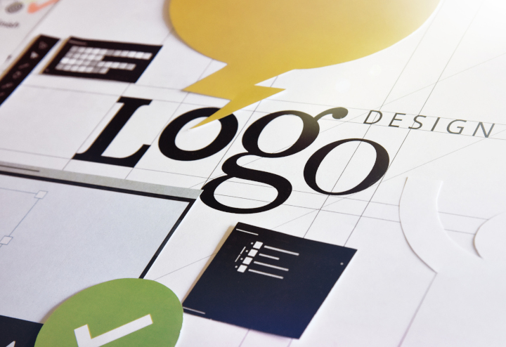
Photo purchased from … www.depositphotos.com
The Printing Industry Exchange Blog is #12 of the best 40 digital printing blogs, as selected by FEEDSPOT.
About thirty years ago when I was an art director and production manager of a government education nonprofit, all of us went through a “logo refresh” or logo redesign. Our superiors felt, rightly or wrongly, that the task would be better done by an outside design firm than by our in-house designers.(We would then implement the new logo in all of our publications.)
What I learned in the process is that there are a number of aspects to consider, but for the most part they fit into these categories:
- How did the old logo design–and how will the new logo design–position the company among other, similar organizations? That is, what is the context of the logo redesign?
- How does the new logo capture and reflect the service or product the organization offers, as well as its unique personality and values?
- How can the new logo be used, creatively and effectively, to give the potential customer an overall understanding of the company–instantly–just by seeing the logo? This might be expressed as “what to do with the logo” or “how to use the logo.”
(While expecting the customer to grasp the entirety of the company through her or his initial exposure to the logo is unrealistic, seeing the logo should bring to mind certain thoughts and feelings congruent with the company’s ethos. This should then be reinforced through subsequent exposure to the logo.)
For example, after seeing the Starbucks logo ten times and drinking ten cups of Starbucks coffee (if that’s your thing), then just seeing the logo should bring to mind positive thoughts and feelings about the company.
Brand recognition is the goal of a good logo.
In this light I was recently asked to help a client redesign her logo. To save her money, I said I would do this as a consultant, and she would be the designer. This is the client of mine who produces color swatch print books to help clients select clothes and makeup hues that will complement their complexion and hair. She is the fashionista I have spoken of in many prior PIE Blog articles.
Design of the Logo (Logo Mark and Text)
My client had already produced draft versions of two logo concepts: a word-only version (just text, no logo-mark) and a version with a gemstone background in multiple colors.
To start with the latter (and I did encourage her to develop three distinct versions from which she could choose after careful thought and discussion with colleagues in her field), the outer diamond shape contained the name of her company in caps and small caps across the center of the gemstone.
My client sells a color scheme and an approach to the use of color, but in reality she sells “magic” and “glamour,” as well as the associated feelings of confidence, empowerment, and joy. The approach to color is really just the scientific vehicle for selling the magic.
Therefore, the gemstone visual motif is appropriate, but in my client’s first rendering, the colors and size of the gemstone dwarfed the name of her company. In addition, the two-word name of her company was set in capital and small capital letters, so it was less legible than an upper and lowercase version of the business name.
So I made these suggestions:
- Make the reader’s eye go to the name of the company first by enlarging the name of the company relative to the gemstone image.
- Use more color in the name of the company and less color in the background gemstone, since the former is more important than the latter.
Design of the Logo (Text-Only Version)
My client chose two typefaces for the text-only version of the logo. For the “color analysis” aspect of the logo she chose an all-caps version in a Modern typeface, with dramatic contrast between the thick and thin strokes of the letters. For the “magic” aspect of the logo (a different word, for the sake of her anonymity, but essentially the “glamour” part of her company), my client chose a script typeface in an upper and lowercase treatment. She also included a starburst on one of the letters to give the viewer a sense of seeing a bright light reflected off glass or metal.
I liked the way the two text treatments of the two essential concepts (color analysis and magic) were presented in contrast to one another. That said, I suggested that my client place the logo (in white on black) on a black, solid rectangle. I said this would simplify the overall look of the logo. Instead of a varied contour (around the two words and the starburst), the logo would have as its recognizable contour or outline only the black rectangle.
The black rectangle would contain and connect all of the disparate elements of the logo. In addition, the black (perhaps with cyan as a highlight color) would look like neon light at night, and this would reinforce the “magic” and “mystery” elements of my client’s business.
I also suggested that my client choose an Old Style typeface (such as Garamond, Palatino, or Times) for the all-caps “color analysis” portion of her business name because of the less dramatic contrast between the thick and thin elements of the letters. I said this would be more readable—particularly by older people. (One’s eyes become less flexible and less able to change focus quickly as one ages.)
Legibility (Vision and Readability Issues)
So in all cases I was asking my client to consider not just the aesthetic elements of the logo, and the relevance of the presentation to the goals and values of the company, but also the legibility of the logo. How does the reader’s eye perceive the logo, giving attention to things like relative size of logo elements, readability of various typefaces and type presentations, and the legibility of upper and lowercase type treatments?
I told my client that this approach is also beneficial when you consider the use of the logo. For instance, how will the logo look when it is on a business card (tiny) or a banner (large)–both from a feeling point of view (associated ideas and values) and a technical or legibility point of view?
Custom Printing Technologies
My client then voiced her concern about the commercial printing cost associated with adding color to the logo. She wanted the process to be efficient and hence less expensive rather than more expensive, going forward over multiple logo uses on multiple print jobs.
My response was to tell her that most printers already have their presses set up for four-color process work. So this would be the most economical approach. In fact, my guess would be that washing up a press and using it to print several PMS match colors would cost more than building color with cyan, magenta, yellow, and black 4-color process inks.
In addition, I noted that laser printers and inkjet printers also work on a CMYK model, so my client would be better able to match the output from all commercial printing technologies (offset, laser, and inkjet).
I also noted that if my client were concerned about color matches between print samples (CMYK inks and toners) and online logo use (Red/Green/Blue phosphors), she could specifically choose hues with the closest visual match across the various technologies.
The one thing I did stress was that when reversing type out of a color (such as reversing the logo out of the black box), the fewer colors that had to be in precise register the better. This is true especially for toner-based laser printing (since the particles of toner often do not wind up as precisely positioned on the substrate as do particles of inkjet ink or offset ink).
If my client were to choose the type treatment reversed out of the black rectangle (for instance) and then use 100 percent cyan as a highlight color for contrast, she would not need to keep four process colors in register. This approach would be more forgiving than a logo using large percentages of cyan, magenta, yellow, and black. And this is especially true for laser printing and for reversing type out of a black background. This is a point where a skilled printer’s advice can be helpful.
The Takeaway
Taking a multi-disciplinary approach to logo design can be prudent or even essential. In your own design work, think about the logo mark and type treatment as an expression of the ethos of your business, but go further. Think about the science of vision, and how various type or color treatments can improve or impede readability. Then consider a commercial printing vendor’s perspective about how the logo will be created with laser, inkjet, or offset equipment, and how this will be reflected not only in the overall cost but also in the ability to match the color output across multiple technologies.
Posted in Design | Comments Off on Custom Printing: Ways to Approach a Logo Redesign
Sunday, January 29th, 2023
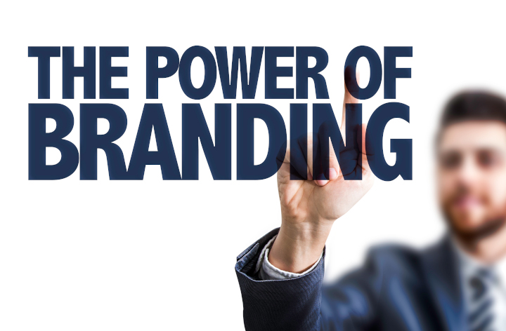
Photo purchased from … www.depositphotos.com
I know the words may sound overly business-like: “corporate identity package.” Another term for this is your “collection” of print business cards, letterhead, custom envelopes, and anything else related to your “brand.” This might even include a pocket folder or a coffee mug. All of the items need to look like they go together, but the design of the individual items can’t be so similar as to be predictable or boring.
Why?
Way back when, cowboys with herds of cows branded them to ensure their immediate recognition as “their cows.” A burned-in mark on the cows couldn’t be rubbed off, and a unique mark conveyed more than indisputable ownership. It reflected quality.
Today a brand does the same thing. It reflects quality. It also identifies the owner of the brand. Think about Starbucks. I don’t even drink coffee, and yet I recognize the specific green color, the twin-tailed mermaid (called Gorgona in modern Greek), and every instance of this mark on Starbucks store signage, Starbucks cups and mugs in the thrift store, gift cards my fiancee receives, and even on the Starbucks products and signage at the grocery store, where there’s a lot competing with this signage for my attention.
So how do you create a brand look that can be reflected in all of the printed material a company sends out?
Build (or Grow) Outward from the Logo
When I was an art director/production manager for a government-education non-profit foundation back in the 1990’s, we freshened up our logo. It was still an eagle, to represent the US government, but the style was very different from its predecessor: simpler, more stylized, and more contemporary.
The logo had been designed by an outside design firm, which specialized in corporate re-branding. When their logo design had been approved, it was up to us to implement it. We had to grow, organically (even more so than build out), a recognizable look. It had to be reflected in all print business cards and letterhead materials, but it also had to be reflected in all of the brochures, signs, and print books we produced during the year. Plus, all of these printed items had to retain their own individual look as well.
I was new to this aspect of publications design at this time, and we didn’t have as widespread access to imagery on the internet as we do now, so the in-house graphic designer and I worked together with printed samples that exemplified superior brand design, along with the designer’s own drawings and mock-ups, to implement the logo and create an overall branded look for the non-profit foundation. This was one of the most challenging jobs (at least to do well), and at the same time one of the most important jobs, I participated in during my time as an art director. And I started with the logo and the best in-house designer we had.
Elements of Brand Design
If I were approaching the same job today, the first thing I would do is Google “corporate identity packages.” I would encourage you to do the same, if you need to grow a logo into a complete identity package. When I do this now (using Google Images) and peruse the myriad photos that come up, I see the following general elements of design to consider for such a design task.
The Logo
As noted before, this is the central element of the brand package. This particular discussion presumes that you already have one. (Otherwise, approaching the design of a logo would probably constitute a book-length explanation in itself. This is probably why the bosses of the organization at which I was an art director farmed out this part of the job.)
The logo has to be recognizable and attractive at many different sizes, from very small to very large. Think about the twin-tailed mermaid of Starbucks fame. Throughout its history and its various iterations, it has been simple. Usually just green and white, or maybe green and black and white, with or without the name Starbucks Coffee, and with a logomark (the mermaid) crafted from only a few lines and no gradations. Because of this it is recognizable at a postage-stamp size or on the side of a building as a banner.
A more complex design might be more nuanced, but the few details of the actual logo (flowing mermaid hair, crown, twin tails) make the image more immediately recognizable and understandable. And as with anything else in marketing (particularly in a grocery store where thousands of visual impressions are competing for your attention), immediate recognition is essential. If you can’t get my attention in an instant, you’ve already lost me. Don’t waste my time.
The Typefaces
For a moment I’d like to shift back to the internet, Googling corporate identity again. It’s a lot more general than the Starbucks example, but when you see photo after photo of “laydowns” (like clothes laid down in a clothing catalog photo) of multiple corporate branding elements all together, the design concepts start to sink in. Many of these are probably fictitious. I don’t recognize any of them. It doesn’t matter. I see patterns.
This is what you can learn. In some way or another the logo is on everything. It is prominent, but it is often larger or smaller from item to item, although the treatment of colors is consistent. If the exact same logo colors are not used, it seems (from all the online samples of corporate identities) that solid black versions or logos reversed to white out of a solid color are optional presentations. When business cards, letterhead, custom envelopes, pocket folders, shopping bags, notepads, coffee mugs, caps, etc., are laid down together in these Google Images photos, the same logo, in different sizes, presented in either identity colors or black or white, all look like part of the same family. That, of course, is the goal.
Working organically, a logo is composed of a mark (drawing) of some kind, the name of the company, and sometimes a tag line. These words are rendered in a typeface relevant to the tone, feelings, values, and images one might associate with the company. This specific typeface (or these typefaces) should be repeated elsewhere, brought into the design of the paper coffee cup, calendar, custom label, or anything else the company prints. For instance, there might be additional copy on the pocket folder and surely on a brochure. This typeface, or these typefaces, if they are consistent with the typeface(s) in the logo, will create a cohesive look. Unity: a principle of design. Variety is another principle of design. You can create interest by varying the size and placement of the words set in this typeface.
Color Usage
Many of the samples I see in Google Images incorporate only one, two, or three corporate colors into the overall design. Some of these “paint the press sheet.” That is, they are used in heavy coverage, and they bleed off the edges of the printed item. This provides an “ample” look, a feeling of abundance.
In many cases, from corporate item to corporate item, the colors are used in different (but complementary) ways. For instance, the color of a brown logo printed on one item (in a small-sized space) may be repeated on another item as the background color bleeding off all edges (i.e., what was the accent color on the first item is now used more abundantly on this other item). This creates a “rhythm,” which is another element of art (both the fine arts and graphic design) along with unity and variety.
The Takeaway
The best way to start thinking along these lines (where unity, variety, rhythm, color usage, typography, and such become second nature) is to view collection after collection of corporate identity materials online (which is easier than collecting them all in physical form).
Then, once you have an intuitive grasp of the concepts, once you kind of know on a pre-verbal level what you want to do next, start making thumbnail sketches. Make them simple. That’s why it’s not good to skip this step and move directly to designing on the computer. You’re not committing more than a few seconds to each drawing. The idea is to sketch out as many ideas as you can, free form. Then you can go back, edit them, choose a few you like, and start making more developed mock-ups using your computer. I always try for at least three different approaches (not just alternate iterations of the same concept).
Then you can start applying the logo and surrounding bits of text to the business card, letterhead, custom envelopes, etc. Lay everything out on a table. In fact it doesn’t hurt to print laser proofs and then cut them to size, and tape the laser proofs to a pocket folder or mug (or whatever other physical item you’re working with). See how everything looks together as a family of promotional items.
Then be ruthless in your editing. Decide what works well individually and what works well together. Make changes. Print out new laser proofs and cut and paste them to make your revised collection. If you have a color printer (inkjet is fine), all the better.
Then show people you trust and respect. Consider their suggestions. Make changes. Rinse and repeat. It’s a lengthy process (perhaps even a journey), but each revision will get better and better, and the group of items will look more and more cohesive.
Posted in Design | Comments Off on Business Card Printing: Designing a Corporate Identity Package
Sunday, December 18th, 2022

Photo purchased from … www.depositphotos.com
Everything I learned about graphic design, I learned on my own by observing. My degree is in English Literature. That said, I’ve been observing, analyzing, and practicing graphic design for 48 years now, ever since I laid out my first high school yearbook.
Last week my fiancee found a print book at a thrift store that immediately caught my interest due to its design or, more specifically, due to the organization of its content and its visual flow from page spread to page spread.
Two Principles of Organization
To illustrate these two concepts, let’s start with the organization of content. Forty years ago, as a print book designer, I would receive a manuscript in which all text was the same size and typeface (written on a mainframe computer). At that stage, a reader would have had no idea of which paragraphs were of greater or lesser importance, which pertained to the front matter of the print book, or which were text, captions, callouts, or sidebars.
It was an undifferentiated mass of text, like some modern novels I have read. My first goal was to break up the text into related chunks, to place these separate text groupings onto appropriate pages, and then to use such tools of graphic design as typeface and point size to either connect these text blocks to one another or to set them apart—based on their content and their levels of importance.
The second concept is more sensory (less cognitive). It is the visual flow of the print book. In this vein, the reader’s eye appreciates contrast. Contrast helps the reader identify related (vs. unrelated) chunks of copy as well as related ideas presented with visuals. It also gives the reader a break from undifferentiated words on a page (as do type size and typeface choices, as noted above).
Analyzing the Book
The print book my fiancee found at the thrift store is called The 9-Inch “Diet” by Alex Bogusky and Chuck Porter. Intriguingly, it is 9” x 9” in format (which is congruent with its title), and it is perfect bound. The content addresses how commercially sold food has been super-sized to the detriment of our health.
As with the books I produced prior to becoming an art director, The 9-Inch “Diet” was initially an undifferentiated manuscript produced in a word processor on a computer. A print book designer made sense out of all the material, and because of this I, as a reader, can now more easily grasp the points Bogusky and Porter make.
Let’s tease out the specific things the book designer did.
Contrast of Size
The running text of the book is set in an easy to read serif typeface in two columns at what looks like about 11 pt. with extra leading (space between lines of type). For ease of readability, the body copy is set ragged right (which is easier to read than justified copy).
Introductory material in the front of the book spans the two columns and is set in a larger point size.
Headlines are set in what looks like a 36 pt. slab serif typeface in all capital letters. Since they are separated from the text with adequate space, the uppercase headlines are still readable (even though an all capitals headline treatment does slow down reading).
The headlines either span two columns (above the text) or fill the column next to a column of body copy.
And there are callouts. If they appear on a page with text, they are slightly smaller than headlines (and are written in a conversational tone), and if they appear alone on a page spread, they are much larger and yet are still set in the same slab serif typeface in all capital letters.
I wouldn’t be surprised if all of this granular information isn’t mind numbing. However, my point is that consistency sets up patterns (and therefore expectations) for the reader to consciously or unconsciously absorb. For the treatment of body text, headlines, and callouts, there is a pattern—and a rhythm—that allows the reader to group information and grasp salient points. Contrast is the tool that makes this happen.
But contrast in this book goes further. There are dramatically different single pages, and double-page spreads, that add variety to the book (and allow the reader to pause in reading the text). Large, all-caps, slab serif typeface blocks of copy (in a conversational tone) are laid out on black, full-bleed backgrounds and white backgrounds.
The large size (the single white or black page or page spread) adds a periodic pause (and a pithy statement) breaking up the flow of the body copy (the running text of the book). This makes these pages stand out, reinforces their importance, and gives the reader a break in reading the text.
Full bleed, double-truck (spanning a full two-page spread) images as well as images that don’t bleed further punctuate the book. In contrast to the complex pages of body text (which often have ample white space around them, reflecting another contrast, one of content vs. no content), these pages are simple, giving the reader only one thing to focus on at the moment.
Visual Flow
Flow is more general (it affects the whole print book rather than just one page), but like contrast of type size and contrast of value (huge white type against a black background and huge black type against a white background), page flow breaks up the book and carries the reader through the text with an implied (and expected) rhythm.
For example, the The 9-Inch “Diet” book designer used “implied lines” to direct the reader. For instance, in one photo a man’s finger points at a single pea on a plate. His arm (in a suit), his hand, and a finger create a diagonal line from the top left to the bottom right of the page, drawing the reader’s eye to the pea (also highlighting the contrast in size of the arm and the pea), while on the opposite page there are two ragged-right columns of type and above these a large amount of white space (this spread opens a chapter, justifying the large white space at the top).
And I just saw this. There’s a tiny head shot to the right of the two columns on the right hand page (i.e., in a scholar’s margin). It is visually analogous to the pea on the plate on the opposite page (the same visual weight). It is also almost exactly aligned horizontally with the man’s finger and the pea.
What this means is that the reader’s eye sees a headline reversed out of the photo of the man’s hand, then the pointing finger, then the pea, then the tiny head shot on the opposite page. So the book designer has led the reader’s eye through the double-page spread. This is exactly what a designer should do, and it happens in a number of other places throughout the print book as well.
More Visuals: Drawings and Silhouettes
Line drawings and photo silhouettes round out the collection of visuals. In some cases the line drawings are informational (i.e., explanatory). In other cases they seem to be used for contrast with photographic images for visual variety.
What makes the numerous photo silhouettes interesting to me is two-fold. In many cases there will be a photo of a food: let’s say a plate of fries in London (5.5 oz) next to a McDonald’s “Super-Size” box of fries (7 oz.). Because of the nature of the silhouette (a total focus on the subject with no distracting background), the presentation highlights the dramatic increase (over time) in food portions in the United States.
The same visual device is used to contrast a plate of baked chicken and vegetables with a much more amply laden plate of fried chicken, potatoes, pasta, and veggies. The first photo has the word “Realistic” reversed out of it. The second has the words “You wish” reversed out of it.
So the visual device of silhouetting an image is congruent with the focus on size (and size differences) that the designer wants to illustrate. It is not a gratuitous effect.
However, as an aside, the silhouetting effect does amplify the white space on the page, which, as noted above, gives the reader a visual break in an otherwise full-to-capacity visual field.
The Takeaway
What can you learn from this discussion? Here are some thoughts:
- All visual techniques and tricks should be pertinent. You as a designer should pick the appropriate tool both to reinforce the points stated in the text and also to show the reader what to read first, second, and third.
- Contrast is a valuable tool for organizing visual and textual material. Consider type size, typeface, background screens, photos. Use generous white space to set apart (and group together) related items.
- Find books and other publications you like, deconstruct them, and be able to articulate how the tools of graphic design were used to reinforce the meaning/content of the book/brochure/etc.
Posted in Design | Comments Off on Commercial Printing: A Striking Book-Design Case Study
Thursday, May 12th, 2022

Photo purchased from … www.depositphotos.com
My first job straight out of college, back in 1980, was editor-in-chief of a small community newspaper. I made almost no money, but that was ok because it was great fun and a tremendous learning experience. I even sold ads, laid out the paper, and delivered 50,000 copies of the tabloid every two weeks. (more…)
Posted in Design | Comments Off on Book Printing: An Approach to Book Page-Spread Design
Monday, January 10th, 2022
Photo purchased from … www.depositphotos.com
In the 1980s, about a year after I had graduated from college and then had edited a small community tabloid for almost no pay, I got what my father called “a real job.” I was hired to copyedit, design, and shoot photos for print books published by a DC-area government education organization. I had been a writer and editor, and I had taken photos for two yearbooks in high school, but I knew nothing about publication design. I only knew how to lay out a tabloid newspaper. (more…)
Posted in Design | Comments Off on Custom Printing: Tips on Designing with Photographs
Sunday, August 29th, 2021
Photo purchased from … www.depositphotos.com
I received a harried email from a colleague earlier this week. Her print book supplier was having problems with her art files. More specifically, a rather complex graphic background used for the print book cover and then repeated on the divider pages was not showing up when the file was opened on various computers in the commercial printing shop. (more…)
Posted in Design, Prepress | Comments Off on Custom Printing: When Press-Ready Art Files Misbehave
Monday, July 5th, 2021
A single publication design that “works”–aesthetically and functionally—both on the computer monitor and on paper (in a commercial printing product) is rare and wonderful. Sort of like a unicorn.
With this in mind, I received an online prospectus from my fiancee’s financial planner this week and was struck by the graphic artist’s awareness of design theory, content organization, and how the reader’s eye works. I wanted to share this with you as an object lesson. Much of what you need to know as a designer, you can learn by studying this Blackstone financial prospectus. (more…)
Posted in Design | Comments Off on Custom Printing: Effective Design for Both Web Layout and Commercial Printing Work
Saturday, April 10th, 2021
Printing plays an important role in making elements of a business visible in front of consumers. These consumers do not always have to be end users, but could be representatives of other businesses. Different types of printed materials commonly required are brochures, flyers, books, posters, T-Shirts, key chains, and others. These days, suitable print coordinators who can get in touch with various print companies all over the world are available for such tasks. (more…)
Posted in Design, Printing | Comments Off on Cheap Printing Services as Long Term Solutions
|
|