Printing Industry Exchange (printindustry.com) is pleased to have Steven Waxman writing and managing the Printing Industry Blog. As a printing consultant, Steven teaches corporations how to save money buying printing, brokers printing services, and teaches prepress techniques. Steven has been in the printing industry for thirty-three years working as a writer, editor, print buyer, photographer, graphic designer, art director, and production manager.
|
Need a Printing Quote from multiple printers? click here.
Are you a Printing Company interested in joining our service? click here. |
The Printing Industry Exchange (PIE) staff are experienced individuals within the printing industry that are dedicated to helping and maintaining a high standard of ethics in this business. We are a privately owned company with principals in the business having a combined total of 103 years experience in the printing industry.
PIE's staff is here to help the print buyer find competitive pricing and the right printer to do their job, and also to help the printing companies increase their revenues by providing numerous leads they can quote on and potentially get new business.
This is a free service to the print buyer. All you do is find the appropriate bid request form, fill it out, and it is emailed out to the printing companies who do that type of printing work. The printers best qualified to do your job, will email you pricing and if you decide to print your job through one of these print vendors, you contact them directly.
We have kept the PIE system simple -- we get a monthly fee from the commercial printers who belong to our service. Once the bid request is submitted, all interactions are between the print buyers and the printers.
We are here to help, you can contact us by email at info@printindustry.com.
|
|
Archive for February, 2023
Monday, February 27th, 2023

Photo purchased from … www.depositphotos.com
Thirty years ago I was promoted from designing print books to serving as the art director and production manager of a government education nonprofit organization. When our best designer got a new job, I took over all of her promotional design work and learned to use Quark XPress (page composition software). It was one of the more intensely educational periods of my professional life.
One of the promo items I produced was a 16-page catalog on 70# gloss text with a 100# gloss text cover. The tall and narrow format was approximately 6 1/8” x 10 7/8”. It was a saddle stitched, four-color product with a press run of between 40,000 and 60,000 copies. The nonprofit was flush at the time, and marketing was viewed as an investment. Also, it was before the wide use of the internet for marketing.
To get back to the size, we chose an odd format because it just fit the US Post Office’s definition of a letter. Anything larger (even 1/8”) would have been a “flat” and would have cost more to mail. But in addition, we chose the size because it fit exactly within the roll width and cut off of the heatset web press owned by one of our best commercial printing suppliers. (More specifically, eight pages of the catalog fit exactly on each side of a sheet cut from the web roll, allowing room for bleeds and printer’s marks.)
And for such a long run (the number of pages multiplied by the press run), producing the job on a heatset web was faster and cheaper than printing the job on a sheetfed press. Moreover, since it was produced on gloss stock, we needed a heatset web rather than a non-heatset web (because we needed the ovens to cure the ink through oxidation). So this was exactly the right custom printing press for the job.
Proofing and Dot Gain
When I started regularly checking proofs for this catalog (a repeat job produced every six months), the first thing that struck me was that the proofs were too light. The b/w halftones, the 4-color images, the area screens, everything. At first I was upset, and then the printer explained to me that heatset web presses have higher than usual dot gain, so the separations need to be “opened up” or burned to negatives, proofs, and plates with lower density, so the final printed product would look as I had intended it to look. (We still used negatives back then.)
So I went to school on the subject.
“Separations” were the four sets of negatives and plates, one set for each of the process colors: cyan, magenta, yellow, and black. “Opened up” meant that the halftone dots of any of the process colors would be reduced slightly in size. And “dot gain” meant that certain types of presses, certain printing processes, and certain types of paper will result to a greater or lesser extent in the enlarging of halftone dots on press. (This is also known as “tone value increase.”)
And the heatset web printer’s solution (opening the separations) was the correct approach to eliminate the dot gain problem.
How Does Dot Gain Present Itself?
In the case of my employer’s catalog of government education print books, the overall darkening of all colors that would have occurred had the printer not opened up the separations would have been the result of the dot gain.
But this is not all that can happen.
According to my go-to book on printing, Getting It Printed by Eric Kenly and Mark Beach, “Halftones and separations lose detail, colors shift in separations, screen tints print too dark, color builds don’t match swatches, chokes and spreads [trapping] don’t function properly, and fine lines drop out when printed as reverses” (Getting It Printed, page 65).
How Is Dot Gain Measured?
According to Getting It Printed, if you start with a 50 percent dot and you have 10 percent dot gain, the halftone dot would now be a 60 percent dot (50 plus 10, not 50 plus 10 percent, as I understand it). Unfortunately, dot gain can be different in different screen percentages of a printed product, since different sized halftone dots grow in different amounts (smaller dots grow more than larger ones, for instance).
Plus, if you think about it, the art file for a double-page spread of one of your commercial printing projects, let’s say a print book, may include multiple items that you have generated in different programs (such as InDesign, Photoshop, Illustrator, etc.) prior to placing them in the art file. This can result in different amounts of dot gain in different portions of a page spread.
What Increases or Decreases Dot Gain?
First of all, according to my research, dot gain will be reflected in the series of printer’s marks on your press sheet outside the live matter art. This notation, showing the growth of the dots, may be further broken down into highlights, quarter tones, halftones, etc. So your printer is already actively looking for this problem and seeking to remedy it.
That said, there are certain elements of commercial printing that will make this problem better or worse. According to Getting It Printed:
- Uncoated paper results in more dot gain than coated paper. This is because the ink seeps into the paper fibers and causes the dots to grow. In a similar vein, calendered paper (run between metal rollers during the paper-making process) experiences less dot gain than uncalendered paper. This is because the metal calender rollers create a harder paper surface, and a harder surface allows for less ink absorption into the paper fibers.
- Different printing technologies, such as offset, flexography, gravure, and screen printing, have different amounts of dot gain.
- Different screening algorithms yield different amounts of dot gain. For instance, FM or stochastic screening uses very tiny halftone dots, with more dots in a dark area and fewer dots in a light area. In contrast, AM or traditional screening uses a specified number of dots per square inch, and they are either larger or smaller depending on the percentage of the screen. So these different sized dots will have different amounts of dot gain.
- Higher halftone screen rulings (maybe up to 200 lines-per-inch for coated paper but only 85 lines-per-inch for newsprint) will produce more dot gain since smaller dots grow more than larger dots.
- Different kinds of offset presses cause different amounts of dot gain. For instance, a web offset press is likely to have more dot gain than a sheetfed offset press.
- Inks make a difference. For instance, soy inks produce less dot gain than petroleum-based inks.
- Chemistry makes a difference. Waterless offset printing, which uses silicone-coated plates and no water solution, minimizes dot gain when compared to traditional offset commercial printing.
What Does This Mean to You?
There are prepress applications that deal with dot gain, but since you may have problems in one area of a page and not in another, and since you are probably inserting other kinds of files into your page layout files, my personal recommendation is the following:
- Assume the printer is checking the dot gain charts on the press sheets (printers marks outside of the live-matter page) and adjusting for the dot gain (even if that means burning new printing plates).
- If the quality needs to be above “basic” or “good” (i.e., “showcase” or “premium”), consider attending a press inspection at your printer’s plant, where you can see the press sheets during the press run and make comments and request changes. Let your commercial printing supplier know your plans at the time of the request for quote, however, since a press inspection slows down the overall process (and ostensibly gets factored into a higher price).
- Make your concerns known to your custom printing vendor and ask for feedback if your job needs to be a premium or showcase printed product.
Personally, I’d avoid trying to compensate for dot gain yourself. There are too many variables, and this is the expertise you’re paying your pressmen to bring to your work.
Posted in Printing | Comments Off on Custom Printing: A Primer on Dot Gain in Printing
Sunday, February 19th, 2023
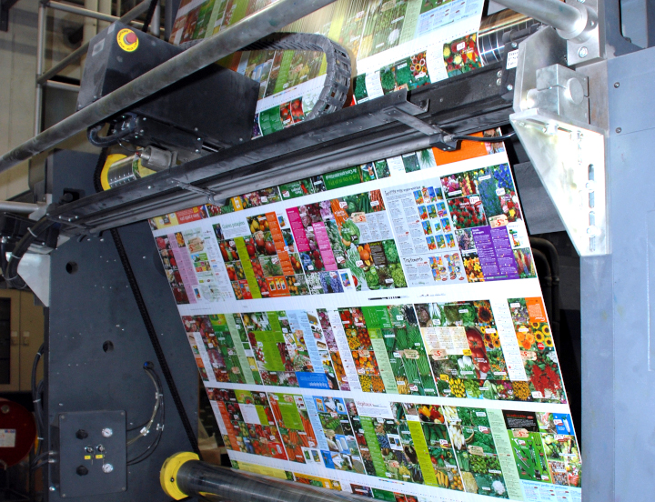
Photo purchased from … www.depositphotos.com
About two decades ago I was a custom printing consultant helping a client produce periodicals analyzing the actions of Congress in Washington, DC. It was a Friday night, and their flagship publication was on press at a local printer on a heatset web press. A tornado came in at that very moment and tore the roof off the commercial printing plant. When I called the sales rep, he said my client’s company was “on its own.” The job would not be printed and sent off to its paying customers that night.
So I contacted a local sheetfed printer I knew wanted the contract for this weekly magazine very, very badly. When I called the plant manager, who was at a bachelor party at the time, he agreed to be my client’s white knight. I sweetened the pot by noting that his successful completion of this job would probably create a vacuum that would suck all of my client’s jobs out of the web-press plant into his sheetfed custom printing plant.
He coordinated a new transfer of all digital data from my client’s office to his shop and produced the magazine via sheetfed lithography. Paying customers received a magazine that looked far better than prior issues. It came out on time as though nothing had happened. Within a year or so, the new printer was producing all of my client’s magazines.
Sheetfed vs. Web
The prior example might read like a fairy tale, but it’s actually true. That said, it was more expensive to print the magazine via sheetfed offset lithography than heatset-web offset lithography. Here are the differences and the reasons to choose one kind of press or the other for your own commercial printing work.
Both kinds of presses print via offset lithography, in which image areas on a flat custom printing plate are treated to receive ink, while non-image areas are treated to repel ink. When the press is running, ink is transferred from a printing plate to a rubber blanket and from the blanket to the paper (hence the term “offset”). So in this particular way, web presses and sheetfed presses are similar.
That said, paper is fed into a sheetfed press as individual sheets stacked in a pile at the front end of the press (even if they had initially come from a roll and had been cut into sheets). The sheets are pulled through all inking units, where they receive ink from the plates and blankets. Stacks of printed press sheets (printed on one side) exit the press and are stored for the ink to dry (via absorption into the paper and/or oxidation into the air, depending on the paper in use). Then the piles of press sheets are turned over and run through the press again to print the opposite side of the sheet (called “backing up the sheet”). Final printed sheets (printed both sides) are then brought into the finishing department for folding, trimming, and other post-press work.
In contrast, on a web offset press, paper comes from a roll. As the press runs, the ribbon of paper coming off the roll is held in tension as it enters the press. Like a sheetfed press, the web press uses plates and blankets on each inking unit to print the job.
If the paper is uncoated and the quality requirement is low (such as a newspaper or newspaper circular), the web press can be an open web (or non-heatset web). The ink dries through absorption only (ink seeps into the uncoated paper).
If, however, the paper is a coated press sheet (or roll, more accurately), the applied ink (usually four colors for this kind of work) has to be dried differently. So once the ribbon of printing paper from the web roll exits the printing units, it must enter the drying ovens, which flash off the solvent from the printed ink with intense heat (i.e., drying by oxidation rather than absorption), hardening the custom printing ink on the surface of the paper rather than letting it sink into the paper fibers. Then the ribbon of paper (the web) travels between the chill rollers, which bring the paper back to room temperature.
At this print, the web press can actually do some of the finishing work in line, getting the press signatures (in the case of my client’s magazines, for instance) ready for binding (some web presses do some kinds of binding in line as well).
Sheetfed presses can’t do this. (Finishing in this case is done in another department.)
Web presses are lightning fast. My random query on the internet notes that a sheetfed press can print 15,000 impressions per hour, while a web press can print 50,000 impressions per hour. (I don’t know how precise these numbers are, but the gist is that web presses are significantly faster than sheetfed presses.)
Moreover, a web press prints both sides of the roll of paper at one pass, unlike a sheetfed press. Either the ribbon of paper is turned over within the printing process using “turning bars” (with four of the inking units printing one side of the paper and then the other four inking units printing the opposite side), or press rollers, plates, and blankets above and below the web of printing paper print both sides simultaneously. This also speeds up the process dramatically.
But speed has its drawbacks. Even a heatset web press (as opposed to a non-heatset web press, which some people call a coldset web) cannot in most cases match the level of quality produced by highly skilled operators on a sheetfed offset press. (This is why my client’s customers who received the tornado edition of their magazine were knocked off their seats by its quality.)
In contrast, speed does yield cost savings. Sheetfed printing involves separate finishing operations in a different department, and overall it progresses more slowly, so the final bill is usually higher, depending on the total press run.
To illustrate, when I was an art director, my employer printed 60,000 copies of a 384-page (approximately) 6” x 9” perfect-bound print book (twelve 32-page signatures). The text was printed on a web press. I believe the 60,000 covers, since they were small, they could be ganged up on a single press plate, and they had to be of very high quality, were printed on a sheetfed press. I’m not good with math, but it seems to me that at 15,000 impressions per hour vs 50,000 impressions per hour, it would take much, much longer to print twelve 32-page press signatures (twelve separate press runs) on a sheetfed press than on a web offset press.
Why Choose One Press Over Another
If you’re buying printing and deciding what kind of printer to approach for a bid, here are some thoughts:
- If you’re producing a textbook, for instance, as was part of my job as an art director, consider the number of pages multiplied by the number of copies. In my case of 60,000 copies multiplied by 384 pages, that would be 23,040,000 book pages. In my experience, that’s definitely a web-offset commercial printing job.
- If you’re printing 60,000 copies of a 8.5” x 11” flyer that will be laid out (imposed) eight-up on a press sheet (eight final copies per 25” x 38” press sheet), then your final print run is actually only a fraction of the total or 7,500 copies, because out of every press sheet you get eight copies. That would most probably be a sheetfed job.
- Quality. Maybe you wouldn’t print an annual report on even a heatset web press. I wouldn’t. Even if it can run coated paper and four-color process ink work, it probably won’t look quite as dynamic as a sheetfed-printed annual report. However, if you’re producing flyers, forms, brochures, newspapers, newspaper circulars–either a heatset web press (for coated printing paper) or a non-heatset web press (for uncoated printing paper) might be a good bet. The key here is the length of the press run.
- So back to press runs. If you’re unsure, ask your printer. But my random check on the internet suggests 10,000 to 15,000 copies as a starting point for web offset, for magazines and brochures. While I would definitely agree with their assessment as it pertains to magazines (multiple custom printing press signatures multiplied by 10,000 or 15,000 copies), I think for brochures or any other work that can be ganged up on a press sheet, your target totals for choosing web offset lithography over sheetfed lithography would be much higher.
But it never hurts to ask your printer.
Posted in Printing | 2 Comments »
Monday, February 13th, 2023
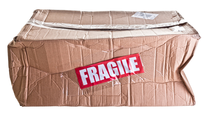
Photo purchased from … www.depositphotos.com
The picture above says it all. Let’s say you have spent months working on a perfect-bound print book, writing and editing it, maybe taking photos, designing the pages lovingly to showcase the content. Once the job has been printed and then delivered, without incident we always assume, it arrives at your office and everyone tells you how good it looks. But maybe this doesn’t happen. Maybe the job has been packed incorrectly by a new employee, or it falls off the skid and gets dinged rather hard, cutting through the cardboard packaging and smashing one or more print books. Or maybe the carton is dropped in a puddle by accident during a rain storm.
You get my drift. The job isn’t complete until you get all of the copies in pristine condition delivered to the exact location you specified. Packing and shipping are vital parts of the process, even though they are completely invisible to most people—until something goes wrong.
What to Do?
I did some research on packing print jobs in Getting It Printed a few days ago. This book by Mark Beach and Eric Kenly is my go-to text on all things about commercial printing, as it has been for the last thirty years.
Beach and Kenly note that making sure the products (print books, brochures, etc.) are not only in the boxes but rigidly secured is of utmost importance. And they need to be horizontally stacked, not vertically stacked. This avoids bowing, I would think, although I’ve always seen envelopes (particularly large 9” x 12” booklet or catalog envelopes) packed vertically.
Regardless (and your commercial printing supplier will know for sure), I think the goal is to work within the laws of physics. If a packaged product will want to move in a certain way in a box or carton and is allowed to do so, its weight coupled with the movement of the carton will cause problems. Make sure it behaves as you want it to, so when you get to the last box of pocket folders, for instance, they are standing upright and are flat and rigid.
Protective Coatings
Scuffing is another issue to avoid. When I was a designer and then an art director, I always used to coat print book covers, pocket folders, and anything else with a heavy coverage of ink. Whether it was aqueous coating, UV coating, or film or liquid laminate, this coating would protect the printed products in transit in the carton.
Shrink wrapping is another good option that Getting It Printed mentions. You can either shrink wrap the items individually (if your job is a long perfect-bound print book, for instance), or you can group items in specific numbers (or “conveniently,” which means your commercial printing supplier can decide how many to group together).
In lieu of shrink wrapping (and you can always ask for the cost of these different approaches when you’re bidding out your job), you can put slip sheets between individual items or groups. A slip sheet is just a piece of paper that keeps two adjacent printed items from rubbing against each other. Or you can paper band stacks of printed products together or even rubber band items together.
The Cartons
Durability of the cartons themselves is also an issue to consider. They need to be able to take a beating. I’ve never done this, but I know you can specify double-wall cartons, which, as their name implies, add another layer of protection.
A related choice I did make when specifying case bound books for one of my clients was to have the printer shrink wrap the individual books and then insert them into “bumper-end mailers.” These had cardboard extensions made specifically to absorb impact, much like the bumper on a car. Before the print book could sustain damage (not only in transit from the printer but in mailing to the customer as well), the bumper-end mailer would absorb the concussion. Again, it helps to consider the laws of physics.
Skid Packing
Handling the packed cartons as a unit (instead of as 50 individual cartons, each containing 20 books) is important as well, according the Getting It Printed. Laying the cartons on top of each other, overlapping like bricks, strengthens the stacks and keeps everything together and stabilized. Also, remember to pack the heaviest cartons on the bottom. Strapping the cartons and shrink wrapping the cartons to the skid also help.
For about five years when my fiancee and I were installing banners and standees at movie theaters, we also had a side gig working for Chanel. We installed exhibits for make-up application, and this included assembling banner stands and other graphics as well as furniture. Needless to say, the contents of the two skids (also known as pallets) we received for each Chanel installation weighed 1,000 pounds or more (comparable to a skid of print books in cartons).
It actually added to my education in commercial printing to learn how to pack a skid, wrap a skid with clear plastic, operate a motorized pallet mover, and operate a freight elevator. All of this experience and information was directly pertinent to the packing and transport of cartons of print books or any other printed product.
Among other things I learned was that everything had to stay dry. This is also true for a skid of cartons of books, perhaps doubly so, since print books and the paper they are made of behave like sponges. The plastic skid wrap sheeting we used (imagine wrapping a skid with saran wrap) is particularly helpful if your books will be in a fulfillment house for a long period of time, since this wrap does keep moisture from getting to the cartons of printed products.
Labeling
Particularly if your print run is long and perhaps destined to be parceled out over an extended period, you may need a fulfillment house. If so, you will want to note on each carton (and on each skid, using a “pallet flag,” which is essentially just a notation on paper) exactly how many cartons the skid contains, and how many books, pocket folders, etc., each carton contains.
Therefore, all of the cartons, except for one, presumably, need to contain exactly the same number of products. The remaining carton, labeled as such, will contain the smaller number of items that rounds out the total.
Then you will want to note all of this on each carton and on the skid in general, so an accurate inventory can be taken at the fulfillment house, and so the pick-and-pack fulfillment people can collect and repack groups of items to send to paying customers.
All of this information can be as simple or as complex as you want, depending on your needs. Getting It Printed notes that in many cases, simply taping a copy of the printed item (perhaps a brochure) to the box is enough. In other cases, for a book publisher, for instance, there may be specific language plus a bar code and even in some cases a QR code to reflect the title, publisher, and perhaps the cost. In this case, information stenciled on the cartons or even printed labels would be needed.
The goal is to decide all of this early and to provide art files the commercial printing supplier can use to add labels, stencils, or even just handwritten notes on the cartons, so everything will be in order once the job has been packed and delivered.
This is one reason, for instance, that I have never been able to get a printer to just finish up maybe two or ten cartons of print books and then deliver or mail them early, while the rest of the print job is finished and packed for transit. Things (including packaging a handful of books) done piecemeal are often done wrong. Or they slow down the job instead of buying time. Actually, one printer was willing to send out an early, partial shipment, but the process would have cost an exorbitant amount and would have wrecked the schedule.
Weight of Cartons
UPS and the US Post Office, as well as other carriers, presumably, have weight restrictions. Your printer probably will know these, but it’s smart to check. If the goal is to treat a carton of printed products as a unit, it defeats your goal to need to have a carton opened, have some items removed, and then have it resealed, just to meet delivery requirements. So plan ahead.
It’s also very important to know how wrapped skids will be delivered. Does the receiving destination have a loading dock? That is, will someone with a forklift or pallet mover be able to drive or walk directly from the loading dock into the back of the delivery truck (at the same level) to retrieve the skids? Or will the delivery truck need to have a lift gate (a little elevator on the back of the delivery truck to lower the skids to the ground). If the latter is the case, will the skid-packed job need to be disassembled and delivered as individual cartons by hand, on a hand-truck, through a building and up the elevator? Obviously this will cost you more because it will involve a lot of extra hand work and heavy lifting.
The Takeaway
The takeaway is that you should consider all of these variables before you hand off a request for quote to your commercial printing vendor. Specify them in detail. Discuss everything with your supplier. The details will dramatically affect your final delivery cost.
Moreover, the details will make the packaging portion of your job, which is the most important part in many ways, ensure that each individual printed item looks as pristine and wonderful the day it is received by the end user as it looked coming off the press and out of the bindery.
Posted in Business Cards, Packaging | Comments Off on Custom Printing: Packing, the Final and Perhaps Most Important Step
Saturday, February 4th, 2023

Photo purchased from … www.depositphotos.com
Photographs in your custom printing work are essentially a record of the light you witnessed. You are creating with light, making a specific artistic and/or editorial statement. Photos are never added to a publication just for their appearance.
In this light (so to speak), it is helpful to understand some terms and definitions. These will help you either take photos or select photos for the projects you design, whether brochures, banners, or print books.
Depth of Field
For the first ten years of my forty-six years (to date) in graphic design and other aspects of publications management, I shot the photos I used in my graphic design work. I used a film camera, not a digital camera, so you will need to do some online research to apply this information to digital photography.
“Depth of field” identifies the part of a photo that is in perfect, crisp focus and the part of the photo that is a little bit fuzzy. It notes the range (or depth into the picture plane) of crystal clarity, assuming all photos have a foreground, middle ground, and background.
If you are working in bright light (outdoors, for instance, photographing a group of flowers), you can set the lens aperture at a higher number (say f/ 16, or “f-stop” 16), which closes down the adjustable “screen” covering the camera lens in just the same way as the pupil in your eye closes to protect your vision in bright light.
This not only allows less light into the light sensor of the digital camera (or onto the film), but it also allows certain parts of the photo (depths into the picture plane, as noted above) to be in sharp focus or out of focus.
Why would you want to do this? Because it allows you to select the part of the photo you want the viewer to focus on, the subject of the photo, while ignoring or giving less attention to other parts of the photo.
If you’re photographing a bed of flowers (to reference the example noted above), you can highlight one flower and make those flowers closer to the viewer and those farther away less prominent, since they will be out of focus. You can also do this when photographing a person, a model.
From a mathematical point of view, the more closed down the lens can be (to allow less light to enter), the more inclusive the sharp focus will be (the larger the area from crisp focus in the foreground to crisp focus deeper into the background). For example, in this case the camera lens setting might be f/ 16 or greater (maybe even f/ 32). This, of course, requires more light, either natural ambient light or light from an electronic flash.
Going in the opposite direction and lessening the depth of field would require you to “open” the lens more (as the pupil of your eye opens more in lower lighting). An open lens (perhaps f/ 1.2) would make the area of crisp focus (which you could change the position of, within the picture plane, using the focusing control of the camera) be less deep.
High-Key and Low-Key Photos, and Contrast in Photos
Photos make a statement of some kind. Depth of field allows you as the photographer to choose what your viewer will look at. Other tools will do the same or similar things, even leading your viewer to feel a certain way about a photo in a print book or other publication.
In this light here are some terms to consider.
A “high-key” photo is one with predominantly light areas (or white or lighter toned pixels when viewed as a “histogram” graph in an image editing program like Photoshop). To the eye, such a photo just looks very white or bright, if it is either in black and white or color. This can suggest the bright, pristine white of early morning sunlight, for instance. The opposite is a “low-key” photo (in which the Photoshop histogram leans toward the darker tones). This might suggest the more subdued feel associated with sunset.
Closely related to this is the range from high contrast to low contrast within a photo. At noon, the sun casts intense shadows. A photo of a rock outcropping in the mountains, for instance, will have deep shadows and almost completely white highlights. It will be of high contrast. You can do the same thing indoors with an electronic flash (or multiple electronic flashes), with the deep shadows making a man’s face seem more masculine and chiseled.
The alternative would be an image with less contrast. Ambient light (natural light outdoors not augmented by electronic flash) in the afternoon can make a model look softer and more approachable.
As with depth of field, creating images with greater or lesser contrast, or photos that are high or low key will allow you to make a statement about the subject matter. That is, you can lead the viewer to perceive the subject in a certain way and/or have certain feelings and make certain judgments about the subject, all by changing its presentation based on the effects of light.
Electronic Flash and Studio Lighting
A book could be written about this subject. This is just to get you started. Also, you can employ studio lighting techniques away from the studio, using an electronic flash attached to the camera. This will increase the number of ways in which to present your subject (perhaps highlighted and therefore more dramatic or with more subdued light and therefore more approachable).
When I started at the non-profit government education foundation at which I eventually became the art director/production manager, part of my day was spent on Capitol Hill taking photos of students in seminars with senators and congressmen. I had a bounce flash, which I attached to a bracket on the camera. I could tilt it up and bounce the light off the ceiling, which would soften the light that fell upon the people I was photographing. Or I could point the flash directly at the students and legislators. I could also vary the intensity of the light the flash produced, and I could adjust both the camera shutter speed and aperture (see above description of depth of field).
Overall, I could make the lighting more dramatic or more subdued, depending on the tone in which I wanted to cast the subject matter. I even attached a white index card to the bounce flash with a rubber band so I could bounce the flash (the card would deflect the light) if the ceiling were too high.
If I were to replicate these lighting options in a photo studio with large, floor-standing studio lights, I might make the following decisions:
- I might use one flash on the camera and then a fill flash or fill light in the room, separate from the camera. The light on the camera might illuminate the front of the model’s face, while a light on the side of the model might cast other shadows and highlight additional portions of the model’s face (like the cheekbones). It might also make the overall face look more dimensional and less flat than what one light would create.
- I might avoid positioning lights below the model, since this could make the model look ghoulish and scary.
- I might avoid shooting the flash near a window or mirror, so as to avoid a reflected glare.
- I might choose to photograph the model with light coming only from one side (at a 90 degree angle) to subtly accentuate the shadows of the face.
- I might illuminate the model only from behind to create a silhouette effect.
- I might use a “softbox,” a lamp covered with a diffusion screen, to scatter the light and soften the look of the model.
Studio lights would make this easier, since I could see the lighting effect before tripping the flash (less easy to see, since it’s there only for an instant). To the best of my knowledge, studio lights today can be turned on, illuminating the subject, and can then be flashed for an instant for the photograph, to increase their intensity for a good exposure.
The goal of all of this is to brighten the subject and increase the detail created by precisely positioned illumination, without creating harsh shadows. Depending on the equipment, you can either do this in a photographic studio or out in the field (with a flash), without needing to artificially doctor up the image in Photoshop. And in all cases, the goal is to use light creatively and precisely to add a mood or tone or in some other way make a statement about the subject of the photo. And this artistic statement can reinforce the tone or message of the print book, large format print banner, or anything else you’re designing.
Posted in Photos | Comments Off on Commercial Printing: Creating Photos, Recording Light
|
|