Printing Industry Exchange (printindustry.com) is pleased to have Steven Waxman writing and managing the Printing Industry Blog. As a printing consultant, Steven teaches corporations how to save money buying printing, brokers printing services, and teaches prepress techniques. Steven has been in the printing industry for thirty-three years working as a writer, editor, print buyer, photographer, graphic designer, art director, and production manager.
|
Need a Printing Quote from multiple printers? click here.
Are you a Printing Company interested in joining our service? click here. |
The Printing Industry Exchange (PIE) staff are experienced individuals within the printing industry that are dedicated to helping and maintaining a high standard of ethics in this business. We are a privately owned company with principals in the business having a combined total of 103 years experience in the printing industry.
PIE's staff is here to help the print buyer find competitive pricing and the right printer to do their job, and also to help the printing companies increase their revenues by providing numerous leads they can quote on and potentially get new business.
This is a free service to the print buyer. All you do is find the appropriate bid request form, fill it out, and it is emailed out to the printing companies who do that type of printing work. The printers best qualified to do your job, will email you pricing and if you decide to print your job through one of these print vendors, you contact them directly.
We have kept the PIE system simple -- we get a monthly fee from the commercial printers who belong to our service. Once the bid request is submitted, all interactions are between the print buyers and the printers.
We are here to help, you can contact us by email at info@printindustry.com.
|
|
Archive for November, 2022
Sunday, November 27th, 2022
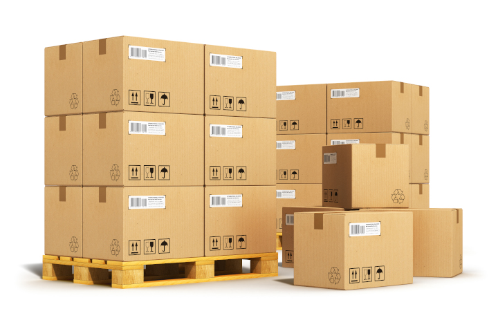
Photo purchased from … www.depositphotos.com
Increasingly, my fiancee and I depend on products ordered online. You push a button, and the boxes show up at your door. We recognize the delivery trucks by their sound out on the neighborhood street, just like the mail truck and the garbage truck.
Amazon. UPS. These entities are their brand, and their brand comprises everything from the look of the boxes (and the imprinted logos) to the kindness of their drivers, to the color of and imprints on their uniforms.
Clearly, this is the core of the new economy: the convenience of one-click ordering plus door to door delivery. We now take it for granted.
Consistent Branding
For years my fiancee and I have received products from one of these large distributors, and for years this distributor has presented a consistent brand image in their packaging. The logo has been consistent and eminently recognizable, even from across the street. Even their logo mark (without any type) has been iconic.
All custom printing except for the brand mark (or pictorial mark) on the carton (without the name or other type) has been on the packing tape strapped across the brown corrugated cartons. Even the second color, used as a minimal highlight on the packing tape, has become immediately recognizable along with the solid brown of the corrugated packing boxes.
Just recently, however, this established brand image has changed a bit. Boxes are now printed on all surfaces with imagery and an additional logo for an upcoming movie franchise. The otherwise recognizable brown of the carton is obscured by this promotional printing. From the white of the reversed type on the box I can assume that all custom printing was done on a white press sheet that was later laminated to the corrugated board of the cartons. That said, under a 12-power printer’s loupe, the random dot pattern in the halftone images suggests to me that inkjet imaging was the chosen commercial printing technique.
Perhaps this is either a short-run test of the new packaging or even only one localized version of the box (perhaps only in my fiancee’s and my neighborhood), with other custom printing on cartons sent to other customers.
Furthermore, another package from the same distributor arrived today, promoting the same film franchise. However, in this case the background color printed on the vinyl bubble-wrap envelope is different from both the first (mustard-colored rather than various tones of brown) newer version with the “altered” print presentation (printing all over the box and a secondary logo for the film franchise) and the long-standing “look” of the original almost-blank carton. So these are relatively major graphic changes.
Why Does This Matter?
Granted, in the world as it is, this is not a crisis by any means. It is just marketing. But to me it is a curious event, based on my understanding of the goals and processes of brand maintenance.
In marketing, the goal is the immediate recognition of a brand by potential clients. If this is a new brand, such buyer recognition can only come from a certain number of exposures to the marketing image and message. (I’ve heard it’s six to ten impressions. The number is less relevant than the concept of awareness and positive associations growing organically over time and arising from the customers’ seeing consistent imagery.)
This nurturing of brand recognition in the minds of potential customers depends on consistency across a number of defined areas. Such consistency includes the treatment of the company logo (everything from colors to size to placement on a printed product), to the typefaces associated with the logo and any tagline or any other writing on the box, brochure, banner, sign, billboard, or any other printed or digitally displayed promotional piece.
But Branding Is More Than Just the Logo
Branding is more than just the logo. It is all of the intangibles linked to the logo and other related graphic presentations. From there, by association, the graphic presentation itself absorbs and then reflects the values of the brand (or corporation). Amazon, Chewy, and UPS do this beautifully.
The qualities and attributes linked to the visual depiction of their brand may include quality, responsiveness, speed, knowledge, environmental stewardship, fairness. The list goes on. When the company employees do their jobs well, compassionately, and knowledgeably, they help foster a positive customer experience. (A business-owner friend of mine also uses the term “frictionless” to suggest that it should be easy for the consumer to get what she or he needs from the corporation, or brand. That is, in his own business, my friend tries to eliminate stress for the customer within all transactions.)
In addition, the brand is reflected in the interior design of the company buildings, the signage, the customer uniforms, and especially, least I forget, both the look and the “frictionless” user experience of the website (and how successfully and seamlessly the website is linked to the physical brand presence).
As an analogy, consider Pavlov’s dog. Pavlov’s dog began to automatically salivate when he heard a bell. This was because getting his dog food and hearing the bell had been linked physiologically and psychologically because they occurred simultaneously. Once food and the bell had been linked in the mind of the dog, Pavlov could ring the bell and fido would salivate.
Branding works in much the same way. You have a great experience in the store and with the product, and you associate these with the interior design of the store, the colors, signage, logo. Once the brand values and experiences and the graphic presentation have become linked, when you see a consistent presentation of the logo and brand colors, you salivate. I mean you remember all of your good experiences with the company and you buy more product or service.
I actually understand this on a conscious level, but I also respond to it just like Pavlov’s dog because it serves my needs. I know I will get what I want from the transaction with the business.
For instance, I moved my cell phone service to Cricket from another carrier a number of years ago. On a whim, my fiancee had suggested that I visit a Cricket store when I was dissatisfied with my current carrier’s price and service. I also didn’t like the little add-ons and extra fees and taxes that drove the prior carrier’s price much higher than the advertised monthly cost.
I actually had a good experience in the Cricket store. They were helpful. The monthly cost matched exactly what Cricket had offered in its promotional literature (with no hidden fees or taxes). And now I recognize the logo and other elements of the branding wherever I see it, even from a distance while driving. And since the initial fortuitous meeting at this first Cricket outlet, every Cricket store I’ve been to for help has solved my problem (at any given moment of crisis) immediately and successfully. That is, they provided consistency and frictionlessness.
Brand Dilution
To return to the concept of brand consistency, I’m not sure I’d have the immediate recognition and positive associations with the logo and logo treatment (colors, typefaces, logo mark) if I drove past a strip mall and saw a different Cricket logo, maybe different colors, or if I received direct mail with a different logo or printing or color treatment. I’d be confused. I wouldn’t get the immediate “aha” moment (the norepinephrine, dopamine, and serotonin coursing through my brain). And the key there is immediate.
So when we look at the distributor whose boxes wind up on our porch on a regular basis, having some of them be different visually, and without even a visible link (base background color, level of simplicity vs. complexity in imagery and type treatment, etc.), this difference may cause confusion, a lack of immediate recognition of the brand and its associated attributes and values.
I call this “diluting the brand.” I even refer to it with my fiancee when we’re choosing art projects for our art therapy work, since we have a brand, too, which encompasses everything from our art projects to our billing invoices. Our goal is always to build the brand, or “burnish the brand,” as I call it, not dilute the brand.
So in the case of door-to-door delivery and the graphic treatment of the distributor’s cartons, I personally think there’s a risk of diluting a brand by presenting the logo, typeface, corporate colors, or any other aspect of the corporate “look” in different ways. Again, why? Because consistency breeds recognition, and change risks confusion (particularly change that deviates dramatically from the treatment of the prior corporate branding).
The Takeaway
No matter what you design, whether it is for the internet or for commercial printing projects, from products to promotional literature to wall signage for a store, consider how your individual item fits in graphically with everything else the company displays or sells. Think about everything as a complex system with minute interactions between each component part. But most of all, think about how all of these elements not only work together visually but more importantly how they support and reflect the core values of the brand.
Posted in Box Printing | Comments Off on Custom Printing: Consistent Branding in Packaging
Monday, November 21st, 2022

Photo purchased from … www.depositphotos.com
At the top of this article you will see a glorious photo taken at sunset. The purples and yellows are rich and vibrant. The same intensity might characterize a photo of a verdant meadow. There are certain “memory colors” that we depend on seeing. They have to be “right.” When they are not (within a certain tolerance), that’s a problem.
In this light, I am sharing this question from a product designer working with a huge American entertainment brand. His is a story about color accuracy and consistency.
Here’s the client’s question:
“How do I spec a ‘white’ for printing on a metal base material? The problem is the white roll material comes from different sources even from the same manufacturer. The base color is then the background white to our graphic. It varies from gray to pink to antique white. None of these are good. I want to spec a white color to lay down as a spot color, so I can get consistent color from factory to factory. What is the solution? FYI, what I am referring to is a slow cooker metal wrap graphic.”
I called this designer immediately, and we spoke for a half hour.
The Backstory on the Manufacturing and Custom Printing Job
The product designer noted that four separate manufacturers produced the slow cookers in China. I first asked about consolidating the vendors, since maintaining consistency when working with multiple sources is difficult. The designer said that due to budgetary constraints, using one vendor was not an option.
Among other things (such as the manufacturers’ using different inks and different colored substrates), there was one other challenge. The three manufactured and printed items would be packaged together.
This was a problem. If you look closely at printed cereal boxes next to one another in the grocery store, you’ll see that from press run to press run (and presumably from printer to printer), there’s some—or a lot of–color variance. However, once you get the cereal home and are eating it, you usually forget the slight difference in packaging color.
This is because the human brain (in most people) cannot remember color for very long. Moreover, it is usually only when two items that differ in color are side by side that the difference stands out (unless they are memory colors, as described above).
This is where we had problems. The product designer’s slow cookers were all supposed to have red printing on a consistently colored white base. Since the colors differed slightly from manufacturer to manufacturer, and since the products were packaged side by side, the color variance was visible.
What I Suggested
My suggestions to the product designer fell into a number of categories:
Technology Used
I suggested that the product designer ask what technology the four separate Chinese manufacturers were using. For instance, my expectation is that they use either inkjet printing or custom screen printing. Granted, it is possible that some other technology is being used; however, knowing exactly how the manufacturers are adding color to the base material of the slow cookers is a good start.
Types of Ink Used
From there, I encouraged the product designer to find out what inks the manufacturers are using for the custom printing. For instance, are they using UV inks, since these can be printed on non-porous substrates? Also, presumably, if one manufacturer is using custom screen printing ink and another is using UV inkjet ink, there might be a variance, particularly if one color is a solid hue and another is a color build. It would probably be helpful as well if the product designer could determine whether the inks are solvent, eco-solvent, or, as noted above, UV inks.
The White-Ink Base Printing
The product designer’s comments about the variance in the color substrate raise an interesting point. One could lay down a base of opaque white and print a red color (presumably consistent among the four vendors) on the white. But what kind of white would be chosen?
I did a quick search online for white pigment (specifically the mineral content of various white inks). This is what I found: Zinc White, Titanium Dioxide, Zinc Sulfide, Lithopone, Alumina Hydrate, Calcium Carbonate, Blanc Fixe, Barytes, talc, silica, and China Clay. All of these minerals and other substances affect the perceived color of the base-white commercial printing.
Therefore, I encouraged the product designer to research what kind of white inks the four Chinese manufacturers have been using and then ensure that these will be consistent going forward.
Specifying and Proofing Color
With all of this in mind, I told the product designer that specifying color and proofing color were important elements of standardizing the colors of future jobs.
Regarding color specification, I encouraged the product designer to start with a successfully printed sample (with the color exactly as he wants it to be) and have a local printer check the color with a spectrophotometer. Unlike a printer’s densitometer, a spectrophotometer will actually determine the base white color and red surprinting ink and quantify these in numbers that will be recognizable (and able to be copied) by different commercial printing vendors associated with different manufacturers.
In addition, when printing ink on paper, I have always trusted “drawdowns.” These are made with your chosen ink smeared on your chosen paper substrate. You don’t see the photos or the actual typeset copy of your job, but you do see how the ink itself will look on the paper you have chosen. I suggested that the product designer ask whether a similar process was available from his manufacturers.
I also suggested that the product designer request a “contract proof” (of the white background and red lettering) before the final print run. Such a proof is considered an agreement between the client and the vendor. If the final print job does not match the contract proof, the printer has to make everything right or extend a discount.
I also suggested that the product designer send all commercial printing suppliers a package containing the shrink-wrapped slow cookers side by side. If it is obvious to him that the colors are off, it should also be obvious to the four Chinese printers. And it would be a good starting point for determining the cause and successful resolution of the problem.
Color and Light in General
Just to keep the discussion lively, I reminded the product designer that color is a function of light and vision. Colors look different under different lighting conditions. (For instance, at night a red car is gray.) To complicate matters, women apparently see color better than men. And, if you look at a colored object and then cover first one eye and then the other, your two eyes will see slightly different colors (at least mine do). So color is changeable and subjective.
That said, there are two terms I shared with the product designer that reference color consistency in both the commercial arts (and custom printing) and the fine arts. They are “metamerism” and “simultaneous contrast.”
Metamerism refers to the fact that some color patches appear to be either identical to one another or different from one another depending on the ambient light. Apparently this condition is more evident in grays, whites, and dark colors (so in the product designer’s case this might be a contributing factor).
Simultaneous contrast, which is closely related, refers to the fact that certain colors placed next to one another (complementary colors, for instance) will each affect how the other is perceived (as opposed to how they look when viewed separately). This speaks to how much our eyesight affects how our brain registers color. I personally think this is interesting but not as directly pertinent to the product designer’s situation with the white metal slow cookers with surprinted red type.
The Takeaway
Regarding the product designer producing slow cookers, I really didn’t know why he was having problems. But he did leave our conversation with a systematic approach to isolating, and then identifying and potentially resolving, the problems with the inconsistent industrial printing inks.
In your own work, if you are faced with a problem like this (with either ink on paper or ink on physical products), first determine the technology and inkset being used. Then consider the substrate (and give thought to printing a layer of opaque white under all other inks to provide a consistent base color).
Use precise, generally-agreed-upon conventions to communicate color (percentage of CMYK, for instance, and maybe even readings from a printer’s spectrophotometer).
Communicate color using printed samples (your chosen ink on your chosen substrate), and when in doubt ask for an ink drawdown. In addition, always request a contract proof.
All of these approaches (and especially seeking to resolve color fidelity issues by isolating all components of the custom printing process) will go a long way towards your success in printing beautiful, consistent color, even when you need to work with multiple commercial printing vendors.
Posted in Product Design | Comments Off on Custom Printing: Consistent Color in Functional Printing
Sunday, November 13th, 2022

Photo purchased from … www.depositphotos.com
I suppose it’s better to make your spouse or significant other your best friend. But if you buy commercial printing or do graphic design for a living, it’s smart to have a paper merchant as your BFF right after your printer. A deeply knowledgeable paper merchant is a truly valuable asset.
First of all, paper is made at a limited number of mills around the world. The mill is not the paper merchant. The paper merchant is a conduit between paper mills and printers. What she or he adds to the transaction is knowledge and connections. She or he can understand your paper needs, work to find a good source, and coordinate everything with you printer. This costs nothing to you as a buyer.
What a paper merchant offers on a physical level that you might want to request is a collection of paper swatch print books. I have about fifteen corrugated paper swatch book cartons (display boxes) upstairs that include the following: stationery papers, coated paper stocks and uncoated paper stocks, digital paper stocks (specifically suited to inkjet and laser printing), text stocks in various intense colors that might be good for a special invitation (see the colorful photo above), and cover stocks paired with text stocks (so I can better decide what cover paper is right for a print book or annual report).
I’m sure I’ve missed some, or a lot, but you get the idea. Ask your paper merchant (or your commercial printing supplier, if you don’t yet have a paper merchant) for a comprehensive supply of these kinds of sample books, and then purge and replace them every so often, based on the date (ask your paper merchant her or his advice about paper swatch book replacement). Think of these as Pantone Matching Books but for paper (color, surface coatings, brightness, whiteness, weight, caliper, etc.) rather than for ink hues.
In my own case I have to admit that my collection of paper swatch books is out of date. Therefore, I only use the books to specify paper qualities, not brands. This is because specific brands of specific categories of paper come and go.
So it’s important to have current paper swatch books if you do graphic design for a living, but you can see why even out-of-date paper books are useful.
Two Sample Paper Swatch Books
Downstairs in my office I have two paper swatch books for immediate access. They are approximately 5.5” x 8.5”, perfect bound, with a crisp vertical press score running parallel to the binding. Both are from Sappi (one of the owners of paper mills). I believe it used to be called Warren, back in the day, until Sappi bought Warren.
On the cover, one book notes “Lustro,” and the other notes “Opus.” These are two paper lines produced by Sappi. Lustro is a #1 sheet (the brightest possible, also called premium). I believe it is bleached during its manufacture to increase its brightness, which refers to the amount of light a paper reflects. One hundred percent would be the highest. Current online information for Sappi Opus notes that it is 94 bright. The cover of the book notes that this is a #2 stock.
Whiteness, on the other hand, refers to the quality (as opposed to the amount) of reflected light. You may refer to a blue-white (or solar-white) sheet vs. a yellow-white, natural, or warm-white sheet. If you read the paper swatch books, you’ll come upon such language.
Keep in mind that blue-white paper appears brighter than natural white or yellow-white paper (and may be a bit hard on the eyes for extended passages of text). Then again, paper affects what’s printed on it, and a cream, natural, or warm-white shade will add its yellow-white tone to the transparent inks printed on it. In short, you may not like the flesh tones if you print people’s faces on a warm-white stock.
All of this can be physically seen, as well as described (along with numbers from various paper quality scales) in the text of these paper swatch books.
To return to the samples, Opus is a #2 grade of paper as opposed to Lustro, which is a #1 sheet (although I don’t see it online, so I believe it may have been discontinued—another good reason to stay current). In my experience #1 sheets are 96 bright or higher, so the 94 specification for Opus is consistent with its being noted as a #2 sheet on the cover of the paper swatch book.
To put this in context, the brightness numbering convention goes even further down to #4 or #5 sheets, many of which have impurities that will make them last a much shorter time before decomposing. Their brightness numbers would be closer to 74-79 for a #4 sheet and 69 to 74 for a #5 sheet (according to Wikipedia). These look a bit dingy when compared to brighter sheets.
Personally, I think the numbers themselves are less important than their relative comparison. Moreover, a #4 or #5 sheet isn’t a bad sheet for a web-offset-printed auto parts catalog for a mechanic, something that doesn’t have to look pristine or last a long time. I just wouldn’t use these papers for an annual report.
On the bright side (no pun intended), a premium sheet costs more than a lower-number sheet (#4, #5, commodity, etc.). Also, if the paper swatch book uses words like “free-sheet,” you know that the paper is of good quality because this means it is free of impurities.
Paper Surface Coating
Lustro lists the following as optons for surface coating (the clay—and other components—that comprise the liquid surface coating applied to the paper). This makes ink sit up on the surface of the press sheet rather than seep into the paper fibers. This is called “holdout,” and it is what allows for crisp, colorful photos. Newsprint paper would be the opposite, an uncoated sheet that soaks up the ink like a sponge. Photos get muddy and lack detail. Photo halftone screens must be coarse (like 85-line) for newsprint rather than 133-line and above for a nice coated sheet.
In the paper swatch books, Lustro is noted as being available as patina, dull, dull cream, and gloss, while Opus is noted as having the following options: matte, dull, and gloss.
What does this mean? A dull coating is smooth and flat but not as smooth as a gloss coating. It actually scatters reflected light and therefore makes reading text easy on the eyes compared to gloss. However, photos don’t jump out as much as they do on gloss coated paper. If your book is heavy on text, your readers will thank you for a dull sheet. In my experience, matte is just a less expensive dull with a slightly rougher texture (actually a slightly less even surface coating). To refer back to whiteness specifications noted above, dull cream is a yellow-white version of Lustro Dull.
Extra Coatings
The additional coatings (gloss vs. dull varnish) noted in the paper swatch books are actually applied on the commercial printing press (in contrast to the original surface coatings, which have already been applied when your printer buys the paper).
That said, both of the Sappi paper swatch print books show a portion of the main sample photo coated with gloss varnish, dull varnish, and then no varnish. In this particular case, in the Lustro book, there is a glamour shot of a model printed across sample sheets of patina, dull, dull cream, and gloss paper, with each sheet sticking out slightly beyond the prior one (for comparison). The varnish, as noted above, coats the image in horizontal strips from the top to the bottom of the page. Sappi noted that the image is printed in 4-color process ink (i.e., no extra colors; plus all process colors are transparent, unlike some other inks).
Paper Weight
Paper sample books include swatches of all available paper weights, both cover and text. This is useful for two reasons. It shows you, without guessing, exactly how thick each sheet at a particular weight will be (since they vary from manufacturer to manufacturer and from paper to paper, even if the specification numbers are the same).
This way you can choose from a sample piece of paper rather than a reference number online or in a print book. Moreover, you can better pair a cover weight sheet with a text weight sheet. You can even ask your paper merchant for a paper dummy (an unprinted copy of a sample book made up with your chosen papers). This way you’ll know exactly how a print book of a particular length will look and feel before it has been printed and delivered.
The Takeaway
What can we learn from this? First of all (do as I say, not as I do), keep your paper book collection current. It will be easier to communicate with your printer. Failing that, use old paper books to only determine specifications, not brands. For instance, with my old books I can still see how a 100# cover sheet and a 100# text sheet for a book will look and feel with a dull, matte, or gloss coating. Then I can ask for brand suggestions and request a paper dummy.
If, on the other hand, you have a current set of paper swatch books, you can select a particular name brand, ask for that or comparable, and, even more importantly, you can see how a 4-color photo will look on the paper stock with a dull, gloss, or no varnish.
All of this will help you visualize the final product and even feel it in your hands. Neither of these can be done if all you have are the reference numbers online for paper brightness, whiteness, finish (the dull or gloss spec), and caliper (thickness at a specific paper weight). Trust your hands and eyes first. But do look at the paper books under various lighting conditions, such as sunlight (5000 degrees Kelvin, like the pressroom observation booths) and maybe incandescent, tungsten, and fluorescent light as well.
Posted in Paper and finishing | Comments Off on Commercial Printing: Make Your Paper Swatch Books Your Second Best Friend
Sunday, November 6th, 2022
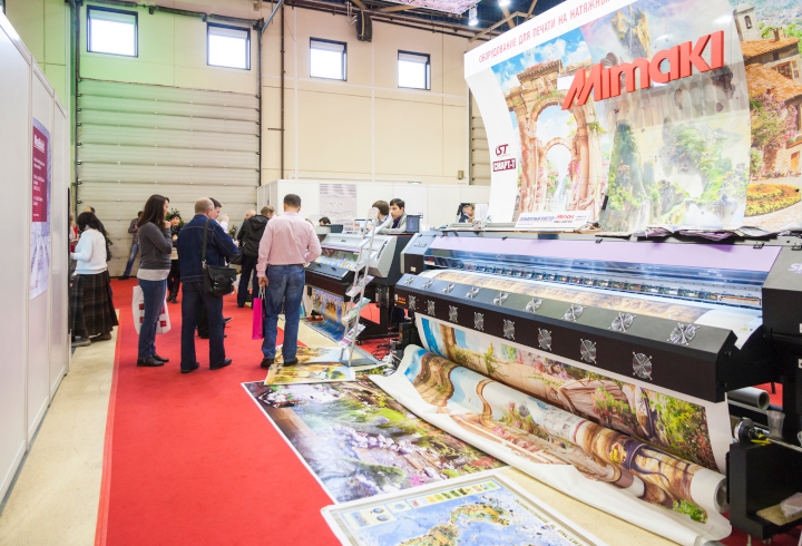
Photo purchased from … www.depositphotos.com
When I was a consultant working with a large Washington, DC, magazine publisher, one of my tasks was to coordinate the commercial printing and installation of a huge banner (an inkjet printed cover of one of the company’s magazines). I also helped the printer with the installation.
I’m a great believer in learning on the job. Just as it didn’t hurt to learn how to use motorized pallet loaders, plastic skid wrapping, and industrial freight elevators when my fiancee and I were doing freelance display installations for Chanel, neither did it hurt to help install a three-story-high banner on the side of the magazine publisher’s exterior wall.
This is what I learned. Hopefully it will help you in your custom printing work.
Design Considerations
First I had to find a vendor. Not all vendors produce large-format print graphics. In this category I include all forms of inkjet work produced on either flatbed printers (for rigid substrates) or roll-fed printers.
Fortunately most inkjet printers include large inksets (cyan, magenta, yellow, black, sometimes a second black, sometimes light cyan and light magenta, sometimes white, sometimes red, blue, and green, or even orange and purple). The goal is this. The more additional colors beyond the traditional CMYK (cyan, magenta, yellow, and black) color set, the wider the color gamut and the more individual hues (such as specific corporate colors) you can match. So if you need to select a large-format print shop, I’d encourage you to approach a dedicated sign-maker or ask a trusted commercial printing supplier for a referral. Referrals go a long way in ensuring product quality, vendor skill, and deadline reliability.
Regarding technical specifications, consider size and resolution. For a large-format print image, you don’t need 300 dpi resolution if your banner will be three stories high. This would create an unnecessarily large (and time-consuming to print) art file. From a distance, your eye is perfectly fine with 80 dpi, or whatever else your printer suggests. (So ask him specifically.)
Presumably he will want a PDF file (not InDesign or Photoshop) of the job. But you should ask about the overall size. Most probably he will ask you to make the banner file the exact size of the final art (to avoid needing to enlarge the artwork when printing). He will probably also ask you to embed the fonts in the file or, more likely, to convert the type into outlines. He will definitely ask for files in CMYK format rather than RGB format. (If he does accept RGB files, he will still need to convert them to CMYK files on his end, so it’s best for you to make the shift before submitting the file so you can see how this will affect the overall color.)
What Will You Print On?
If your banner will be hung indoors, you might consider some kind of fabric (maybe for a table throw, interior wall banner, or roll-up banner stand). But for the kind of exterior banner I needed to provide to my consulting client, vinyl was the best choice. After all, it had to withstand the elements (sun, rain, and wind), which are very hard on a banner.
In this case I had the vendor stitch together the sections of the huge magazine-cover photo image, since the final banner was larger than the 16-foot width of many grand-format, roll-fed, inkjet printing machines. The vendor also hemmed the edges of the banner to improve durability, and added metal grommets along the edges to accept the rope for tying the banner to the side of the building.
Inks were also a consideration. Dye-based inks are more vibrant than pigment-based inks (solutions of water and dye molecules rather than larger particles of pigment suspended in liquid). However, dye-based inks are less weather resistant. More than likely, your printer will suggest a solvent-based, eco-solvent-based, or even UV ink that will tolerate rain and sunlight (which otherwise will cause the color in the inkjet inks to fade).
Be specific when talking with your custom printing vendor about whether your product will be an exterior banner, a bus or car wrap, or a billboard. You may also want to ask about lamination to increase durability, depending on what inks and substrate your printer will use. How long you will need the banner to be outside will also make a difference (three days, three months, three years). Solvent-based inks have the greatest longevity, eco-solvent inks slightly less, and water-based inks least of all. Unfortunately, the most durable inks also pose the largest health and environmental concerns.
Accounting for Wind
Wind does interesting things to banners. When I was hanging the banner on my client’s building with the sign manufacturer, I was struck by how even a gentle wind would catch the vinyl banner like a sail. To keep such a large banner from taking flight, the banner vinyl is often slashed in a regular (often curved, like horizontal “C’s”) pattern. The wind just travels through the vinyl material, and the pattern of slashes is minimal enough to not really compromise the overall look of the banner from a distance.
Interestingly enough, a similar technique is often used for large-format banners that cover windows in buses (or that cover vendor shop windows). These are called 60/40 mesh banners. (I have also seen them outside on fences, so the breeze travels through 60/40 mesh as well.) When a banner or bus wrap has been printed on 60/40 mesh, from a distance the eye sees the portion of the image that is printed and doesn’t really notice the matrix of regularly-spaced holes with no commercial printing ink.
But again, even though it can be used to reduce wind interference, 60/40 mesh is primarily a way to allow bus riders to look out the windows and those outside the bus to just see the banner wrapped around the vehicle.
Two More Considerations
Large-format graphics such as my client’s three-story banner may also show up as billboards, depending on how they are designed and positioned. Interestingly enough, one of the considerations for such a banner is viewing angle.
From a marketing perspective, it’s important to get the attention of the viewer when she or he is driving (especially true for a billboard but also true for a building wrap). In my client’s case, the front of the building was at a 45 degree angle to the road and right next to it. So it was visible for a number of seconds to those driving by.
In contrast, a banner facing a road or highway at a 90 degree angle might be missed, or it might be seen only for an instant. You may want to think about this, and ensure that the viewer gets as long an exposure to the image as possible. Of course this is also why you want to only include a few words on the banner along with a striking image. (Don’t make the viewer take more than an instant to process the information while driving.)
This is relevant in terms of safety as well. If the banner faces the street at a 90 degree angle, and the person driving looks away from the road to see the banner, she or he will be at serious risk.
Final Thoughts
So, as with most other printed products, a large-format print banner (whether a building wrap, a bus or car wrap, or a 60/40 banner covering a store window) has both a design component and a functional, production component.
The best large-format graphics make a dramatic statement with only a few words and a striking image in brilliant color. They don’t make the viewer take more than an instant to process the information. But it’s also important to consider the best vendor for such a job, as well as the proper inkset (both the hue and the ink formulation, whether dye-based, eco-solvent, UV, or solvent), file resolution, and document size.
Your printer is your best ally in helping you get this kind of work done.
Posted in Large-Format Printing | 2 Comments »
|
|