Photo purchased from … www.depositphotos.com
The Printing Industry Exchange Blog is #12 of the best 40 digital printing blogs, as selected by FEEDSPOT.
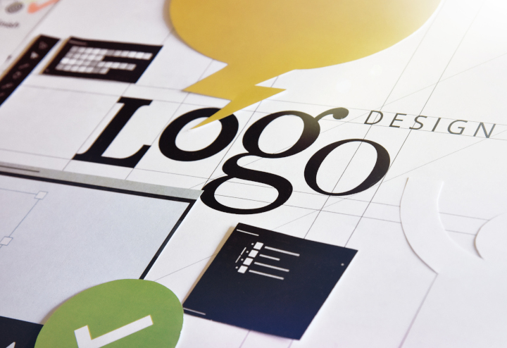
About thirty years ago when I was an art director and production manager of a government education nonprofit, all of us went through a “logo refresh” or logo redesign. Our superiors felt, rightly or wrongly, that the task would be better done by an outside design firm than by our in-house designers.(We would then implement the new logo in all of our publications.)
What I learned in the process is that there are a number of aspects to consider, but for the most part they fit into these categories:
- How did the old logo design–and how will the new logo design–position the company among other, similar organizations? That is, what is the context of the logo redesign?
- How does the new logo capture and reflect the service or product the organization offers, as well as its unique personality and values?
- How can the new logo be used, creatively and effectively, to give the potential customer an overall understanding of the company–instantly–just by seeing the logo? This might be expressed as “what to do with the logo” or “how to use the logo.”
(While expecting the customer to grasp the entirety of the company through her or his initial exposure to the logo is unrealistic, seeing the logo should bring to mind certain thoughts and feelings congruent with the company’s ethos. This should then be reinforced through subsequent exposure to the logo.)
For example, after seeing the Starbucks logo ten times and drinking ten cups of Starbucks coffee (if that’s your thing), then just seeing the logo should bring to mind positive thoughts and feelings about the company.
Brand recognition is the goal of a good logo.
In this light I was recently asked to help a client redesign her logo. To save her money, I said I would do this as a consultant, and she would be the designer. This is the client of mine who produces color swatch print books to help clients select clothes and makeup hues that will complement their complexion and hair. She is the fashionista I have spoken of in many prior PIE Blog articles.
Design of the Logo (Logo Mark and Text)
My client had already produced draft versions of two logo concepts: a word-only version (just text, no logo-mark) and a version with a gemstone background in multiple colors.
To start with the latter (and I did encourage her to develop three distinct versions from which she could choose after careful thought and discussion with colleagues in her field), the outer diamond shape contained the name of her company in caps and small caps across the center of the gemstone.
My client sells a color scheme and an approach to the use of color, but in reality she sells “magic” and “glamour,” as well as the associated feelings of confidence, empowerment, and joy. The approach to color is really just the scientific vehicle for selling the magic.
Therefore, the gemstone visual motif is appropriate, but in my client’s first rendering, the colors and size of the gemstone dwarfed the name of her company. In addition, the two-word name of her company was set in capital and small capital letters, so it was less legible than an upper and lowercase version of the business name.
So I made these suggestions:
- Make the reader’s eye go to the name of the company first by enlarging the name of the company relative to the gemstone image.
- Use more color in the name of the company and less color in the background gemstone, since the former is more important than the latter.
Design of the Logo (Text-Only Version)
My client chose two typefaces for the text-only version of the logo. For the “color analysis” aspect of the logo she chose an all-caps version in a Modern typeface, with dramatic contrast between the thick and thin strokes of the letters. For the “magic” aspect of the logo (a different word, for the sake of her anonymity, but essentially the “glamour” part of her company), my client chose a script typeface in an upper and lowercase treatment. She also included a starburst on one of the letters to give the viewer a sense of seeing a bright light reflected off glass or metal.
I liked the way the two text treatments of the two essential concepts (color analysis and magic) were presented in contrast to one another. That said, I suggested that my client place the logo (in white on black) on a black, solid rectangle. I said this would simplify the overall look of the logo. Instead of a varied contour (around the two words and the starburst), the logo would have as its recognizable contour or outline only the black rectangle.
The black rectangle would contain and connect all of the disparate elements of the logo. In addition, the black (perhaps with cyan as a highlight color) would look like neon light at night, and this would reinforce the “magic” and “mystery” elements of my client’s business.
I also suggested that my client choose an Old Style typeface (such as Garamond, Palatino, or Times) for the all-caps “color analysis” portion of her business name because of the less dramatic contrast between the thick and thin elements of the letters. I said this would be more readable—particularly by older people. (One’s eyes become less flexible and less able to change focus quickly as one ages.)
Legibility (Vision and Readability Issues)
So in all cases I was asking my client to consider not just the aesthetic elements of the logo, and the relevance of the presentation to the goals and values of the company, but also the legibility of the logo. How does the reader’s eye perceive the logo, giving attention to things like relative size of logo elements, readability of various typefaces and type presentations, and the legibility of upper and lowercase type treatments?
I told my client that this approach is also beneficial when you consider the use of the logo. For instance, how will the logo look when it is on a business card (tiny) or a banner (large)–both from a feeling point of view (associated ideas and values) and a technical or legibility point of view?
Custom Printing Technologies
My client then voiced her concern about the commercial printing cost associated with adding color to the logo. She wanted the process to be efficient and hence less expensive rather than more expensive, going forward over multiple logo uses on multiple print jobs.
My response was to tell her that most printers already have their presses set up for four-color process work. So this would be the most economical approach. In fact, my guess would be that washing up a press and using it to print several PMS match colors would cost more than building color with cyan, magenta, yellow, and black 4-color process inks.
In addition, I noted that laser printers and inkjet printers also work on a CMYK model, so my client would be better able to match the output from all commercial printing technologies (offset, laser, and inkjet).
I also noted that if my client were concerned about color matches between print samples (CMYK inks and toners) and online logo use (Red/Green/Blue phosphors), she could specifically choose hues with the closest visual match across the various technologies.
The one thing I did stress was that when reversing type out of a color (such as reversing the logo out of the black box), the fewer colors that had to be in precise register the better. This is true especially for toner-based laser printing (since the particles of toner often do not wind up as precisely positioned on the substrate as do particles of inkjet ink or offset ink).
If my client were to choose the type treatment reversed out of the black rectangle (for instance) and then use 100 percent cyan as a highlight color for contrast, she would not need to keep four process colors in register. This approach would be more forgiving than a logo using large percentages of cyan, magenta, yellow, and black. And this is especially true for laser printing and for reversing type out of a black background. This is a point where a skilled printer’s advice can be helpful.
The Takeaway
Taking a multi-disciplinary approach to logo design can be prudent or even essential. In your own design work, think about the logo mark and type treatment as an expression of the ethos of your business, but go further. Think about the science of vision, and how various type or color treatments can improve or impede readability. Then consider a commercial printing vendor’s perspective about how the logo will be created with laser, inkjet, or offset equipment, and how this will be reflected not only in the overall cost but also in the ability to match the color output across multiple technologies.
This entry was posted
on Monday, September 18th, 2023 at 5:17 pm and is filed under Design.
You can follow any responses to this entry through the RSS 2.0 feed.
Both comments and pings are currently closed.