Photo purchased from … www.depositphotos.com
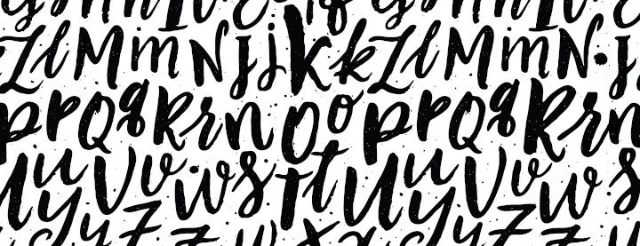
As you can see from the undifferentiated mass of letters above, one major goal of good typography is to organize type for the reader. How should she or he read the brochure, sign, or print book you have designed? It is through your type choices (everything from the typeface to the type point size, from leading to line length to tracking, kerning, and color—as well as your placement of the type on a grid you deem appropriate for the content of your project) that the reader’s eye can know where to go first, second, and third. It’s your responsibility to lead the viewer around the page.
Beyond this, which I would call typographic design, there is another area of tweaks, perhaps subtle ones, which can make reading word after word, page after page, a more pleasurable experience and therefore one leading to better understanding and greater content retention. After all, the reader is usually picturing in her or his mind’s eye the elements of the story your brochure, poster, or print book is telling. Anything that facilitates this is worth doing.
Some Examples
I’m currently reading Graphics for Visual Communication, which I found at a thrift store. It was written by Craig Denton. It’s about thirty years old, but the rules of design are as appropriate now as they were then. Here is a random sampling of rules noted in Denton’s book that will set your type above desktop publishing and into the realm of actual typesetting. Follow along below, and you’ll get some great tips from this print book.
(As an aside, when I started doing graphic design back in the early 1980s, a typesetter would set type on a typesetting machine based on my stated specifications, and I would lay out and paste up the galleys of type using the phototypesetting paper printouts she or he provided. These were two separate professions, actually. Typesetters were artists in their own right, massaging the individual letters to make the copy as readable as technically possible before handing it off to graphic designers for the final layout.)
Letterspacing and Readability
Each line of type is made up of a number of letters. How close they are to one another can either foster readability or impede it. When you are setting type, make sure the letters are neither too close to one another nor too far apart. If there’s too much letterspacing, the words no longer read as complete, individual items. (The reader looks for the shape of a recognizable word. She or he does not read every letter.) If the letters are too close together (with too little letterspacing), the words will all run together. The spaces between the words will disappear and the text will become illegible.
The function in your layout program that you would look for to control letterspacing (hopefully a design tool such as InDesign rather than a word processor) is often called “tracking.” It is different from “kerning,” which controls the space between pairs of letters, such as a capital “A” and a capital “V.” If you’re setting a headline, for instance, such letter pairs as “AV” will often be too far apart. Kerning allows you to tighten them up (much as you would tighten up a full line of type with a tracking command). When you do this, the reader will not get visually stuck at the “AV” letter pair. It will not bring the reader out of her or his imaginative experience of reading to focus on what looks wrong about the typography (just as seeing a typo might derail your train of thought).
Learning how to control both letterspacing and kerning will improve the overall look and the readability of your typeset copy. And as a side note, both of these are more problematic–or visible–in larger type than in smaller type (headlines compared to body text, for instance). I personally do not kern letter pairs in body copy. It would take too long, and it would be below the threshold of visibility for most readers. That said, I believe there are global controls in high-end design applications that will still allow you to automatically kern all problematic pairs of letters you choose. (At least this is what I did in the mid-1980s, before the advent of desktop publishing, when I was setting my own type on a Mergenthaler typesetting machine.)
Line Spacing and Leading
It used to be that typesetters would add extra “lead” (the metal) between lines of type in certain instances. This was before phototypesetting. At that time lines of type were typeset in molten metal (lead) and printed via letterpress rather than offset lithography. Adding lead or leading opened up the space between lines, and this made large blocks of type more legible.
Why? Because once the reader’s eye reaches the end of a line, it must return to the beginning of the next line, back on the left (usually) side of the page. Long lines of type can make it difficult for the eye to travel back to the left and immediately find the starting point of the next line. So adding a little space between lines (or extra leading) can make this task easier.
Type set without extra leading is “set solid.” If you choose 11 pt type and set it without extra leading, this would be noted as 11/11 type. At any line length, this is usually harder to read (although it gets progressively harder as the width, or measure, of the line increases). A more reader-friendly balance would be 11/13 type (11 pt type with two points of lead).
Widows and Orphans
If you have a design with multiple columns of type (actually even when you set print books with a single column extending from page to page), watch for widows and orphans. “A widow is a line less than one-third of the column width at the end of a paragraph or the first line of a paragraph left unattached at the bottom of a column,” according to Graphics for Visual Communication. “An orphan, a portion of a line at the top of a column, must be eliminated by rewriting copy or changing the line spacing or column depth,” according to Graphics for Visual Communication (p. 96).
The reason these are problematic is that they trip up the reader. They look like errors. So they become a distraction. Any short piece of text left at the bottom of a final paragraph (or the top of the initial paragraph) in a column is a distraction.
Type Alignment
I mentioned earlier that the goal of typesetting is to facilitate reading and make it a pleasurable experience. In all cases, the reader’s eye has to return to the beginning of a line once it has finished reading the prior line. Type alignment can either make this easier or harder.
Graphics for Visual Communication notes that the most readable options are flush left type and justified type (in that order). Flush left type has a consistent left-hand margin, but the right-hand margin varies based on the length of the lines, which change based on the length of the words (and any hyphenation of words). In all cases, the space between words is consistent.
In contrast, justified type is set flush with both the left-hand margin and the right-hand margin. What makes this work is the varied spacing between the words. Unfortunately, if the lines are very short, or if the hyphenation is not ideal, the space between some words can be dramatically larger than between other words, leading to “rivers of white,” trapped white areas that appear to run down the page of type.
So justified copy is not quite as legible or attractive as flush-left copy.
Even less readable are the two other alternatives: flush-right text and centered text. In the case of flush-right copy (with a consistent right-hand margin and a left-hand margin that varies depending on the length of the words, but with equal spacing between the words), the eye has to return to a different position to begin each line (on the left), even though each line ends at the same right-hand margin. Actually the same is true for centered copy, but the eye has not only a different right-hand margin but also a different left-hand margin for each line.
This can be a problem. That said, some designers will use flush-right copy, for instance, in a limited amount (perhaps for a few lines of a pull-quote or callout). And maybe that designer will increase the legibility by adding a few extra points of leading between the lines of copy.
All rules can be broken. It’s just prudent to compensate, to find ways to balance things that reduce legibility with things that improve legibility.
Breaking Up Headlines Into Complete Thoughts
Graphics for Visual Communication uses the following headline to make a point: “The Wisely Designed Display Head.”
If you can get the entire headline on one line, that’s great (perhaps over several columns in a newspaper). One complete thought, no breaks. If you can’t do this, what’s the next best option?
Graphics for Visual Communication draws a contrast between typesetting “The Wisely Designed” on one line and “Display Head” on the next (in the first option) and, in the second option, “The Wisely” typeset on the first line, followed by “Designed Display” on the second line and “Head” on the third line.
The first treatment breaks the words of the headline into logically related groups of thoughts. Simplicity in thought makes for easier reading. The second option, according to Graphics for Visual Communication, may better fit the available space, but the words grouped together are not as intuitively and logically related as they are in the first option. And this will slow down the reader.
The Takeaway
All of this may seem like minutiae. And it is. But good typography does not call attention to itself. Rather it makes reading easier and more enjoyable. In typesetting, the details make all the difference.