Photo purchased from … www.depositphotos.com
In addition to providing content (the thoughts that words convey), typefaces provide a sense of character, tone, and value to the process of understanding these words. They tell you, often subconsciously, exactly how to feel about the words you’re reading.
Here’s a simple example. If you were to design a cover for Tolstoy’s print book War and Peace, for instance, and you only had type to work with (no images), you might typeset “War” in an aggressive, sans-serif font, and you might set “Peace” in a floral, perhaps serif, font. (I realize this is somewhat cliché, but I think it makes my point.)
To expand upon this a bit, the typefaces “tell” you how to feel about the subject matter. Not just pro or con, like or dislike, but in a more nuanced way in terms of character and feel. For me, the adjectives that come to mind when I think of war are “loud,” “violent,” and “chaotic”: hence the bold or even extra-bold, sans-serif typeface with abrupt, hard edges. I think of peace as “quiet,” “artistic,” and “uplifting.” These adjectives I associate with the curves and varied weights of a serif typeface.
Granted, the key word here is “I,” and if you’re designing something for an audience, it helps to also predict the emotions, values, and characteristics the reader might associate with a particular typeface. In my own design work, I always like to show my client a few design options using different fonts. And to come up with these design options, I often review samples of what other designers have created to see how they have associated typefaces with a mood, tone, or value.
It absolutely always helps to become a lifetime student of design, noticing everything from billboard designs to brochure designs. In fact, immersing oneself in design samples seems to rub off on one’s own design work. Ideas and approaches seem to come to mind more readily after repeated exposure to visual media.
Examples: The Type at the Top of This Article
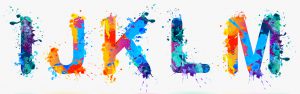
The “IJKLM” type at the top of this article was rendered in splashes of brilliant color in a simple sans-serif typeface with rounded ends on all letterforms (no angles, just symmetrical, rounded forms). The drips and bubbles of what appears to be thrown commercial printing ink (a little like Jackson Pollock’s action painting) provide a sense of movement, while the intensity of the colors evokes a feeling of joy, energy, and fun (in me, at least). This is no accident. The artist chose the letters, the typeface, and the colors intentionally to convey a certain tone. In my view, she or he was successful.
Examples: A Dishcloth from a Thrift Store
My fiancee and I are both visual artists. She is a sculptor. I am a painter. I also draw. In addition to bringing these skills into our art therapy work with the autistic, we like collecting art, sometimes in the strangest of places: the thrift store.
This week my fiancee brought home a used dishcloth (still in very good shape). I’m sure it only cost a couple of dollars, but it had been printed (in black commercial printing ink only on white fabric) in an interesting typeface. There were just a few sentences. However, the typeface (which may have been hand drawn) spoke volumes to both my fiancee and me. (Keep in mind that she, in particular, appreciates lettering on everything from curtains to t-shirts to mugs to dishcloths.)
The dishcloth was designed by Primitives by Kathy, LOL, Made You Smile. It included the following lines of type:
“I WILL NOT YELL IN CLASS.” (in a hand-written, sans-serif typeface)
“I WILL NOT THROW THINGS.” (in a hand-written, sans-serif typeface)
“I WILL NOT TEASE OTHER KIDS.” (in a hand-written, sans-serif typeface)
“I am the Teacher.” (set in two lines in a floral, hand-lettered script with a hand-drawn flourish between the two lines and a hand-drawn quill pen under the word “Teacher”)
(Primitives by Kathy)
Here are some things I noted. (I realize you don’t actually see the type treatment, so I will describe it.) Keep in mind that the final two lines, “I am the Teacher,” are almost triple the size of the all-capital-letter treatment of the first three lines.
The first three lines remind me of the sentences children (in the 1960s and probably before) had to write on the blackboard when they had been naughty. In this case the designer made the word “Yell” larger than the rest (this makes sense; yelling is louder than normal speech, and making it larger reflects this tone).
The second line includes what looks like little stones coming from the word “throw.” They arch over the word “things” and travel upwards through and beyond the first line of type. (There are little streaks indicating movement.) This makes sense. It looks like the word “throw” is throwing little rocks.
The third line includes a hand-drawn extension of the letter “E” that extends into the letter “O” of “Other Kids.” It looks a bit like a child’s hand tickling the ear of another kid from behind. The “O” of “Other” has four or five little stress lines radiating outward from the letter that make the “O” look irritated or aggravated.
Finally “I am the Teacher” is large, graceful, and floral. Still, it appears that the teacher in this case was naughty (after all, she or he is writing all of this) and had to stay after school to write these “lessons” repeatedly on the blackboard in chalk.
There’s no other art, just black type on a white background, but it still gives you the feel of a list of sentences on a chalkboard. Moreover, you even get a sense of both the childlike/childish demeanor of the teacher and her/his somewhat inflated self-image.
All of this is done almost entirely with type choices (and contrast of type size, use of all capital letters in the first three lines, and the casual and even personal nature of what appears to be hand lettering).
Example: Roy Lichtenstein’s “POP”
This is an example of Pop Art, created in the 1960s by artist Roy Lichtenstein. You can find it using Google Images. It is the word “POP!” The important characteristics are that it was painted in all caps with an exclamation point over a stylized explosion painted in various bright colors, with every pictorial element outlined in black.
It looks exactly like a snippet from a 1960s comic book. Of course this is intentional because Lichtenstein is commenting on popular iconography (perhaps even parodying it). Lichtenstein’s paintings, many of which include stylized comic book images of people with pithy comments in “word bubbles,” gently poke fun at the commoditization and commercialization of American society. To put him in context, one of Lichtenstein’s contemporaries was Andy Warhol.
The “POP!” portion of the painting is rendered in all capital letters in a fat, simple sans-serif typeface. It has a drop shadow to make it feel even more dynamic. In fact the typeface, colors, simplicity, and outlining of everything would also make it a good example of onomatopoeia. Onomatopoeia, which you may remember from grade school, is a word that sounds like what it means. (This is quite a bit like the subject of this blog article, how to make type look like what it means.)
In the case of Lichtenstein’s painting, which is huge (and which therefore causes the viewer to look at a cartoon strip out of context and with a fresh eye), the typeface, colors, and meaning are all congruent. All the elements of the design point toward the same meaning.
If you watch 1960s Batman television shows, the same kind of icon is used whenever the Dynamic Duo fight the bad guys. Their punches are interspersed with Lichtenstein-like bursts with words such as “Boof,” “Bam,” and “KaPow,” which would also be considered onomatopoetic.
The Takeaway
It’s a little like the “Form Follows Function” imperative of 19th and 20th century architecture (as referenced in Wikipedia) and is attributed to Louis Sullivan, an architect (also according to Wikipedia). Even though we’re jumping from dishcloths to Pop Art to architecture, we’re talking about the same thing: the benefit of congruence between the meaning or message of words or an image and the way it is presented.
It’s a bit like an army marching across a bridge. All soldiers break stride at the bridge because if they were in step, they would generate such resonance in their perfect synchronization of marching steps (called mechanical resonance, according to “Why Do Soldiers Break Stride On A Bridge?” Elizabeth Howell, May 22, 2013) that the frequency of vibration would cause the bridge to collapse. In graphic design, when you pair the tone and meaning of the words and ideas (the content) with type, color, and layout that reinforce this meaning, you create an unstoppable force.
This entry was posted
on Wednesday, October 13th, 2021 at 7:11 pm and is filed under Typography.
You can follow any responses to this entry through the RSS 2.0 feed.
Both comments and pings are currently closed.