Photo purchased from … www.depositphotos.com
Whether you’re designing a print book (everything from the cover to the table of contents and the interior text pages), or you’re designing a poster, a brochure, or even a web page, your first goal is to make the design inviting and readable. If you can’t capture the reader’s attention, you can’t engage the reader. You can’t tell a story, teach the reader something, or persuade the reader to buy your product or service. If you don’t do this, all of the information on the page is meaningless.
But how do you organize text and images on a page to make the print book, poster, or brochure both enticing and readable?
Grouping Similar Information
Group things together that are related, and make things that are different look different. Also, give the reader a hierarchy of importance in the design. (What’s the most important element, then the next most important element, etc.?)
In this light, I remember reading a book by Gabriel Garcia Marquez that was particularly frustrating because it had no punctuation and no paragraph indentations (as a method of illustrating the stream of consciousness of the main character). Had the print book not been required reading for my college class, I would have missed a captivating story.
So, a device as simple as a paragraph indent will indicate to the reader the transition from one idea to the next. What would otherwise be a sea of gray type becomes a series of groups of ideas.
A good designer can use type style and size; width of margins; and contrast between the headings, subheads, and text copy (including type size and contrasting fonts) to group some information together and set this apart from other information.
But what other methods of organizing book content does the designer have at hand? One of these is the distinction between the cover and the main text pages, and between both of these and the front matter and back matter of the print book (i.e., the table of contents, copyright page, and title page in the front of the book, and the index and afterword in the back). The best way to learn to craft this global organization of a book is to observe, copy good design, and then create your own design work.
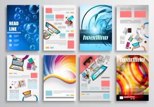
A Few Points on Magazine Design
In contrast, on a magazine page spread, the graphic artist has a few more design elements to consider than a print book designer. (Of course, this depends on the complexity of both the print book and the magazine.) These may include photos, captions, color screens and solids, and pull quotes. All distinctions (i.e., contrast) between one design element and the next will work together to serve up little chunks of information in a manner that aids in the reader’s comprehension.
It is up to you as the designer to determine this order of reading and to use your page design skills to facilitate it. The building blocks of page design include contrast in type size, contrast between type styles, size and color contrast within and between photos, and the use of white space on the page spread.
With magazine design, as with print book design, you use these to group certain visual elements and indicate their relative importance. There are a plethora of tips and tricks to create this “road map” for the reader. but in just a few words, your primary goal is to direct the reader’s eye around the page.
A good way to learn how to do this by studying design grids (the structure of a page: how things are placed within a predetermined “scaffolding,” also referred to as “page geometry”) of the books, posters, and brochures you find striking. Observe. Notice what you like. Then deconstruct it and articulate why you like it and what design rules the graphic artist has used to give order, structure, and unity to the layout.
Eye Movement (Some Samples for Illustration)
One of the key methods for leading the reader’s eye around a print book page, a magazine page, a poster, or a brochure is to note the visual direction implied in photos or other visual elements (even the style and placement of type).
For instance, my favorite design book (Design Basics Index by Jim Krause), to which I often refer in the PIE Blog articles, includes four sample business cards for a surf shop. Each sample includes the client’s contact information and a blue ocean wave. Nothing else. The four samples are very similar. But here are the differences:
-
- In the first option, the wave is breaking to the left (toward the edge of the card), but all contact information text is stacked and on the far right of the card. Because the wave is breaking off the left side, it leads the reader’s eye off the left side of the business card. It does not lead the reader’s eye to the name, address, phone number, and other contact information. It may look pretty, but the design and the intended eye movement are at odds. (Krause says as much in the text of his print book, but I would add one other observation. In this culture we read from left to right. So if the wave leads the reader in the opposite direction, this goes against her/his expectations and hinders the reading process.)
-
- Option #2 has all contact information stacked on the left of the card (set flush left). On the right the wave crests and is about to “break” off the edge of the business card. The reader’s eye goes to the cresting wave first, but then it has to “back up” (go back to the left side of the card) to get to the contact information. If you only have a second to make an impression, this card may only give the hasty reader an image of the cresting wave, and she/he may miss the contact information. The takeaway? Assume the reader will unconsciously read from left to right. Make sure your placement of design elements both reflects and encourages this eye movement.
- (Actually both option #3 and #4) Krause’s third and fourth design samples are very similar. The only difference is in the way the wave is drawn. In both cases the wave crests and is about to fall to the right, onto the contact information. On the third sample card, the wave beyond the curling crest exits the page exactly horizontally. But on the fourth sample business card, the curve under the crest of the wave cradles (or contains) the lines of contact information (because it curves upward slightly on the right as it bleeds off the edge of the business card). This particular design, unlike the other three, includes a cresting wave falling onto the most important part of the card (the text), but it also holds the reader’s eye in place with a simple rising of the water to the right of the wave.
The Takeaway
Learning design can be a lifetime pursuit. I personally learned my design skills not in school but on the job. But what has helped me the most has been looking closely at the design work of the masters and asking myself the following: What was the overall goal? And how did the designer achieve the goal using the elements and principles of design?
The elements of design might include type style, size, and weight; page geometry, or the design grid; color; and imagery such as drawings and photos. And the principles of design might include repetition, contrast, unity, and the like.
So the short answer is: Observe, deconstruct, understand, create.
This entry was posted
on Saturday, February 6th, 2021 at 11:52 pm and is filed under Design.
You can follow any responses to this entry through the RSS 2.0 feed.
Both comments and pings are currently closed.