Photo purchased from … www.depositphotos.com
If you’ve ever seen the high-contrast drawing of one vase or two faces (called the “Rubin Vase,” if you Google it online), you understand that contrast makes “things” stand out: like the proverbial “can’t see the forest for the trees” quote suggests. One’s perception of the Rubin vase switches back and forth between two black facial silhouettes and one white vase (called a “bi-stable image”) only because of the contrast between the stark white and black achromatic “colors.”
My fiancee and I were discussing this concept with our autistic art therapy class recently, and I thought about how contrast as an important element of design in the fine arts was equally relevant to graphic design for commercial printing. After all, if you research the famous masters in art history print books, you will notice that many of them were also graphic designers.
Contrasting Images
With this thought in mind I did some research in the Design Basics Index, my go-to textbook on publication design. Jim Krause’s print book notes one of the cardinal rules of design, “Styles between images should be either identical, or noticeably different” (p. 200, Design Basics Index).
This echoes one of the maxims of the first boss I had from whom I learned graphic design, “Whatever you do (regarding contrast), make it big.”
In Design Basics Index, Jim Krause says the same thing. Krause includes three versions of an advertisement to illustrate “contrast in style, agreement in theme” (p. 200, Design Basics Index). All three versions are of a symmetrically designed ad (its balance achieved with all elements centered vertically), with a large photo of the arch above a (presumably) cathedral doorway, in color, containing a half-circle stained glass window with radiating sections (like a cross section of an orange). In its presentation, the image looks “painterly,” as though it had been rendered with a brush or even with colored pencils.
Below this image in all three versions of the ad is the tag line in what looks like actual handwriting (it might be a faux handwriting font). This approach resonates with the artistic treatment of the 4-color image above. Below this is a small, vertical photo of another part of the building, then three lines of type (two in a brown hue and one in a more yellow ochre tone).
Finally, in a grey tone, at a larger point size, is the logotype for the historical society the advertisement promotes. Behind all of the type, and abutting the 4-color image of the arched window above the cathedral door is a cream-colored background screen to tie everything together. The screen unifies the design along with the earth tones in the photo, the “antique” look of the handwritten headline treatment, and the browns and yellows of the type in the bottom half of the ad.
So here’s the difference (from one ad to another) and the lesson Jim Krause is teaching with the three versions of the advertisement. The smaller image alone changes from ad to ad. In the first ad, the small image (which appears to be an architectural support on a Gothic cathedral) is a warm-toned (sepia, perhaps) image, which contrasts with the more painterly treatment of the large image of the cornice and stained glass window.
In the second rendition of this ad, the same small image is treated as a high-contrast photo overlaying a ghosted and much larger version of the same image in the background.
In the third version of the ad both the larger image of the stained glass window above the door and the small image of the curvilinear support structure are rendered in the same 4-color, painterly style.
What Jim Krause teaches us with these examples is the following:
-
- Treating both photos the same (both in a 4-color, artistically distressed manner) makes the two photos compete for the viewer’s attention. They are too similar, even if one is much smaller than the other.
-
- The high-contrast-positive image of the support structure (and the screened back, much larger version of the same image in the background) hang together and provide ample contrast with the large, 4-color, stained glass window photo at the top of the ad.
-
- The thematic associations (hand-written headline, earth tones for the type, light cream background screen to tie everything together) all visually unify the ad.
-
- But the treatment of only the larger photo in a saturated, 4-color, painterly manner gives this image prominence because of its contrast with the remaining type and monochromatic imagery.
-
- Or, as my old boss said, “Whatever you do (in this case, contrasting the treatment of images on the page), make it big.” (Another way to say this is that minor contrasts between images look like an accident, whereas major contrasts create drama.)
- I would even go one step further on this theme: The huge difference in size between the large image of the arch with the stained glass and the support structure of the (presumably) Gothic cathedral creates drama in and of itself. Difference in size also creates contrast and interest in a design (in both the commercial arts and fine arts).
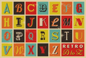
The Same Is True for Type
As I was learning graphic design (on the job, over many years), I always read that you should limit the number of font changes within a design to two or three typefaces at most. In fact, I learned that it wasn’t even a bad idea to design something with only the various weights (bold, italic, etc.) of a single typeface.
I also learned that, when choosing a typeface for headlines and a different typeface for body copy, I should make the contrast obvious. Choosing two similar sans serif typefaces was not a good idea, and choosing two similar, but not quite the same, serif typefaces was not advisable. If a headline type and a body copy typeface looked almost the same, that would give the impression that the choice was an error, an oversight. Making the contrast between the headline type and body copy type a “big,” or dramatic, one would create more energy in the design of the ad, publication, poster, etc.
Interestingly enough, the ad I deconstructed above, from Jim Krause’s Design Basics Index, actually illustrates this point with its choice of typefaces.
As noted above, the headline of the ad (all three versions) is either handwriting or a handwriting font. All of the remaining type (two font choices, as my old boss taught me) is in a tall, narrow, and perhaps severe Moden typeface (that is, with dramatic shifts between the thick and thin strokes in the letterforms). I can think of no typeface that would contrast as dramatically with the handwriting font (or handwriting) as a stark Modern font. In addition, the handwriting is also more horizontal and less tightly tracked (the space adjustment between successive letters) than the more vertical treatment of the narrow (perhaps even condensed) lines of copy and the logotype at the bottom of the ad.
Again, a big difference in letterforms (from one section to another) creates contrast and drama.
What Can We Learn from This Deconstruction and Analysis of an Advertisement?
-
- The first thing is to learn to observe. Look closely at every ad that appeals to you, every print book design, every magazine that takes your fancy. Then consider what design elements the graphic artist has used to create visual interest, a sense of unity, and even contrast in order to evoke a dramatic mood.
-
- Realize that contrast comes in many flavors: contrast in size, contrast in typeface design, color contrast, contrast in artistic treatment, and so forth.
- When you’re designing something, make sure that all of your design decisions support the thematic whole. That is, make sure every choice of type, photo treatment, color, and placement of design elements is congruent with the intended message—what you’re saying and even the mood you’re trying to evoke. Making something look good for its own sake is not enough. To quote a famous architect, “Form follows function” (Louis Sullivan).
This entry was posted
on Monday, December 14th, 2020 at 2:52 am and is filed under Design.
You can follow any responses to this entry through the RSS 2.0 feed.
Both comments and pings are currently closed.