Printing Companies
  1. About Printing Industry
  2. Printing Services
  3. Print Buyers
  4. Printing Resources
  5. Classified Ads
  6. Printing Glossary
  7. Printing Newsletters
  8. Contact Print Industry
Who We Are

Printing Industry Exchange (printindustry.com) is pleased to have Steven Waxman writing and managing the Printing Industry Blog. As a printing consultant, Steven teaches corporations how to save money buying printing, brokers printing services, and teaches prepress techniques. Steven has been in the printing industry for thirty-three years working as a writer, editor, print buyer, photographer, graphic designer, art director, and production manager.

Need a Printing Quote from multiple printers? click here.

Are you a Printing Company interested in joining our service? click here.

The Printing Industry Exchange (PIE) staff are experienced individuals within the printing industry that are dedicated to helping and maintaining a high standard of ethics in this business. We are a privately owned company with principals in the business having a combined total of 103 years experience in the printing industry.

PIE's staff is here to help the print buyer find competitive pricing and the right printer to do their job, and also to help the printing companies increase their revenues by providing numerous leads they can quote on and potentially get new business.

This is a free service to the print buyer. All you do is find the appropriate bid request form, fill it out, and it is emailed out to the printing companies who do that type of printing work. The printers best qualified to do your job, will email you pricing and if you decide to print your job through one of these print vendors, you contact them directly.

We have kept the PIE system simple -- we get a monthly fee from the commercial printers who belong to our service. Once the bid request is submitted, all interactions are between the print buyers and the printers.

We are here to help, you can contact us by email at info@printindustry.com.

Blog Articles for PrintIndustry.com

Archive for November, 2023

Custom Printing: Printing on Metal, Wood, and Glass

Monday, November 20th, 2023

Photo purchased from … www.depositphotos.com

The Printing Industry Exchange Blog is #12 of the best 40 digital printing blogs, as selected by FEEDSPOT.

How did they do that?

At our favorite thrift store my fiancee and I found a print of a beach scene printed on wood. The yellowish cast of the wood created an overall tone and feel of sand, and the swirls in the wood grain made it look like the wind had created dunes. The beach umbrella and empty chair (presumably the owner was in the surf) added to the overall ambiance. Don’t you wish you were there? I did.

Since I am a commercial printing nerd, my mind clicked on a few spaces, wondering how the artwork had been printed. I also thought about the options for printing on metal and glass, and even printing on irregular items like drinking glasses.

Printing on Wood

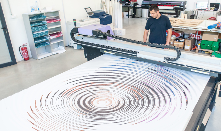
So I went to school on the subject. Apparently you can run a door, or any other large, flat piece of wood, through a flatbed inkjet printer. Such a printer differs from your inkjet printer at home in that it is huge, and it will accept “rigid media.” This is also different from the roll-fed inkjet printers used to produce full-size vinyl banners or component parts for even larger banners that are then sewn together.

UV flatbed inkjet printers are ideal for printing on wood, since UV radiation (i.e., light) cures the ink instantly on the surface of the wood.

I have also seen other wood items that have been printed and then coated with layers of flood varnish (or some other durable coating). This would be a step ahead of decoupage (laying a printed image on a box or table and then coating it with multiple layers of varnish to make the image essentially a part of the substrate). I would think printed surfboards were produced this way before the advent of digital commercial printing.

Such “print-on-wood” technology is also useful for imaging floorboards digitally. The things to keep in mind are the kind of ink you’ll be using, whether it will adhere firmly to the substrate, and how durable it will be, depending on its intended use. (For instance, printed floorboards need to be more abrasion resistant than wall panels.)

Printing on vinyl and then adhering the image to wood is a second option. And a third option would be custom screen printing, another ideal choice given the thickness of the ink.

Clearly this opens up possibilities not only for surfboards but also for all manner of interior design items.

Printing on Glass

Glass an interesting substrate. You can actually tint glass used in the exterior walls of buildings in such a manner that you can control the interior temperature to a good extent, depending on how the coloration affects the absorption or reflection of heat from the sun. Intelligent use of this capability can reduce air conditioning costs dramatically.

According to my research there are currently two main ways to image glass: custom screen printing and custom printing with ceramic glass inks. The former will not be as durable, since the screen printing inks will sit up on the surface of the glass completely. There will be no absorption into the substrate that might allow for a good bond.

On the other hand, ceramic glass printing actually makes the pigment a part of the glass, significantly increasing its durability. In this case the pigment (heat resistant enamel) is applied to the surface of the glass prior to its being tempered. The heat-based tempering process then fuses the pigment to the glass and strengthens the glass against breakage at the same time.

Granted, these options address issues of interior design and architecture, whereas it is also possible to print on drinking glasses, presumably also with these two kinds of ink. The custom screen printing ink (or digital UV ink) sits up on the surface of the glass, whereas the enamel ceramic ink would be fused to the glass.

In terms of logistics, the option of screen printing, for instance, would involve the glass’ being rolled around its center axis while the flat screen-printing apparatus above the glass allows the ink to pass through the open areas of the stencil and onto the glass.

The UV digital imaging option would involve digitally printing onto the glass, again with an ink cured by UV light, but this would also not be as durable as pigments that can tolerate the high heat of a kiln (ceramic glass inks), which would provide more durability. Presumably you can also decorate drinking glasses with printed appliques.

Understandably enough, since glass is an extremely flat, non-porous substrate, getting the ink to adhere is a challenge. In my research I learned about such products as Pyrosil and Pyrotrack, which promote adhesion. (Essentially, these adhere to the glass to strengthen the bond between the glass and the printing ink.)

Printing on Metal

I’ve seen a lot of photos printed on metal at street fairs and craft fairs. The background substrate gives a sheen to the entire print. But how do you do it? How do you print on metal?

Metal is like glass in that the substrate is exceptionally flat and also non-porous, so adhesion of the ink to the substrate is challenging.

In the past, custom screen printing and then digital inkjet printing would have been the methods of choice. In my research I learned that for the most part, digital printing is used to print photos on aluminum for display. Presumably this would be adequate, since the photo print would be hung on a wall (in contrast to something printed on floorboards or a flat metal floor). Also, presumably, using UV-cured inkjet inks would improve the durability of the inks and their ability to adhere to a non-porous surface.

That said, the new way to print on metal is via dye sublimation, which has a number of benefits.

First of all, as with dye-sub printing on polyester fabric, dye-sub printing on metal is usually done by inkjetting special sublimation inks onto a transfer sheet. This is placed against the metal substrate, and a heat press turns the solid inks directly into gas (i.e., sublimation means changing the physical state of the ink from solid directly to gas without the interim liquid state). The high heat fuses the image to the metal (as it also does with ceramic mugs and other rigid substrates–i.e., items other than fabric).

The good news is that once the image has been sublimated, it is resistant to the elements (heat and cold) as well as rub resistant and chemical resistant. The images are also resistant to UV light (i.e., exposure to sunlight), and they won’t bubble, or flake or peel off the substrate—essentially because the heat of the sublimation process has made the image part of the metal.

The one thing to keep in mind is that dye-sub printing needs a polyester base, so the metal must be coated with polyester (just like the garments used in dye-sublimation fabric printing).

The Takeaway

If you design promotional items, such as branded drinking glasses, or even glass, wood, or metal materials used for architectural structures, it would be prudent to learn about all the options you have for imaging onto these substrates.

From my research it seems that the main issues will be the adhesion of the ink to the substrate and its subsequent durability. But it also seems that you have multiple options, ranging from custom screen printing to digital printing (both inkjet and dye sublimation). Any process that fuses the image to the substrate will last a lot longer than a process that only deposits ink on the surface of the material. That said, it seems that UV digital printing is still a good (but somewhat less durable) option. In this case you at least have the ability to cure the ink instantly, which will allow it to sit up on the surface of (and adhere to) a non-porous surface like glass.

In all cases, however, it’s smart to look for skilled professionals well versed in custom printing on the substrate of choice, whether glass, wood, or metal, and to ask questions about such things as chemical resistance, peeling, flaking, and rub resistance. Make sure you vet the printer to ensure that the printed product looks as good in a few years as it did when it was delivered.

Book Printing: Designing for Print vs. the Screen

Tuesday, November 14th, 2023

Photo purchased from … www.depositphotos.com

The Printing Industry Exchange Blog is #12 of the best 40 digital printing blogs, as selected by FEEDSPOT.

A colleague of mine edits and designs print books for the World Bank, NATO, and several other government agencies. This week she mentioned her frustration in designing a physical book that will be repurposed as a book for online reading in Nairobi, at least on a computer and possibly on a handheld device as well.

Clearly there are a number of differences in design (both technical and aesthetic) that need to be addressed for this to provide an optimal reading experience. In my colleague’s case, for instance, a physical book designed to be read in two-page spreads will be much larger in format (and the design will be more complex, including charts and graphs as well as photos) than an ebook or a document to be read on a tablet or smartphone.

In addition, readers in Nairobi might not be able to access especially large files (in terms of storage space and/or required computer memory) for the online version of the print book my colleague is designing.

Specific Design Differences

Right off the top of my head here are some things to consider.

There will be differences in computer programs (and devices) used, differences in page formats and image resolution, differences in reader eye movements around the physical book page vs. web page vs. ebook page, and differences in reading backlit computer screens vs. reading text illuminated by reflected ambient light (for physical books).

And yet on the positive side, there will be the opportunity on digital reading devices to incorporate video and audio (as an alternative to the missing tactile qualities only available in physical books).

For instance, one designs a print book in double-page spreads. The reader’s eye can travel across and around a larger space than in an ebook or on a web page (both of which are usually designed for optimal reading on either a small vertical screen or a larger horizontal screen but, unlike print books, usually not as a two-page spread).

Therefore, if the goal is to move the reader’s eye through a double-page spread and on to successive, similarly designed pages, this becomes much harder with an ebook or web page (especially when you take into consideration needing to navigate the links to other pages inherent in a computer-based publication).

The bottom line is that the design and pacing will always be different when you compare a print book to an ebook or web page.

Book design becomes even more challenging when you design one publication for use as both a physical book and an ebook. For instance, the books my colleague produces for NATO and The World Bank often must be viewable online as well as in print.

In this case, my colleague might have two choices. She could save the finished print book as a PDF file, which would be readable on a desktop or laptop computer, computer tablet, cell phone, or ebook reader. Unfortunately, although the design would be faithful to the original (printed on paper), in most cases the reader would need to scroll around the two-page-spread design (even if the book pages were saved independently). And since the reader’s view on many of the devices (in other parts of the world) would be much, much smaller than the 8.5″ x 11″ (give or take) format in which the physical book had been originally designed, the overall effect of the design would be compromised on an electronic reader.

Of course, the alternative would be for my colleague to create a completely different design for the ebook. However, in many cases given the number of ebook formats and the plethora of e-reader devices, there would be a likelihood of formatting problems occurring (for instance, problems in anchoring drop capital letters to paragraphs, or problems with anchoring photos or charts to a particular page or paragraph, or even general problems with type formatting not appearing as planned).

Beyond this, the nature of an e-reader is to allow the user to change the font, point size, and other text attributes. What this means is that the designer’s vision of a particular publication, which had originally been fixed and immutable in a physical book, may be very fluid on a computer or e-reader (and beyond the control of the book designer), and this will make it a very different design challenge.

In addition, photos for print books need to be saved at a much higher resolution (300 dpi rather than the 72 dpi that is adequate for the web or ebooks). Anything of a higher resolution used on a computer (web page or e-reader) will slow down the computer’s displaying the page. But in a physical book, anything of a lower resolution than 300 dpi will look fuzzy or will have pixellation.

In addition, designing for the internet or an ebook cannot take advantage of any tactile characteristics inherent in a physical book, such as the smoothness of a soft-touch matte film laminate or a foil stamp, or the roughness of an uncoated book paper. On a computer, these are irrelevant to the reading experience, whereas when reading a print book, the feel of the paper is an important component of the overall experience.

Finally, a publication designed for reading on the internet or an e-reader depends on a backlit screen, whereas a print book only depends on reflected, ambient light for reading. Reading text on a backlit screen tires the eyes. Granted, many of the e-readers with less contrast between the text and the gray background will minimize this eye fatigue, but overall the reading of electronic matter is more tiring to the eyes than the reading of printed matter.

Therefore, many if not most people don’t actually read web pages and e-books. They scan them, taking less time to absorb individual words and/or just plain skipping words. So the medium actually changes the reading process as well as the reader’s approach to absorbing the design and navigating an e-book page, web page, online brochure, etc.

In this light I have seen online periodicals (over the years) that have sought to replicate the page-turning approach to reading a print book or magazine. You can see two pages side by side, and you can click on a specific location on a page to enlarge it. Moreover, since one of the features of an online publication is the ability to include links to video or audio, such online publications can set themselves apart from physical books in these new ways as well. (As with physical books, it’s prudent to play to the strengths of the medium when designing computer-based publications as well.)

I’ve also seen combined designs incorporating both printed text and computer imagery. One in particular comes to mind that had a physical book attached to the left side of a two-panel folder and a small, flat computer screen attached to the right panel. I believe it contained a sales message for a high-end graphic novel for adults. By incorporating both the benefits of print and the benefits of electronic reading devices (such as sound and video), this promotional device made for a completely immersive experience. The only thing that would have improved the experience would have been a link to a virtual reality program, which I assume would have been included in future iterations of the device (it was a number of years ago).

Presumably the future of the ebook (or web page) and the print book will be for both electronic media and print media to continue to coexist, with each requiring different approaches to design and navigation, and with each offering specific benefits the other lacks (sound and movement for the computer-based publication and physical qualities like paper texture for physical books).

The Takeaway

So what can you do with this information as graphic designers, presumably designing for both print publications and electronic reading devices?

  1. If at all possible, design a different publication for each medium. Don’t expect a print product posted online to be as readable as the original paper version.
  2. Simplify the design for online reading.
  3. Present small chunks of content online (use short paragraphs and bullet points, for instance).
  4. Find websites you like and deconstruct the design. Think about how the designer used colors and fonts. Think about how how the website leads the reader’s eye through one screen, through an entire (scrolled-down) page, and from one linked page to another. Do the same kind of analysis for an ebook product. Think about how you can present small chunks of information and imagery in such a way that the reader will know what is of major importance and what is of minor importance.
  5. Do the same for books, brochures, and other printed products.
  6. Now the hard one. Think of how you can visually relate a print product to a web page or to a digital version of a book. Think about the fonts, colors, imagery. What can you do to make the print design and the electronic design coherent, such that they will present a single brand image?
  7. Now discuss the technical ramifications of what you are doing with a savvy computer geek to determine the computer requirements and the potential pitfalls.
  8. Good luck. If you can do this well, you’ll be in consummately high demand as a designer.

Custom Printing: Photos Make You Believe What You See

Monday, November 6th, 2023

Photo purchased from … www.depositphotos.com

The Printing Industry Exchange Blog is #12 of the best 40 digital printing blogs, as selected by FEEDSPOT.

I’ll believe it when I see it. That’s the meme. (Personally I think the reverse is true as well. Once we believe something, we tend to see it everywhere.)

In this light I was intrigued by a print book my fiancee shared with me. It’s called The Commissar Vanishes (by David King), and it includes numerous versions of propaganda photos from Stalinist Russia.

Paging through this book also dovetailed with the art therapy project we had just done with out autistic students, a paper collage including images of food from the art magazines we collect as well as the students’ own drawings on the cardboard backgrounds.

Even the concept of “paste-up” (making a composite with photos, rule lines, and waxed strips of computer-typeset text and then photographing the results to make a negative and from this a custom printing plate–which is how prepress used to be done before the advent of computer desktop publishing) is based on this same “photo compositing” principle.

And then there’s Photoshop and all of its implications.

You might ask how this swirling collection of art techniques and technologies, approaches to image editing, and computer programs pertain to one another. Here are some thoughts:

Images Pack an Emotional Punch

People relate emotionally (as well as cognitively) to images far more so than to words, especially when images mirror their desires, memories, and aspirations.

We Believe What We See

We have been trained to believe what we see if the image in question is a photo. That said, photos can be retouched or composited to make something that never really happened look like an actual event. In my fiancee’s print book, The Commissar Vanishes, many of the photos have before and after versions in which various leaders are (or are not) present and various collective mobs either are (or are not) reacting to their leaders. The retouched versions provide a very different version of history than the originals. Why is this relevant? Because people believe what they see.

Back in Stalinist Russia, (as noted in The Commissar Vanishes), the photo retouchers used tiny paintbrushes and India ink to doctor up the emulsion of the photo prints. Now photo retouchers use Photoshop. (In my 49 years in the field of publications management and commercial printing I have done both.)

Photo retouchers also composited images by cutting out part of one photo and gluing it into another photo (and then often rephotographing the result to create a single negative). Shortly after the invention of photography by Joseph Niepce, a Frenchman, in 1826, women and children in the Victorian era used to composite photos (like the collages my fiancee and I created with our art therapy students) as part of a collaging and scrapbooking hobby that was very popular at the time. Why? Because it preserved their memories.

How We Present the Images Makes a Difference

For the moment, as you peruse the images on the internet and in magazines, pay particular attention to such things as color, cropping, composition, size, and the simplicity or complexity of a photo.

How you present the content of a photo makes a difference. For instance, if you alter the color of certain things we expect to be a specific hue, that will affect the reader’s perception of the image as well as her or his emotional reaction to it. These colors we’ve come to expect are called “memory colors.” They include the blue of the sky and the green of the grass.

Think about images in cookbooks in which the color of the food is slightly “off” (or different from your expectations). The right color can make you salivate; the wrong color can turn your stomach.

Or think about the content of a photo and its cropping. In my fiancee’s print book, The Commissar Vanishes, removing an angry mob of dissenting rabble from a photo makes the leader’s words from the podium seem more persuasive and also makes it seem that everyone approves.

In contrast (and from a different place and time—China in 1989), the Tiananmen Square photo of a single man staring down a line of tanks displays supreme courage and commitment. It’s not only the subject matter; it’s also the composition of the photo (what is and is not in the photo, and how everything is arranged in the photo). Although this image is more likely to be “factual” than those in The Commissar Vanishes, it was still “selected” for the power of its composition and content.

Moreover, the photo tells a story. It has a purpose. It seeks to make a point on a political and humanitarian level based on this implied narrative. If the person in front of the tank had been presented as being farther away, or in a group rather than alone, this would have affected both the overall feel of the photo and also its message.

The same can be said for non-political photos used for advertising. After all, promotional images come in all varieties, some pertaining to politics, others pertaining to things (or services) we buy or sell. In all cases (political or consumer) the goal really is the same: to evoke a specific feeling and provoke a specific action. To make people feel either good or bad (in the simplest terms) about something. To make them want to do or buy something, or want to avoid something.

Images can give an entirely different impression if there are more or fewer people in the photo, if the photo is taken up close or from far away, or if there are (or are not) distracting elements in the photo unrelated to the subject matter. And now, fortunately, such image editing programs as Photoshop (or GIMP for Linux-based computers) make the collaging process (the photo compositing) much easier. So you can focus more on the goal and less on the technical process.

Moreover, it’s now much easier to make smooth transitions between photos put together in collages so they look more realistic. For my fiancee’s and my art therapy class, for instance, I found a sample image of the Jefferson Memorial with the dome replaced by the top layer of a cupcake and with a huge spoon in front of the memorial. An artist had made the transitions between the disparate elements of the photo so seamless that the content was totally believable. My fiancee and I used the image to illustrate both Pop Art and Surrealism for our class project, but this also shows the sophistication (and hence believability) of the output of today’s image editing software.

The Takeaway

The bottom line is that with skill and practice, you can create a new reality with Photoshop or GIMP rather than just reflect the “actual” reality with which you have been presented.

And the purpose of doing this is to persuade your audience to like something, want something, or do something. You use the images to tell a story, and then when you have touched both the intellect and the emotions (especially the emotions) of the audience, your reader or viewer (or in the fine arts even the attendees at your museum exhibit) will respond—hopefully as you intended.

You can see that all of this has serious and far-reaching moral implications.

I sometimes think there’s no stronger power on Earth than promotional communications (imagery and writing), to be able to make a product or service seem appealing, unique, and something one needs to buy this very instant if not sooner.

Archives

Recent Posts

Categories


Read and subscribe to our newsletter!


Printing Services include all print categories listed below & more!
4-color Catalogs
Affordable Brochures: Pricing
Affordable Flyers
Book Binding Types and Printing Services
Book Print Services
Booklet, Catalog, Window Envelopes
Brochures: Promotional, Marketing
Bumper Stickers
Business Cards
Business Stationery and Envelopes
Catalog Printers
Cheap Brochures
Color, B&W Catalogs
Color Brochure Printers
Color Postcards
Commercial Book Printers
Commercial Catalog Printing
Custom Decals
Custom Labels
Custom Posters Printers
Custom Stickers, Product Labels
Custom T-shirt Prices
Decals, Labels, Stickers: Vinyl, Clear
Digital, On-Demand Books Prices
Digital Poster, Large Format Prints
Discount Brochures, Flyers Vendors
Envelope Printers, Manufacturers
Label, Sticker, Decal Companies
Letterhead, Stationary, Stationery
Magazine Publication Quotes
Monthly Newsletter Pricing
Newsletter, Flyer Printers
Newspaper Printing, Tabloid Printers
Online Book Price Quotes
Paperback Book Printers
Postcard Printers
Post Card Mailing Service
Postcards, Rackcards
Postcard Printers & Mailing Services
Post Card Direct Mail Service
Poster, Large Format Projects
Posters (Maps, Events, Conferences)
Print Custom TShirts
Screen Print Cards, Shirts
Shortrun Book Printers
Tabloid, Newsprint, Newspapers
T-shirts: Custom Printed Shirts
Tshirt Screen Printers
Printing Industry Exchange, LLC, P.O. Box 394, Bluffton, SC 29910
©2019 Printing Industry Exchange, LLC - All rights reserved