Printing Industry Exchange (printindustry.com) is pleased to have Steven Waxman writing and managing the Printing Industry Blog. As a printing consultant, Steven teaches corporations how to save money buying printing, brokers printing services, and teaches prepress techniques. Steven has been in the printing industry for thirty-three years working as a writer, editor, print buyer, photographer, graphic designer, art director, and production manager.
|
Need a Printing Quote from multiple printers? click here.
Are you a Printing Company interested in joining our service? click here. |
The Printing Industry Exchange (PIE) staff are experienced individuals within the printing industry that are dedicated to helping and maintaining a high standard of ethics in this business. We are a privately owned company with principals in the business having a combined total of 103 years experience in the printing industry.
PIE's staff is here to help the print buyer find competitive pricing and the right printer to do their job, and also to help the printing companies increase their revenues by providing numerous leads they can quote on and potentially get new business.
This is a free service to the print buyer. All you do is find the appropriate bid request form, fill it out, and it is emailed out to the printing companies who do that type of printing work. The printers best qualified to do your job, will email you pricing and if you decide to print your job through one of these print vendors, you contact them directly.
We have kept the PIE system simple -- we get a monthly fee from the commercial printers who belong to our service. Once the bid request is submitted, all interactions are between the print buyers and the printers.
We are here to help, you can contact us by email at info@printindustry.com.
|
|
Archive for July, 2023
Sunday, July 30th, 2023
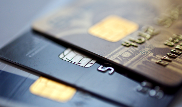
Photo purchased from … www.depositphotos.com
The Printing Industry Exchange Blog is #12 of the best 40 digital printing blogs, as selected by FEEDSPOT.
We live by credit. I’m surprised computer chips have not been embedded in our bodies yet. “Chaarrrrrrrgggge It!” That’s what Fred Flintstone’s wife used to say back in the early 1960s cartoons.
But how are credit cards printed or, rather, manufactured (since custom printing is only one element of these tools of commerce)?
First of all, credit cards fit into the category of commercial printing called “functional printing.” The other two categories I would identify are promotional printing (with the goal of convincing someone to buy something) and educational printing (with the goal of teaching readers something). As an aggregate, these categories would cover everything from a traffic sign to an annual report to a textbook.
Functional printing is printing that is part of a product (with the goal of improving its usability). This includes the traffic sign, the letters on your computer keyboard, the temperature markings on your stove and toaster oven, and the notations on your car dashboard. (Try using any of these products without these notations.)
Any lettering and decoration on credit cards fit into this category of functional commercial printing.
How Are Credit Cards Produced?
I went to school on this subject, and I found that most credit cards are produced at CPI Card Group near Denver, Colorado. All credit cards (and all pieces of plastic used to make them, as well as the data itself) are tracked by computer throughout the manufacturing process to ensure the protection of all credit information.
The cards CPI produces include credit cards, debit cards, gift cards, transit cards, and so forth. These range in complexity from simple cards to cards with EMV smart chips, from plastic cards to metal and even wood cards.
The first step in the process is aesthetic, making the “look” of the card visually consistent with the bank’s or retailer’s brand image. This design step may include simple graphics or even more complex imagery such as holograms.
Using magnetic ink printing or custom screen printing (with various colored inks and dyes made specifically to adhere to non-porous plastic substrates), the commercial printing vendor takes thick sheets of plastic (which have been composed of various chemical compounds heated to a liquid consistency, molded, and then flatted into sheets using rollers) and prints multiple cards at once. One sheet is used to print the front of all cards, and another sheet is used to print the back of these same cards. This allows the manufacturer to encase the magnetic strips and other electronics between the two sheets (and have room in the plastic to cut holes for inserting the EMV chips). Then the commercial printing vendor can laminate the cards.
The addition of the magnetic data strip (in some cases using hot stamping) must follow lamination, so the magnetic particles (metal oxides) in the ink and data strips will not be obscured.
Once everything has been printed and the electronic components have been inserted/assembled, heat is used to bake the two plastic sheet layers together.
As noted before, multiple cards are produced at once. One article I read noted upwards of 60 cards produced at the same time, laid out to be printed in multiple sections on the plastic custom printing sheets.
Once the cards have been printed and laminated and then cut down into individual cards, these can be personalized. This would include adding the cardholder’s identifying information (such as embossing the credit card numbers) and printing the expiration date and security code. Also, the computer chips that have been inserted into cutouts in the cards can be programmed to record individual credit transaction information.
All of this personal and credit information must be both accurate and secure. Moreover, the cards themselves (the plastic) and the printed decoration (branding), as well as the computer chips and magnetic strips, must all be both functional and durable (because the cards need to last a long time and tolerate abuse).
Even the plastic of the cards has to be appropriately mixed and of sufficient strength to not break or chip during use or storage. And the colored pigments used in the inks must be color faithful and durable. Finally, all of the digital information programmed into the magnetic strips and computer chips must be accurate, secure, and incorruptible.
Incorporating Special Qualities and Characteristics Into the Cards
Some of these cards can be treated (in terms of design and composition) to stand out and reflect a premium image. For instance, you can get cards that are made of metal or wood. Some can incorporate transparency or holographic imagery. One article even mentioned scratch-and-sniff cards that incorporate liquid in beads that can be scratched to release odors.
For regular cards, due to the ganging up of individual jobs, the cost can be as little as 10 cents per card, or, when adding electronic components or premium base materials such as metal cards, the unit costs can rise to $1.00 to $2.00 (“How a Credit Card Is Made,” written by credit.com). Some of these cards can even be read without being touched, just by waving them over a card reader.
What Does the Future Hold for Credit Cards?
According to “How a Credit Card Is Made,” your cell phone can already operate as a credit card by using capabilities of its SIM card. Cell phones operate with NFC technology (near field communications), and this technology can be used to transfer credit information for contactless payment. According to the article, the first step will be to transition credit card information to the cell phone, but after that, the information will be uploaded to the internet for credit payments.
But will this mean the end of physical credit cards? Apparently, the answer is no, because cell phone batteries run out of power, and cellphones lose their signal connections or just plain break from time to time. There needs to be a back-up plan, so the tried-and-true credit card will always be needed. Moreover, so much goes into making the credit card graphically appealing that people will always want a physical credit card.
The Takeaway: What Does This Mean to You?
Most of you probably do not design credit cards. I, for one, do not. However, it is eye opening to realize that the greater portion of commercial printing (or at least a huge portion of it) is for functional printing uses rather than educational or promotional printing uses.
Functional printing often (but not always) relies on screen printing technology. After all, you’re often not printing on a flat surface or even on paper.
But the common theme of all functional custom printing is that it has a utilitarian purpose: It tells you how to use the piece of equipment on which the words have been printed.
Beyond that, as product designers will tell you (such as OXO Good Grips’ product designers, who envision and then produce home-oriented tools, such as kitchen implements), appearance and feel are integral to the overall appeal of a product. Functionality (and the overall experience of using the item) is a major part of this, one inseparable from, and intertwined with, its visual and tactile appeal.
With this in mind, all of the aesthetic characteristics of today’s credit cards will keep people wanting them for a long, long time.
Posted in Credit Cards | Comments Off on Custom Printing: How Are Credit Cards Printed?
Monday, July 24th, 2023

Photo purchased from … www.depositphotos.com
The Printing Industry Exchange Blog is #12 of the best 40 digital printing blogs, as selected by FEEDSPOT.
In the recent weeks I have received in the mail or acquired in other ways three marketing initiatives that share a few things in common. They all involve packaging that is out of the ordinary. Most involve some form of cross-media promotion, involving the internet and commercial printing media. And one (which I bought at my fiancee’s and my favorite thrift store) involves actual branding, as in red-hot iron used to burn the company logo onto the wood box.
I would say that the three share in common the marketer’s desire to wow the customer and convert her or him to a lifetime, mutually advantageous relationship, and they use multiple media and/or multiple textures and substrates not only to convey information but also to take care of the customer like a king or queen.
Smalls Cat Food
My fiancee and I recently brought a new cat into our home, a Ragamuffin. He’s big (15.9 pounds), and we want to keep him healthy. So after some extended research, we chose Smalls.
The corrugated cardboard packaging that arrived at our door was clearly printed via flexography (two-color, a yellow and black), but the drawings of the cats were adorable. Clearly, someone at Smalls had a particular appreciation for the playfulness and joy of cats, having worked several drawings into the large Smalls logotype that wrapped around the carton.
All of the language printed on the interior of the box panels was personal, describing (in a friendly typeface with words such as “you” and “us”) just how to care for the food and what to do with the package insulation. (Put it in the sink and watch the water make the cornstarch insulation product disappear.)
A print book accompanied the package. “Hi, human” was the salutation on one page. Other pages included hand-drawn cartoons, and there was a smattering of sweet cat photos. Needless to say, there was also information as to why Smalls is so good for cats and how to transition a cat from their prior food to this food. There was also a discount card (in the same yellow with the same cat drawings), plus another handout letting you know how to treat, defrost, and store cat food of this caliber.
So it was a mix of information and sales literature, but it showed a believably sincere desire to make your experience (and your cat’s experience) with Smalls (the company) and Smalls (the food) a happy, and hopefully lifelong, one.
The piece de resistance was the bagged dry ice that the insulation surrounded, within flexo-printed plastic bags that explained how to safely handle (or rather avoid handling) the dry ice. Again, clearly, the goal was to be 200 percent thorough as well as personable. The company clearly wants your cat to appreciate Smalls food for years to come.
And finally, after we had received the boxed cat food, my fiancee and I started seeing regular TV commercials about the Smalls company. You could say that was a little spooky, given the perfect timing of seeing multiple Smalls commercials just after receiving the product, but as a student of commercial printing and marketing, I was just struck by how many coordinated avenues Smalls has addressed with its cross-media promotion. I was also not surprised to see, under the circumstances, QR codes on the promotional literature. These codes send the recipient to the Smalls website for further information, brand exposure, and communication in general.
And none of this felt like a sales pitch. In fact, all of it felt like a genuine attempt to be helpful. I personally hope Smalls makes a lot of money on this highly coordinated packaging, informational, and promotional work. They deserve it.
The Branded-Wood Fish Box
Ducktrap River Fish Farm, Inc., clearly takes branding seriously. Literally. I found their fish (food, not pets) transport box at my fiancee’s and my favorite thrift store, so I snapped it up, presumably for use in an art project. But then I started to notice its promotional approach, and my interest was piqued.
The words and logo image (a trout, I believe, although I could be wrong) are burned into the wood in the top left corner. The brand has texture (debossed letters) and a charred tone that extends past the letterforms and the fish. So it really looks a bit like the backside of a branded cow (as grisly—and intriguing—as that may sound).
Inside the box is a sheet of printed wax paper with a one-color rendering in green ink of the logotype and fish in a repeated pattern across the wax-paper substrate.
When I looked closely and saw all of this I felt like I was in the Wild West, where securing one’s food involved more than a trip to the grocery store. I liked the feel, the connotations, and the imaginative trip to the rivers beyond the city. Presumably, the packaged product is purchased at a grocery store rather than sent to clients (as is the Smalls cat food noted above), but it projects a similar tone of freshness.
I think anyone at any grocery or specialty store selling this product will be honored to buy this fish and keep the box. And that actually benefits Ducktrap River Fish Farm, Inc., since the customer’s retaining the box all but ensures repeat buying. Who wouldn’t go back for more after spotting the box and Ducktrap River Fish Farm, Inc., logo in one’s house repeatedly?
Since I bought the box at a thrift store, I can only imagine what kind of commercial printing promotions accompanied this box in its first use. I would not have been surprised to find out that the marketers had coordinated the fish packaging with promotional literature and an internet presence. After all, when all three of these are operating in lockstep, a marketing initiative can be unstoppable.
Home Security Superstore Mace
Life is scarier than it used to be, with all the rampant crime. So I decided it was prudent to buy mace or pepper spray. Being totally ignorant of all things in this vein, I did some research online and bought one spray can for my fiancee and one for myself.
The initial contact was through Amazon, but as soon as I had made the connection, I started getting information from the Home Security Superstore. I liked the name, since I wanted to be secure, safe, and protected. I was therefore not only relieved but also impressed that the marketing team had reached out immediately to let me know what I had purchased and when to expect its arrival. Over the next day or so, I received other online promotional and informational materials describing the mace product, its use and care, and what other items might increase my sense of security.
Of course this is what any promotional literature should do. But not all of it does. The Home Security Superstore succeeded. It did this splendidly. Since I needed the product and some explanation of what to expect and how to use it, I was especially pleased and made more confident by the online promotional contact.
When the mace arrived, I even wrote a review of the process (and the sense—through the online information–that the company was right there with me, providing any support I needed). And they sent me a gift, another can of mace. So between us, my fiancee and I now have three spray cans: two big ones and a baby one.
Sales (and promotional literature) are often perceived as intrusive and heavy handed. But when you want to buy something and you need help in making your choice, it doesn’t hurt to have the experience that the company is right there—not selling to you but helping you to buy what you need.
When this can be done in a personal way, that reflects consummate skill: a useful skill, a skill that makes my life better.
The Takeaway
When I want to buy something I need, I actually want a skilled salesperson with me. Sales is not a bad word when it involves assessing my needs and then helping me to buy the appropriate item. In all three of these cases I had that experience. It was reinforced by the custom printing collateral, the packaging, the overall branding, and the link to an online presence.
Posted in Packaging | Comments Off on Custom Printing: The Unboxing Experience and Cross-Media Promotions
Sunday, July 16th, 2023
Photo purchased from … www.depositphotos.com
The Printing Industry Exchange Blog is #12 of the best 40 digital printing blogs, as selected by FEEDSPOT.
I realize that things go wrong. I understand that as simple a job (presumably) as an envelope printing run can be fraught with complexities.
In that light, a print brokering client of mine recently brought me a job that included an annual report, a letter to constituents, and a large envelope to contain them. Ironically, as the bidding process proceeded and the specifics of the design came clear, the only element of the package that didn’t change was the annual report, a 12-page, 4-color print product on 80# gloss text with an 80# gloss cover and with all pages gloss aqueous coated.
The Issues
First off, my client specified 9” x 12” vs 10” x 13” envelopes. I conferred with the commercial printing vendor and learned that the ideal size for so few items (two) would be 9” x 12”. My client didn’t need anything larger.
In addition, there was a question about paper weight for the pre-made envelopes. I suggested 28# (comparable to 70# text stock) rather than 24# (comparable to 60# text stock) not only because it would be stronger but also because at that size (9” x 12”) a thicker paper would be more substantial. Less flimsy. Plus with a press run of 1,100 copies, the difference in cost would be (according to the printer) negligible.
So far, so good.
The next issue to resolve was whether my client wanted booklet or catalog envelopes. For the uninitiated, this just refers to the position of the flap. If the envelope opens on the long side, it’s called a “booklet” envelope. If it opens on the short side, it’s called a “catalog” envelope.
In my personal view, the booklet envelope is a little more stately than a catalog envelope. Others may disagree. To me it just looks more like a traditional #10 envelope due to the position of the flap on the long side.
That said (which is really a personal choice), a more pressing issue was that according to the printer, who would be doing the mailing work for the job as well as printing all elements of the project, a booklet envelope would be machinable, while a catalog envelope would not.
This means that the printer’s mailing equipment could automatically insert the letter and the annual report into the envelope if it opened on the long side, but if it opened on the short side, then inserting the client letter and annual report would be hand work. That is, this portion of the job would cost more.
This is where I’d suggest making a mental note. At least that’s what I did. I’m not sure whether other printers (perhaps ones that focus more on promotional mailing initiatives) might have other equipment that could insert items into an open-end envelope (or whether most printers would need to charge for hand-inserting). However, I’d encourage you to ask to avoid being surprised.
Bleeds, Screens, Digital Printing, and Heavy-coverage Solids
After the initial bid, which was based on adjusted specs from the prior year’s mailing, I acquired digital art files for the annual report, accompanying letter, and envelope.
First of all, the artwork did not include heavy coverage solids. This was good. If it had included these, the envelopes might have needed to be printed as flat press sheets that would then be cut, folded, and glued into final envelopes. This (called “converting”) would have been expensive. Given the simplicity of my client’s design, pre-made 9” x 12” envelopes could be used.
However, since the envelope artwork had bleeds on three sides, producing the envelope would need to be done as subcontracted work by a dedicated envelope printer (i.e., not by the printer who had otherwise won the bid). The outside vendor would presumably have produced the envelopes on a special “jet press” that would offset print the envelopes (with bleeds). This outsourced work would cost significantly more than initially planned.
So What Is a JetPress?
A jet press is a specific kind of offset press that accepts envelopes up to 12×15 ½ in size and can print up to 30,000 envelopes per hour. These can even print quality images with fine lines, tight register, or halftones (or area screens). They are appropriate for press runs from 500 copies to 100,000 copies. For fewer than 500 copies, a digital press would be more economical. Unfortunately, even jet presses have limitations. For heavy ink coverage on either the front or back (or both sides) of an envelope, you would still need to print the envelopes as a flat-sheet offset-lithographic project and then convert them into envelopes (adding to the overall cost of the job).
Therefore, I encouraged my client to redesign the envelopes without bleeds. The annual report was perfect as it was. The client letter could be done in-house (by the printer) with or without bleeds. And since it was such a short run (1,100 copies), producing these digitally would be much cheaper than firing up a 40” offset commercial printing press. If my client had concerns about the quality of the screens, she could remove the small screen on the envelope.
And as for the envelope, once my client had redesigned the envelope to omit the bleeds, the printer could then produce all elements of the annual report job in house on a digital press (except, of course, for the offset-printed annual report). This would lower the price back to the initial estimate, saving about $1,400. Again, if my client were concerned about the quality of the screens, she could omit the one screen on the envelope.
From this I learned (and if you are a print buyer or designer, you might want to remember) that bleeds often do not add to the cost of a project, but in some cases (as with these envelopes) they jack the price way up. Not all printers have all press equipment. And subcontracting work costs money and takes time.
Mailing
Fortunately, in my client’s case, the annual report and letter would be sent to constituents with actual postage affixed to the envelopes. That is, this envelope would not need to conform to standards for Business Reply Mail, as paid for by the company that originally sends out the reply mail envelope to potential clients. But since in your case this may or may not be true, I would encourage you to:
- Study (online) the US Postal Service’s Business Reply Mail requirements. Or ask for a print book containing this information. Preparing your envelopes (design, placement of type, blank areas on the envelopes) correctly will save you a lot of money by allowing the US Post Office to automate the process (make the job machinable).
- Ask your printer about these Business Reply Mail requirements if you prefer. His (or her) print shop may have enough in-house mailing capabilities to have made him or her cognizant of all of these requirements. Some printers I’ve worked with actually do everything (or almost everything) the Post Office does right in their own print shops.
- Consider options for business reply mail vs. standard postage (indicia, meter stamp, precanceled stamp, or other stamp), and be mindful of other business reply mail requirements.
- Remember that weight affects postage. Ask your printer whether a 9” x 12” vs. 10” x 13” envelope will increase postage requirements depending on what it must contain. Both are large format, so they will cost more to mail than letters.
The Takeaway
- Discuss your custom printing and mailing components in depth with your printer. It’s even smart to make a physical, paper mock-up showing the size of the envelope, placement of copy and art on the envelope, and all printed items the envelope will contain. Any problems (potential US Postal Service issues as well as printing and mailing costs) will be evident. Nothing communicates your needs better than a physical sample.
- Ask about bleeds, screens, and heavy coverage and how these will affect the cost and schedule for your mailing initiative (as well as whether you will need to subcontract a portion of the overall job).
- Be mindful that the run length of your job will determine whether your printer will produce it (envelopes, in this case) on digital or offset equipment.
- Look for dedicated envelope and promotional custom printing companies if you do this kind of work regularly. This might save you money, and the printer will most likely be very well versed in all postal regulations.
Posted in Envelope Printing | Comments Off on Commercial Printing: An Envelope-Printing Case Study
Monday, July 10th, 2023
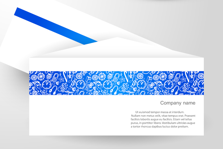
Photo purchased from … www.depositphotos.com
This week we are sharing two short blog articles, one about textured paper options and the other about the induction of the Printing Industry Exchange weekly blog into Feedspot’s Top 40 Digital Printing Blogs.
Paper Choices
When I’m designing something new, my knee-jerk impulse is to print it on gloss or dull coated paper. So I pause for a moment and really think about the purpose of the item. For instance:
- Is the job a print book? Does it include black and white or color photos?
- Is the job an annual report, and do I want to project a corporate image or a softer, more approachable image?
- Am I designing a stationery package, including a business card, letterhead, envelope, and such?
All of these will lead to specific, and different, paper choices.
For instance:
- For print books with lots of photos, black and white or color, the images “pop” when they’re printed on gloss stock. That said, if the book is text-heavy, gloss stock can be tiring on the eyes. It’s easier to read text on uncoated paper or dull- (or matte-) coated stock.
- In the case of an annual report or other print collateral for an organization, uncoated paper feels softer, and the ink colors printed on the stock (solids and photos) are more muted. This, combined with the softer feel of the paper, can give a more intimate and personal feel to the publication. This might be appropriate for an environmental organization that wants less of a “corporate” look and more of an approachable, environmental-steward tone.
- For business stationery, letterhead, business cards, and various kinds of envelopes, you will probably want an uncoated stock. Moreover, to provide a unified look and feel, you might want to select paper from a coordinated stationery-package paper swatch book with different weights of complementary custom printing stock. Or, for the business cards, you might opt for a coated paper (if you’re designing business cards for a tech-oriented company or a financial company, for instance).
- You may also want an uncoated sheet for a special invitation, say to a black-tie dinner. In this case, in addition to uncoated paper, you may want a textured sheet and/or a colored paper stock, perhaps even a dark tone like a deep green or black with white text.
In short, the paper should reflect the purpose of the printed item and the tone or ethos of the company brand. Therefore, it is important to choose a stock carefully, and the best way to do this is with samples.
Your commercial printing supplier or paper merchant can send you swatch books (unprinted, but with a variety of selected papers) and printed samples (produced for the printer’s other clients), and these will make your decisions easier. The swatch books will give you a sense of the colors and textures from which to choose, and the printed samples will show you how solid ink colors, type, and photos will look on the selected paper stock.
Options for Paper Texture
Printing is a tactile experience. Your fingers can help you select paper for special projects. If the choice is an uncoated stock, here are some options:
- Laid: There are both horizontal and vertical lines in the paper, which are added with metal rollers during the papermaking process. This is a good choice for stately letterhead and printed presentations because it simulates classic, hand-made paper.
- Linen and felt: Both of these options simulate the texture and pattern of the cloth after which they are named. As with laid paper, linen and felt patterns are pressed into the paper during the papermaking process. Linen has more of a cross-hatched look with similar-width horizontal and vertical lines (like woven fabric), and felt-finish paper has more of the look and feel of felt cloth.
- Column: This pattern comprises, as the name implies, a series of vertical, ribbed columns on the surface of the press sheet.
- Vellum: Unlike laid, linen, and felt, vellum is very smooth. It has a slightly puckered texture like the surface of an eggshell.
- Wove: Wove is the smoothest uncoated option of all, although its surface is also described as being similar to an eggshell, albeit a bit smoother than vellum.
In all cases, there is no better way to grasp the differences in paper surface (both visually and in terms of the feel of the paper) than to request samples from your printer or paper merchant. Some of the textures are more prominent, while others are less prominent. In all of these cases, the texture lends a sense of understated elegance to letterhead and other elements of a stationery package or to an invitation or program for a special event.
Things to Consider
In my view, color is one of the major considerations, in two senses:
- If you choose a dark colored, textured sheet, it will be striking, but since commercial printing ink is usually somewhat transparent, you may need to add a second pass of a color to make the ink/typescript dark enough, evenly applied, and readable. Granted, for an invitation, you can foil stamp the text on the sheet, but this will require the additional cost of a metal foil-stamping die (which also takes time to make) as well as the cost of the foil-stamping procedure.
- If you choose a white uncoated press sheet, it will absorb the ink. (In contrast, ink sits up on the surface of a coated sheet, whether dull or gloss.) Therefore, the ink printed on an uncoated commercial printing sheet (type, solid colors, or halftones) will look softer, darker, and less intense than the same ink will look on a coated press sheet. While the printer can compensate somewhat for this fact, large areas of solid ink may appear blotchy (when compared to the same ink treatment on a coated sheet). It’s smart to discuss this with your printer and request samples first.
That said, in my opinion, printing color on uncoated paper can provide subtle, nuanced images that are soft and elegant. It just takes a skilled custom printing vendor to do this.
Printing Industry Exchange Blog Included in Feedspot Top 40 List
The CEO of The Printing Industry Exchange just received notification that the PIE Blog has been featured (as #12) in the Feedspot Top 40 Digital Printing Blogs. If you want to learn more, check out this link:
https://blog.feedspot.com/digital_printing_blogs/?feedid=5425058
This is a description of Feedspot’ s vetting process, in their own words:
“The best Digital Printing blogs from thousands of blogs on the web and ranked by traffic, social media followers, and freshness.
“Feedspot discovers, categorizes, and ranks blogs, podcasts, and influencers in several niche categories. We have curated over 250,000 popular blogs and categorized them in more than 5,000 niche categories and industries. With millions of blogs on the web, finding influential, authoritative, and trustworthy bloggers in a niche industry is a hard problem to address. Our experience leads us to believe that a thoughtful combination of both algorithmic and human editing offers the best means of curation.
“There are several ways we discover new feeds.
- Publishers submit their blogs, podcasts, or YouTube channels on Feedspot using the “Submit” form at the top of this page.
- We have a research team who does extensive research on Google and social media platforms to discover new influencers.
- Feedspot has in-house media monitoring tools for discovering bloggers in several niche categories.
“Our expert editorial team reviews each blog before adding [it] to a relevant category list.
Ranking is based on:
- Relevancy
- Industry blogs (those not favoring a specific brand) are given higher rank than blogs by individual brands (who often tend to promote their own products).
- Blog post frequency (freshness)
- Social media follower counts and engagements
- Domain authority
- Age of a blog
- Alexa Web Traffic Rank and many other parameters.”
Posted in Paper and finishing | Comments Off on Custom Printing: Textured Paper Options, and a Nod to the PIE Blog
Sunday, July 2nd, 2023

Photo purchased from … www.depositphotos.com
My fiancee and I keep a printer’s loupe (a 12-power magnifier) in the car glove box so that wherever we go (mainly thrift stores) we can check out the artwork. Are the prints authentic, traditional lithographs, or are they offset lithography prints? That is always the question. (Granted, it is highly unlikely that an art print–rather than a reproduction–will show up at a thrift store or estate sale, but it has happened to us a number of times, so it pays to be prepared.)
In this light my fiancee and I recently found an Edgar Degas print online for free. Someone just didn’t want it any more. Since we loved the rendering we saw online, we drove about twelve miles and brought the framed print home. Of course, I immediately found my 12-power printer’s loupe and checked out the art. As we expected, it was (essentially) a very beautiful large format print poster. It was framed by a skilled framer. And it was free. So it was still a good acquisition, most importantly because we like the image (subject matter, rendering) a lot.
The Degas Reclining Nude Print
The print is of a reclining nude. It is quite large, and the print is “floated.” That is, it seems to float above the background mat rather than being covered by it. The drawing by Degas is sensitive and beautiful, and the tones are rich, deep, and velvety. So it actually looks like either a charcoal drawing or a real lithograph. There is nothing cheap about it (except for its being free).
Moreover, the edge of the floated paper on which the poster is printed is deckled. That is, the edge is feathered rather than flush cut in order to mimic hand-made paper. And the paper is a cream-white, laid commercial printing stock with the traditional texture of horizontal and vertical ribbed lines.
All of this plus the signature looks entirely authentic. But it’s not.
Upon close examination with a loupe, I see the halftone dots (black only and somewhat ragged, which lends to the authentic look). And the deckled edge of the paper is actually an illusion as well. The printer has created a slight shadow on the paper, which also comprises numerous halftone dots, as does the signature. Only the red museum stamp has the traditional commercial printing rosette pattern of magenta, yellow, and black halftone dots set at slight angles to one another.
So if you like the image (and don’t have multiple thousands, tens of thousands, or hundreds of thousands of dollars or more), this is still a nice acquisition. It also shows that a skilled offset lithographer is an artist as well as a craftsman to be able to create a large format print like this.
The Lithography Process
Traditional fine art lithography and commercial printing (i.e., offset lithography) both work on the same principle, that water and oil do not mix. This chemical property allows both the image area and the non-image area of both a traditional litho plate and an offset printing plate to be on the same flat or planar surface (hence the custom printing term “planographic”). And since both image and non-image areas are on the same plane or level, it is possible to print very long runs of an art print when compared to other commercial printing techniques (intaglio, for instance, in which the image is recessed–or sunken–into the custom printing plate, or relief, in which the image area on the printing plate rises above the non-image area).
A fine artist preparing the plate for printing (historically, the plate was limestone, because of its absorbency, but it is now often metal) draws on the limestone plate surface with a greasy crayon (oil, fat, or wax), sometimes tinted to be more visible. These image areas, which can be very detailed, and either very rich and velvety or very subtle, will attract the oily lithography inks.
The rest of the limestone (or metal) printing plate is treated with a solution of gum arabic and weak nitric acid. This will attract water and repel ink.
The artist wipes down the image with lithographic turpentine, removing excess oil or wax from the image but at the same time sealing the image areas so they will better accept the lithographic ink. During the custom printing process, the artist also keeps the limestone plate wet. Due to the porosity of the limestone, the printing plate absorbs water and helps maintain the separation of ink (on image areas) and water (on non-image areas).
When everything is ready, the artist inks up the plate, positions the printing paper on the plate, and rolls it through the hand-operated printing press. Then he repeats the process (with more hands-on attention than in offset lithography and with a much shorter press run to increase the value—due to scarcity—of each individual print). Then he signs and numbers the individual prints in the limited press run.
If the artist wants to introduce color into the printed images, she or he has to use a different limestone plate for each color and then print them in alignment (called “in register,” the same custom printing term as used in offset lithography).
How Does This Differ from Offset Lithography?
First of all, both traditional lithography and offset lithography, as noted above, are planographic printing processes based on the “immiscibility” of oil and water. (Oil and water don’t mix.)
That said, offset lithography plates print first to a rubber and fabric blanket, and then this printed image is transferred from the blanket to the paper substrate. In contrast, in traditional lithography the image is transferred directly from the printing plate to the paper.
In addition, with offset lithography photos and gradated tones (tones that are intermediate rather than fully black or white) have to be rendered using halftone technology, which breaks an image or photo down into a grid of dots, larger or smaller depending on the amount of ink to be printed. Dark areas contain larger dots. Lighter areas contain smaller dots. (This is called AM or amplitude-modulated halftone screening and is different from FM or frequency-modulated screening, which comprises the dithered, random pattern of minuscule dots produced on an inkjet printer.)
In traditional lithography, there are no halftone dots. According to Silvie Turner in Print Collecting: Selecting, Evaluating, and Caring for Fine Prints, “One of the qualities most valued in lithography is its ability to record the finest nuances of shade, tone, and wash with the greatest fidelity, allowing a wide and subtle range of tone—from a very deep black to the tenderest of greys.” (Turner, page 18).
How Can You Tell the Difference?
As noted above, I always start with the loupe. If I see halftone dots, I know the print is an offset lithograph.
Art dealers suggest that you buy traditional lithographs from a reputable fine art dealer. (These will, of course, hold more financial value than prints from a much longer, and presumably less personally curated, offset lithographic print run.)
Look for a signature (and make sure it’s not made up of halftone dots). I also just learned that there may be a signature on the back of the press sheet. Look for this, too. Also look for the print number and the total print run, expressed as a fraction (5/300 means the fifth print pulled in an edition of 300). Both of these should be hand-noted under the image, usually in pencil.
Ink on a traditional lithograph is also usually thicker than on an offset lithographic large format print.(Wear cloth gloves when you check the ink so the oils on your hands do not damage the print.)
The Takeaway
Sometimes you can find real lithographic prints at estate sales and thrift stores. It has happened. It’s worth knowing what you’re looking for, and it’s worth keeping a printer’s loupe with you.
That said, there’s still a huge amount of artistry (as well as craftsmanship) in offset lithography. If you like a large format print, even if it’s not an original litho, I think it’s best to not be a purist, especially when you get it for free or at a discount at a thrift store.
Posted in Fine Art Printing | Comments Off on Commercial Printing: A Gorgeous–and Free–Degas Print
|
|