Photo purchased from … www.depositphotos.com
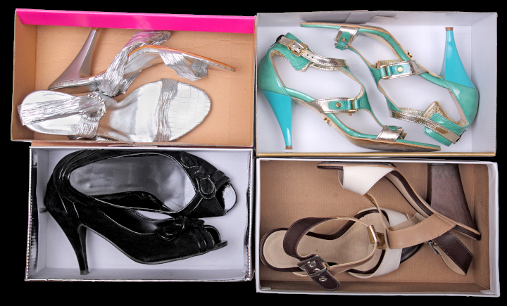
My fiancee and I recently went to Nordstrom Rack for shoeboxes. We’re working with our autistic art therapy students to make Halloween dioramas. They will be miniature rooms with a coffin, spider webs, rats, skeletons, plus any drawings the students wish to add.
As a student of commercial printing, however, I noticed the attention to quality and detail in the construction of the empty shoeboxes. We found about thirty of them for our various classes, and two of them in particular stood out from the rest. I’d like to talk about why they are effective marketing items beyond the shoes they once contained.
Marketing Is a Dialogue
Good marketing is a dialogue. It is personal, even intimate. A brand speaks directly to you. If the company has done research into its clientele, its marketing department will be able to describe exactly who the target buyer will be. This person will have specific likes and dislikes, interests, values. They will share many of these with other buyers and may even have certain similarities in their personal history. The detail of this “persona” is impressive, given all the data the company must collect and digest to envision this model buyer. But the good news is that the marketing research will allow a brand (let’s say in this case a shoemaker) to predict exactly what kind of shoes you will want and to give them to you.
Based on this information, the company (i.e., the brand) will work to communicate its brand values, with which you will presumably resonate. This is true (in the case of the shoeboxes) for both the product and the packaging. The shoes have to be outstanding. Granted. But the packaging has to convince you to open the box (the “unboxing experience”) and try on the shoes.
These brand values, which perhaps will include the quality of workmanship, the stylish nature of the shoes, the social conscience of the company, or on an even more personal level just how good you will look and how you will feel when you wear the shoes—all of this has to be reflected in the packaging (the box) as well as the shoes.
Apparently Nordstrom Rack (at least this one store) recycles more than 300 shoeboxes a day. When my fiancee and I went inside for the boxes, we saw aisle after aisle of shoes, multiple hundreds of boxes vying for the buyer’s attention. Since the shoeboxes have sides that obscure the shoes themselves (a little), a lot was riding on the unique nature of the boxes to sell the products inside.
The Sample Boxes
The first sample box I want to describe is entirely covered with a 4-color comic strip (top, bottom, and all exterior sides). It is a Jeffrey Campbell shoebox covered with empowering and empowered women superheros, including one on a motorcycle and one in space in a meteor shower. It is like a comic strip because one hand-drawn image is set off in a black-edged box, with word bubbles for the character’s dialogue, and there are also other signs and word-bubbles across the surface of the box.
I personally know nothing about Jeffrey Campbell shoes. (I’m sure my fiancee knows a lot, since she is very stylish and knows brands well.) However, with no knowledge except my initial reaction to the box and the words “Women Unite,” Resist,” and such, plus the space imagery and bright colors, I would say that the company’s brand values include not only empowerment but also humor. And humor sells. Most people want to “associate” themselves with (to be “affiliated with”) a product and company that embody these specific values, and the job of the shoebox is to communicate these values.
If you open the box and look closely at its construction (the lamination of the commercial printing press sheet over the thick chipboard), you might say that the company or brand pays attention to detail (in general) and durability (in particular). Not all of the boxes in the store would meet this standard, both for quality package manufacturing and creative, unique graphics. So this goes a long way.
The second box is lime green. In fact, my fiancee picked out a number of boxes in this specific color for our students. When we walked down the aisles looking for empty boxes, these in particular jumped out because of the thick, heavy ink coverage of the lime green, which was almost fluorescent in its luminosity. A box like this is distinctive. In a store with multiple hundreds of boxes of shoes, that’s very important.
As with the first box, the thickness of the chipboard broadcasts durability and quality. Like the first box, the green commercial printing press sheet (with only a white, hand-lettered Sam Edelman script signature and logo on the green) totally covers all chipboard in the box (in contrast to a lot of other boxes in the store). Again, to me this reflects the brand’s attention to detail and overall quality. All edges, folds, and corners are crisp and precise, with the laminated paper square to the sides of the box.
What makes this box unique is threefold. First, as noted, you can see it from across the store. That’s good advertising. Sam Edelman chose not to compete with other brands for the customer’s attention but rather to grab it immediately with the color of the box. Second, the surface of the lime green box has a canvas texture, like a painter’s canvas. It feels good in the hands. You can easily grasp the box. And it also feels strong and rigid.
But to return to my assertion that good marketing is a conversation, the “piece de resistance” is an envelope containing a little saddle-stitched print book included in the box with the shoes.
Here’s why it’s unique.
First of all, the envelope is about 2” x 3”. It has a build of about 1/3” on all sides, allowing for the easy insertion and removal of the print book it contains. The lime green background of the box continues onto this envelope and book, with only a Sam Edelman signature reversed out of the green envelope and the book cover. The booklet is printed on bright blue-white paper, so the words and images “pop.”
There’s something personal about the size of the print book. No one else would know you’re reading it, it’s so small. And inside there are hand-drawn images of a man (Sam, presumably Sam Edelman himself) and a woman (the shoe buyer, Libby) engaged in a dialogue.
All of the dialogue between the two of them (set in a small, sans-serif typeface) centers on where the shoes were made, how they were made, and why they are special. At one point Libby even says, “And because of this I want to keep them forever. Shoes say so much about a person.”
As a reader, I’m the proverbial fly on the wall looking at watercolor images of Sam and Libby while listening to their discussion. Some of the illustrations are even accompanied by hand-lettered callouts describing the Sam Edelman shoes.
Overall, it’s an intriguing and personal conversation. And even though I don’t buy women’s shoes I can appreciate my fiancee’s love for this entire packaging initiative. It shows that a brand can do enough research to understand its buyers and deliver a unique product that will satisfy them and help them look beautiful.
The Takeaway
What can we learn from this?
- Consider this approach. If you wanted a job at a particular corporation, you wouldn’t just mail in your resume. You’d probably study the company’s website and annual report. Maybe you’d visit the company to see what you could learn. You would try to absorb as much as possible about the company to see how you could specifically contribute (or “add value”) to its operations. A good marketer will do this, too, even with a shoebox. Who is the client? What does the client like and dislike? What can a brand create (both product and packaging) that will please the client? In my view, these two shoeboxes reflect this kind of soul searching into what both brands can offer that is unique.
- After a brand is able to articulate the nuances of a buyer’s persona, the brand’s goal is to reflect all of this not only in the product (shoes, in this case) but also in all marketing materials, making relevant design decisions in everything from typefaces to paper choices to color. Every time the buyer interacts with the brand (through signage, a brand’s online presence, catalogs, even “frictionless” interactions with the company’s call center), the brand’s ethos must shine through. That is separate from, but intricately intertwined with, the overall quality and specific attributes of the product.
- As a marketer, it is your responsibility to initiate and maintain such a conversation with your customers.
This entry was posted
on Sunday, December 4th, 2022 at 10:28 am and is filed under Packaging.
You can follow any responses to this entry through the RSS 2.0 feed.
Both comments and pings are currently closed.