Photo purchased from … www.depositphotos.com
Who chooses the Color of the Year? I know these words are reminiscent of the Academy Awards. And now, the envelope please. The winner is chartreuse.
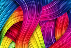
But seriously, color is extraordinarily powerful. In most cases a full-color photograph will grab your attention more quickly than a black and white photo (depending, of course, in large part on the surrounding images). The same is true when you consider the specific green of Starbucks or the orange of Home Depot or the multi-colored Apple logo. In all cases, the color ensures immediate brand recognition.
Colors touch people’s memories, their emotions. People associate certain colors with certain attributes (perhaps a deep purple with opulence, or an orange with an upbeat disposition).
In different cultures, however, the same colors might have opposite connotations, a good reason to do research when designing a logo.
Or think of fashion and interior design. Look at Vogue magazine. Observe the particular colors of the clothes the models are wearing, or the colors of their interior surroundings. Colors make powerful statements about people.
But who chooses these colors? Who says, “This year, Chili Pepper, Pantone 19-1557, is what everyone should bring into their fashion color palette”? (Actually that’s a much easier question, and the answer is Executive Director of the Pantone Color Institute, Leatrice Eiseman. The year in question for “Chili Pepper” was 2007.)
The Backstory
It is within this context that a dear friend and commercial printing colleague asked me about the Pantone Color Institute’s yearly color choices, and more specifically about who makes the selections.
To begin with, what is the Pantone Color Institute, and what is Pantone, in general?
If you’re a graphic designer or commercial printing supplier, your desk is probably no farther than four feet from a PMS swatchbook, which lists all PMS colors. These can be mixed (like a baking recipe) from a limited number of colors (13 base pigments plus black, although for a while, from 2007 to 2013, Pantone used fewer colors—10 plus clear coating—for the Pantone Goe System).
These mixtures of pigments create a much larger color gamut than CMYK (the traditional four-color printing ink set, which has at various times been augmented with such colors as orange and green to expand the universe of printable hues). Color builds of cyan, magenta, yellow, and black cannot match the rich and varied hues of an RGB (red, green, blue) computer monitor. This can be a problem if you have specific corporate colors for your logo, for instance. In such cases (that is, if you want to match a particular color that cannot be achieved with a CMYK build), you use a PMS book to select a specific, mixed color. The Pantone Color Institute creates this book of color swatches and curates the annual Color of the Year selection process.
Pantone colors have the incredible benefit of allowing printers all across the globe to communicate color choices, standardize custom printing press output on either coated or uncoated papers, and even translate specific printed colors (reasonably closely) to colors generated on computer monitors. This benefits print production workers, fashion design artists, product designers, and interior designers such as wallpaper designers and upholstery designers, such that everyone involved can have a common language for describing color: on paper, plastics, or fabric. The color scheme is even used by florists. (I once saw a sports car with a vanity plate that read, PMS 185. And the owner of the car was right.)
As an interesting historical note, Pantone began in the 1950s in New Jersey at M&J Levine Advertising (Mervin and Jesse Levine). The Pantone Matching System includes 1,114 spot colors plus metallic and fluorescent colors (as per Wikipedia).
As an interesting optical note, you might also want to Google L*a*b color, which is in fact the most accurate “device independent” description of color, presumably even more accurate than the PMS system (according to Wikipedia). But the Pantone Matching System is exceptionally comprehensive (i.e., it offers a wide color gamut). It is also a standard that is understood everywhere.
The Color of the Year
When I read about how the Pantone Color Institute selects a particular color (or colors) each year, it reminded me of how popes are chosen in Rome. (The description had that tone of gravitas.) Apparently “in a European capital, a secret meeting of representatives from various nations’ color standards groups” selects a color for the following year “after two days of presentations and debate.” (Wikipedia, Pantone).
The key underlying the color of choice is the association of colors to events, approaches to life, and emotions. (That is, the color reflects the current zeitgeist, the temper or tenor of a particular period in history.) For instance, the Pantone Color Institute, headed by Leatrice Eiseman, as noted earlier in this article, chose “Honeysuckle” in 2011 (PMS 18-2120), because “in times of stress, we need something to lift our spirits. Honeysuckle is a captivating, stimulating color that gets the adrenaline going—perfect to ward off the blues” (Wikipedia).
This also reminds me of a wine connoisseur speaking of the “notes” and the “finish” of a particular wine.
Here’s another quote from Leatrice Eiseman:
“I look for ascending color trends, colors that are being used in broader ways and broader context than before…. In this case, Radiant Orchid descends from the purple family, which is kind of a magical color that denotes creativity and innovation…. [The] backstory to purple is that it inspires confidence in your creativity, and we’re living in a world where that kind of creative innovation is greatly admired. In the world of color, purple is an attention-getter, and it has a meaning” (a comment by Leatrice Eiseman about Radiant Orchid, PMS 18-3224, the 2014 Color of the Year).
What We Can Learn from the Pantone Color of the Year
-
- Color has a huge effect on people. People often have an intensely personal connection to a color.
-
- Color influences people’s moods and emotions through print design, interior design, package design, product design, fashion design, etc. If you’re a designer of any kind whatsoever, it absolutely behooves you to study all aspects of color, from the optical to the artistic to the psychological.
-
- Warm colors (like red and orange) appear to advance toward the viewer. Cool colors, like green and blue, appear to recede.
-
- Each person sees a slightly different color when they look at the same item. Based on my reading, it appears that women see color better than men do (when I used to approve print book covers in-person, on press, I would often take a female colleague to the printer with me for this reason).
-
- Color is a function of light and the components of your eye. Therefore, red paint in a closed metal can is not red. It’s black. That’s why a red car looks grey at night.
-
- Some people get as specific about the attributes they pair with certain colors as other people get with their description of a fine wine. Therefore, if you’re choosing a color, or colors, for a corporate identity, it’s wise to get feedback from many, many people.
-
- Assume these pairings of colors and attributes will change from culture to culture, from nationality to nationality. When preparing colors for a corporate identity, show your work to diverse people from multiple groups and cultures.
-
- Realize that there are different standards used to define color. PMS is just one, granted the most popular. Once you tell a printer to use PMS 199, PMS 286, or whatever, that is a contract. He has to match it. (Granted, the color of the paper substrate will affect the look of the color.)
-
- Google the differences between color created on screen (with light) and color created with inks, paints, pencils, and markers. The former is called “additive color.” The latter is called “subtractive color.”
- RGB color (created with light) provides a larger color gamut (a huge range of different colors) than colors created with CMYK inks. The specific mixtures of inks comprising PMS colors can allow you to match significantly more hues than if you only used CMYK commercial printing inks.
This entry was posted
on Monday, September 28th, 2020 at 5:41 pm and is filed under Color Theory.
You can follow any responses to this entry through the RSS 2.0 feed.
Both comments and pings are currently closed.