December 18th, 2023
Posted in Photos | Comments Off on Custom Printing: The Promise of AI-Generated Images

Photo purchased from … www.depositphotos.com
The Printing Industry Exchange Blog is #12 of the best 40 digital printing blogs, as selected by FEEDSPOT.
One of my print brokering clients is a “fashionista.” I have written numerous PIE Blog articles about her work. Her main printed product is a 3.54” x 1.42” color swatch book on a screw-and-post assembly that looks like a small PMS swatch book. It allows her clients to select complementary clothing and makeup colors based on their complexion. Over the years my client has expanded her product line into print books, an online presence, and (soon) clothing based on her proprietary color scheme.
All of my client’s products include illustrations of women with various hair colors and skin tones. These include cover art for 28 separate “master” copies of her color swatch print books. Among other things, my client is an illustrator, but drawing all of these cover models takes time.
AI-Generated Photography in My Client’s Work
With this in mind my client recently sent me about ten or so photos generated by Artificial-Intelligence (AI)-based photo generators she had found online. She had typed in various prompts, and the software had generated breathtakingly beautiful images that looked a lot more like photos than illustrations.
My client had asked my opinion. I gave it to her, and I also did some online research into the whole process (and legality, regarding copyright infringement) of AI image generators.
First of all I will say more about why this is relevant to my client. It’s not about attractive photos. It’s about what my client is really selling.
I told my client she was really selling beauty, magic, dreams, fantasy, and glamour. Feminist literature I perused also spoke of the “male gaze” (in less than glowing terms). My client’s vehicle for selling these intangibles is her proprietary color scheme. In much the same way, as she ventures into clothing lines, her products will be less about the fabric and style and more about how the colors themselves enhance the beauty of the person wearing the clothing.
With this in mind, let’s return to the photos. I will describe some of them. All of the women are stunning. They range in age from their twenties to sixties (my guess), blondes, brunettes, redheads, women with stunning gray hair. Latinas, African Americans, Caucasians. Beauty and diversity.
What they all have in common is that they look directly at the viewer.
This has been important since the dawn of painted portraits. When the subject of a painting or photo looks directly at you, this forms a bond between the subject of the image and the observer, much more of a bond than an image of a subject looking elsewhere. If the subject looks elsewhere in the painting or photo, the person looking at the image becomes an observer rather than a participant. The relationship at that point changes from a link between the subject and the observer to the subject’s relationship to her or his environment (possessions and/or people).
So it is understandable that my client chose only images gazing at the observer, photos that will be reproduced on her print book covers, web pages, and marketing collateral.
Actually, chose is not as precise a word in this context as created. She created (or the AI algorithm created) all ten of the images my client shared with me specifically based on text prompts. In fact, when I did some research on the subject, I learned that some of the AI image generators will accept figurative language as well as literal wording. That is, you can type in an allusion, metaphor, simile, famous quotation (presumably). My client typed in specific ages for the women, and then noted that all of them should be beautiful (a subjective concept), and that all should be looking at the observer. But the AI image generators apparently can go well beyond this.
In fact, I noticed one other thing about the ten images my client shared with me. The subjects’ eyes were not only focused on the observer, as noted, but they were “in focus” (which implies the subjects of the photos are/were “present” with the observer rather than lost in thought—or bored). That said, their gaze is slightly (just barely) softer in focus to imply romantic interest in the observer.
All of these characteristics work on the viewer. Subconsciously, but powerfully. Just ask any glamour photographer who takes pictures of models for clothing ads or cosmetics ads.
Fantasy
I also mentioned fantasy as one of the things my client sells with her proprietary color scheme. One image she requested had the subject in “period” costume in front of an iron gate and with Gothic architecture in the background (akin to the Gothic novel Jane Eyre).
In our current world, where everyday life is serious and now often dangerous, images of models (which my client will have selected or created very consciously to appeal to her clients) tied to people’s fantasies will go a long way. These will be images with characteristics to which my client’s clients will aspire.
As a rule, most, if not all, advertising is about either possessing something or becoming something. And since my client’s clients are all women, the photos my client creates with AI image generation technology will be aimed at encouraging her clients to become whatever they aspire to in their dreams and fantasies. They will do this by using my client’s color system to enhance their own beauty, their sense of glamour.
In short, I think my client is going in the right direction not only by focusing the “gaze” of the models on the observer but also by including some elements of fantasy. After all, romance novels are actually increasing dramatically in their popularity for a reason.
(From BookRiot.com: “NPD BookScan, a market research group, states that romance is selling more in 2022 than at any point since 2014. Its data shows unit sales of romance novels growing 41% in 2021 and growing even more in 2022.”)
Further Thoughts
One of my first thoughts in seeing my client’s selection of AI generated images was that the quality had improved dramatically since the last time I had seen such photos. These actually look like photos, even though the people in the images do not exist. Prior iterations of such images looked (to me) more like illustrations. And therefore they had a sense of being artificial, cold, and impersonal. Beautiful but lifeless. These images my client sent me, in contrast, exuded warmth.
To go back to the technology, which I can’t even begin to understand, I did read that the computer “learns” based on the words you type into the image generator, and this is reflected in the qualities and characteristics of the photos generated. To me, that’s incredibly exciting, as I think ahead five or ten years—or even just now.
I also saw some related attributes (technical rather than emotive and artistic) that pertain to image quality. For instance, one of the image “manipulators” acts as Photoshop might but goes one step further. I saw online how it removed all noise from the background of the image as well as the subject, improved the resolution of the image significantly, and possibly even added or corrected background and foreground detail based on an analysis of the subject.
Granted, a lot of this you could do with an image editor like Photoshop, but you would still get spotty results from enlarging or upsampling an image, and you would need not only artistic talent but also a lot of time to (essentially) paint in details.
(In the 1970s I did this with India ink, a tiny brush, and a photo. In the ensuing decades starting in the early ‘90s, I did this in Photoshop with the pen and paintbrush tools. Now the computer can analyze the image and do all of this for you instantly.)
Copyright
Based on my reading, if you choose to pursue AI generated imagery, I’d encourage you to research copyright requirements. Read the legal language accompanying the online AI generation engine. It seems that AI generated imagery can’t be copyrighted since it is not created by humans.
Then again, you may want to make sure your use of such images (particularly in promotional materials that generate money for you) does not expose you to liability. I haven’t seen anything worrisome yet, but it’s worth careful study, just as you would carefully read language from a royalty-free or rights-managed online photo bank.
In my estimation, this will be transformative technology. If you are involved in any aspect of commercial art or fine art (or commercial printing), you may want to read up on the subject.
Posted in Photos | Comments Off on Custom Printing: The Promise of AI-Generated Images
December 11th, 2023
Posted in Book Binding | Comments Off on Book Printing: Options for Layflat Binding

Photo purchased from … www.depositphotos.com
The Printing Industry Exchange Blog is #12 of the best 40 digital printing blogs, as selected by FEEDSPOT.
A client of mine called me out of the blue this week and asked about options for 50,000 copies of a 4-color print book containing voting records from Capitol Hill. She needed the book to lie flat, though, and she knew this would drive up the price.
A Plethora of Choices
I told my client that most of the options would be expensive because of the handwork involved. These would include such mechanical bindings as Wire-O, Spiral Wire, Plastic Coil, and GBC (or comb binding). All of these methods are accomplished by hand with minimal automation, so a 50,000 press run would raise the price, beyond the extra cost of printing 4-color ink throughout the book text. But here’s what I told my client (which will also serve as a review for your own commercial printing work).
Spiral Wire
The bind edge of the book is drilled with little holes parallel to the trim and a coil of wire is fed into these holes. If you used a spiral notebook in school, you know what this is. You also know that the coil of wire can be inadvertently crushed. Spiral wire comes in a few different colors.
Another downside is that due to the nature of a coil, facing pages don’t align exactly when the print book is open and lying flat. In addition, the coils come only in standard sizes (widths) that accommodate standard page counts. If you choose this option, make sure your book printer offers spiral wire coils that will match your book length.
Plastic Coil
This is like spiral wire, but it is made out of plastic. Therefore, it has “memory.” It will squish up a little if squeezed, but it will come back immediately to its original form. This is a huge benefit. Again, it involves expensive handwork, it comes in only a handful of colors, and you need to make sure it will accommodate your print book page count.
Wire-O
Wire-O is metal (like spiral wire), but it is composed of double-wire loops that are parallel to one another and attached to a metal post running the length of the spine. The double wire makes the binding stronger than spiral wire, and the fact that the wire loops are parallel to one another (rather than in a spiral) makes the facing pages of an open print book align across the gutter. The same issues apply with the cost of handwork, page count, and color options.
GBC or Plastic-Comb Binding
If you completely unwind and flatten a GBC binding coil, it will look like a comb (hence the name). The tines of this comb are fed (i.e., handwork) through holes drilled in the book text block. When the coils jump back into place, you have a coil holding all the book pages together. What you also have (which is not available with Wire-O, Spiral Wire, or Plastic Coil binding) is a printable spine. Since the plastic has “memory,” it jumps back into place. You can therefore add or remove pages, but in my experience over the years the pages always seem to pull out, fall out, or tear out.
3-Ring Binder
This is an interesting option because you can easily add or remove pages. It’s the same as the binders you had in grade school. Binders come in numerous spine widths, so the page count of the print book need not be an issue. You can even print the text block, shrink wrap it, lay it inside the closed binder, and make the reader assemble the product.
Background vinyl colors are numerous, and some even have clear plastic pockets heat welded to the outside of the binder to allow you to insert slipsheets. That is, instead of custom screen printing art and text on the outside of the vinyl binder (which would be an expensive addition), you can print 4-color single sheets that you can slip into pockets on the front and back covers (and spine), embellishing the binder without paying for screen printing.
Layflat Perfect Binding
Somebody really earned their money when they invented this bindery method. Apparently it’s durable (I was worried, so I checked). And it really is much the same as case binding (hardcover, edition binding) in its approach.
Here’s how. On a perfect-bound book the stacked, printed press signatures are notched or ground off at the bind edge. Then glue is applied to the spine edge of the text block. Finally, a paper cover is wrapped around the text block, adhering to the spine and a slight bit of the front and back cover. Then the book printer trims the book.
In contrast, on a case-bound print book the text block is not attached to the spine. It is glued to a “crash,” (also called a “super” or “liner”), a piece of gauze running the length of the spine and extending slightly outward on both sides. In the case-bound book these gauze flaps are attached to the front and back (binder’s board) covers of the print book and then covered with the endsheets and flyleaves (end papers).
So the text block essentially hangs on the edge of the front and back covers and (in most cases) is not attached to the (inside of the) spine.
Layflat perfect binding works the same way, but instead of using thick binder’s boards (front, back, and spine covered with fabric or leather), the binder attaches the print book text block (all printed, gathered, and stacked press signatures) to a gauze strip, which he then attaches to the edges of the front and back (perfect binding) paper covers. Just a strip is enough (just like case binding).
The text block never touches the spine, so the book lies flat when open on the table. In fact, this option is often used for photo books (personally printed for you using your photos) in stores like Costco, because the open pages (which align perfectly with one another) make full-bleed photos seem to be connected at the spine as if they were one huge, double-page, full-bleed photo. The overall experience is breathtaking.
This does not involve that much handwork (when compared to the mechanical bindings noted above), so the overall cost per unit does not have to be prohibitive, even for longer press runs.
The process (only one of the variants of layflat binding) is called Otabind.
And here are more characteristics/features/benefits:
- The glue used in the process is a hot melt, exceptionally durable glue (EVA, PVA, or PUR glue). So the print books last a long time, and pages don’t easily pull out.
- The cover is scored a number of times (at the spine, and outward from the spine parallel to the bind edge). This scoring, along with the fact that the text is not actually attached to the spine, allows for an extremely flexible and durable book which will lie flat when open.
- This process, especially because of the specific glue used, when combined with deep “notching” (cutting notches into the bind edge of the folded press signatures to allow the glue to really seep in), provides surprising strength.
The Takeaway
No matter what you want to do in printing, there are usually a number of ways to do it.
That said, those methods requiring lots of handwork will be expensive (overall and on a unit-cost basis, because there are no economies of scale for handwork). With that in mind, such automated layflat options as Otabind can help make up for this.
If, on the other hand, you only need (as an arbitrary, small number) 200 copies, you might choose vinyl binders, Plastic Coil, Wire-O, Spiral Wire, or GBC comb binding. These are especially good for cookbooks and manuals, or anything else you need to refer to when you’re using both hands for something else.
Posted in Book Binding | Comments Off on Book Printing: Options for Layflat Binding
December 3rd, 2023
Posted in Printing | Comments Off on Custom Printing: Printing Problems, Problems, Problems
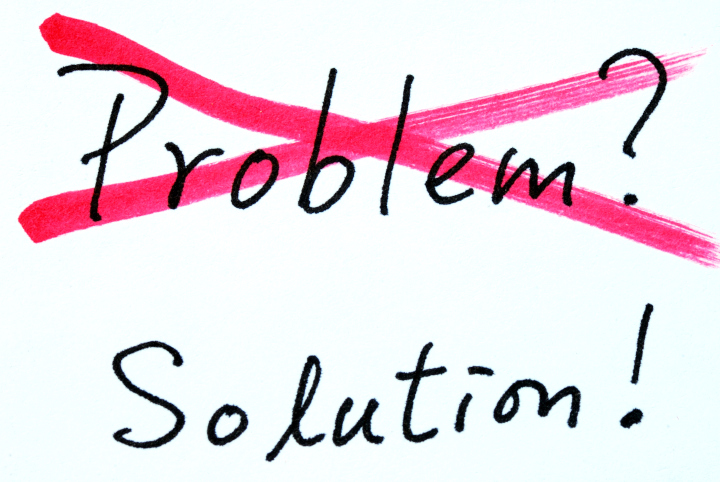
Photo purchased from … www.depositphotos.com
The Printing Industry Exchange Blog is #12 of the best 40 digital printing blogs, as selected by FEEDSPOT.
When you design a print product and/or buy commercial printing services, sometimes problems arise. Printing is a complex process not only in terms of logistics but also in terms of design issues and art file preparation issues.
The very best way to avoid errors is twofold:
- Put everything in writing. Craft an ongoing specification sheet, which you can then alter for each job, or kind of job, as needed. You can start by closely reading a number of printer’s bids. These will give you ideas, which you can expand upon over time. I’ve been changing and updating my base spec sheet for over 40 years. The more I learn about commercial printing, the more I tweak this document. And each time a totally new kind of work comes up (like a sample case for pieces of flooring, for which I brokered custom printing services a few years ago), I add even more specifications and/or massage the ones already there. This document is the main communications device between you and your printer, addressing everything from design specifications to file preparation to printing, binding, and delivery.
- Proof early and often (to misquote the mid-19th century political saying). Back in the day (the ‘80s and ‘90s), our proofs weren’t as comprehensive as now. Make sure you see as many proofs as you need to at the highest level of detail you can, showing all color, all images (pretty much all of this is commonplace now). But review them closely during the printing process. Don’t edit copy at this stage, but do have relevant decision-makers in your office review them, too. Proofing is an investment, not an expense.
Client Errors: My Own Biggest Error and and a Colleague’s Error
Either you created the problem or the printer did. Those are the two options. That said, some flaws are just embarrassing, while others make a project unusable. It’s important to make an honest assessment. Here’s a mistake I made early in my career as the art director/production manager for a nonprofit government education organization.
I had designed a poster (approximately 3-feet wide by 4-feet tall) with an image of the Capitol as the background. I had positioned around the Capitol dome a number of illustrations of students drawn by a famous cartoonist that worked with my organization. I left it to the printer to do all of the photo compositing work. But the problem was that I had started with a 35mm slide of the Capitol. Back then, since we didn’t scan our own images, we didn’t see the enlarged film grain (silver halide, the old process prior to digital). We only saw this patterning of the film grain (and somewhat soft focus) at the proof stage. I had enlarged the image, which already had a lot of grain (since it was an especially fast, or light sensitive, film). At the very least I should have used an 8” x 10” press-camera image or (if that had not been an option) a 2 ¼” square-format image. (We didn’t have digital images back then.) The larger-sized negative would have been more detailed at that size with more gradations of color and less film grain. Therefore it would have yielded a better print.
What We Can Learn
I made the mistake. Because we saw the problem at the proof stage, we didn’t have to make the decision whether to reprint or live with this. We decided to embrace the patterning and call it a mezzotint. But I learned something.
So in the case of your own design and print buying, if you need a huge photo, buy the reprint rights to one and make sure it’s huge. Never enlarge a photo. You’ll see grain patterning (if it’s a silver halide print) or pixelation (if it’s a digital image). You can get these images online (we didn’t have that option back in the ‘80s and ‘90s).
Fortunately, now all images will have been incorporated into your design file before you send it to the printer, so check the color, resolution, placement, cropping, etc., of all images and then request a “contract-quality” proof from the printer.
All of these steps should ensure your success. But remember, never enlarge. Only reduce.
One other thing to remember is that if you do need to reprint a job due to an error (one of my print brokering clients had to do this a few years ago due to problems with her color choices and positioning of solid inks), your printer may only charge you his cost (without his added profit percentage). This may be negotiable. It doesn’t hurt to ask, and that can make a difference.
Printer’s Errors
When I was an art director, a commercial printing vendor “flopped” a photo. That means that when he stripped the photo negative into the composite negative from which the plates were made, it was “wrong reading” rather than “right reading.” I asked for a reprint for the following reason. The image included the organization’s logo prominently displayed (on a podium sign, so it was very visible). And it was backwards. Since it had been correct on the blueline proof and then had been changed (in error) between this proof stage and the final printed piece, it was the printer’s fault. He had to pay for the reprint.
I also made the printer reprint the CEO’s letterhead after it arrived with the two colors of the logo out of register. Unfortunately, even though these two jobs were worthy of reprinting at the printer’s cost, our organization did get a bit of a reputation in the local pool of custom printing suppliers as being a problem client. That’s why I’d encourage you to use discernment and honesty when you decide whether a printing flaw is annoying or whether it renders the job unusable.
Another job doesn’t really highlight an error but rather a potential risk of an error. A local magazine wanted to print an invitation for a special event. I suggested seed paper (they could actually plant the printed invitations, and flowers would grow from the seeds in the paper). I contracted with a printer on the East Coast, and then I bought the seed paper from a vendor in the Midwest and had it shipped to the printer. Unfortunately, many of the sheets of seed paper jammed the East Coast printer’s digital press. (They were not of equal thickness across the entire sheet.) Due to the excessive spoilage, the printer almost didn’t have enough paper for the job.
If I had this to do over, I would have had the printer buy the paper rather than buying it for him. He would have known exactly what to buy and how much. Fortunately, this was a problem that didn’t quite happen, but it almost did, and it would have been bad. Best to learn from it.
The third example had to do with a small-format perfect-bound book of flower photos. Each page spread had a flower on the left and a pithy quote about life on the right. It was intended to make you think about the simple joys and beauty of life.
The background of the front cover, back cover, and spine was a black solid with heavy ink coverage. Over this black ink, the printer added a dull film laminate. Unfortunately, the black solid ink was not completely dry when the printer added the laminate. Therefore the ink produced a gas as the liquid ink vehicle evaporated, and the gas made the cover coating bubble. None of the books were usable.
The vendor stepped up. He took off the covers and reprinted them, and re-applied them to all the text blocks once the ink had dried and the covers had been laminated. Then he trimmed the books a second time. Fortunately, I had left a little wiggle room around all art elements close to the exterior cover trim. So what might have gone from “close to the trim” to “painfully close to the trim” didn’t occur.
So in your own design and print buying work, always, always, always remember that replacing print book covers renders the overall book smaller than you had planned. Therefore, keep all live-matter type and imagery away from folds and the trim.
What We Can Learn
The first scenario (with the flopped photo) should never happen again, given the fact that you, as a designer, will always either buy or scan the images yourself. That said, if anything ever goes wrong between the printer’s contract proof and the final job, you have proof that it was the printer’s responsibility.
The second scenario pertains to color register. If colors are out of register, that is a printing flaw. Your printer should look for this during the press run. That said, some problem press sheets may slip through, so be aware. Colors out of register can also create color shifts within photos, especially in neutral colors.
The third scenario with the book covers provides several life lessons.
As noted above, keep wide margins–even if you never have to replace print book covers in the course of your career. This includes—especially–where you position the page numbers (folios). They can also become “too close for comfort” in saddle-stitched print books with longer page counts. Pages close to the center of the book will be pushed out slightly from the bind edge, and folios close to the center spread can get too close to the trim or be trimmed off entirely.
Work with vendors who will take responsibility for their actions. If the error is truly theirs, they will acknowledge this and give you some options. (For instance, the printer only reprinted and reattached the covers because there was nothing wrong with the text blocks. There was no reason to reprint the entire job. I continued to work with this printer for many years thereafter.)
Assume there might be problems with drying and coating operations when you’re printing heavy-coverage inks. You may want to ask the printer about this.
The Takeaway
I have made my share of errors. I lived through them. I also learned from them and never made them again. Fortunately graphic art file preparation in 2023 gives you more control than I had in the 1980s and 1990s because you can see the complete pages on your computer, your inkjet printer, and your printer’s “contract proof.” You can usually see the errors before they happen. That’s a blessing.
Always seek to develop mutually beneficial, long-term relationships with printers. Price should only be one component of your decision to go with a specific vendor.
If problems do occur, try to work with the printer dispassionately to find a solution. It’s human nature to want to lay blame, but it doesn’t solve your problem. Maybe you need a reprint. Maybe you only need a discount.
Posted in Printing | Comments Off on Custom Printing: Printing Problems, Problems, Problems
November 20th, 2023
Posted in Printing | 2 Comments »
Photo purchased from … www.depositphotos.com
The Printing Industry Exchange Blog is #12 of the best 40 digital printing blogs, as selected by FEEDSPOT.
How did they do that?
At our favorite thrift store my fiancee and I found a print of a beach scene printed on wood. The yellowish cast of the wood created an overall tone and feel of sand, and the swirls in the wood grain made it look like the wind had created dunes. The beach umbrella and empty chair (presumably the owner was in the surf) added to the overall ambiance. Don’t you wish you were there? I did.
Since I am a commercial printing nerd, my mind clicked on a few spaces, wondering how the artwork had been printed. I also thought about the options for printing on metal and glass, and even printing on irregular items like drinking glasses.
Printing on Wood
So I went to school on the subject. Apparently you can run a door, or any other large, flat piece of wood, through a flatbed inkjet printer. Such a printer differs from your inkjet printer at home in that it is huge, and it will accept “rigid media.” This is also different from the roll-fed inkjet printers used to produce full-size vinyl banners or component parts for even larger banners that are then sewn together.
UV flatbed inkjet printers are ideal for printing on wood, since UV radiation (i.e., light) cures the ink instantly on the surface of the wood.
I have also seen other wood items that have been printed and then coated with layers of flood varnish (or some other durable coating). This would be a step ahead of decoupage (laying a printed image on a box or table and then coating it with multiple layers of varnish to make the image essentially a part of the substrate). I would think printed surfboards were produced this way before the advent of digital commercial printing.
Such “print-on-wood” technology is also useful for imaging floorboards digitally. The things to keep in mind are the kind of ink you’ll be using, whether it will adhere firmly to the substrate, and how durable it will be, depending on its intended use. (For instance, printed floorboards need to be more abrasion resistant than wall panels.)
Printing on vinyl and then adhering the image to wood is a second option. And a third option would be custom screen printing, another ideal choice given the thickness of the ink.
Clearly this opens up possibilities not only for surfboards but also for all manner of interior design items.
Printing on Glass
Glass an interesting substrate. You can actually tint glass used in the exterior walls of buildings in such a manner that you can control the interior temperature to a good extent, depending on how the coloration affects the absorption or reflection of heat from the sun. Intelligent use of this capability can reduce air conditioning costs dramatically.
According to my research there are currently two main ways to image glass: custom screen printing and custom printing with ceramic glass inks. The former will not be as durable, since the screen printing inks will sit up on the surface of the glass completely. There will be no absorption into the substrate that might allow for a good bond.
On the other hand, ceramic glass printing actually makes the pigment a part of the glass, significantly increasing its durability. In this case the pigment (heat resistant enamel) is applied to the surface of the glass prior to its being tempered. The heat-based tempering process then fuses the pigment to the glass and strengthens the glass against breakage at the same time.
Granted, these options address issues of interior design and architecture, whereas it is also possible to print on drinking glasses, presumably also with these two kinds of ink. The custom screen printing ink (or digital UV ink) sits up on the surface of the glass, whereas the enamel ceramic ink would be fused to the glass.
In terms of logistics, the option of screen printing, for instance, would involve the glass’ being rolled around its center axis while the flat screen-printing apparatus above the glass allows the ink to pass through the open areas of the stencil and onto the glass.
The UV digital imaging option would involve digitally printing onto the glass, again with an ink cured by UV light, but this would also not be as durable as pigments that can tolerate the high heat of a kiln (ceramic glass inks), which would provide more durability. Presumably you can also decorate drinking glasses with printed appliques.
Understandably enough, since glass is an extremely flat, non-porous substrate, getting the ink to adhere is a challenge. In my research I learned about such products as Pyrosil and Pyrotrack, which promote adhesion. (Essentially, these adhere to the glass to strengthen the bond between the glass and the printing ink.)
Printing on Metal
I’ve seen a lot of photos printed on metal at street fairs and craft fairs. The background substrate gives a sheen to the entire print. But how do you do it? How do you print on metal?
Metal is like glass in that the substrate is exceptionally flat and also non-porous, so adhesion of the ink to the substrate is challenging.
In the past, custom screen printing and then digital inkjet printing would have been the methods of choice. In my research I learned that for the most part, digital printing is used to print photos on aluminum for display. Presumably this would be adequate, since the photo print would be hung on a wall (in contrast to something printed on floorboards or a flat metal floor). Also, presumably, using UV-cured inkjet inks would improve the durability of the inks and their ability to adhere to a non-porous surface.
That said, the new way to print on metal is via dye sublimation, which has a number of benefits.
First of all, as with dye-sub printing on polyester fabric, dye-sub printing on metal is usually done by inkjetting special sublimation inks onto a transfer sheet. This is placed against the metal substrate, and a heat press turns the solid inks directly into gas (i.e., sublimation means changing the physical state of the ink from solid directly to gas without the interim liquid state). The high heat fuses the image to the metal (as it also does with ceramic mugs and other rigid substrates–i.e., items other than fabric).
The good news is that once the image has been sublimated, it is resistant to the elements (heat and cold) as well as rub resistant and chemical resistant. The images are also resistant to UV light (i.e., exposure to sunlight), and they won’t bubble, or flake or peel off the substrate—essentially because the heat of the sublimation process has made the image part of the metal.
The one thing to keep in mind is that dye-sub printing needs a polyester base, so the metal must be coated with polyester (just like the garments used in dye-sublimation fabric printing).
The Takeaway
If you design promotional items, such as branded drinking glasses, or even glass, wood, or metal materials used for architectural structures, it would be prudent to learn about all the options you have for imaging onto these substrates.
From my research it seems that the main issues will be the adhesion of the ink to the substrate and its subsequent durability. But it also seems that you have multiple options, ranging from custom screen printing to digital printing (both inkjet and dye sublimation). Any process that fuses the image to the substrate will last a lot longer than a process that only deposits ink on the surface of the material. That said, it seems that UV digital printing is still a good (but somewhat less durable) option. In this case you at least have the ability to cure the ink instantly, which will allow it to sit up on the surface of (and adhere to) a non-porous surface like glass.
In all cases, however, it’s smart to look for skilled professionals well versed in custom printing on the substrate of choice, whether glass, wood, or metal, and to ask questions about such things as chemical resistance, peeling, flaking, and rub resistance. Make sure you vet the printer to ensure that the printed product looks as good in a few years as it did when it was delivered.
Posted in Printing | 2 Comments »
November 14th, 2023
Posted in Design | 2 Comments »

Photo purchased from … www.depositphotos.com
The Printing Industry Exchange Blog is #12 of the best 40 digital printing blogs, as selected by FEEDSPOT.
A colleague of mine edits and designs print books for the World Bank, NATO, and several other government agencies. This week she mentioned her frustration in designing a physical book that will be repurposed as a book for online reading in Nairobi, at least on a computer and possibly on a handheld device as well.
Clearly there are a number of differences in design (both technical and aesthetic) that need to be addressed for this to provide an optimal reading experience. In my colleague’s case, for instance, a physical book designed to be read in two-page spreads will be much larger in format (and the design will be more complex, including charts and graphs as well as photos) than an ebook or a document to be read on a tablet or smartphone.
In addition, readers in Nairobi might not be able to access especially large files (in terms of storage space and/or required computer memory) for the online version of the print book my colleague is designing.
Specific Design Differences
Right off the top of my head here are some things to consider.
There will be differences in computer programs (and devices) used, differences in page formats and image resolution, differences in reader eye movements around the physical book page vs. web page vs. ebook page, and differences in reading backlit computer screens vs. reading text illuminated by reflected ambient light (for physical books).
And yet on the positive side, there will be the opportunity on digital reading devices to incorporate video and audio (as an alternative to the missing tactile qualities only available in physical books).
For instance, one designs a print book in double-page spreads. The reader’s eye can travel across and around a larger space than in an ebook or on a web page (both of which are usually designed for optimal reading on either a small vertical screen or a larger horizontal screen but, unlike print books, usually not as a two-page spread).
Therefore, if the goal is to move the reader’s eye through a double-page spread and on to successive, similarly designed pages, this becomes much harder with an ebook or web page (especially when you take into consideration needing to navigate the links to other pages inherent in a computer-based publication).
The bottom line is that the design and pacing will always be different when you compare a print book to an ebook or web page.
Book design becomes even more challenging when you design one publication for use as both a physical book and an ebook. For instance, the books my colleague produces for NATO and The World Bank often must be viewable online as well as in print.
In this case, my colleague might have two choices. She could save the finished print book as a PDF file, which would be readable on a desktop or laptop computer, computer tablet, cell phone, or ebook reader. Unfortunately, although the design would be faithful to the original (printed on paper), in most cases the reader would need to scroll around the two-page-spread design (even if the book pages were saved independently). And since the reader’s view on many of the devices (in other parts of the world) would be much, much smaller than the 8.5″ x 11″ (give or take) format in which the physical book had been originally designed, the overall effect of the design would be compromised on an electronic reader.
Of course, the alternative would be for my colleague to create a completely different design for the ebook. However, in many cases given the number of ebook formats and the plethora of e-reader devices, there would be a likelihood of formatting problems occurring (for instance, problems in anchoring drop capital letters to paragraphs, or problems with anchoring photos or charts to a particular page or paragraph, or even general problems with type formatting not appearing as planned).
Beyond this, the nature of an e-reader is to allow the user to change the font, point size, and other text attributes. What this means is that the designer’s vision of a particular publication, which had originally been fixed and immutable in a physical book, may be very fluid on a computer or e-reader (and beyond the control of the book designer), and this will make it a very different design challenge.
In addition, photos for print books need to be saved at a much higher resolution (300 dpi rather than the 72 dpi that is adequate for the web or ebooks). Anything of a higher resolution used on a computer (web page or e-reader) will slow down the computer’s displaying the page. But in a physical book, anything of a lower resolution than 300 dpi will look fuzzy or will have pixellation.
In addition, designing for the internet or an ebook cannot take advantage of any tactile characteristics inherent in a physical book, such as the smoothness of a soft-touch matte film laminate or a foil stamp, or the roughness of an uncoated book paper. On a computer, these are irrelevant to the reading experience, whereas when reading a print book, the feel of the paper is an important component of the overall experience.
Finally, a publication designed for reading on the internet or an e-reader depends on a backlit screen, whereas a print book only depends on reflected, ambient light for reading. Reading text on a backlit screen tires the eyes. Granted, many of the e-readers with less contrast between the text and the gray background will minimize this eye fatigue, but overall the reading of electronic matter is more tiring to the eyes than the reading of printed matter.
Therefore, many if not most people don’t actually read web pages and e-books. They scan them, taking less time to absorb individual words and/or just plain skipping words. So the medium actually changes the reading process as well as the reader’s approach to absorbing the design and navigating an e-book page, web page, online brochure, etc.
In this light I have seen online periodicals (over the years) that have sought to replicate the page-turning approach to reading a print book or magazine. You can see two pages side by side, and you can click on a specific location on a page to enlarge it. Moreover, since one of the features of an online publication is the ability to include links to video or audio, such online publications can set themselves apart from physical books in these new ways as well. (As with physical books, it’s prudent to play to the strengths of the medium when designing computer-based publications as well.)
I’ve also seen combined designs incorporating both printed text and computer imagery. One in particular comes to mind that had a physical book attached to the left side of a two-panel folder and a small, flat computer screen attached to the right panel. I believe it contained a sales message for a high-end graphic novel for adults. By incorporating both the benefits of print and the benefits of electronic reading devices (such as sound and video), this promotional device made for a completely immersive experience. The only thing that would have improved the experience would have been a link to a virtual reality program, which I assume would have been included in future iterations of the device (it was a number of years ago).
Presumably the future of the ebook (or web page) and the print book will be for both electronic media and print media to continue to coexist, with each requiring different approaches to design and navigation, and with each offering specific benefits the other lacks (sound and movement for the computer-based publication and physical qualities like paper texture for physical books).
The Takeaway
So what can you do with this information as graphic designers, presumably designing for both print publications and electronic reading devices?
- If at all possible, design a different publication for each medium. Don’t expect a print product posted online to be as readable as the original paper version.
- Simplify the design for online reading.
- Present small chunks of content online (use short paragraphs and bullet points, for instance).
- Find websites you like and deconstruct the design. Think about how the designer used colors and fonts. Think about how how the website leads the reader’s eye through one screen, through an entire (scrolled-down) page, and from one linked page to another. Do the same kind of analysis for an ebook product. Think about how you can present small chunks of information and imagery in such a way that the reader will know what is of major importance and what is of minor importance.
- Do the same for books, brochures, and other printed products.
- Now the hard one. Think of how you can visually relate a print product to a web page or to a digital version of a book. Think about the fonts, colors, imagery. What can you do to make the print design and the electronic design coherent, such that they will present a single brand image?
- Now discuss the technical ramifications of what you are doing with a savvy computer geek to determine the computer requirements and the potential pitfalls.
- Good luck. If you can do this well, you’ll be in consummately high demand as a designer.
Posted in Design | 2 Comments »
November 6th, 2023
Posted in Photos | Comments Off on Custom Printing: Photos Make You Believe What You See
Photo purchased from … www.depositphotos.com
The Printing Industry Exchange Blog is #12 of the best 40 digital printing blogs, as selected by FEEDSPOT.
I’ll believe it when I see it. That’s the meme. (Personally I think the reverse is true as well. Once we believe something, we tend to see it everywhere.)
In this light I was intrigued by a print book my fiancee shared with me. It’s called The Commissar Vanishes (by David King), and it includes numerous versions of propaganda photos from Stalinist Russia.
Paging through this book also dovetailed with the art therapy project we had just done with out autistic students, a paper collage including images of food from the art magazines we collect as well as the students’ own drawings on the cardboard backgrounds.
Even the concept of “paste-up” (making a composite with photos, rule lines, and waxed strips of computer-typeset text and then photographing the results to make a negative and from this a custom printing plate–which is how prepress used to be done before the advent of computer desktop publishing) is based on this same “photo compositing” principle.
And then there’s Photoshop and all of its implications.
You might ask how this swirling collection of art techniques and technologies, approaches to image editing, and computer programs pertain to one another. Here are some thoughts:
Images Pack an Emotional Punch
People relate emotionally (as well as cognitively) to images far more so than to words, especially when images mirror their desires, memories, and aspirations.
We Believe What We See
We have been trained to believe what we see if the image in question is a photo. That said, photos can be retouched or composited to make something that never really happened look like an actual event. In my fiancee’s print book, The Commissar Vanishes, many of the photos have before and after versions in which various leaders are (or are not) present and various collective mobs either are (or are not) reacting to their leaders. The retouched versions provide a very different version of history than the originals. Why is this relevant? Because people believe what they see.
Back in Stalinist Russia, (as noted in The Commissar Vanishes), the photo retouchers used tiny paintbrushes and India ink to doctor up the emulsion of the photo prints. Now photo retouchers use Photoshop. (In my 49 years in the field of publications management and commercial printing I have done both.)
Photo retouchers also composited images by cutting out part of one photo and gluing it into another photo (and then often rephotographing the result to create a single negative). Shortly after the invention of photography by Joseph Niepce, a Frenchman, in 1826, women and children in the Victorian era used to composite photos (like the collages my fiancee and I created with our art therapy students) as part of a collaging and scrapbooking hobby that was very popular at the time. Why? Because it preserved their memories.
How We Present the Images Makes a Difference
For the moment, as you peruse the images on the internet and in magazines, pay particular attention to such things as color, cropping, composition, size, and the simplicity or complexity of a photo.
How you present the content of a photo makes a difference. For instance, if you alter the color of certain things we expect to be a specific hue, that will affect the reader’s perception of the image as well as her or his emotional reaction to it. These colors we’ve come to expect are called “memory colors.” They include the blue of the sky and the green of the grass.
Think about images in cookbooks in which the color of the food is slightly “off” (or different from your expectations). The right color can make you salivate; the wrong color can turn your stomach.
Or think about the content of a photo and its cropping. In my fiancee’s print book, The Commissar Vanishes, removing an angry mob of dissenting rabble from a photo makes the leader’s words from the podium seem more persuasive and also makes it seem that everyone approves.
In contrast (and from a different place and time—China in 1989), the Tiananmen Square photo of a single man staring down a line of tanks displays supreme courage and commitment. It’s not only the subject matter; it’s also the composition of the photo (what is and is not in the photo, and how everything is arranged in the photo). Although this image is more likely to be “factual” than those in The Commissar Vanishes, it was still “selected” for the power of its composition and content.
Moreover, the photo tells a story. It has a purpose. It seeks to make a point on a political and humanitarian level based on this implied narrative. If the person in front of the tank had been presented as being farther away, or in a group rather than alone, this would have affected both the overall feel of the photo and also its message.
The same can be said for non-political photos used for advertising. After all, promotional images come in all varieties, some pertaining to politics, others pertaining to things (or services) we buy or sell. In all cases (political or consumer) the goal really is the same: to evoke a specific feeling and provoke a specific action. To make people feel either good or bad (in the simplest terms) about something. To make them want to do or buy something, or want to avoid something.
Images can give an entirely different impression if there are more or fewer people in the photo, if the photo is taken up close or from far away, or if there are (or are not) distracting elements in the photo unrelated to the subject matter. And now, fortunately, such image editing programs as Photoshop (or GIMP for Linux-based computers) make the collaging process (the photo compositing) much easier. So you can focus more on the goal and less on the technical process.
Moreover, it’s now much easier to make smooth transitions between photos put together in collages so they look more realistic. For my fiancee’s and my art therapy class, for instance, I found a sample image of the Jefferson Memorial with the dome replaced by the top layer of a cupcake and with a huge spoon in front of the memorial. An artist had made the transitions between the disparate elements of the photo so seamless that the content was totally believable. My fiancee and I used the image to illustrate both Pop Art and Surrealism for our class project, but this also shows the sophistication (and hence believability) of the output of today’s image editing software.
The Takeaway
The bottom line is that with skill and practice, you can create a new reality with Photoshop or GIMP rather than just reflect the “actual” reality with which you have been presented.
And the purpose of doing this is to persuade your audience to like something, want something, or do something. You use the images to tell a story, and then when you have touched both the intellect and the emotions (especially the emotions) of the audience, your reader or viewer (or in the fine arts even the attendees at your museum exhibit) will respond—hopefully as you intended.
You can see that all of this has serious and far-reaching moral implications.
I sometimes think there’s no stronger power on Earth than promotional communications (imagery and writing), to be able to make a product or service seem appealing, unique, and something one needs to buy this very instant if not sooner.
Posted in Photos | Comments Off on Custom Printing: Photos Make You Believe What You See
October 30th, 2023
Posted in Design | Comments Off on Book Printing: More Approaches to Book Cover Design

Photo purchased from … www.depositphotos.com
The Printing Industry Exchange Blog is #12 of the best 40 digital printing blogs, as selected by FEEDSPOT.
Every so often I come upon a book that reminds me why book printing has not disappeared, in spite of rumors over the past several years. In fact, based on my recent research, it seems that there has been a resurgence in the printing of physical books. After all, ebooks do not have a tactile component—at all. None. There’s no smell or feel of the paper, and no difference in coating texture between various elements on the cover of an ebook. Don’t get me started.
At the very least I’m pleased that my print brokering clients who produce print books on a regular basis continue to do just that.
In this light I have collected a number of books in the past several weeks and will endeavor to break down for you those elements of cover design that go beyond just the visual enhancements.
Varnish vs. Foil Stamping vs. Embossing
My fiancee has a book about statins (drugs that reduce cholesterol) called A Statin Nation. The background of the front cover (the front of a pill bottle on a light blue screen) as well as the spine and the back cover (exclusive of most of the text) are flood coated with a dull varnish (or a matte film laminate). This absorbs all light rather than reflecting it back to the reader’s eyes.
In contrast, the print book designer has flood gloss coated the title, A Statin Nation, on both the front cover and the spine. Because of this, the title jumps off the page whenever the reader moves the book and these words catch the light.
In short, by accentuating the difference between the matte coating on the overall background of the perfect-bound book cover and the selected text highlighted in gloss varnish, the book designer has produced what looks like a multi-dimensional, as well as multi-textured, cover treatment. You can even run your fingers across the gloss and matte finishes and experience on a physical level the difference between the two.
Something like this could never have been accomplished on an ebook. And it works on more than an aesthetic level. On a cognitive level it separates the title from the rest of the cover as being of the highest importance.
Now the same thing achieved by playing dull and gloss varnish against one another can be achieved with a matte and gloss laminate. In your own print design and print buying work you may want to ask your book printer which of these capabilities he has in house and which might be more expensive or less expensive. If he has to subcontract out such work because he does not have one of these technologies on the pressroom floor, your print book will cost more. Also, it’s wise to request printed samples so you will know how each option will look and feel.
In most cases, if your printer can apply the cover coating in house, the extra cost should not be excessive, because this coating process usually involves only the custom printing plates.
That said, UV coating and lamination will outlive varnishes, which will tend to yellow over time. Therefore, you might want to use a dull laminate on the background for the softer effect and then use a spot gloss UV coating for the highlights.
Based on my research, the laminate for the background is either a transparent flat sheet (a film) applied to the underlying press sheet or a gloss liquid spread on top of the press sheet (which apparently tends to be more uniform than film lamination).
Then, if you add a gloss UV coating (cured or hardened instantly by exposure to UV light) for the title of the book, your printer might use a custom screen printing technique (rather than an offset printing technique) to gloss highlight the type in an especially bright and reflective manner.
Beyond these, there are two more options for setting one element of the design (like the title) apart from another (like the photos). These are foil stamping and embossing.
To be more specific, I have another sample book, an art book that describes the various movements in art throughout history, including Impressionism, Regionalism, Cubism, and many, many more. It is entitled …isms: Understanding Art. This particular sample print book also has a matte or dull coating in the background (like the prior book), and the book designer has set apart the “…isms” portion of the title by using a deep yellow stamping foil instead of ink to print the word (at a rather large point size).
What makes this treatment different from the aforementioned varnish, laminate, or UV coating is that on a tactile level the foil stamped word (…isms) feels a bit thicker and more substantial to the touch. It’s subtle, but I can feel the difference.
On a production level, however, there are a number of differences. Varnish is printed on a commercial printing press inking unit from a printing plate and press blanket. And, as noted above, spot UV coating (which is usually a flood coating) can be added as a spot coating (text only, for instance) using a custom screen printing technique rather than an offset printing technique.
But for foil stamping your printer must have a metal die made in the shape of the letters (in this case …isms). This metal die will then be heated and struck against a roll of foil. It will “punch out” the text, and then using high heat it will adhere the foil to the substrate (in this case the spine and front cover of my sample art book).
In addition to the high contrast between the gloss yellow foil and the dull matte background coating, in the case of …isms: Understanding Art, the contrast is more dramatic because for the most part readers expect to see metallic gold or silver foils rather than a brilliant canary yellow foil (which is also denser than any printable process-color ink, like yellow, would be on an offset press).
Stamping foils come in gloss or matte versions and in multiple colors (including matte and gloss black), which make for a unique look. In your own work, ask about prices and request printed samples before committing to this technique.
The final (and even more tactile) option is embossing, in which a two-part metal die (a raised portion under the press sheet and a recessed portion above the press sheet) produces a three dimensional image when forced against the paper using a letterpress. (Embossed elements rise above the surface level of the paper, while debossed elements are recessed.) Before the embossing or debossing process, you can also register an offset-printed image where the embossing/debossing will be.
Like foil stamping, embossing and debossing will require an extra metal die (made by your printer’s subcontractor), and this will add time and money to the job. However, this effect can look quite dramatic, so it may be worth it.
Faux Case Binding
Here’s another technique to make your print book stand out. Usually a case-bound book has a heavy binding made from thick binders’ boards (a chipboard product). It’s great in terms of durability, but it’s a bit cumbersome.
As an alternative, you may want to use thick cover stock for the turned-edge cover. The book I mentioned earlier (…isms: Understanding Art) has a cover produced on a thinner (thinner than chipboard at least) cover stock (like the paper used for the cover of a perfect-bound print book). It has endsheets, pasted over the turned edges of the cover, and flyleaves—all just like a case bound book. It even has headbands and footbands to cover the bind edge of the folded and stacked press signatures. And you can see a crash (liner) between the press signatures and the outer spine. Plus, the text block actually floats away from the exterior spine like a loose-back case-bound book.
If all of this sounds like gibberish, the only important thing to remember is that it looks and feels like a case-bound book but without the weight. Plus, the cover is more flexible.
And in the case of my book, there are French flaps folding in (over part of the interior front and back covers).
So what you have is a cross between a paperback and a hardback.
Paper Half-Cover Wraps
Finally, here’s a novel idea. A book called American Junk, which my fiancee bought at our favorite thrift store, has no title on the front cover, but it has a half-cover wrap to carry the title, byline, and a little blurb about the book. Fortunately, the title is also on the printed spine of this case-bound book, so you will know what book it is when the cover wrap is removed.
When I say half-cover wrap, it is actually centered vertically on the cover (letting the reader see photos above and below the wrap), and it goes around the book like a dust jacket and into the front and back inside covers.
It is also produced with thick brown kraft paper, so it looks and feels like the paper of a grocery bag (or the book covers we used to make from grocery bags in the 1960s). The type is huge and printed in black ink (the word JUNK) or small and printed in burgundy ink (the word American), which is letterspaced (i.e., spread out letter by letter dramatically).
Consider something like this for one of your upcoming projects. The contrast between the gloss stock of the cover and the mottled, uncoated cover wrap is striking.
And that’s what this is all about—creating a print book design no one can forget.
The Takeaway
Reading a book on a computer will tire your eyes more quickly than reading ink on a page. With an e-reader, this is less of a problem. However, there are a lot of tactile elements of a print book that cannot be replicated in an electronic version.
When you design a print book for offset printing or digital printing, ask yourself the question, “How can this book design benefit from the qualities only available in physical, printed books?” Look for samples in your own home library (as I have done), and also ask your book printer for samples that will inspire you.
Posted in Design | Comments Off on Book Printing: More Approaches to Book Cover Design
October 24th, 2023
Posted in PrintBuying, Printing Contracts | Comments Off on Custom Printing: Case Study on Scheduling and Payment Terms

Photo purchased from … www.depositphotos.com
The Printing Industry Exchange Blog is #12 of the best 40 digital printing blogs, as selected by FEEDSPOT.
A relationship with a printer is just that, a relationship. To move forward, it must involve mutual trust. You need to know the printer will produce your job in a satisfactory way, and your printer needs to know you will pay as agreed.
This PIE Blog posting is a case study about agreements and expectations, and how there can unfortunately be a perfect storm when everything goes wrong. At the same time, there are ways to minimize this chance, and to understand the spoken and unspoken agreements with your commercial printing vendor based on accepted industry standards.
The Backstory
I am currently addressing a payment situation with a client for an annual report promotional mailing.
This is the job: a 24-page annual report in 4-color process ink, trimmed and saddle stitched; a 4-color letter on 60# offset stock; a 28# open-side envelope (which opens on the long side and is therefore “machinable,” which means it can be stuffed on a machine rather than by hand); and all mailshop work to prepare 1,500 copies of the aforementioned package and enter them into the mail stream.
All of this was produced over the course of the summer, which is prime vacation time for both commercial printing vendors and my clients–which led to people not being present to read and sign contracts, cut and sign checks, and respond to emails. Fortunately, the printer had enough staff to keep things going at all times, and I made sincere attempts at all times to contact my client (and/or her boss) in a timely manner with all contracts, schedules, and requests for payment.
The Schedule
The long and short of the matter is that a contract was drafted and signed in late May, and an initial request for half payment was made in early June. The half payment was not made in a timely manner, and at the end of the third week the printer put the job on hold, moved the annual reports, envelopes, and promotional letters into storage, and requested full payment plus estimated postage in order to continue.
(Keep in mind that my client is a “cash” client, not a “credit client.” Therefore it is within industry standard for the printer to require half payment before work starts–to cover the direct cost of buying printing paper, for instance. And it is within industry standard for the custom printing supplier to require final payment before shipping, unless the client has established credit terms. Postage is a direct cost, up-front, paid to the US Postal Service, so it is within industry standard for the printer to request and receive this estimated payment before the mailshop preparation or mail drop: the entry of the product into the mail stream by the Post Office.)
With that in mind, I encouraged my client to pay by electronic funds transfer rather than by check to eliminate any chance of delay in the mail delivery. I also explained in writing the reason the printer now required full payment, rather than half payment, to proceed.
By the end of a week’s time my client’s accountant (outsourced, not in-house) had sent out two checks (half payment and full payment) in error—and without using the faster option of the electronic transfer of funds. The process would have gone more quickly if two of the three participants had not been on their summer vacations.
I asked the printer to let me know when the checks had arrived, to destroy the check for the lesser amount, and to let me know when the remaining check had cleared (and therefore when work on the job could resume).
The job went into the mail as soon as it could. Unfortunately, this occurred about two days after the US Post Office raised postage rates, incurring just under $400 of additional charges for my client.
Needless to say, my client refused to pay the surcharge and said the printer was responsible because they had held up the job. This is where things are now.
What You Can Learn to Avoid This
All of this was the perfect storm of miscommunication augmented by key people being out of range of communication (due to summer vacations). I have drafted a letter to my client including a timeline of all activities, from the signing of the contract through billing, and including all invoices from the printer and the US Postal receipt (Form-3600R) for the mailing.
I have not heard back yet, but the bottom line is that since I had kept all relevant emails describing what was agreed upon and what had happened (plus references to the standard printing industry terms and conditions), I expect an eventual positive resolution. We’ll see what happens.
That said, this might happen to you (maybe once in your career as a designer or print buyer), so you may want to consider the following to help you sidestep such a nuisance:
- First of all, postage estimates from the printer are just that—estimates. The printer will bill you for additional costs or refund to you any credits you are owed.
- You can pay by cash, credit, or Visa in many cases. Payment by Visa will probably incur a 3 percent surcharge. “Cash” terms will require a down payment and a final payment before the job can be delivered to you or mailed to your clients.
- I particularly like the option of electronic funds transfer for payment. Funds go from your company’s bank to the commercial printing vendor’s bank without any chance of delay or loss in the mail. The transaction (and the clearing of funds) will go much faster than the check writing, mailing, and bank-clearing process. In most cases this service is offered for free and sidesteps the 3 percent credit card fee.
- You may not want to establish credit terms. Not that your credit is bad, but I believe an inquiry may affect your credit score. That said, if this is not a concern for you, you may appreciate being billed and having 30 days to pay.
- Your custom printing supplier has to charge you up front because he must buy paper, and this is a major expense. He can’t be expected to front the money for paper, or for postage for that matter.
- Charging you before releasing your job ensures your full payment in a timely manner. After all, the printer can’t front all monies and then come to you for reimbursement.
- Schedules are important. Printers take holidays, too, and count workdays as Monday through Friday only, not Saturdays and Sundays. If you need rush services, this may be negotiable for a higher cost (i.e., to hire more staff to complete your job more quickly).
- Good planning and communication with your printer are essential. If a company’s accounting services are outsourced (which is the case with my client), in slow times (such as late summer during vacations) unforeseen delays in payment can occur.
- It’s important to keep records (written notes as well as a history of relevant emails) to explain your workflow should something go wrong.
- No one wants to be considered a difficult client. The preceding list shows the importance of requesting a bill once you have signed the printer’s contract, and then paying it promptly on the agreed-upon schedule. Nothing will better ensure the timely delivery or mailing of your print job.
- It would be wise to read the “Terms and Conditions” page of your printers’ contracts and familiarize yourself with the customs and standards of the commercial printing industry. Getting It Printed by Mark Beach and Eric Kenly is an outstanding book on custom printing, and it includes a copy of these in the text. (This may be out of date, since my personal copy of the book is a number of decades old. So you may want to Google these printing terms and conditions as well.)
The Final Takeaway
If you understand the written and unwritten laws of conducting business in the field of commercial printing, you can see what your rights and responsibilities are as well as what your printer’s rights and responsibilities are. This will keep your response to any problems on a logical rather than emotional level.
I’m sure my client was completely authentic in feeling he had been mistreated by the printer and by the Post Office. That just happens to not be relevant to the agreements made with the printer and the rules pertaining to US Postal Service rate increases.
We’ll see what happens.
Posted in PrintBuying, Printing Contracts | Comments Off on Custom Printing: Case Study on Scheduling and Payment Terms
October 16th, 2023
Posted in Printing Contracts | Comments Off on Custom Printing: Thoughts on Negotiating Jobs with Printers

Photo purchased from … www.depositphotos.com
The Printing Industry Exchange Blog is #12 of the best 40 digital printing blogs, as selected by FEEDSPOT.
A lot of these PIE Blog articles address various aspects of buying commercial printing. But really, if you have to start from scratch, how do you even begin to find good printers?
Since the onset of Covid, and with the rise in paper prices, I myself have had to revisit this question in my own print brokering work. So here are some of the things I consider when vetting a new printer and when deciding whether to continue with, or disconnect from, a printer I’ve been working with.
As I think about this, it sounds like pursuing a romantic relationship or letting one go. I think this is because, to me, it’s all about developing a mutually advantageous relationship with a custom printing vendor that is based on trust.
Draft a Written Specification Sheet
The first thing I do–and I have done exactly this since the early 1980s when I started buying commercial printing–is draft a specification sheet for the print job. I think of this as a blueprint for the job, a foundational document that will contain the words and numbers describing every element of the print job, from the dimensions of the product to the press run, from the date for upload of art files to the job delivery and/or fulfillment date.
Over the years I have devised a prototype of this form, which I adjust as needed for each new job. Keeping it in writing not only makes me more able to envision the job but also less likely to forget key elements. It also means that I have a single document to send to a number of printers. And all of these printers will be providing estimates based on the same specifications, the same details. Otherwise there will be no way to check and recheck to make certain that an individual printer has not inadvertently missed something.
And this does happen regularly. The challenge is to catch the errors and omissions and ask the printer for clarification. To do this I personally read over each estimate a number of times, comparing the printer’s bid to my own specification sheet. From time to time, in doing this, I also see other specifications I may want to add to my “master spec sheet.”
Choose Printers Appropriate for the Print Job
Keep in mind that not all printers specialize in the same things. Some printers are skilled in book printing. Others, called commercial printers, are more generalists. I personally choose these for promotional work such as brochures. There’s often some overlap, but I have found that book printers, for instance, offer better pricing on books than on other print jobs.
Often, if not usually, this is because they have not only the particular skill set and knowledge base, but book printers usually also have book printing and binding equipment on their pressroom floor and therefore don’t have to subcontract out portions of a book printing job. Some book printers, for instance, have perfect binding in house. Some even have case binding in house (but this would probably be a very large printing plant, since there’s usually not enough case binding work available to justify such an equipment expense).
In this light, about two years ago I needed bids on a scratch-off poster (similar to a Lotto card) with a coating that could be rubbed off to reveal printing underneath. I also once needed a printer that could die cut printed cards in the shape of house keys. In both of these cases I started my research with a local printer that produced specialized marketing initiatives for advertisers. They had the specialized knowledge, technical skill, experience, and equipment.
Another time I needed to have a wood sample box crafted to display flooring materials. In this case I went through trusted colleagues, asking them for names of vendors they might suggest. This was also helpful in finding custom screen printing vendors.
In short, referrals from colleagues are golden.
Details of Delivery, Printing Flaws, Etc.
Here are some random, general things to consider in your print buying work:
- Check the printed product immediately upon delivery. Getting It Printed (Mark Beach and Eric Kenly) says you should do this within 15 days. I still believe it’s best to do this immediately. If you see any flaws, check random samples from a number of the packed cartons to get a sense of the extent of the problem. Contact the printer and discuss what you found. Determine whether the job is still usable. (Be realistic about this; there may be alternatives to a reprint.) In one case, about 15 years ago, I had to have the printer retrieve the job and replace and re-trim the covers due to outgassing (air bubbles) that lifted the film laminate off the heavily inked cover (which had not yet dried sufficiently when it was laminated).
- Discuss overs and unders. The acceptable norm is 10 percent overs or unders (with the total printer’s charge to you adjusted with a surcharge or credit to account for these). That said, this is often negotiable. If you need “no less than” a certain number, the printer can charge for more overs (also often negotiable). Printing an exact number is not possible, since there is a waste factor inherent in the multiple processes of printing and binding. (Some books, for instance, get damaged when they’re being bound. If you print the exact number and lose copies through spoilage, you’ll always have too few copies at the end of the process.)
- Discuss the point at which ownership of the job passes from the printer to you. If the bid notes “FOB Printer’s dock,” this usually means the printer is using a separate freight carrier, and you take ownership of the job at the printer’s loading dock, where the subcontracted freight company picks up the job. If the printer uses his own truck to deliver the job to you, you take ownership at the delivery point (rather than the pick-up point).
- The printer’s liability for any problem is never more than the cost of the actual print job. The printer cannot be held liable for related problems (such as loss of your client’s business) that occur because a job is late or has flaws in the printing.
- Research printing trade customs in Getting It Printed (or online). Or look for these trade customs on the back of your printer’s hard-copy job estimates. These will give you an idea of what is and is not a reasonable expectation in the commercial printing trade. This includes who owns elements of the job, schedules, tolerances for various custom printing processes, liability, etc.
The Takeaway
So the takeaway at this point, regarding your own print buying work, is to:
- Draft a specification sheet for each job that sets forth every aspect of the project, from prepress to printing to delivery or fulfillment (in which the printer sends out printed materials to your clients). Make this as detailed as you can. Include scheduling information. I’d also encourage you to either purchase the current edition of Getting It Printed (Mark Beach and Eric Kenly) or search online for sample offset and digital printing specification sheets.
- Do research online. And ask colleagues and even other printers for suggestions. (That said, it’s better to ask printers for alternate sources for jobs that differ from what these printers themselves specialize in.)
- Make sure you’re going to the right vendors. Commercial printers print most kinds of jobs, often including digital and large-format jobs like banners. Book printers specialize in books. Web-offset printers produce long-press-run jobs like books and journals, while sheetfed printers produce jobs with shorter press runs. If you’re in doubt, share the spec sheet with a printer and ask whether this job matches his skills and equipment, and whether he expects to be competitive.
- Ask for printed samples. Granted, this will be the best work the printer has produced, but also pay attention to whether the printer can match the samples to the specifications for your specific print job.
- See how long it takes to get the estimate and the samples. You’re making a judgment as to whether you will be a priority. These intangibles are just as important as price and quality. You’re determining whether you can trust the vendor. In this light, it’s often smart to start a new printer off with a smaller rather than larger first job.
- Consider a service like the Printing Industry Exchange. When I need a new printer, I upload specs to the PIE server, and I’m often contacted by printers I didn’t even know existed before. Granted, I need to do my own research, vetting their pricing and samples (and sometimes even checking their references), but it’s a good way to make new connections. In fact, I’ve found many of the printers I now like and trust the most this way.
- Don’t let price be the absolute determining factor. There are intangibles that are at least as important as, if not more important than, price, such as whether the printer will maintain (or even beat) the agreed-upon schedule and whether the printed product will stand apart from (in terms of quality) other print vendors’ work. Granted, this is the kind of thing that one determines in the course of a long relationship with a printer. The little things count. You usually get what you pay for, so within reason it’s not wise to buy based entirely on price.
Posted in Printing Contracts | Comments Off on Custom Printing: Thoughts on Negotiating Jobs with Printers
October 8th, 2023
Posted in Printing | Comments Off on Custom Printing: Get a Jump on Printed Halloween Swag—Boo!

Photo purchased from … www.depositphotos.com
The Printing Industry Exchange Blog is #12 of the best 40 digital printing blogs, as selected by FEEDSPOT.
Halloween is almost two months away. That’s not too soon to start planning.
If you look at the photo above, you can learn a lot about Halloween. First of all, in this country we have pumpkins we carve into Jack-O’-Lanterns. This is a lot easier than in past centuries (in Europe), when people carved faces into turnips and set lit candles into them. A turnip is smaller than a pumpkin, and the flesh of a turnip is much harder to carve.
On a spiritual note, Halloween was the Celtic New Year, when the veil between the world of the living and the land of the dead was thin and permeable, and people (i.e., souls) could travel in both directions between the worlds.
The other elements in the photo above are the painted skull and the marigolds, both of which represent the Day of the Dead (Dio de los Muertos) in countries like Mexico. This holiday celebrates those who have passed on. People dress up, paint their faces (often like the skull in the photo), and leave marigolds and offerings of food at gravesites of their loved ones.
So How Does This Pertain to Commercial Printing?
It’s relevant in at least five ways. For me, these come to mind immediately.
- The technology of 3D custom printing is well suited to the little items we associate with Halloween, particularly since most of the items are fanciful. (It’s much easier to 3D-print a goblin than to either find a live one or carve one out of plastic or wood. Or, you could potentially 3D print a Hand of Glory–Main de Gloire–out of wax and use it as a candle that will supposedly make you invisible.)
- It is also possible to laser-print words and images onto waterslide decals and then wet them and slip the images off onto ceramic items. Then when you fire the items in a kiln, the high heat will allow the glaze to soften and the iron in the laser toner particles to become embedded in the glaze.
- Custom screen printing would also be an option. In this technique you would force thick ink through a mesh screen with a squeegee. First you would attach a stencil to the screen, and when the ink is drawn down the length of the screen with the squeegee, the solid areas of the stencil would block the ink while the open areas of the stencil would allow the ink to flow through. This is especially good for custom screen printing Halloween t-shirts.
- Digital commercial printing is another option–specifically inkjet. These days “direct-to-shape” (DTS) printing is in vogue, so if you have a 3D object you want to decorate, you may be able to find a vendor with direct-to-shape printing capabilities. Perhaps you have a foam rubber pumpkin you want to decorate. If the product can fit in a direct-to-shape printing enclosure, you may be able to decorate it directly with the inkjet press. This works because the jets of the inkjet press never actually touch the substrate. Instead they are suspended above and moved around irregularly shaped objects.
- Pad printing is still another option. This is a technique in which a little rubber bulb is pressed against an inked custom printing plate, where it picks up the image. The pad is then moved into place over the substrate. When the pad is pressed against the substrate (in this case perhaps a Halloween golf ball with a printed image of a ghost), the image is transferred to the new object. (Usually all of this takes place in a coordinated fashion, mechanically, on a pad press. It is an ideal commercial printing method for objects with irregular surfaces like golf balls.)
Some Examples: 3D Printing in Plastic
Let’s address a few of these custom printing technologies individually and in more depth, and maybe identify some Halloween items for which they would be ideal.
First, let’s discuss 3D printing, since you can find these printers at a reasonable price point now in big-box computer stores. In my mind, 3D printing is similar to a souped-up version of inkjet printing. Plastic filament from a spool is melted and then jetted through a print nozzle, producing layer upon layer of the plastic to build up a physical product that has length, width, and height (in contrast to a 2D inkjet printer, which creates an image with length and width only). Once the melted plastic filament hardens again, you have a physical object.
When I Googled “3D Halloween,” I found images of pumpkins with all kinds of detailed expressions. You would still have to paint the items, since the filament that I’ve seen prints in only one color. Plus, the extrusion jet only prints layers, not specific items. But you can capture detail that would not be feasible in any other method. So this lends itself to things like jewelry (perhaps ghoolish earrings for the witch in the family).
I was also struck by images of Jack-O’-Lanterns that were not only intricate but hollow, with openings for eyes and a mouth that led to the interior reaches of the Jack-O’-Lantern. When you remember that these 3D items are produced from digital CAD-CAM data and extruded layer by layer, you can imagine how much detail can be included for both the exterior and interior of a 3D printed item.
That said, I do believe that some filing and cutting away of any imperfections may need to be done in some cases, but presumably much less than for removing excess plastic from around the seams of injection-molded plastic items.
I also found 3D printed ghosts, spiders, and monsters. In all cases, it was the level of detail that intrigued me.
More Examples: Ceramic Printing
My fiancee has three items that exemplify custom printing on ceramics: two palmistry hands with alchemical and astrological symbols and one phrenology head. (The phrenology head notes which parts of the person’s cranium pertain to various characteristics and life events, in such a manner that you can presumably tell fortunes based on the bumps on her or his head.)
In all cases these are black markings (no color involved) on gloss, glazed ceramic.
Usually, one could decorate these palmistry hands and phrenology head with ceramic glazes containing heat-resistant minerals that would give a specific color to the ceramic base product. These could even be added to the ceramic piece (as noted before) using waterslide decals, if you did not want to paint the design directly onto the ceramic item.
With waterslide decals, you image the decal in a “backwards,” or wrong-reading, orientation. Then you wet the decal, which will make it curl. If you wait a little while, the decal will flatten again, and you can place it against the item you wish to print (such as my fiancee’s palmistry hands). If you then slip away the waterslide backing, you will leave the printing on the base ceramic piece (such as all the symbols for the planets printed on my fiancee’s palmistry hands). Since this mineral glaze is heat resistant, it will stay in place in the high heat of the ceramic kiln, and the mineral will fuse with the glaze already on the ceramic hand.
A similar approach involves using a laser printer. One of my fiancee’s ceramic palmistry hands appears to have halftone dots comparable to laser-printing output. Apparently, since toner particles include iron, the high heat of a ceramic kiln will only burn away the plastic and binders in the toner powder leaving the iron toner particles in place. The benefit of this particular method is that you can get the precision available with laser printing.
So for printing text on a phrenology head or symbols of the planets on a palmistry hand, it can be far easier to laser print on the decal, and then transfer the image to the ceramic substrate, rather than paint all the letters in a colored glaze by hand.
And the process works better with a glossy (rather than matte or dull) glaze, since the heated gloss glaze in the kiln absorbs the toner particles, whereas the toner particles only sit up on top of a matte or dull glaze. This makes the bond with the gloss coating more durable (rub-resistant).
My fiancee also has a multimedia piece with a printed background (a 3D hand decorated with alchemical symbols and set within a “shadow-box” Halloween-imaged background). First the background was printed on paper using offset lithography (I can see the halftone dots) and then glued to the inside of an open wood box. Then a cast-plastic palmistry hand painted with astrological symbols was set within the shadow-box frame. (I say hand-painted because the ink or paint is thick, like screen printing ink, and because there are no halftone dots, as there would be with a laser-printed image.)
You may want to Google this waterslide decal process, which allows you to laser print an image (backwards) on plastic, slip the wet image onto a ceramic piece, and then kiln-fire the item to make the image and text a permanent part of the surface glaze.
Posted in Printing | Comments Off on Custom Printing: Get a Jump on Printed Halloween Swag—Boo!