October 2nd, 2023
Posted in Book Binding | Comments Off on Book Printing: A Selection of Creative Cover Options
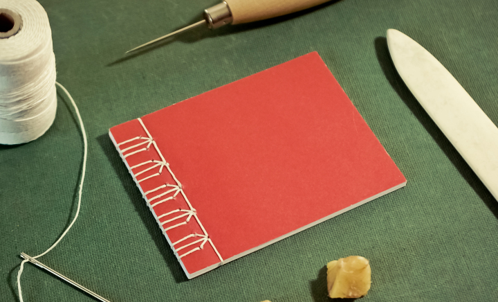
Photo purchased from … www.depositphotos.com
The Printing Industry Exchange Blog is #12 of the best 40 digital printing blogs, as selected by FEEDSPOT.
What you include on a book cover in the way of graphic design, or creative, or imagery, is just one element of print book cover design. The physical presentation, including what materials you use and how you combine them, is equally important, and it sets the tone for the whole print book as well.
Stab Binding (from Japan, China, and Korea)
I know this sounds grisly (only the book pages and cover pages get stabbed), but it is actually an elegant and ancient Asian bookbinding technique. (I included a photo of this binding option at the top of this blog article.)
The process does not involve any glue (unlike perfect binding). All you do is stab holes into the cover and book pages and then lace up the book over the spine edge with string. If you Google this process, you’ll see that you can make a number of different geometric patterns with the string.
This might be a unique binding method for a writing journal or sketch book. You could even use special paper (maybe seed paper, with actual seeds in the paper stock, or paper containing flecks of flower petals—anything to make the finished product more tactile and organic).
Stab binding has a long history (centuries) as a binding method in China, Japan, and Korea.
Unfortunately, stab binding, which really is similar to the current method of side stitching (in which case you would use staples instead of string), will not allow the open book to lie flat. But if lying flat is not an essential characteristic of your print book, this may be a good option. Personally, I consider it a unique, aesthetically appealing option for a “hand-crafted” look.
A Few Options for Case Binding
I have a number of books from the late 1800s that were case bound. This option is very durable. But it also provides at least three variations that come to mind immediately.
Leather, fabric, or paper can be wrapped around the binder’s boards used in case binding a print book. Binder’s boards are thick chipboard (a kind of dense cardboard stock). A flexible spine is added to the book between the front and back covers, and the interior text block is actually suspended from this “casing,” allowing the pages to be turned, and allowing the print book to lie flat when open.
In terms of book decoration, the front cover image and title, for instance, might appear not on this paper, fabric, or leather book cover but rather on a separate dust jacket wrapped around the book.
Alternatively, you can use hot-foil stamping (heat and pressure applied to a roll of metallic foil) to punch out lettering for the book title and affix this to the book cover material. And then you can add a more elaborate dust jacket for a repeat of the cover text and an added cover photo.
The dust jacket, by the way, would be a large printed and perhaps UV coated or film laminated press sheet with flaps that fold around the book binding boards. In this way you can design a more intricate and complex cover than you can with the foil stamping on the main fabric, leather, or paper cover.
One thing to keep in mind with the foil-stamping process is that you will need to pay to have the printer’s subcontractor create a metal die for the foil stamping, and this can be expensive. It will also add to the overall book production time.
That was the first option. Another option is to print the book covers on flat press sheets and then laminate them directly to the binder’s boards and spine of the case-bound print book. If you think back to many of your high school or college textbooks, these were produced this way, with colorful covers but no separate dust jackets.
If you skip the dust jackets and print the book covers directly on press sheets that can then be laminated to the binder’s boards, you can avoid producing (and paying for) metal dies to cut the hot-stamp foil (noted in the prior book decoration option).
The third option for case binding is really a hybrid, mixing “Wire-O” binding with case binding. You may have seen these books in the cooking section of the bookstore. Metal wire loops are stacked parallel to one another and are affixed to a wire running parallel to the spine. This wire apparatus (with the text of the book attached to it like a spiral notebook) is looped into the cardboard spine of the case-bound book. (The loops are often visible from the outside of the spine.)
On the interior front and back covers of such a book, you can see that endsheets have been pasted onto the binder’s boards (as in case-binding work). With both the wire loops and the case binding, this is an especially durable option, which is probably why publishers often choose this method for cookbooks. The books also lie flat when open, which is useful when you’re using both hands to prepare food.
You can assume that this will be an expensive binding option, since the “Wire-O” portion of the binding involves handwork. But for the right product, it can be a very attractive and functional option.
The Usual Suspects: Saddle Stitching, Perfect Binding, and Mechanical Binding
To round out this discussion, I’d like to briefly mention the more traditional, and less expensive, methods you can choose to bind your books.
Saddle stitching involves nesting book signatures inside one another (when bound and trimmed, these would look like a stack of four-page signatures, one on top of the next, folded, with staples in the center). This is probably the cheapest option. It’s often used for magazines and journals. But the main downside is that you don’t have a spine on which to print the book title, and you have a size (page-count) limit of about 96 pages (three 32-page signatures) or less. I’ve seen pages fall off the center staples in magazines exceeding this length. Wherever you look online, you’ll find a different page number limit (because it all depends on how thick your paper is), but 96 pages is a good place to start discussing binding options with your printer.
Perfect binding is like case binding without the hard case (and binder’s boards). It’s for longer print books. Unlike case bound books, the text of the book is not suspended from the heavy cardboard book-cover boards with endsheets. Rather the paper cover (usually of a thicker stock than the text) is just wrapped around the text block (the stacked press signatures of the text, as opposed to the nested press signatures of saddle stitching). The paper cover is glued to the spine, and the book is then trimmed on three sides (top, bottom, and front or face margin).
Perfect bound books are durable, and they come at a reasonable price. Almost all of the paperbacks you’ll find (that aren’t saddle stitched) will be perfect bound. Ask that your printer use PUR binding glue. It’s flexible, and it doesn’t dry out and get brittle as it ages. It’s worth a little extra money.
The third option, mechanical binding, includes tape binding, spiral wire (like spiral notebooks), plastic coil (a plastic wire version of the spiral wire), Wire-O (mentioned above in the composite binding for the cookbook), Velo binding (a plastic strip on the top and bottom of the text block running parallel to the bind edge and attached to one another through holes drilled through the text), and GBC (or comb binding). The list goes on. I’m sure there are more.
What you need to remember is that mechanical binding almost always requires handwork. So the unit cost can be expensive. That said, if you are producing a handful of reports to distribute at a conference, this will save you the make-ready expense of perfect binding or saddle stitching your print book.
As to the design of saddle-stitched, perfect-bound, and mechanically bound books, these really aren’t very exotic—at least not like the Asian stab binding. So in these cases you’re pretty much dependent on the visual design of the covers rather than the intricacies of the binding itself for the “Wow” factor.
That said, a client of mine prints a number of 5.5” x 8.5” perfect-bound book titles each year. And they (husband and wife) always specify French flaps. This is a 3.5” extension to the front and back covers. The flaps fold inward over the interior front and back covers and make the book look like it has a dust jacket. This is more of a European approach (so it looks stylish), but it also provides space in the front and rear of the book for an author photo and bio and perhaps some marketing text.
So in this case it is possible to make a perfect-bound book look sexy.
The Takeaway
Consider both the creative design and the physical construction of all of your book binding options. Think about utility, price, length of the press run, and schedule (for instance, cookbooks that mix case binding and Wire-O binding cost more per unit and take longer overall to produce).
Look at printed samples, and think of not only the appearance but how the binding method will feel in the hands of the reader. Will he/she need four hands in order to both cook and refer to a cookbook that doesn’t lie flat?
Appearance and utility. These are two key concepts to keep at the top of your mind when selecting the perfect binding approach for your print book.
Posted in Book Binding | Comments Off on Book Printing: A Selection of Creative Cover Options
September 25th, 2023
Posted in Printing | Comments Off on Commercial Printing: Expanding the Color Gamut
Photo purchased from … www.depositphotos.com
The Printing Industry Exchange Blog is #12 of the best 40 digital printing blogs, as selected by FEEDSPOT.
For a number of years I’ve been seeing online (web-to-print) offers in which you can print your photograph or artwork onto metal. This is based on inkjet printing. It also takes advantage of the reflective nature of metal to enhance the appearance of your photo or art, to brighten it, and to give it an otherworldly sheen.
I find this interesting because it calls to mind a number of other approaches I have seen over the years to enlarge the number of distinct, printable colors available with a particular commercial printing technology.
The Hexachrome Process
About thirty years ago one of the commercial printing vendors I worked with (I was an art director/production manager for a non-profit government education foundation at the time) had installed two technologies relevant to this discussion: Hexachrome custom printing and the substitution of CMYK inks with anywhere from one to four fluorescent inks.
All of this was based on the limits of offset lithography. CMYK inks (cyan, magenta, yellow, and black) combine to create only a limited portion of the visible light spectrum. This is called the “color gamut.” Visible light (what you see outside in the sun) provides the widest color gamut of distinct colors. RGB (red, green, blue) phosphors that create color on a computer monitor or television screen produce a smaller color gamut. And the smallest color gamut is created with ink, paint, or toners (i.e., CMYK pigment on a substrate).
These colors (in the case of offset lithography) are transparent inks (usually printed in halftone dot patterns laid over one another and then slightly angled to keep dots of the four process colors from producing visible moire patterns). The percentages of these colors (as reflected in the size of the halftone dots) when seen together create the impression of color in the eye and brain of the beholder.
Because the offset lithographic color gamut is smaller than that of a monitor (or the visible light spectrum outdoors), it has been a goal over the years to find ways to expand the color range. Back when I was working with the aforementioned printer delving into Hexachrome color and replacement of certain process colors with fluorescent inks, this was how they attempted to extend the color gamut.
Hexachrome added orange and green to the normal cyan, magenta, yellow, and black inks. More specifically, when separating a photograph (for instance) into the usual four printing plates needed for process color printing, this commercial printing supplier would actually separate the photos into six halftone images. Doing so would add two of the secondary colors (orange and green) into the mix and therefore enhance anything containing these two non-CMYK hues, producing (for instance) vibrant blues and purples when combined with the CMYK inks.
You may want to compare this offset lithographic custom printing technique to today’s large-format digital inkjet printing technology, in which multiple inks (such as the usual cyan, magenta, yellow, and black, along with light cyan, light magenta, and sometimes red, green, blue, orange, and violet—or any combination thereof–for up to about ten or twelve inks) expand the inkjet color gamut beyond that of traditional offset lithography.
Touch Plates, Bump Plates, and Kiss Plates
Two things to remember when using commercial printing techniques with an expanded inkset are that you need more than four inking units on your offset press (so the price-per-hour to run a larger press, like an eight-color press, will rise beyond that of a four- or six-color press) and you can’t accurately proof such a job using traditional four-color proofing devices.
That said, and in spite of the fact that Hexachrome has not been a familiar name (to me at least) since I saw it in the 1990s, printers will add colors to your process ink work if you ask them to do so. These colors (with one plate for each additional color) have been referred to as “touch plates,” “kiss plates,” and “bump plates” because they bump up an otherwise subdued or non-reproducible hue. They also increase color saturation and contrast, so the effect can be quite attractive, and can in fact make a particular part of an image (like a child’s red wagon) really jump off the page.
To do this kind of work requires a skilled prepress operator, because you don’t want the transition between the additional color and the surrounding colors to stand out in too stark a manner. You don’t want obvious edges.
White and Silver Ink
The same approach needs to be taken to the underprinting of white or silver ink.
If you are printing on an uncoated, tinted sheet (let’s say a cream stock, for instance), the normal process colors will do two things. They will seep into the paper fibers, which will dull down the color, and (since they are transparent) the process color hues will be changed to a certain extent by the color of the paper substrate.
Printing a white background (graduated intelligently to avoid a “cut-out” appearance) will improve the color fidelity of the overprinted inks (they won’t shift due to the color of the underlying paper), or if you are printing a photo of jewelry, for instance, you can give a metallic sheen to the printed image by using silver ink rather than white ink for the underprinting.
Again, keep in mind that the background needs to be sensitively created with a wide range of tones (light to dark) to make it look like part of the overall color image.
Fluorescent Inks
A similar approach to adding silver or white ink to an offset printed job is to replace one or more of the four process colors with fluorescent inks.
The same printer I referenced earlier that was experimenting with the Hexachrome process (a Pantone, Inc., invention, by the way) made its own set of process colors with the same goal in mind: to augment the printable color spectrum. In this case, this printer would add fluorescent inks (anywhere from one to four fluorescent replacements for the CMYK colors, depending on the result the printer wanted to achieve).
That said, it is possible to replace a process color with just a more intense version of the same process ink rather than an actual fluorescent ink. But in either case, it is important to note that changing the color of one process ink will affect everything in the job—all photos, colored type, and solids and tints—and this may adversely affect such things as skin tones, creating an otherworldly effect. This can be made even more problematic given the difficulty in accurately proofing such ink substitutions.
The Takeaway
That said, you may have more options than you had thought for your commercial printing jobs if you’re willing to experiment with the inks. When I was an art director there were sample books you could get from printers and paper merchants showing the specific kinds of effects possible with metallic inks or fluorescent inks. These included color images printed on different kinds of paper (uncoated vs. coated, for instance, or different colored hues of paper).
Assuming you can still get these sample print books, I’d encourage you to do so in order to show your print provider the exact effect you want to achieve. And don’t assume all printers will be equally skilled in custom printing fluorescent and metallic inks. Ask your printer for samples of work he has actually produced as well as paper and ink sample books.
Posted in Printing | Comments Off on Commercial Printing: Expanding the Color Gamut
September 18th, 2023
Posted in Design | Comments Off on Custom Printing: Ways to Approach a Logo Redesign
Photo purchased from … www.depositphotos.com
The Printing Industry Exchange Blog is #12 of the best 40 digital printing blogs, as selected by FEEDSPOT.
About thirty years ago when I was an art director and production manager of a government education nonprofit, all of us went through a “logo refresh” or logo redesign. Our superiors felt, rightly or wrongly, that the task would be better done by an outside design firm than by our in-house designers.(We would then implement the new logo in all of our publications.)
What I learned in the process is that there are a number of aspects to consider, but for the most part they fit into these categories:
- How did the old logo design–and how will the new logo design–position the company among other, similar organizations? That is, what is the context of the logo redesign?
- How does the new logo capture and reflect the service or product the organization offers, as well as its unique personality and values?
- How can the new logo be used, creatively and effectively, to give the potential customer an overall understanding of the company–instantly–just by seeing the logo? This might be expressed as “what to do with the logo” or “how to use the logo.”
(While expecting the customer to grasp the entirety of the company through her or his initial exposure to the logo is unrealistic, seeing the logo should bring to mind certain thoughts and feelings congruent with the company’s ethos. This should then be reinforced through subsequent exposure to the logo.)
For example, after seeing the Starbucks logo ten times and drinking ten cups of Starbucks coffee (if that’s your thing), then just seeing the logo should bring to mind positive thoughts and feelings about the company.
Brand recognition is the goal of a good logo.
In this light I was recently asked to help a client redesign her logo. To save her money, I said I would do this as a consultant, and she would be the designer. This is the client of mine who produces color swatch print books to help clients select clothes and makeup hues that will complement their complexion and hair. She is the fashionista I have spoken of in many prior PIE Blog articles.
Design of the Logo (Logo Mark and Text)
My client had already produced draft versions of two logo concepts: a word-only version (just text, no logo-mark) and a version with a gemstone background in multiple colors.
To start with the latter (and I did encourage her to develop three distinct versions from which she could choose after careful thought and discussion with colleagues in her field), the outer diamond shape contained the name of her company in caps and small caps across the center of the gemstone.
My client sells a color scheme and an approach to the use of color, but in reality she sells “magic” and “glamour,” as well as the associated feelings of confidence, empowerment, and joy. The approach to color is really just the scientific vehicle for selling the magic.
Therefore, the gemstone visual motif is appropriate, but in my client’s first rendering, the colors and size of the gemstone dwarfed the name of her company. In addition, the two-word name of her company was set in capital and small capital letters, so it was less legible than an upper and lowercase version of the business name.
So I made these suggestions:
- Make the reader’s eye go to the name of the company first by enlarging the name of the company relative to the gemstone image.
- Use more color in the name of the company and less color in the background gemstone, since the former is more important than the latter.
Design of the Logo (Text-Only Version)
My client chose two typefaces for the text-only version of the logo. For the “color analysis” aspect of the logo she chose an all-caps version in a Modern typeface, with dramatic contrast between the thick and thin strokes of the letters. For the “magic” aspect of the logo (a different word, for the sake of her anonymity, but essentially the “glamour” part of her company), my client chose a script typeface in an upper and lowercase treatment. She also included a starburst on one of the letters to give the viewer a sense of seeing a bright light reflected off glass or metal.
I liked the way the two text treatments of the two essential concepts (color analysis and magic) were presented in contrast to one another. That said, I suggested that my client place the logo (in white on black) on a black, solid rectangle. I said this would simplify the overall look of the logo. Instead of a varied contour (around the two words and the starburst), the logo would have as its recognizable contour or outline only the black rectangle.
The black rectangle would contain and connect all of the disparate elements of the logo. In addition, the black (perhaps with cyan as a highlight color) would look like neon light at night, and this would reinforce the “magic” and “mystery” elements of my client’s business.
I also suggested that my client choose an Old Style typeface (such as Garamond, Palatino, or Times) for the all-caps “color analysis” portion of her business name because of the less dramatic contrast between the thick and thin elements of the letters. I said this would be more readable—particularly by older people. (One’s eyes become less flexible and less able to change focus quickly as one ages.)
Legibility (Vision and Readability Issues)
So in all cases I was asking my client to consider not just the aesthetic elements of the logo, and the relevance of the presentation to the goals and values of the company, but also the legibility of the logo. How does the reader’s eye perceive the logo, giving attention to things like relative size of logo elements, readability of various typefaces and type presentations, and the legibility of upper and lowercase type treatments?
I told my client that this approach is also beneficial when you consider the use of the logo. For instance, how will the logo look when it is on a business card (tiny) or a banner (large)–both from a feeling point of view (associated ideas and values) and a technical or legibility point of view?
Custom Printing Technologies
My client then voiced her concern about the commercial printing cost associated with adding color to the logo. She wanted the process to be efficient and hence less expensive rather than more expensive, going forward over multiple logo uses on multiple print jobs.
My response was to tell her that most printers already have their presses set up for four-color process work. So this would be the most economical approach. In fact, my guess would be that washing up a press and using it to print several PMS match colors would cost more than building color with cyan, magenta, yellow, and black 4-color process inks.
In addition, I noted that laser printers and inkjet printers also work on a CMYK model, so my client would be better able to match the output from all commercial printing technologies (offset, laser, and inkjet).
I also noted that if my client were concerned about color matches between print samples (CMYK inks and toners) and online logo use (Red/Green/Blue phosphors), she could specifically choose hues with the closest visual match across the various technologies.
The one thing I did stress was that when reversing type out of a color (such as reversing the logo out of the black box), the fewer colors that had to be in precise register the better. This is true especially for toner-based laser printing (since the particles of toner often do not wind up as precisely positioned on the substrate as do particles of inkjet ink or offset ink).
If my client were to choose the type treatment reversed out of the black rectangle (for instance) and then use 100 percent cyan as a highlight color for contrast, she would not need to keep four process colors in register. This approach would be more forgiving than a logo using large percentages of cyan, magenta, yellow, and black. And this is especially true for laser printing and for reversing type out of a black background. This is a point where a skilled printer’s advice can be helpful.
The Takeaway
Taking a multi-disciplinary approach to logo design can be prudent or even essential. In your own design work, think about the logo mark and type treatment as an expression of the ethos of your business, but go further. Think about the science of vision, and how various type or color treatments can improve or impede readability. Then consider a commercial printing vendor’s perspective about how the logo will be created with laser, inkjet, or offset equipment, and how this will be reflected not only in the overall cost but also in the ability to match the color output across multiple technologies.
Posted in Design | Comments Off on Custom Printing: Ways to Approach a Logo Redesign
September 11th, 2023
Posted in Advertising | Comments Off on Commercial Printing: A Select Few Advertising Venues

Photo purchased from … www.depositphotos.com
The Printing Industry Exchange Blog is #12 of the best 40 digital printing blogs, as selected by FEEDSPOT.
I just learned a new word: “advertising creep.” I guess it’s like mission creep, in which your boss’ plans for you grow exponentially, and sometimes the original goal is lost.
Advertising creep is not a bad thing, though. After all, advertisers compete heavily for your attention. Just think about all the images and ads that bombard you when you go to the grocery store. Even the shelves now have “shelf talkers,” little signs as you go through the aisle, identifying and describing the merchandise, lest you not see it and walk on by. On Google, I just found that a grocery store has up to 60,000 individual SKUs (or distinct items).
A Grocery Cashier’s Branded Conveyor Belt
So in this light I was actually rather amused when my fiancee and I entered a specialty food store recently and found advertising creative on a formerly black conveyor belt at a checkout cashier’s station. Moreover, it had a huge QR code along with the bright advertising imagery and text.
So when we got home I Googled this new phenomenon (which I’m sure will spring up elsewhere as well) and landed on “messagewrap.com,” where I did some research.
First I learned about the logistics. I found a video of a seven-year-old installing what looked like a long, flat strip of custom printing material over the black conveyor belt, then attaching the two ends with pre-positioned double-sided tape, and then using a roller to firmly adhere the adhesive-backed, printed strip to the conveyor belt. I hope they paid the seven-year-old. She did a great job.
Accompanying data on the website noted that most people would actually prefer to see advertising instead of a solid black conveyor belt. And from the point of view of the advertisers, this is a great opportunity. After all, for a good chunk of time they have the undivided attention of the target consumer. Even if he or she doesn’t buy the advertised product at that specific time, the message has been transmitted and stored in the customer’s subconscious. Maybe next time.
And in the case of my fiancee’s and my trip to the grocer, the huge QR code we saw will send anyone with a cell phone and the right app (or computer application) directly to the grocer’s website. From this point on, she or he can learn about food items, prices, and more. And everything I have read for years touts the synergistic effect of cross-media marketing. If you use more than one advertising medium together–seamlessly–moving the customer from the conveyor belt (metaphorically, of course) to the grocer’s website, your chance of increasing sales rises exponentially.
What makes this exciting to me is not that it exists now, but that it hadn’t existed before. Someone actually identified the few square feet in a grocery store not covered in flexible packaging art, folding carton design, shelf talkers, and other promotional signage. More power to them.
To go back to the company that makes these wraps (messagewrap.com), here are some specifics from the website:
- There are 6,000 trained installers across North America (plus the seven-year-old in the video).
- The message wrap is supposed to last for six months (i.e., regarding its “durability”). This doesn’t deter me, since other billboards (which is essentially what this is, a moving billboard) are often installed for only a short amount of time.
- The commercial printing product is coated for durability (scratch resistance), but it’s also coated to be antimicrobial. You really can’t say this about the original, unprinted black conveyor belt it covers.
- According to messagewrap.com research, customers seem to love the new look since it is colorful and engaging.
- It’s new. Apparently no one has done this before.
- The specific physical design (having one end of the printed advertisement attached to the other end in an endless loop and then also having it bonded to the underlying black conveyor belt) makes it stay put and not come loose.
I did not look closely with a 12-power printer’s loupe when my fiancee and I saw the printed conveyor belt at the specialty grocer, but given the look of the product in the messagewrap.com website video, I would venture to say that it was inkjet printed on a roll-fed inkjet printer and then coated for scratch resistance and cleanliness. Apparently, it also comes with cleaning liquid to make it both pristine again (after regular use) and sanitary again.
A Medical Office’s Digital Signage
Another captive audience includes patients at a doctor’s office or dentist’s office. In addition to posters on doctors’ examination room walls selling pharmaceuticals, there is a trend now toward digital signage and/or videos. In my dentist’s office waiting room, for instance, there is a short video in which chimpanzees discuss dental self-care. What makes this effective is twofold. When you’re waiting to see the dentist, you have relatively few sources of visual stimulation, so the large-monitor digital-signage/video along with its soundtrack will catch your attention. This visual/audio center of the waiting room can be very persuasive. And this is the goal of advertising.
The second reason it’s effective is that it repeats in an endless loop. Ask any hypnotist just how effective repetition can be.
From the point of view of a marketer, the doctor’s or dentist’s office provides multiple opportunities for advertising creative. The posters in the examination room provide distraction for the patient awaiting a medical examination. In many cases these posters focus on pharmaceuticals the patient may request or the doctor may offer. But when these are paired with brochures scattered among the waiting room magazines and the visual and auditory stimulation of the digital signage, a coherent marketing message can be presented. In fact, I’m surprised my dentist has not yet included QR codes in his promotional literature, although he does text me both before and then after my appointment (for feedback), and his office assistant does call to remind me of the appointment. So you can add my cellphone to the digital signage and printed posters and literature, for a comprehensive, targeted media blitz.
A Near-Field Communication Poster
Finally, the same technology that allows you to tap a chip-enabled credit card against a cash register reader and transfer your payment information, NFC (near-field communication) technology can also enable you to touch a poster with a hand-held device, like a cellphone, and have a NFC chip in the large format print poster link you to further information about a product or service.
What makes this useful is its short range. Unlike Bluetooth-enabled devices, NFC technology only works within about four inches. This makes it convenient for a marketer to link a large format print poster or other marketing tool (in a fixed location) with your (or another prospective customer’s) cellphone. And it also ensures more secure communications.
The Takeaway
In many if not most of these cases, the effectiveness of the advertising is based on cross-media promotion, in which multiple technologies are used together to enhance the effectiveness of both (or all of them) in communicating a single marketing message.
It’s called synergy. Everything works together—if your marketing guru has thought this through and has ensured a seamless transition from one technology (and device) to another. And together everything works better than the sum of the individual, component parts.
Posted in Advertising | Comments Off on Commercial Printing: A Select Few Advertising Venues
September 3rd, 2023
Posted in Printing | Comments Off on Custom Printing Type Forms on Vases, Furniture, and Bottles
Photo purchased from … www.depositphotos.com
The Printing Industry Exchange Blog is #12 of the best 40 digital printing blogs, as selected by FEEDSPOT.
During our numerous visits to thrift stores over the years, my fiancee has bought a plethora of objects with words printed on them. She is a sculptor (that’s one of the skills she brings to our art therapy work), so printed, 3-dimensional objects of interest to her include everything from furniture to vases to giant clocks, even words printed on bottles. (She loves advertising art and found objects.) The list goes on.
Now to me, as a student of commercial printing, this is of interest because I can see how printers print on substrates other than paper. In fact, the first thing I often do when we get home with a new thrift-store purchase is to take out my 12-power printer’s loupe and analyze the print job closely, considering both the aesthetic effects and the technical elements of the print job.
The other thing that interests me is the different cognitive experience of seeing a printed cabinet, for instance, with type rather than a picture or other image printed on it. What little I know about the brain from studying both graphic art (as well as commercial printing) and the fine arts (painting, drawing) has made me conscious of the different parts of the brain involved in seeing and responding to words vs. pictures.
The Furniture
Most of our furniture with words as opposed to pictures printed on it is in the realm of cabinetry. Both pieces that come to mind as good examples seem to have been printed using stencils. If you think back to World War II and the ammunition boxes (which my fiancee also has) stenciled with various letters and numbers, stenciling starts with images, patterns, or letters cut out of a background.
When you place these stencils on the furniture and then paint over the open areas with paint and a brush, you can then lift the stencil off the furniture to reveal a completed image. Then you can do this again and again on other portions of the same furniture, or on other pieces of furniture. This significantly reduces your time and effort when compared to freehand lettering.
Stenciling is also done within the custom screen printing process. In this case a stencil is attached to a fabric or metal screen. Using ink and a squeegee to spread the ink and force it through the screen and open areas of the stencil, you can produce any number of duplicate images. Screen printing is usually done with a base attached to the screen frame, but this doesn’t always have to be the case. In the late 1970s, when I was working at an art gallery, I saw museum personnel custom screen print paragraphs of type right on the wall as descriptions and explanations of an exhibit they were preparing.
In my fiancee’s case, it looks like either method may have been used. If you decide to look closely at your own printed furniture, use a printer’s loupe and look for especially thick ink. That’s one of the clear and obvious characteristics of custom screen printing ink.
The Bottles and Ceramic Vases
I’m thinking specifically of a set of beer mugs my fiancee found that had been created from brown glass beer bottles. Interestingly enough, although all of them have lettering on the surfaces (quite a bit of type), only one writing sample is upside down. In this case the writing notes that if you can read this glass, you’ve spilled your drink.
Given the thickness of the ink, I would say that all of the glasses had been printed with screen printing ink. If you can create a jig that will stabilize the glasses and then spin them around their central axis, you can use a flat custom screen printing frame to print on the curved surface of the glass.
Another option, which may have been used for a much larger vase my fiancee found at a thrift store, involves glazes. The word glaze is derived from a Middle English word meaning glass. In the case of the larger vase, my educated guess would be that the words were painted on with liquid glaze of a particular color, and then the vase was fired in a kiln at an especially high temperature. A glaze seals the surface of earthenware pottery making it impervious to liquids. It can also be used to add a color (or paint an image or add type letterforms, as in this case).
As an alternative, it is possible to print the imagery and/or type (backward, or wrong-reading) on decals and then transfer the images from the backing sheet onto the ceramic piece (printed right-reading) prior to kiln firing. As with the example of furniture decorated either with screen printing (serigraphy) or by hand painting over stencils, it is much easier to make multiple copies quickly by using decals than by hand-lettering the words.
The Printed Clock Face
One of the items my fiancee collects is clocks–of all sizes, from tiny ones to clocks used as round table tops to a wall clock maybe three feet in diameter. I used to run around the house replacing batteries as they ran out, but after a certain time I stopped worrying and just kept live batteries in a few centrally located clocks.
The large face of the three-foot clock appears to be an offset lithographic print on paper. Why? Because of the halftone dots I see with my 12-power printer’s loupe and because it has been produced on paper. Thicker items usually (but not always) need printing techniques other than offset lithography due to the intense pressure of the custom printing rollers against the substrate, which could crush a wood (rather than paper) printed clock face.
So most probably the face of this particular clock was printed on paper, which was diecut and then attached to the wood backing with an adhesive prior to being mounted within the round clock structure.
How the Brain Processes Visual Information
The brain is a fascinating organ. Although it is not as cut and dried a process as I’m about to describe, different parts of the brain process different kinds of information. For instance, for the photo at the top of this article (a photo of colorful, printed mugs decorated with both text and imagery), the right side of the brain usually processes spatial, artistic information, while the left side of the brain usually processes more linear, logical information (like words). It has been found, since I first read about this process multiple decades ago, that certain things you might think would be processed in one hemisphere of the brain (perhaps the left hemisphere for logical information) might also have an aesthetic component that is processed by the other side of the brain.
So in the case of my fiancee’s furniture, clock faces, and ceramics incorporating words and numbers more than images, it is quite possible that they intrigue her because they stimulate both the logical side and the artistic side of her brain. (Granted, I know very little about science, but this is nevertheless an interesting thought.)
The Takeaway
I see at least three things you might want to consider if you are a product designer or even just a lover of fine art and graphic art:
- Printing on actual 3D products may be considered either “functional printing” (such as letters on a computer keyboard or other images used to help you operate a device) or aesthetic printing (such as printing to highlight the beauty of the letterforms themselves on the furniture and ceramics my fiancee bought at the thrift stores).
- In producing effective design work, it helps to be aware of these distinctions and to understand how the brain processes different kinds of information in different ways and in different parts of the brain. This awareness can help you communicate more effectively with those who see and respond to your commercial art.
- It helps to approach any physical, 3D-printed item with the following question in mind. “What kind of printing technology would be the most effective and efficient for printing on the object?” Some will lend themselves to offset lithography, some to flexography, some to stenciling, and some to custom screen printing. In many cases both the material on which you are printing and the number of copies you are making will determine your choice of a particular commercial printing technology. Therefore, the more you know about the various options, the better able you will be to choose the most appropriate method.
Posted in Printing | Comments Off on Custom Printing Type Forms on Vases, Furniture, and Bottles
August 26th, 2023
Posted in Packaging | Comments Off on Custom Printing: An Intricate Carton-Printing Design

Photo purchased from … www.depositphotos.com
The Printing Industry Exchange Blog is #12 of the best 40 digital printing blogs, as selected by FEEDSPOT.
The purpose of a box is to “contain.” Boxes, or cartons, keep together all component parts of whatever you’re shipping. They also sell your brand. To do this, they have to look good.
In this light, my fiancee found a corrugated box this week for Spoonful of Comfort. It is simply designed, with text and (what looks like) a woodcut image of a rooster bleeding off the bottom on two sides plus the branding (the name of the company in a box-rule overlaying the rooster images). On one panel is a text-only logo (Spoonful of Comfort) taking up a space about 3” x 5” wide.
All of this is printed in black ink only, directly on the brown kraft paper of the corrugated board. On the final exterior panel is a notation that the contents were packed with care and that someone is thinking of you. This feels very laid back and personal, probably because of the old-time look of the box (the woodcut rooster) and the very readable type.
Ironically, even though there is a flourish (a floral squiggly rule line) on either side of the “of” in the logo, the type still looks somewhat modern. The text is letterspaced (spread out slightly) in three different modern or contemporary typefaces, but they look old because of the black-only treatment, the flourish, and one small raised letter. (The second “o” in “Comfort” in the logo is small and slightly raised, with a graphic mark under the “o,” although it still aligns with the top of the other capital letters.)
So the long and short of this is that by combining the look of the Old West (the rooster and the capitalized, almost “chiseled” letters) with some modern treatments, the logo and the box in general look timeless (old and new simultaneously), comfortable, and personal.
That’s no mean feat with black type only on unbleached, fluted kraft board.
But the piece de resistance is the interior. The interior supports the “unboxing experience.” This is the excitement you feel when the carton arrives on your doorstep (and you pick it up before the porch pirates get it) and you open the carton in the comfort of your own home. You have an experience not unlike opening gifts on Christmas morning (or Hanukkah, Kwanzaa, and so forth). In our hearts we’re all still children.
The inside of this box is orange, with white knock-out geometric forms (mostly interlocking circles, with a white flower in every other chained circle). It reminds me of a chain-link fence the way everything connects.
In contrast to the black-only imagery on the exterior of the carton, the orange of the interior provides the “Wow” factor. Of course, this is heightened by the copy block on one panel mentioning the care that went into the package. It’s effective marketing, but it’s also quite attractive. I was interested, even though I knew the box was empty.
Printing Technology Options
Being a commercial printing nerd, I wanted to know what technology was used to print the boxes. So I started with the usual suspects:
Is It Offset Printing?
No. First of all, since an offset press would crush the “fluting” (the wavy interior paper that looks like back and forth “S”s), the only way to successfully print on the exterior of a carton via offset lithography would be to print a coated or uncoated press sheet and laminate it to the outside of the fluting. This would create a (usually full-color) image on the outside of the box. I’ve seen this done often on cartons containing liquor bottles. Then again, I’ve also seen coated 4-color printed litho paper laminated to cartons containing electronic devices from “big-box” stores.
Is It Flexography?
Flexography involves using rubber (relief) commercial printing plates to image flat corrugated cartons, usually in one color (often black). Unlike offset litho, this does not involve heavy pressure, so the process will not crush the fluting (the purpose of which is to make the cardboard cartons both light in weight and durable).
When my fiancee and I used to assemble “standees” at movie theaters, the back panels of a lot of the standees had been printed via flexography. I knew because the chalky black ink came off on my hands. Also, the graphics were simple, usually just a flood of black ink covering all surfaces not visible to the theater patrons.
Also, at least back in the 1990s when I was getting labels printed via flexography, the letterforms weren’t as precise as offset-printed text. They had “halos,” a slightly thicker or darker stroke visible around the edges of the letterforms. I know flexography has improved a lot in the past 30-something years, but this was a distinguishing characteristic (at least when the job was printed on matte litho paper).
In the case of this particular carton, I would say that maybe it was printed via flexography, although through a 12-power printer’s loupe the ink looks a little more substantial than the water-based flexography ink I am used to. Perhaps it’s custom screen printing ink (i.e., for serigraphy, a.k.a. silkscreen).
Is It Screen Printing?
Custom screen printing involves forcing thick ink through a fabric or wire screen onto a substrate. It’s good for printing boxes and printing garments like golf caps or items like messenger bags. It does, however, take a lot to set up a press run, so custom screen printing is really only useful for longer runs—like this cardboard box, perhaps. And since the orange color inside is a match color (rather than a build of cyan, magenta, yellow, and black), this would lend credence to my educated guess regarding the commercial printing method.
Is It Digital (i.e., Inkjet) Printing?
Inkjet print heads don’t touch the substrate (ink is jetted onto the substrate through nozzles on the inkjet press), so this option for printing on corrugated cardboard definitely would not crush the fluting. That said, it is a slow imaging process compared to custom screen printing and flexography (once preparation or makeready for screen printing and flexo has been completed). So for a longer press run of cartons (in this case without any variable data such as names), digital inkjet would probably not be cost effective.
In addition, if you look very closely, a sample of inkjet printing is composed of a huge number of almost microscopic dots. To my eyes the ink layer on the cardboard carton seems more even-toned than a layer of inkjet ink.
What’s My Guess?
For a very short press run I would say the technology of choice would have been inkjet. For a long run I would say that, since the design is simple with no registration of colors, this may have been printed via flexography. (Also, flexo may be more forgiving on corrugated stock than on matte litho label paper. If so, this might account for the absence of halos on the perimeter of the letterforms in the typography on the box.)
That said, since the unbleached kraft paper that comprises the carton is porous, I would imagine that a water-based commercial printing ink (such as flexographic ink) might seep into the paper substrate more and not appear to be as thick and rich, particularly the orange ink inside the carton. (That is, I’d expect ink that sits up on the surface of a porous cardboard box—like the box I speak of–to more likely be custom screen printing ink than flexographic ink.)
The Takeaway
In your own design work and print buying work, you may want to take this kind of approach to a design and print job. It’s a good habit, since it will make you articulate your goals and address what technology fits these goals best. Think about the length of the press run, the number of colors, the quality of the substrate (whether you want it to be more or less porous).
Consider whether you want to print a detailed, 4-color design or whether black (or a different single color, or two) type and imagery without close register of ink colors would be sufficient.
Do you need to personalize the boxes (by adding people’s names), or is your box part of a versioned run (with so many boxes for each separate segment of an overall promotional initiative)?
Answers to all of these questions and others will help you determine which method of custom printing to choose.
Posted in Packaging | Comments Off on Custom Printing: An Intricate Carton-Printing Design
August 20th, 2023
Posted in Color Theory | Comments Off on Custom Printing: What Is the Difference Between CMYK and Pantone Colors?
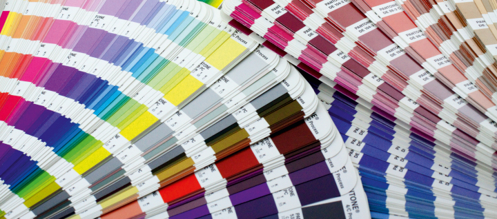
Photo purchased from … www.depositphotos.com
The Printing Industry Exchange Blog is #12 of the best 40 digital printing blogs, as selected by FEEDSPOT.
What is the difference between PMS match colors and 4-color process colors?
First of all, let’s step back for a moment. Color is a function of light and the interaction between the rods and cones in your eyes and the lighted subject you are observing. People see color differently, especially men and women, and if you cover one eye and then the other, you’ll see a slightly different hue with each eye. Also, if the light is different, the color will be different.
So color is quite subjective.
The number of distinct colors you can see is far greater in real life than the colors a computer display can reproduce (using red, green, and blue phosphors), and the RGB color gamut is much larger than the colors you can reproduce with colored toners or inks (the process colors: cyan, magenta, yellow, and black).
(You can find diagrams of each of these color spaces on Google Images. Many of these images show one color gamut superimposed over the others, showing the visible spectrum as being much larger than the CMYK color gamut.)
4-Color Process Offset and Digital Commercial Printing
In many cases this is not a problem. After all, on an inkjet printer or an offset press, the process colors will reproduce the majority of distinct hues.
The way an offset press (or a laser printing press) creates colors is to layer halftone screens of the process colors over one another at specific angles such that the halftone dots do not cover one another. Since the halftone dots are different sizes (the same number per square inch, in rows, but larger or smaller as needed for the four process colors to create–together–all manner of different hues).
Inkjet commercial printing works in a slightly different way. Inkjet printers spray more or fewer dots of cyan, magenta, yellow, and black ink (minuscule but all the same size) as needed to create—when seen together—all manner of hues. Unlike most but not all offset presses and most but not all laser printing presses, inkjet presses often include additional colors in their inkset. Perhaps this would include a light magenta and light cyan, or even a purple and a green, or a red and blue. The goal is to expand the number of colors the inkjet press can render.
To do this on a laser press involves adding more toners. For instance, you can add more liquid toners (very tiny particles of physical toner suspended in fuser oil) to the colors used on an HP Indigo press (and presumably other presses, such as the Kodak NexPress).
If you want to do the same thing on an offset press, however, you would need to use more inking units. For instance, instead of using a 4-color press with four inking units, you might need an 8-color press. You might use four of these color stations for the process colors (CMYK), and then you might add one or two PMS colors (which I will describe shortly) and perhaps a gloss varnish and a dull varnish.
Keep in mind that the 8-unit press would cost considerably more to run than the 4-unit press. So the price of your print job would go up. Moreover, not every commercial printing supplier would have an 8-color offset press, so this might limit your choice of custom printing vendors.
What Are PMS Colors?
Beyond the four process colors, which are laid over one another to produce multiple additional hues, there is a set of colors called PMS (or Pantone Matching System) colors. You can find samples of these in PMS books of various kinds. These match colors or spot colors, unlike the process color builds, are actually mixed (like a recipe for a cake). Companies specifically mix so many parts of one color (like Rubine Red) with so many parts of another color to achieve the exact hue you have chosen from one of the PMS color books.
One benefit of this system is that all custom printing suppliers across the globe can communicate the precise color they want using this agreed-upon standard, and all PMS 199s or 286s will look the same.
(If you use these books, it’s still always best to choose from printed samples in the books rather than from simulations of PMS colors on your computer monitor. Your color samples will be more accurate.)
Why Would You Want to Do This?
Usually, if you’re printing a color job on an offset press, the four process inks will be enough. You can produce brilliant color. You just can’t produce all of the brilliant colors in the visible spectrum. If you’re designing and custom printing a coffee-table art book including vivid oranges, violets, or greens, these colors in the printed job might not be as vibrant as you would like if you only use the process inks.
In that case, you can separate the color images onto more than four printing plates. In the late ‘90s I read about and saw examples of Hexachrome and High-Fidelity Color, which included extra colors like the green, orange, and violet noted above. In this case the separations might include halftones of cyan, magenta, yellow, and black plus “touch plates,” “bump plates,” or “kiss plates” using match green and match violet inks to enhance certain colors in specific areas of the photos.
Another way you can use additional PMS colors on an offset press is to print flat art (solid areas of color, screens, or type, for instance). This would be separate from the photos. That is, you can add a green PMS color as a background screen, or you can set the headlines of the text sections in a solid PMS color without needing to layer process inks over each other to do this.
A flat color, spot color, or match color (all of these are different names for the same thing) will yield much crisper type letterforms than 4-color type (a build of four colors) because there will be no halftone dots used to create the colored type. This would be especially useful if you want to set the text type in a dark gray, for instance, instead of black, since small type rendered in multiple 4-color process colors would be less crisp and harder to read than type printed in a single PMS color.
Another good reason to add PMS colors is to reproduce your corporate logo colors exactly and consistently. When I was an art director in the 1990s, the non-profit government education organization for which I worked included PMS 199 red and PMS 286 blue for it’s red and blue eagle logo in addition to the process colors used for the full-color photographs.
So another benefit of using match colors is their absolute consistency.
For instance, let’s say your job is a 16-page booklet. On the press sheet there would be eight pages on either side, with four across the top and four more pages immediately below these, plus the other eight pages on the back of the press sheet.
Let’s say your backgrounds on some of the pages include heavy coverage ink. Or maybe some have large photographs and some do not. Maybe the commercial printing pressman identifies a color cast in one of the photos and therefore adjusts the ink mix, adding more or less of one or more of the process inks. In the page layout (imposition) of four pages above four more pages on one side of the custom printing sheet, changing the ink composition to fix the colors in one of the large photos might change the appearance of the process color build on the page immediately below it.
If your background color (maybe a green color build behind all other graphic elements on every page) shifts due to the printer’s having adjusted the color to benefit one photo, that change would stand out like a sore thumb. Your background colors would no longer match. However, if you use a match color for all backgrounds on all pages in the 16-page booklet, you wouldn’t have this problem. All of the backgrounds, printed in the same extra color (as a solid PMS color rather than a CMYK build) would be absolutely consistent.
The same is true for your logo colors. These won’t vary from one logo image to another because the PMS colors are always the same.
Duotones
PMS colors can also be used in duotones (images made up of halftone dots like four-color images but created with two inks rather than all four process colors). In this case you might want to use a black and a gray ink, or perhaps a black and a dark green ink, to add color to the image. In this example PMS match colors would be helpful, particularly since you could use the dark green color in both the duotone and elsewhere on the page, perhaps as a highlight color for the headlines of the text in the book you’re producing.
Unfortunately, though, if you’re creating duotones, you can’t really get an exact match when you’re proofing the colors. This is because almost all proofing devices are based on CMYK inks. Therefore, the only way to accurately proof them is on a small proofing press (i.e., by doing an actual, but very short, press run). I will also mention that drawdowns of PMS colors are useful (a colored ink smeared on the paper substrate of choice to give an approximation of the final look of the ink).
Sample PMS Books
Talk with your commercial printing vendor about buying Pantone sample books. The most useful of these is the PMS swatch book that shows all possible PMS colors. (This long and narrow book of color strips will probably comprise more than one volume.) With this swatch book you can select your PMS colors in good room light or sunlight from physical samples on paper rather than images on a computer monitor.
There are also books that show each Pantone Color with its closest CMYK build. This way you can see whether you can create an adequate version of a specific color using process inks, or whether you will need one or more additional PMS colors.
There are also books that show halftones in a particular color, as well as type surprinted on and reversed out of an image or a solid or a screen.
All of these give the designer an approximation of the final printed appearance of the piece she or he is designing.
Better to know what to expect before your printer puts ink on paper.
Posted in Color Theory | Comments Off on Custom Printing: What Is the Difference Between CMYK and Pantone Colors?
August 13th, 2023
Posted in Fine Art Printing | Comments Off on Custom Printing: Giclee Art Prints and Paper Choices
Photo purchased from … www.depositphotos.com
The Printing Industry Exchange Blog is #12 of the best 40 digital printing blogs, as selected by FEEDSPOT.
On our local free-goods website this past weekend, my fiancee and I found a print, on stretched canvas, of a Gustav Klimt painting. This is better than Craig’s List or even our two favorite thrift stores because, as I noted before, everything is free.
That said, free comes at a price, and in this case the painting, with which we were both familiar, had been cropped severely into the subject matter. Moreover, the gold coloration (Klimt used a lot of gold paint in his patterned images of women) registered as brown because of the porous substrate. It was canvas, but the holdout of the inkjet inks on the primed canvas was mediocre, which dulled down the overall look of what otherwise would have been a striking copy of this Symbolist painting.
Giclee Technology
I have written about giclee printing before. The word means “spurt.” It is high-end inkjet custom printing done with archival inks, archival paper (i.e., acid-free or alkaline paper), and the close attention of the artist (or in this case the close attention of fine arts professionals who had studied Klimt’s work as art rather than as home décor).
Giclee drives up art prices in two ways. The edition of a particular print is sometimes limited. That is, artists may elect to only print a certain number of copies of their original, and this scarcity will increase the monetary value of each copy. The opposite of a “limited edition” is an “open edition,” which can be added to (with more prints) at will by the artist, further diluting their value.
Keep in mind that value comes in two flavors. If you want to make money on art, the more copies that are in existence, the less each copy is worth. If, on the other hand, you love the painting and want to be able to afford a copy, this is a good way to start. In this case the monetary value doesn’t really matter.
In contrast, limited editions or original works of art sold at art galleries and art auctions, such as large paintings even by relatively unknown artists, can run upwards from several thousands of dollars (or much, much more for anything by anyone as famous as Gustav Klimt).
So inkjet commercial printing makes art affordable. This is actually what happened with Alfonse Mucha (and other fine artists, such as Toulouse Lautrec, who made money in the commercial arts as well as the fine arts), especially after the invention in the late 1870s (for printing on tin) or early 1900s (for printing on paper) of offset commercial printing. Regular people could not only see more art but also own it as prints.
With this in mind I thought about other prints I have bought at auction, and I also remembered an early version (from the ‘80s) of an inkjet printer used specifically for proofing custom printing jobs, the Iris. It was an inkjet printer, but due to the technology and the color set, it was not only continuous tone (like a photo print rather than a printed halftone) but also rich in ink coverage and accurate in color reproduction. So it made for an especially good contract commercial printing proof. I never bought one for a job, but I always paid attention to the technology.
Ironically, as noted above, the specific technology was intended to be an interim step in offset custom printing, an especially faithful proof. However, over the years the Iris print has actually became a final art piece to be coveted by collectors.
Old-time Etchings, Engravings, and Other Prints
If we step back in time a bit, artists used to use either sharp instruments to incise metal custom printing plates for fine art line work or establish tones on the printing plate using acids, and resist materials, to either burn away the metal or keep it from being burned away, all to vary the darkness of tones later printed with ink rolled onto the plate.
This meant that in most cases the plate was used to make not a single, original art piece but rather multiple copies. Once burned with acid or cut with an engraving tool, the plate could be printed any number of times on a custom printing press, and the value would rise or fall not only depending on the skill and renown of the artist but also on the scarcity of the limited edition.
In contrast, the kinds of prints that used to be produced via inkjet technology on the Iris proofing device or in modern times on large-format inkjet equipment were in my experience mostly reproductions of paintings and other colorful, flat art.
In my fiancee’s and my case with the Klimt print, we were looking at ways to reproduce colorful paintings, not monochromatic etchings, drypoints, engravings, or mezzotints.
Back to the Present
To come back to present times, our free Gustav Klimt image led us to a couple of solutions. The first involved my fiancee’s touching up areas of the print with metallic paint. (Like metallic printing ink, metallic paint contains small flecks of actual metal: aluminum–or copper and zinc–for silver and brass for gold). This provides a metallic lustre or sheen. My fiancee painted right on the canvas.
She was satisfied with the result but wanted an uncropped image of Klimt’s painting, so we went online to find an art printer.
In my opinion, what makes an art printer more appropriate for this work is that he or she will have the proper inkjet equipment (using pigment-based inks rather than water-based dyes) and archival inks and papers (or canvas). And she or he will have control (as the artist himself or herself would have had) of the overall look of the final giclee (again, not offset custom printing but high-end inkjet, with no halftone dots but instead only minuscule inkjet dots giving a continuous-tone appearance).
The Art Supplier’s Paper Choices
This particular online printer, Fine Art America, offered different sized prints on a number of substrates. I was surprised that canvas was not one of them, although I’m sure their roll-fed printers could accommodate rolls of canvas that might later be stretched over wood stretcher strips. Perhaps for some aesthetic reason Fine Art America offered only paper of various kinds.
When my fiancee and I thought about which paper substrate to use, we looked online but were somewhat confused. We knew that, as with any inkjet or even offset print produced on paper, the substrate (color and texture) would affect the overall look of the print.
In my experience uncoated papers dull back the coloration of inks (of any kind), and gloss-, matte-, or dull-coated papers provide more crisp hues because the ink sits on the surface of the paper rather than seeping into the paper fibers. (I assumed fine art printing and commercial printing would be comparable in these assumptions.)
Fine Art America offered different sizes on different papers. I asked for more detailed descriptions of the paper options and was pleased to receive a list noting specific details of the surface formation and potential appearance of each printed paper stock.
(Remember that the Klimt painting reproductions would have metallics in the inkset. Although we haven’t gotten that far yet with negotiations, it is my understanding that the expanded inksets of professional-grade inkjet printers can include metallic inks–also made, presumably, with flecks of metal in their ink mix.)
In the list of paper options, we looked for such words as “neutral white,” since we didn’t want the hue of the paper to shift the color of the inkjet printed image. Fine Art America included archival matte paper in their offerings, but I was a bit concerned that this would dull down the metallic sheen.
The next three offerings were photo paper (gloss, luster, and photo matte), but my fiancee and I were concerned that this might not give a warm enough feel to the colors and might give somewhat of a metallic sheen to the print (which would not necessarily be bad given the gold in the original).
The next option was a picture “rag” (cotton-, rather than wood-based paper), but we were again concerned that the uncoated nature of the paper would dull down the look of the metallic ink.
The three other options were a watercolor stock, a metallic paper, and a velvet (paper with a bit of texture and yet some smoothness). This cotton rag paper softens the look of the final art, which might make the Klimt image look sensuous and inviting but might also dull down the gold. Watercolor paper we liked for the texture and thickness, but for the metallics we had the same concern about potentially dull ink coloration.
One item noted, however, in Fine Art America’s description of their paper options did catch my interest. Their metallic paper intrigued me. This is how they describe it: “provides an exceptionally vibrant print with the shine and shimmer of metal. This highly durable paper is mostly white with a signature metallic finish, making it ideal for a wide range of images including white and flesh tones” (Fine Art America).
To me, one of the most important characteristics of this paper stock is that it is “mostly white.” So it will not add an unwanted color cast to the final print. This was one concern I had. But it will provide “the shine and shimmer of metal” (Fine Art America). Hence, it might very well provide a realistic appearance of gold in Gustav Klimt’s nudes.
Granted, the best way to make the decision would be to buy one copy (the smallest available copy) of several of the paper options, perhaps including the metallic and the archival matte stock, and make a decision with our own eyes rather than visualizing the results in our mind’s eye.
The Takeaway
This shows just how much of an art form giclee prints have become. The attention to detail, color fidelity, and longevity place this method of reproduction alongside traditional etchings, engraving, screen prints, and art lithographs, as worthy of serious consideration.
And if this interests you, you will see that your own understanding of the principles of traditional offset lithography along with your understanding of various inkjet commercial printing technologies and paper options will be most helpful in your decisions.
But remember to get samples and trust your own eyes rather than just descriptions of paper characteristics. And be mindful of just how the color and texture of the paper substrate will alter the appearance of the final art.
Posted in Fine Art Printing | Comments Off on Custom Printing: Giclee Art Prints and Paper Choices
August 7th, 2023
Posted in Fabric Printing | Comments Off on Custom Printing: Printing All of the Bathroom Decor

Photo purchased from … www.depositphotos.com
The Printing Industry Exchange Blog is #12 of the best 40 digital printing blogs, as selected by FEEDSPOT.
Decor is very big in the digital commercial printing world at the moment. Through the Google aggregator I use, I see almost daily articles on bathroom accoutrements, living room décor, even bedroom sheets, bedspreads, and pillowcases. Why not? You can create your own design, upload the art files, and have a service bureau produce and send you furnishings that all match. If you’re a good designer, that is a great thing.
For this PIE Blog posting, let’s focus on the bathroom. I did some research to find out what people print and how this is done.
Shower Curtains
In addition to online research, I checked all of my fiancee’s and my bathrooms, and I noticed that all of them had fabric curtains that hung outside the bathtub and inside liners that hung into the tub.
When I researched the subject online I found what I had expected, that polyester-based fabrics lent themselves to dye sublimation custom printing, in which a solid ink is heated to the point of being a gas. This gas travels into the polyester fabric and then actually bonds to the polyester fibers. This makes the connection between ink and fabric very strong, so the coloration (in addition to being very bright) is very durable.
Interestingly enough, even if the shower curtain fabric is a cotton-poly blend (or even some other materials), it appears to be possible to treat the fabric with a liquid that will accept dye sublimation printing. In cases where this is not an option, inkjet printing would be the technology of choice.
One thing I did find in my research is that liners are very useful in keeping the printed fabric of the shower curtain away from the water in the shower. Since all printed shower curtains and other digitally decorated (or screen printed) fabrics may have at least some issues with rub resistance (less so with dye sublimation), having a liner is a smart idea.
But what if your shower curtains are vinyl? After all, non-porous materials will not absorb the gaseous pigments of dye sublimation custom printing as polyester fabrics will.
In this case, you would want to use some form of vinyl applique. You can even find videos online showing you how to print these at home. Some form of adhesive (preferably one that can tolerate the heat and moisture of the bathroom) would then be used to attach the appliques to the exterior of the shower curtain. In this case it would be even more important to have the vinyl applique on the outside vinyl sheet and also a liner hanging into the tub.
What about inkjet printing using UV inks? I didn’t find anything on this, but it seems to me that printers with large-format roll-fed or flatbed inkjet equipment with UV lamps could print on the non-porous surface of the vinyl and both cure the UV inks with light and allow the UV inks to stay bonded (for at least a certain amount of time) to the vinyl sheeting. After all, you can inkjet print on glass or metal (or other non-porous surfaces) with UV inks cured with UV light.
Or there’s custom screen printing. Ink for screen printing (a process in which ink is forced through a mesh with a squeegie, with block-out stencils holding back the ink from non-image areas while allowing the ink to flow through the screen onto image areas) can also sit up on top of plastic (or fabric for that matter).
In fact, screen printing is a very dynamic choice since the inks are thick and brilliant in color. They sit up on top of the substrate, unlike dye sublimation inks and inkjet inks. Based on my reading, it seems that some water-based custom screen printing inks are less viscous than traditional screen printing fabric inks (like oil-based Plastisol), so these inks can get the pigment to migrate deeper into the shower curtain fabric (again, fabric in this case, not vinyl).
One reason you might want the ink (whether inkjet, dye sublimation, or custom screen printing ink) to travel further into the fibers of the fabric is that the “hand” or “feel” of the printed shower curtains will be softer. This is also true when you’re buying printing for a fabric flag or banner for a trade show or convention, or even if you’re buying printing for sheets and pillowcases.
Ink of whatever kind that sits up on the surface of the substrate (whether a shower curtain, bed sheet, or even a shirt) the way oil-based screen printing ink does can cause one other problem. Over time and use the ink film on the surface of the item will crack. This is also true, presumably, for printed vinyl appliques, as noted before, that you might attach to vinyl with an adhesive, or attach to fabric with a heat press. The newer water-based screen printing inks seem to not experience as much of this problem because they migrate below the surface into the fibers of the fabric (in ways similar to water-based inkjet inks and dye sublimation inks).
If you choose to print on shower curtains, go online. There’s no shortage of web-to-print applications that will allow you to upload your own designs and then receive a box in the mail containing your new shower curtain. Based on my reading, it seems that some would be stitched together and others printed in one piece, depending on the width of the inkjet equipment or (the smaller) dye sublimation equipment, and all would be drilled at the top (using various options such as holes or slits) for the hooks that hold the shower curtain on the shower curtain rod.
Going Beyond the Shower Curtains
You may also want towels, a bathmat for the floor, or even wallpaper. All of these are possibilities. Just go to the internet. You will want to consider the best adhesives to use, given the heat and humidity of the room. (It seems that décor for the bedroom would undergo less stress from ambient conditions.)
That said, this is where one’s design acumen will make a difference, since coordinating all aspects of the printed environment will require aesthetic judgment and an understated approach to avoid visual chaos.
Hand towels and wash cloths may be problematic, as noted before, because you will need to consider regular laundering as well as rub resistance during general use.
In this light, if you’re not going to use a dye to color the towels and other terrycloth materials (which would only introduce coloration and would not allow for printing patterns or images), you might want to research “fiber reactive printing.”
I don’t completely understand fiber reactive printing yet, but it seems to allow designs to be deeply and permanently embedded in the fabric. Apparently, precisely positioned “discharge” ink allows you to extract the dye (background color) of the towel, bathmat, washcloth, etc., and then add the coloration of the ink where the dye had been removed. This technique uses heating or steaming to remove the dyes while setting the inks you have added, allowing for durability, inks that are set deeply into the fabric substrate, and brilliant coloration.
When you consider how these last three qualities are the very ones that have caused problems for each of the aforementioned custom printing technologies, fiber reactive printing seems to hold promise for the printing of home décor items (presumably even rugs). In fact, it seems to me that all of the benefits of dye sublimation technology are present. I personally will be watching this technology going forward.
The Takeaway
You may or may not be designing items for home décor, but since this is a growing field (one of the hottest in commercial printing), it still behooves you to study it. You can see what the technological options are, but you can also see that these are functional products, so they must be washable, color fast, and durable as well as beautiful. They must stay pristine, and fortunately the technologies are improving along these lines.
Moreover, it’s fun (on a personal level) and intriguing (on a global level) to see how digital custom printing allows us to move away from the long press runs of custom screen printing and other analog processes, while giving us the option of creating a home (bedroom, bathroom—or even a closet full of clothes) that expresses the tastes and design acumen of each individual person.
Posted in Fabric Printing | Comments Off on Custom Printing: Printing All of the Bathroom Decor
July 30th, 2023
Posted in Credit Cards | Comments Off on Custom Printing: How Are Credit Cards Printed?
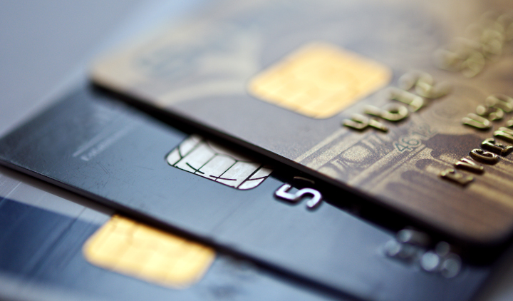
Photo purchased from … www.depositphotos.com
The Printing Industry Exchange Blog is #12 of the best 40 digital printing blogs, as selected by FEEDSPOT.
We live by credit. I’m surprised computer chips have not been embedded in our bodies yet. “Chaarrrrrrrgggge It!” That’s what Fred Flintstone’s wife used to say back in the early 1960s cartoons.
But how are credit cards printed or, rather, manufactured (since custom printing is only one element of these tools of commerce)?
First of all, credit cards fit into the category of commercial printing called “functional printing.” The other two categories I would identify are promotional printing (with the goal of convincing someone to buy something) and educational printing (with the goal of teaching readers something). As an aggregate, these categories would cover everything from a traffic sign to an annual report to a textbook.
Functional printing is printing that is part of a product (with the goal of improving its usability). This includes the traffic sign, the letters on your computer keyboard, the temperature markings on your stove and toaster oven, and the notations on your car dashboard. (Try using any of these products without these notations.)
Any lettering and decoration on credit cards fit into this category of functional commercial printing.
How Are Credit Cards Produced?
I went to school on this subject, and I found that most credit cards are produced at CPI Card Group near Denver, Colorado. All credit cards (and all pieces of plastic used to make them, as well as the data itself) are tracked by computer throughout the manufacturing process to ensure the protection of all credit information.
The cards CPI produces include credit cards, debit cards, gift cards, transit cards, and so forth. These range in complexity from simple cards to cards with EMV smart chips, from plastic cards to metal and even wood cards.
The first step in the process is aesthetic, making the “look” of the card visually consistent with the bank’s or retailer’s brand image. This design step may include simple graphics or even more complex imagery such as holograms.
Using magnetic ink printing or custom screen printing (with various colored inks and dyes made specifically to adhere to non-porous plastic substrates), the commercial printing vendor takes thick sheets of plastic (which have been composed of various chemical compounds heated to a liquid consistency, molded, and then flatted into sheets using rollers) and prints multiple cards at once. One sheet is used to print the front of all cards, and another sheet is used to print the back of these same cards. This allows the manufacturer to encase the magnetic strips and other electronics between the two sheets (and have room in the plastic to cut holes for inserting the EMV chips). Then the commercial printing vendor can laminate the cards.
The addition of the magnetic data strip (in some cases using hot stamping) must follow lamination, so the magnetic particles (metal oxides) in the ink and data strips will not be obscured.
Once everything has been printed and the electronic components have been inserted/assembled, heat is used to bake the two plastic sheet layers together.
As noted before, multiple cards are produced at once. One article I read noted upwards of 60 cards produced at the same time, laid out to be printed in multiple sections on the plastic custom printing sheets.
Once the cards have been printed and laminated and then cut down into individual cards, these can be personalized. This would include adding the cardholder’s identifying information (such as embossing the credit card numbers) and printing the expiration date and security code. Also, the computer chips that have been inserted into cutouts in the cards can be programmed to record individual credit transaction information.
All of this personal and credit information must be both accurate and secure. Moreover, the cards themselves (the plastic) and the printed decoration (branding), as well as the computer chips and magnetic strips, must all be both functional and durable (because the cards need to last a long time and tolerate abuse).
Even the plastic of the cards has to be appropriately mixed and of sufficient strength to not break or chip during use or storage. And the colored pigments used in the inks must be color faithful and durable. Finally, all of the digital information programmed into the magnetic strips and computer chips must be accurate, secure, and incorruptible.
Incorporating Special Qualities and Characteristics Into the Cards
Some of these cards can be treated (in terms of design and composition) to stand out and reflect a premium image. For instance, you can get cards that are made of metal or wood. Some can incorporate transparency or holographic imagery. One article even mentioned scratch-and-sniff cards that incorporate liquid in beads that can be scratched to release odors.
For regular cards, due to the ganging up of individual jobs, the cost can be as little as 10 cents per card, or, when adding electronic components or premium base materials such as metal cards, the unit costs can rise to $1.00 to $2.00 (“How a Credit Card Is Made,” written by credit.com). Some of these cards can even be read without being touched, just by waving them over a card reader.
What Does the Future Hold for Credit Cards?
According to “How a Credit Card Is Made,” your cell phone can already operate as a credit card by using capabilities of its SIM card. Cell phones operate with NFC technology (near field communications), and this technology can be used to transfer credit information for contactless payment. According to the article, the first step will be to transition credit card information to the cell phone, but after that, the information will be uploaded to the internet for credit payments.
But will this mean the end of physical credit cards? Apparently, the answer is no, because cell phone batteries run out of power, and cellphones lose their signal connections or just plain break from time to time. There needs to be a back-up plan, so the tried-and-true credit card will always be needed. Moreover, so much goes into making the credit card graphically appealing that people will always want a physical credit card.
The Takeaway: What Does This Mean to You?
Most of you probably do not design credit cards. I, for one, do not. However, it is eye opening to realize that the greater portion of commercial printing (or at least a huge portion of it) is for functional printing uses rather than educational or promotional printing uses.
Functional printing often (but not always) relies on screen printing technology. After all, you’re often not printing on a flat surface or even on paper.
But the common theme of all functional custom printing is that it has a utilitarian purpose: It tells you how to use the piece of equipment on which the words have been printed.
Beyond that, as product designers will tell you (such as OXO Good Grips’ product designers, who envision and then produce home-oriented tools, such as kitchen implements), appearance and feel are integral to the overall appeal of a product. Functionality (and the overall experience of using the item) is a major part of this, one inseparable from, and intertwined with, its visual and tactile appeal.
With this in mind, all of the aesthetic characteristics of today’s credit cards will keep people wanting them for a long, long time.
Posted in Credit Cards | Comments Off on Custom Printing: How Are Credit Cards Printed?